As product managers, some — or maybe even many — of us have been able to escape the Build Trap and evolve past the Feature Factory. Hopefully behind us are the days of chasing purely feature-based roadmaps and instead, we’re working in empowered teams trying to achieve outcomes.
As part of this transition, we have started to use product analytics tools like Pendo to understand user behavior and sentiment from a quantitative perspective. As we’re confirming user problems to solve and evaluating various solutions, we’re conducting user interviews and usability tests, which means we’re amassing all kinds of qualitative information.
This introduces a set of new challenges:
- How do we know we’re making progress and moving in the right direction?
- How can we demonstrate and quantify learning?
- How do we know we’re “done?” (Or when it’s time to pivot or quit?)
These are new questions for product managers to answer, and I’d like to propose several potential approaches to tackling them.
Data
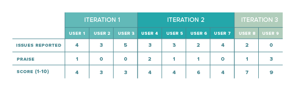
For the sake of this conversation, let’s assume we’re iterating on a solution for a problem we’re trying to solve. For each iteration, we’re conducting several user tests with a prototype. What might be some quantitative metrics we could capture as part of these interviews? How about the following, relatively straightforward data points?
- Number of issues reported (negative feedback)
- Points of praise received (positive feedback)
- Overall score (1-10)
There may be additional metrics in the context of usability tests, but for now, let’s stick with these three to keep it simple. Below is a sample data set from user interviews of several iterations of the same product:
A direct visualization of the raw data could look something like this:
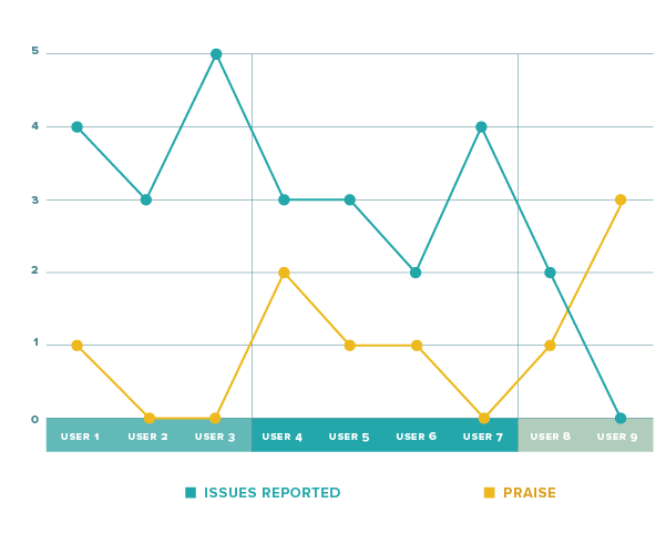
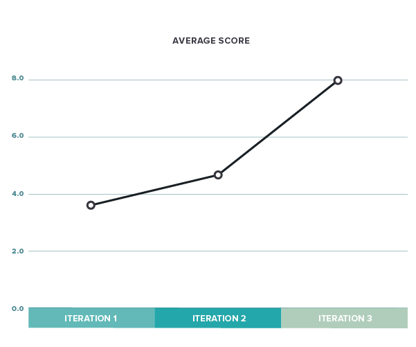
This is somewhat helpful, but there is probably a better way to summarize the iterations. If we average issues, praise, and score for each iteration, we can reduce the noise by showing the data like this:
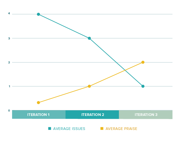
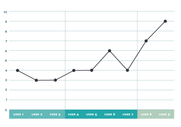
We can see that issues seem to be reduced while positive feedback is increasing. So hopefully we’re moving in the right direction. The average score looks equally positive:
Netting issues and praise
In my mind, praise and issues are two sides of the same coin. It would be hard to omit one and focus solely on the other. One way to approach this is to think of issues as diminishing praise. Therefore, we could simplify further by netting out issues and praise via subtractions. We could call the resulting number the “net value” (praise minus issues). The result is the following visual:
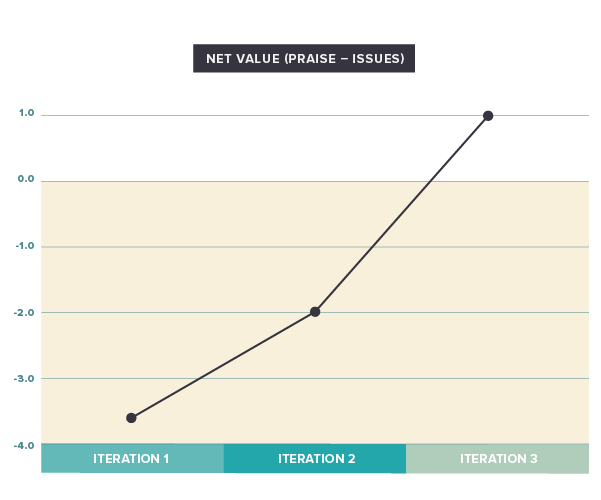
What’s interesting here is that we’re starting in negative territory, which means that the issues outweigh the positive feedback. A good indicator for where we end up may be that the last data point is in positive territory, although just barely.
However, simple netting/subtraction may be a little challenging for a number of reasons. For one, people are more likely to find issues and talk about them than they are to provide positive feedback (yes, that is human nature). That naturally lowers the net value. One potential solution to this is to apply a factor (a multiplier, such as 1.5 or 2) to the praise. Speaking of weights, we are also considering all issues to be equal. Instead, we might consider differentiating them by importance (low, medium, and high) and using different factors/weights for them. That, of course, would mean capturing additional information in our interviews.
NPS-ish
We’ve seen that the average score is already quite informative on its own. Since we’re dealing with a 1-10 scale, we could copy a page from the NPS book and subtract the percentage of detractors (1-6) from the promoters (9-10). The resulting visual would look like this:
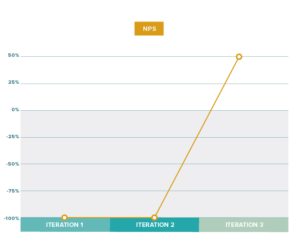
Our data resulted in the first two iterations flattening out to -100%, the worst possible score, while the last iteration finishes at 50%. This could be an indicator that the first two iterations were still “failures,” while in the end, we finished with a pretty good solution. Since the NPS approach basically reduces a more differentiated data set into detractors and promoters (a loss in “resolution”), it may not work as well for smaller sample sizes.
Personally, I’m not sure I like the NPS approach, but I’d be curious to hear others’ opinions
“Are we there yet?”
The good news is that these visualization techniques allow us to quickly show progress and learning with just a few data elements. But how do we know when we’re “done?” When will we know we’ve found a good solution that’s worthy of being implemented?
Like many things in product, there may not be hard and fast rules here. Certainly trending “up” is a good indicator, both for net and score. For the net value, you’ll definitely want to be in positive territory, but what’s a good value? 2-3? Or higher? Your mileage may also vary based on industry, general customer sentiment, product maturity, B2B vs. B2C, etc. Maybe experience will teach you what “good” looks like in your specific case.
For score, maybe it’s a little easier to set an actual hard target. We could say an average score of seven or above may be “good enough” to proceed. Again, it will depend on your circumstances and the level of enthusiasm you aim to evoke.
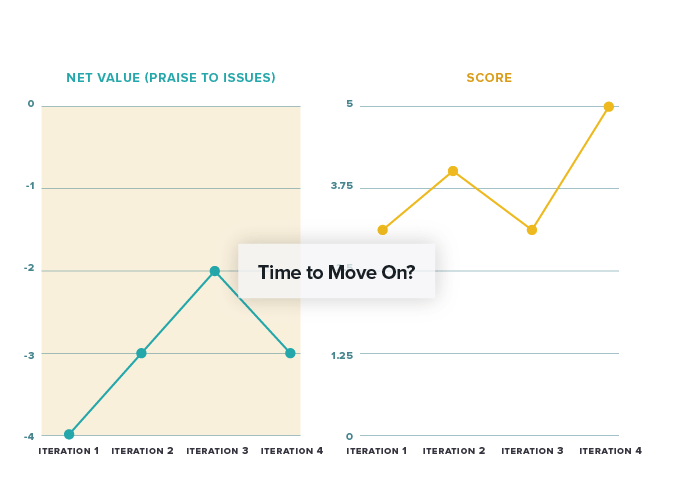
What if things don’t go as expected? When might be the time to pivot or abandon a solution? A good indication might be if, after three to four iterations, issues persist and/or positive feedback doesn’t really materialize. In this case, you might see net value flattening out in or near negative territory. And score may never exceed 5-6.
Putting numbers to learnings
Innovation accounting and measuring learning is new and challenging territory. We certainly don’t want to ignore all the valuable qualitative feedback we’re gathering. And turning the insights we gain into something measurable and visible will help us show progress, determine trends, and make decisions.
For those of you who have attempted to measure learnings, what did you do and how did it work for you?