Priming is a powerful psychological tool in influencing consumer decisions and something product managers can use, to great effect, when onboarding new users. In this article, discover how and see examples of effective priming in play.
What is it that makes us think about the SKY when we see the word BLUE?
Why is it that when I say APPLE, you think of the PHONE, and someone else thinks FRUIT?
The answer to these questions is that we are all primed. Psychologists and behavioral scientists define priming as the exposure to one stimulus that influences our reaction to the next stimulus. In other words, it refers to the phenomenon of influencing a decision by introducing a stimulus or intervention prior to the decision.
Priming works by engaging our familiarity with a given subject. We are more likely to associate BANANA (subject) to the color YELLOW (stimulus). As both of them are congruent, the association (action) is quick. This process takes place without our conscious awareness. It happens across numerous aspects of our everyday lives. And while we understand priming interventions to be a primarily visual phenomenon, priming can take place over auditory and sensory media as well.
Though priming may seem simple and obvious, its power to influence consumer decisions has been proven time and again. In 1999, researchers conducted a study, ‘The influence of in-store music on wine selections’ to reveal the effects of music on decision-making in a grocery store.
For two weeks, stereotypically French and German music was played on alternating days and the amount of French wine versus German wine sold was measured. The numbers told an interesting story as they indicated that more French wine was sold on days when French music was playing and more German wine was sold on the German music days. A simple, auditory prime had an unconscious but profound effect on customers’ buying behavior.
In modern times, marketing and product teams have used priming to maximum effect. Specifically, product teams prime users to influence and incentivize a desired action. While there are numerous examples of priming being used across the customer lifecycle, both casual observers and product professionals, we often see priming in heavy use during the onboarding phase of the user journey and lifecycle.
Why is Priming Important During Onboarding?
In The Elements of User Onboarding, Samuel Hulick describes user onboarding as “guiding the uninitiated all the way to their own personal promised lands”. Here lies an issue that so many product teams face – we overestimate our new users and their knowledge about the product, its utility, and usability.
This is how expectation and reality plays out: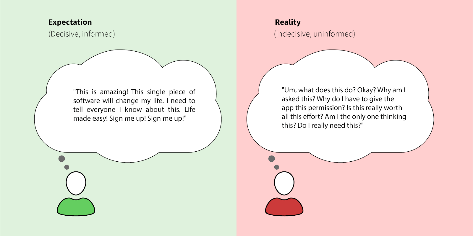
While it’s an effective method to influence behavior, priming is particularly useful and applicable for users who aren’t aware or don’t know (yet) how to use a product or the value that they’re going to receive from using it. In other words, while product teams would surely like to influence user behavior at later parts of the customer lifecycle, user onboarding represents a precarious part of the lifecycle, where a few “wrong” actions or the lack of action can often result in a failed onboarding, and ultimately, customer churn.
With that in mind, let’s take a look at a few examples of priming in user onboarding.
Visuals Speak Louder Than Words
It’s generally acknowledged that consumers suddenly perceive lemonade as sweeter when the logo of the drink is more saturated towards yellow. The subtlety of visual stimuli makes it a powerful tool to use. Visual information can be processed 60,000 times faster than text and is easier to remember.
Let’s consider the onboarding screens of Trello, Headspace and Calm.
Trello (below, left) is about organizing boards and planning projects. It primes you with a visual mock-up, accompanied by the company’s mascot asking you if you are ready to get stuff done. Easy to process, straightforward to remember.
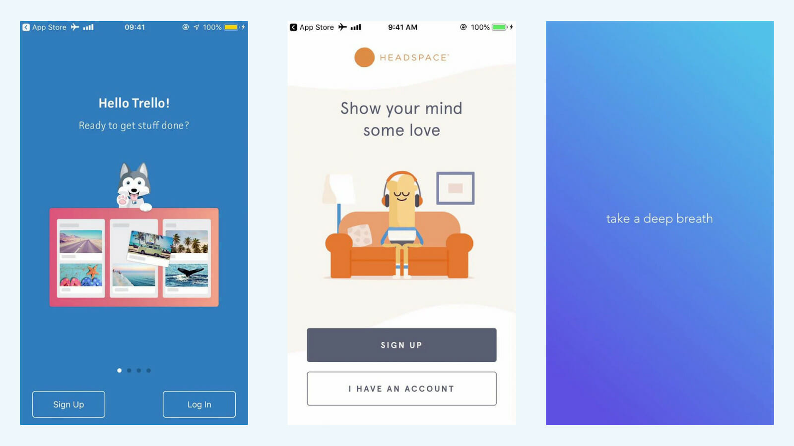
Headspace’s prime (above, middle) is a calm, relaxed representative of the user, sitting in their living room – it is a personal reflection of the peace of mind and mindfulness that the user is looking for. Calm (above, right) also sets this context in just four words – “take a deep breath”, perched against a serene, blue background.
Through these visual states, our associative memory comes into play. From pinboards to organize work, to natural, long, deep breaths to meditate on, a user is primed for the first action on the app.
Setting Context for What’s Ahead
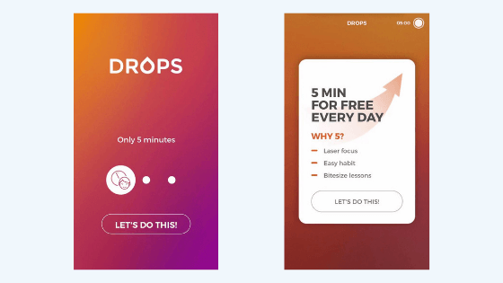
Language learning app Drops primes users with its key differentiator – bite-size lessons that take only five minutes (stimulus). “Only five minutes” is a small investment of a user’s time to learn new vocabulary every day (action). This is the prime in play – one that asks users to commit just five minutes of their time. This is different from other language learning apps that might tout the breadth of languages offered or the language-learning methodology. In two screens, it primes users twice to expect a markedly different experience and gets them ready to start their first lesson.
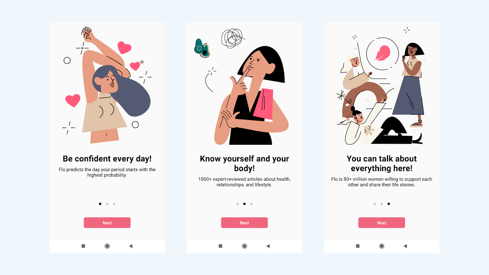
Such micro-interactions are handy during onboarding. Some apps deploy short walkthroughs that set context or introduce each feature. This approach works well if the educative content is visual and value-driven. Consider period and ovulation tracker app Flo, in three swipes (stimulus), the app delivers a level of assurance to the user – to be confident, to know themselves better and to be open about their stories. The aim of the prime here is to bring a level of comfort to period tracking (action), during a tricky time of the month. This assurance is carried forward when the users move on to the app’s features for the first time.
Permission Priming
Brands and product teams try to achieve many different goals during the onboarding process, but one common goal is to ask and receive user-level permissions. Typically, brands ask for notification or email permission And users want to know why.
A study by B2B research company Clutch shows that more than four out of five respondents find it somewhat to very important that they know why an app is asking for certain information.
With that in mind, how do some apps prime users prior to permission requests?
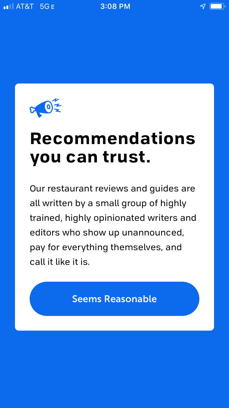
The Infatuation, an events and city-guides app, addresses users’ distrust of notifications head-on. It primes users, not just with a sense of trust, but also with the idea of a relationship between the users and the brand team. By priming the user to think about real people fussing and sweating over city-guides, The Infatuation tries to create a small semblance of empathy, which ultimately translates into a user’s permission. (Also of note is the “seems reasonable” call to action, which is explicitly written to seem casual and personable, further cementing the idea of a “relationship” with The Infatuation and the user.
This relationship-building can be seen in Strava (below, left) as well. As a social fitness network for runners and swimmers, the Strava app allows them to track their exercise and fitness activities. The app primes users with the value it is trying to deliver by explicitly listing out the benefits of its email strategy. Here, Strava is encouraging readership of its emails – its medium of engagement, and getting due permission to allow this. Both Infatuation and Strava use their permission prompts to establish a relationship with the user.
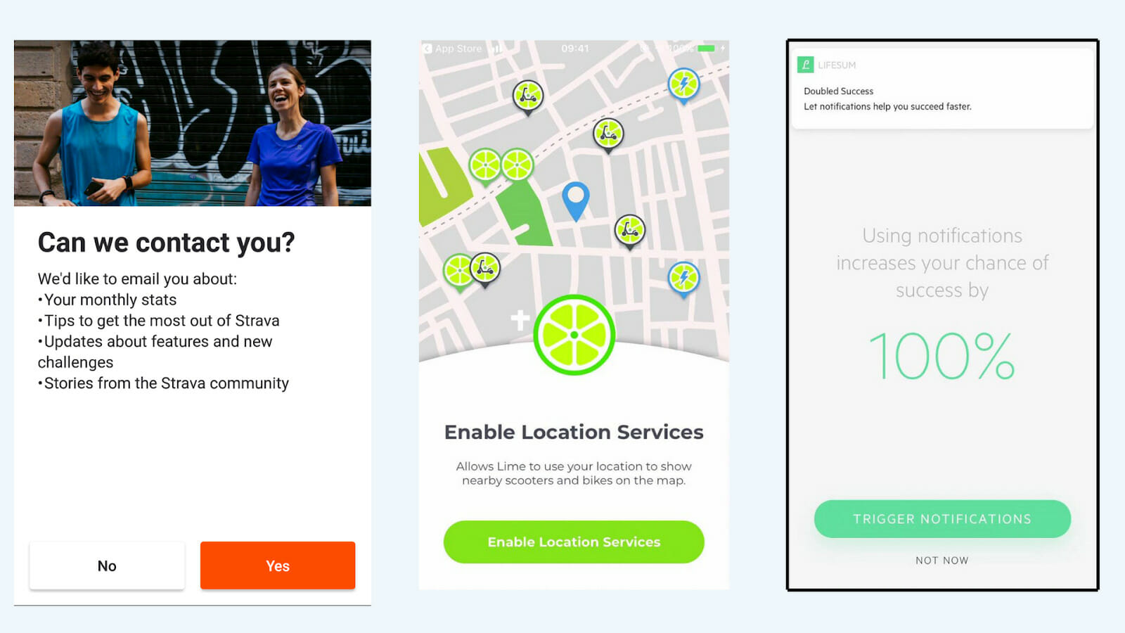
Bike-sharing app Lime (above, middle) is pretty straightforward with its permission prompts – we need access to your location to find your closest scooter. This direct approach is common among apps – it highlights key features and the core components that drive them. We see this in Lifesum too, the health and wellness app (above, right) that runs most of its engagement through notifications. Users are told that they are likely to be more successful with their fitness goals if they make use of the app’s notifications, thus priming them for how the app works.
In these three examples, the first stimulus highlights what access is being requested (email, location, notification). The second stimulus is the why (stay ahead of the game, chances of finding bikes, increased success). This results in comfort (user’s trust), leading to motivation (to provide access).
In Summary
Priming refers to the phenomenon where a decision is influenced by a stimulus or an intervention prior to the decision.
Businesses use priming to influence consumer decisions and incentivize desired actions.
In web and mobile apps, priming is commonly featured in the onboarding phase of the user journey, in the form of visual cues and permission prompts.
Priming is particularly effective for new users who are uninitiated with the product, how it works and its value. By influencing user behavior, product teams can counter a lack of action or “wrong actions”.
Right from sign-up, onboarding should be a comforting process, an assurance of delivering a promise. And that’s where priming fits in the scheme of things – turning users into stampeding elephants of unstoppable motivation, as Samuel Hulick puts it, to reach their promised lands.


Comments 0