For the Love of the Checkmark
Every Bad #ProdMgmt Competitive Analysis Comparison Grid I’ve Ever Seen pic.twitter.com/6CXS8z1pFd
— Jeff Lash (@jefflash) August 23, 2018
Comparison grids are a pet peeve of mine. On the one hand, I love the ability to compare features across products when evaluating them. On the other hand, they’re so formulaic and often not-entirely-reliable. Jeff Lash nails it with this one. Print it, put it up in your office, and do the opposite.
UX State of Mind
A lot of the things that caught my eye this week are design-related, probably because this week’s debate on wireframes has been on my mind. This tweet from design researcher Emma Boulton gets at the crux of how blurry the lines in product are getting — specifically, that quantitative analytics can increasingly tell you a lot about why your users behave in certain ways. It’s a thread worth reading.
Tired of hearing UX people say that quant tells us the what and qual tells us the why. This is an over simplification. You can get a lot of what without the why from qual too. Analysis and interpretation are where the why and what to do about it comes from.
— Emma Boulton (@emmaboulton) August 18, 2018
Dead Horses
You’ve heard it a million times – that anecdote about Ford and faster horses? Well, Ford never said that, apparently. In this interview, Sarah Kampman, the VP of Product at Square Root, gives us a much better metaphor for product design and ideation. She talks about a recent book she read that describes how hot air balloons were actually imperfect prototypes, and why it took more than a century to get from them (technically, flying vehicles) to airplanes (actual flying vehicles). I especially appreciated this quote:
So if there’s a lesson here, it’s that useful metaphors are hiding everywhere. I’m hoping the next one is hiding in the stack of armchair detective stories sitting on my desk.
Sarah, if you’re reading this, and you have a book club, I want in.
A Gratifying GIF
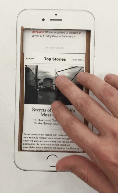
This image is technically from last week. However, I found out about it this week when I saw a banner on The New York Times about their upcoming homepage relaunch. Naturally, I went to learn more, and eventually discovered this gif in the Times Open, where NYT employees blog about building digital products. The Times’ explanation of the WHY behind the redesign is worth a look:
“We’ve heard from you, our readers, that you want more freedom to use The Times on any device, to more easily find the stories you are interested in and to go deeper on topics of particular appeal. We will be focused in the coming months and years on making those things better and easier for you.”
Listening, empathy, personalization, ease of use, communicate the vision. Reads like a list of buzzwords, but these are all crucial pointers for improving your software (or publication).
Saw a really cool thing we missed? Send it to us, @ us, or comment on this post.