
Contents
Have you ever observed elderly people using their phones? Have you ever thought of designing apps for seniors? I’ve collected five of the dozens of interesting traits for the elderly I’ve come across during my projects as a UX researcher. Here they go.
“The 20-30–year-old, tech-savvy people who live in large cities and tend to download new and exciting apps make up our audience base.” Sound familiar? During my research work I observed that the majority of our clients have the above target audience criteria in mind when they come to our kick-off meeting and want to design an app. Why? They find them the easiest to reach out to – digital natives open to solving their issues with digital solutions. But your product will cater not only to this target group, so it’s important to keep in mind apps for seniors as well.
A decade ago I assumed “senior” referred to a homogeneous group. These probably retired over-65s use large-button phones without internet and want to get away from everything digital they don’t understand. They seemed a hassle for digital product developers, as they didn’t have much money or buy online and remained less open to new gadgets.
Well, I assumed wrong.
When my 70-year-old grandma got a laptop, I started to change the way I think about the connection between technology and designing apps for seniors. Since then, her collection has grown with a smartphone, a digital camera and a smart TV. Now over 80, she mirrors knitting videos on YouTube from her phone to the TV after she finishes talking to her friends on Skype.
Why should we design apps for the elderly?
Smartphone usage among the elderly is constantly growing. In the US, 42% of senior citizens owned a smartphone and 64% had gotten online by 2016. These numbers are steadily growing as our population is aging. In 10 years, 19% of US citizens will have reached 65.
Seniors don’t make up a homogeneous group, contrary to how we refer to them. Don’t think you can cluster these unique people more easily to create user personas as we do with other age groups. Remember these general recommendations for the majority when it comes to designing digital products such as apps for seniors.

We don’t necessarily have to create specific apps for seniors. We should come up with solutions they can easily use if we want our product in their hands.
Think of a bank website or application: How much time can we save for a senior if they can learn how to transfer money over the internet instead of waiting in line? Not to talk about getting there and back.
5 common traits in designing apps for the elderly
I’ve based these traits on my recent projects and personal experience among family members. I also asked colleagues about their observations. So let’s take a loot at some of the traits that need to be considered when designing apps for seniors.
Abstract world
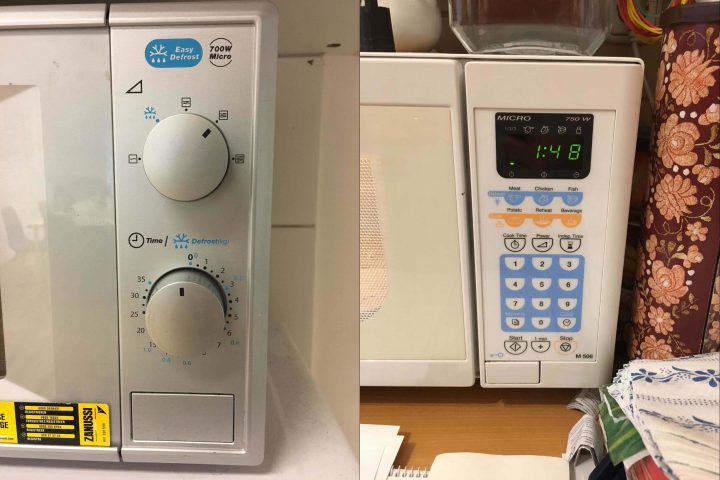
For decades, we had gotten used to interacting with single inputs (button, switch) that did one thing only. The power button turned the TV on, the handle on the microwave set the heating time. Nowadays an input source – such as a mouse or keyboard – does infinite things in an abstract and complex system. Those unfamiliar with it can find it hard to visualize.
First, seniors find it more difficult to take control of these systems. Second, they may face a greater challenge to picture this imaginary structure. Not understanding the navigation of a webpage, you get lost quite easily. Imagine doing a trunk test every time you click on something. Not so fun, huh?
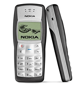
My colleague told me a story about her grandpa. He had an old Nokia on which the middle button served many purposes. Large enough for thick fingers to easily press it, it always did what the text on the screen above read. One day the family received a much larger phone bill than expected. What had happened? On this device, pressing the home button many times on the main screen deleted the first message.
Apparently, he pressed the main button many times and deleted all his text messages. Eventually, he deleted the message about the carrier’s notice of the contract plan terminating – asking him to renew it or they’d put him on a default plan.
This story has so many easily solved usability issues – much smaller other buttons compared to this large one, navigation, destructive action put upfront, etc. But who would’ve thought 10 years ago or more that these phones would become so popular among seniors when smartphones started ruling the world?
My learnings:
- Use real-life examples and mind the processes in digital products
- Design digital products navigation and hierarchy more carefully
- Test with all audiences who’ll use your product
- Make destructive high-importance actions slightly harder to access or touch
Repeated learning
Our ability to learn and adapt to new things slows as we age. Seniors get used to previously-learned routines. They may take much longer learning this than we do.
“Imagine that someone comes into your home and rearranges everything in your kitchen cabinets. This could go horribly or wonderfully, but either way, there’s going to be a learning curve.” – Jessica Drum from Facebook Research.
When it comes to design, they may need to learn how to compose a new email 20-30 times until they get used to it. Imagine asking a senior to update to a newer operating system from the one they’ve been using for years and have finally gotten used to.
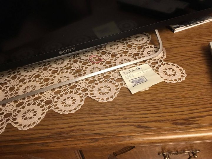
My grandma uses a booklet to write down the steps for new processes she needs to learn. This serves as her help center and FAQ at the same time. She checks some steps even after eight months! If she gets lost, I just sketch a post-it to her and put it in a handy place for her designated task.
My learnings:
- Update your product wisely: Don’t change everything at once – that makes it; harder for seniors (and others)
- Pay special attention to help texts and tooltips
- Put the most important navigation elements up front
- Take care when altering frequently used flows
Recalling visual elements
Seniors find icons without text especially hard to recall. They’re less likely to know processes younger people were born doing, such as using a ➕ (plus) sign to compose an email, or a paper plane to send it. Knowledge of Nielsen’s heuristic about “recognition rather than recall” plays a more important role in this case than usual.
Luckily, many products have an option to put text versions next to icons. We find it in file browsers, Gmail, web browsers and other places.
Visual elements come with tricks too as they’ve become less real-world copies since skeuomorphic design vanished. If you check Android or iOS devices, you can easily recognize every navigation element. Seniors didn’t have the chance to go through the skeuomorphic learning period as we did. As a button had a shadow and 3D-like appearance back then, flat buttons now look like plain text for seniors. What happens if you turn on all the accessibility features? Your navigation elements get underlined, outlined, font weight gets bigger – and they still don’t look like buttons.
My learnings:
- Provide large enough fonts that the operating system can adjust dynamically
- Give an option to put text next to icons and navigation elements when designing apps for seniors
Mind the text
Every time a senior comes to an app test, they first hold the device closer or further away from their eyes. They constantly play with this distance to focus. Imagine doing this in a car, driving while you try to read the road sign and the arrow on the screen.
In the US, 11 million people have age-related macular degeneration; many more have other forms of degenerative eye diseases. Worsening eyesight makes up part of aging, and when design apps for seniors we need to take this into account.
Seniors tend to read pages thoroughly. Our generation’s big challenge lies in filtering the necessary information poured over us. We have distractions, but older people focus better and have longer attention spans. They’ve lived their lives collecting the bits of information, making them less vulnerable to irrelevant content. They follow big red CTAs less, but carefully analyze all the options in front of them. Behavioral research studies with them can take 40-50% longer – so have patience and love.
Seniors don’t always know the words on the screen. They have a different vocabulary. I heard grandpas talking on the tram about how to “send away programs” – meaning how they close an application window on desktop.
My learnings:
- You can’t use large enough fonts for them, but increase it anyway
- Make your text dynamically adjustable both on desktop and mobile so browsers, operating systems and accessibility tools can increase their size according to their settings. Test apps and websites this way – it shouldn’t break your pages
- Write a copy knowing that a senior audience may use different phrases and don’t know even basic technical terms
Issues with apps for the elderly
Contrary to the desktop, touchscreen devices seem to ease the interface issue among seniors. They perceive touching on a button actually beneath their fingers more as a real-world convention than using a mouse. No surprise a third of all seniors living in the US own a tablet.
However, touchscreens don’t make everything shiny. My colleagues told me of their experiences with seniors missing the feedback of pressing a button on smartphones. As we get older, our fingers become less sensitive. How can we know if they really pushed that button or not in these cases?
Swiping and pinching to zoom also comes up regularly as a flaw while designing apps for elderly. We can’t do many key activities without swiping, like picking up the phone or locking it. I find it interesting to observe how well and intuitively they can scroll or navigate on a map on touch devices, although swiping to pick up a phone can still trip up many seniors.
My learnings:
- Many seniors find touch input easier and more intuitive
- Don’t put key activities behind special movements. Make your product respond to tapping or clicking only.
Conclusion
Thanks for reading this blog post. I hope you learned along the way. Keep in mind that the above collection makes up only a snippet of the total traits worth considering and discussing when designing apps for seniors.
What can I do now?
- Consider seniors. Think of audiences other than the regular 20-30ish tech-savvy group.
- Invite them to your research if they make up some of your audience members and the project allows. You’ll be surprised.
- Observe them using their devices in public spaces like libraries if you don’t have the opportunity to include them in your research. Gaining understanding and building empathy can start on this level, too 🙂
Continue learning with UX studio
As UX/UI designers and a top ui/ux design agency, we commit to finding the best way to make usable products with useable tools. Discover why Adobe XD will conquer the world of UI design tools and prototyping.
For additional reading, check out our Product Design book by our CEO, David Pasztor. We ship worldwide!

