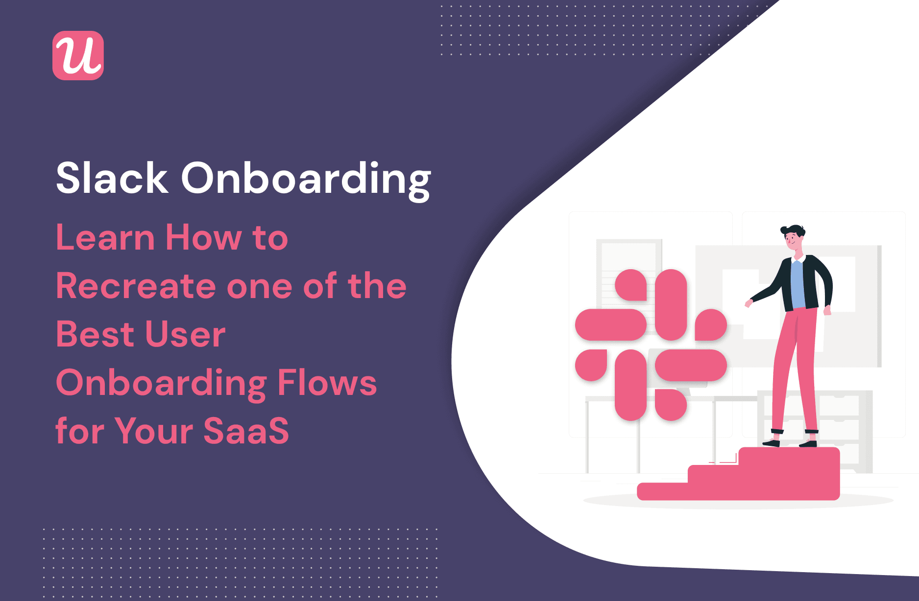
Slack Onboarding – Learn How To Recreate One Of The Best User Onboarding Flows For Your SaaS
Have you ever been through Slack onboarding?
I went through it recently as part of a new project I’m working on and was blown away by how instructive Slack’s onboarding process is.
So let’s look at Slack’s onboarding as a case study and see what other SaaS businesses can glean from it.
Let’s get into it.
TL;DR
- Rather than trying to reinvent the wheel with your onboarding process, it’s always a good idea to take inspiration from how top SaaS companies are onboarding their users right now.
- Slack’s onboarding flow consists of a frictionless signup, two welcome screens, an onboarding survey, and a short product tour.
- Slack’s entire onboarding system is filled with touches of gamification and personalization, which make the user experience that much more pleasant.
- It’s surprisingly easy to recreate Slack’s onboarding process in your own business.
- To avoid having to code everything from scratch, you’ll just need to partner with onboarding software like Userpilot.
What does Slack’s onboarding flow consist of?
Let’s begin by walking through Slack’s onboarding flow, step by step.
Disclaimer: The screenshots that follow are accurate as of December 2021. It’s possible, even likely, that Slack will continue to tweak its onboarding system over time.
Home page
Slack’s onboarding flow begins with their home page:

One best practice that we’re always encouraging our customers to follow is to articulate their value proposition clearly and repeatedly.
Slack does this exceptionally well.
Not only do they communicate their value proposition in pithy copy and combine that with a nice screenshot of a simplified UI, but they also have a calculator that will let you estimate your ROI from Slack.
The ROI calculator stands out clearly with its blue banner against the white background.
Given that Slack’s target audience is business owners who care about the ROI on the tools they purchase, this is a smart move.
This landing page also contains multiple CTAs. One encourages a free sign-up, while another allows you to sign up using Google. The latter is a so-called “lazy sign-up,” meaning that it reduces the amount of effort users have to exert.
What both CTAs have in common: Slack is opting for a frictionless sign-up.
That means that they want to reduce the Time to Value and get you using their product as quickly and efficiently as possible.
Away from the main two CTAs, there’s another CTA on the top navigation bar that lets you talk to sales. This is aimed at the enterprise customer, who might have a more complicated use case that requires some dialog with Slack before they can jump in.
Slack onboarding signup page
If you click “Try for free,” the following page pops up:

Again, Slack’s focus on a frictionless sign-up process is clear from the design of this page.
The design is minimalist, almost to the point of being spartan!
All you can really do here is enter your email. And, if you want the lazy signup option, Slack gives that to you again.
It’s smart that Slack specifically emphasizes that you should use your work email.
Not only is that going to make it easier for Slack to figure out which other emails you should add later from the same domain, but it’s also subtly positioning Slack in your mind as a “work tool.”
Let’s face it: if you’re going to spend an evening watching Twitch videos with your friends and a few beers, Slack is not going to be your communication tool of choice!
Let’s see what happens next after we put in our details…
Slack onboarding welcome screen #1

We talk a lot about welcome screen design here at Userpilot, and this one’s a work of art!
The copy speaks to Slack’s value proposition again, and the image reinforces that in a playful way, even using a couple of icons from Slack’s UI.
Again, there’s only one CTA, so it’s very clear to new users where they’re supposed to go next.
Slack onboarding survey
Once you’ve committed to creating your first workspace, Slack wants to find out a bit more about you so that it can personalize the rest of your onboarding experience.
This makes sense: otherwise you’d be subjected to a boring, linear product tour, which is something that no-one appreciates.
So the first survey question gets you to put in your team name:

The next question asks you to say what you’ll mainly be using Slack for.

This accomplishes two goals:
- It shows Slack the sorts of industries that come to its product, and the types of problems that those industries want to solve. This is useful data for segmentation and product optimization purposes.
- It will also be the name of your first Slack channel, which immediately gives you a feeling of relevance and personalization. More on that in a moment.
Lastly, if you haven’t added any colleagues yet, the third survey question prompts you to invite teammates:

And Slack is REALLY keen on you bringing on the rest of your team. So keen, in fact, that they’ll interrupt your flow with a modal if you try to proceed without inviting teammates:

This makes sense from Slack’s perspective, as their product only really has value if you use it with other people on your team. It’s pretty tedious to use Slack all on your own!
A nice red button on this modal visually underscores the urgency of adding more users.
Slack onboarding welcome screen (again!)
If the previous welcome screen was there to introduce you to the product as a whole, this one is here to announce the beginning of the product tour:

The first thing that you’ll notice from this screenshot is that Slack has taken your answer to their survey question about what you’re working on and turned that into the name of your first channel.
This adds a personal touch, and helps you feel right at home.
If you’re a new user of Slack, the copy helps underline the purpose of Slack channels, and why they’re valuable to your business.
The sparkles at the side add a playful, gamified feel, which further draws you in.
From here, it’s apparent that Slack wants you to click on the obviously-placed CTA to see what comes next…
Slack onboarding product tour
The subsequent product tour encourages you to send a message on the channel you’ve just created:

The placeholder content saying “send a message to #content-marketing” vanishes as soon as you click on the text box to start typing.
It makes sense that Slack is so keen to get new users to understand the basics of creating channels and sending messages. If you can get a channel set up and send messages to your colleagues, you’ve experienced the core of Slack’s product, so you’ve probably activated.
So you can see from this onboarding flow that Slack is trying to move you towards that point as quickly as possible, in a way that feels smooth and fun.
Slack onboarding success message
The final step in Slack’s onboarding flow is a success message rewarding you for sending your first message:

We’ve written before about the value of well-placed dopamine hits to reward users for completing onboarding tasks. This is an amoral aspect of human nature: it can be exploited for commercial gain, but it can also be used to lead people towards something that genuinely benefits them.
After this success message pops up, you have about 5 seconds to click on “Teach me something else” before it vanishes.
My interpretation of this: Slack wants you to get stuck into using their app without stalling you with further product education — unless you really want it.
Notice also that the copy in the success message reinforces the value of Slack’s product and how easy it is to use.
How can you recreate Slack’s onboarding flow in your own business?
Now that you’ve seen what Slack’s onboarding looks like, let’s think about how you could apply some of the same tools in your own SaaS business.
It might just be easier than you think!
Signup flow

This is the first thing that your users will see when they join your app, so it’s important to get it right.
The key design decision here is: will you choose a frictionless signup flow, or a friction-based one? Put another way, will you take your customers towards activation as quickly as possible, or do you have a good reason to draw out the process?
Slack went for a frictionless one, and this is the right approach for most businesses.
To create a frictionless signup flow for your business, try emulating Slack in the following ways:
- Make your CTA leading to the signup flow easy to find and appealing to click on.
- Allow for lazy registration via third parties such as Gmail
- Keep the number of forms your user needs to fill out to an absolute minimum
- Express your value proposition in as few words as possible
A friction-based sign-up flow can be a good alternative if you have reason to draw out your registration process. Good reasons could be:
- You have a complicated API to integrate, without which the user can’t get any value from your app
- Your industry is heavily regulated and there’s lots of red tape to fill out before the user can get started with your product
- Your product is a matter of life or death for the user
Welcome screen

Welcome screens are commonly used in onboarding to make new users feel welcome, as well as segment them so that the rest of their onboarding experience is customized to their needs.
It’s rather unusual for Slack to use two welcome screens as part of their onboarding, but they do work well and there is quite a bit you can learn from them.
Firstly, Slack’s welcome screens are built using modals. These are large, rectangular UI patterns that disrupt a significant part of the user’s screen.
You can read how to use Userpilot to design a modal for your own SaaS business here.
Secondly, the welcome screens both articulate the value of Slack’s product really clearly, in very few words.
They have eye-catching imagery, and one, simple CTA that’s just asking to be clicked on.
There’s no reason why you couldn’t build a welcome screen like this for your own SaaS. Click here to read how Kontentino did just that by partnering with Userpilot.
Onboarding survey

Onboarding surveys are great for gathering information from your customers so that you can personalize their product experience.
Slack’s onboarding survey consists only of three questions, and users can immediately see some of their answers reflected back at them in terms of the name of their workspace and channel.
If you want to create a similar survey for your business, one really helpful tool is Typeform. It comes with various pre-made survey templates which you can just plug and play.
Typeform’s conditional logic will also let you ask different questions to different users, depending on those users’ previous answers earlier in the survey.
Alternatively, you could also create your onboarding survey with Userpilot, especially if it’s a microsurvey. You could even build the survey into your welcome screen like Postfity did here:

Your questions could be quantitative, or qualitative; it’s up to you. You could also consider offering these microsurveys to your customers in-app at regular intervals, not just during primary onboarding.
To get you started with thinking about what questions you might include in your onboarding survey, try reading this post.
Product tour

Another lesson that Slack’s onboarding flow teaches us is the value of a product tour.
In Slack’s case, it’s personalized to the name of the user’s organization and the user’s goals, and it’s also laser-focused on activation.
Sure, the user can continue the product tour after activating if they want, but from Slack’s point of view, activation is sufficient.
To build your own product tour, you should consider what it is that your particular user segments need to learn in order to become active users of your platform. Often you can derive this from comparing the behavior of power users against users who churn in the first few days.
Next, create a checklist of the tasks that your users need to perform before activation, and serve your customers with that checklist. Like Slack’s example, there shouldn’t be too many activation tasks. 3-4 is more than enough.
Finally, you can use UI patterns such as tooltips, modals, and hotspots to highlight the areas of your UI that will take your user towards activation. Slack’s little finger icon pointing to the messaging feature is instructive here.
Finding the right onboarding software can save you a lot of time.
Userpilot can help you with segmentation, tooltips, modals, hotspots, and checklists. It doesn’t make sense to code these from scratch if you can build them code-free with the right tool.
For more on how to build your own interactive product walkthrough, read this article.
Conclusion
Slack really does have a great onboarding process, and we hope that you can take inspiration from the screenshots that we’ve shared.
Perhaps you’ll be able to build a signup flow, a welcome screen, an onboarding survey, or a product tour for your own business?
If you’re looking for help with that, get a Userpilot demo and see how you can get started in minutes.
It will let you build all of the above without needing to code!

