Contents
Have you ever uninstalled an app because the first impression didn't fit your expectations? If you answered yes, you know your own app could suffer the same fate – unless you design a killer home page that makes converts.
Even larger companies struggle to turn newcomers into regular mobile users. While it also depends on various other reasons (like targeting), the home page always takes priority. So what key features and properties lead a home page to success?
Designing a screen that holds the user a bit longer doesn’t constitute rocket science but creating something that engages them might make for a harder task. But can we even measure this? 🤔
How we picked our top 5 app home pages
To find out how to create user-friendly app landing pages that convert the masses might logically seem to lead to finding successful ones and analyzing them. But stay cautious!
Pick apps with real competition. Facebook, for example, has no competitor within its own kind of service. This means they can experiment with unique techniques or mobile app design without risking user loss to rivals. By looking at popular apps with serious competitors, we look at solutions that have resulted from a constant, neverending fight for users.
In addition, every app differs in its own way: We won’t find two identical solutions to the same problem. Finding out which design solutions boost conversion requires some deduction as well. We’re going to keep it simple and look at applications that dominate their field. Then, we’ll try to highlight their best solutions to define key requirements for the perfect app home page. 🔎
REVOLUT – Show users what they want to see

When I take a look at the Revolut home page, the first thing that comes to mind: I can see everything I want to see.
This might sound obvious, but it provides the number one reason I stick with this app instead of switching. Checking my current balance? At first sight. My last transactions? Right there.
I want to see exactly this when I open the app – and I don’t even have to move a muscle. Meanwhile, all the secondary functions feature in the background as well, just a tap or a swipe away. For example, I can access my full transaction history by simply scrolling down. The tabs of months come up only at that moment. It not only saves space on the home page but also reminds the user of this feature. Clever! 💡
Also note that they perfectly placed functions where they belong. Take the top-up and conversion buttons. I expect them right next to the balance and – Bang! – I find them there. So the mobile app designers saved me a few seconds. I wasn’t looking for the buttons; I was doing what I wanted to do since I had decided to unlock my phone and launch the app.
TRIPADVISOR – Make it less scary

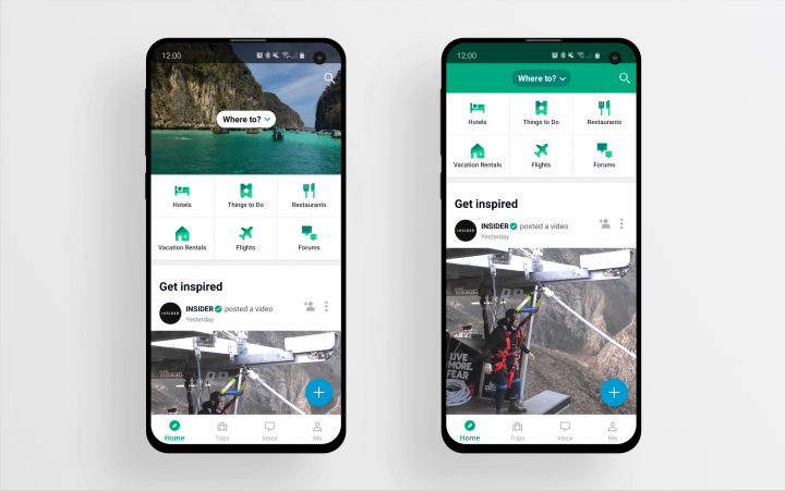
Here at UX studio, we call apps with multiple functions “Star Destroyers”. These huge, heavy things work well in a lot of situations but unsurprisingly, the average first-time user would prefer something smaller and less scary.
It all comes down to sheer size: A huge app with a lot of functions makes it easier to get lost. Make your app transparent and easy-to-use whatever your software size.
TripAdvisor does some things right, but believe me, it still counts as a huge app. You can search for hotels, get on sightseeing tours, book tables in restaurants and write comments, reviews, share photos etc. Oh, and they have a forum as well.
Users could panic and close the app with all these functions in there, but here comes the important part of designing a home page. The key: they organize those functions in a way that the home page looks like a friendly social feed with a little extra stuff on the top.
You can always make your app friendlier – imply group functions and offer them as an extra feature next to a usual, well-known function. This way the app could serve as a familiar but handy tool instead of a huge Swiss Army knife with a maze inside. 😱
Airbnb – Stimulus gun

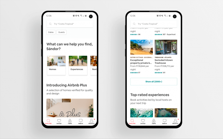
When I decided to go on a vacation abroad, I found myself scrolling through the Airbnb homepage for hours. Not continuously, of course, but I spent hours on that screen because it literally kept shooting me offers. I call this a “stimulus gun”.
Studies have shown that having fewer options makes us happier. So technically, the infinite flow of information (or in Airbnb’s case, the list of homes) makes it harder to decide. In spite of this, it still works because I use the app for dozens of minutes instead of leaving it.
Funny, I don’t blame it for showing too much information but exactly the opposite. I blame myself for taking this long to decide where to stay.
The trick here: Flood the user with carefully selected information. If they group it into small packages that show only the most important stuff (and also throw in a nice picture), it won’t overload the user’s mind. They just do as much as to occupy the user enough to keep them scrolling. 🧠
DUOLINGO – Make it unique and engaging

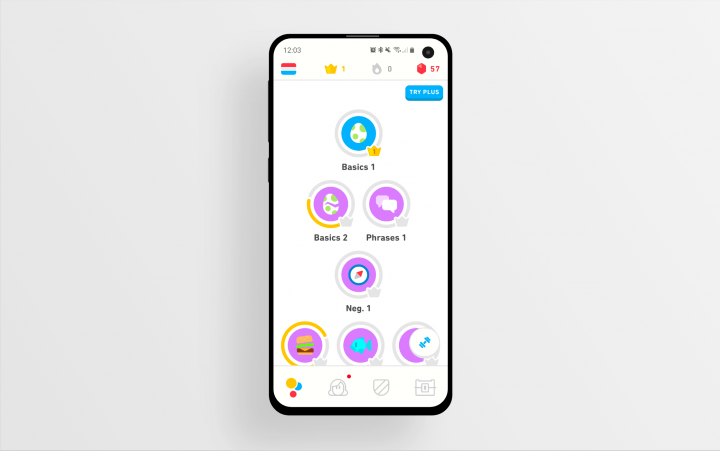
Surely every language autodidact knows Duolingo. I came across the app from that background two years ago. It quite surprised me last month when I opened it again and saw the amazing amount of work they had put into its unique design!
Every element represents a small artwork on its own and together they form a wonderful sight. Honestly, it’s motivated me again to refresh that old Dutch knowledge in the back of my brain. And I have only that damn redesign to thank! 🎨
Duolingo uses another trick as well. The home page introduces a “visual adventure” – a game, we could say. I can see all the steps of the adventure and this challenges me to start working on my skills and “level up”.
The home page makes learning a language (something really abstract) easily measurable and while doing so, makes the whole thing seem simpler. Not every app can use this formula of course, but making the home page interactive will help engage the user.
WOLT – Use the wow factor

As a designer, I always wonder about the highest possible standard of interface design. I believe nothing limits what we could utilize but that we tend to give in to boundaries of code and imagination.
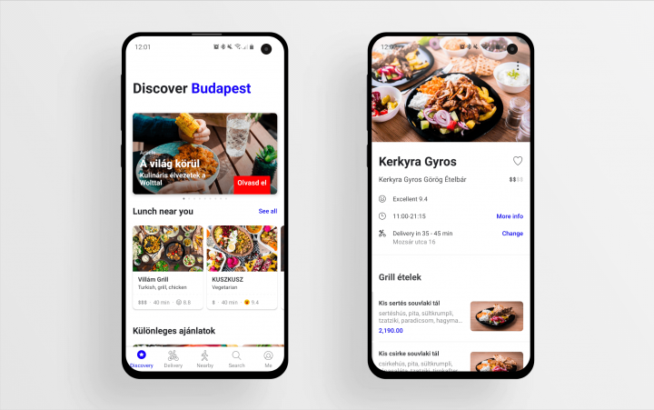
In my view, however, food delivery company Wolt managed to overcome these limitations and created something truly unique. The fade on the map, the artwork paired with the service messages and the hidden city picker pop-up all make the home page stand out from the crowd.
Another reason lies behind why I’ve chosen Wolt as the last app on my list. Its home page shows you what it can do and they’ve perfectly grouped and positioned the information. At the same time, they give you endlessly flowing choices and also keep you engaged.
This makes jaws drop on the first launch and brings users (me, for sure) back. We’re setting only one lesson to learn here: Keep all these “rules” in mind while designing a home page and you’ll see the whole thing unfold by itself. 😮
What’s your favorite app home page?
Share with us your personal favorites in the comment section below! I would love to hear your take on the topic.
https://www.designrush.com/trends/top-most-downloaded-mobile-apps
If you want to learn more on product management processes, check out our Product Design book!
If you need some help with design, feel free to contact us at UX studio. Our dedicated team will eagerly help uncover new aspects of design that will make you stand out and set you a step ahead of the competition.


