

Why is Minimalism the UI Design prodigal son? What's wrong with its rebellious, up to no good brother, Brutalism? When comparing these two many questions still arise.
Has brutalism become mainstream? Did it cure the supposed lack of creativity pandemic carried by the minimalist style trend? Is it ok to call minimalism a trend? Is one better than the other?
In this blog post, I will take a shot to not just answer these questions, but also to clarify if there are any factors that can help you choose between minimalism and brutalism, in a way, opposite “trends”, for your next project.
So many questions, so little time… So let’s get to it.
A brief look at the evolution of web design
To better understand both Minimalism and Brutalism, first we need to take a quick look at the evolution of web design. It’s 2020 and I think that we can honestly say that UX/UI Design has successfully established itself as an independent design practice. If you’re anything like me, you also have trouble wrapping your head around the idea that the ’90s were THIRTY years ago. If we think about it, thirty years isn’t that long for a new practice to establish itself in a field that hasn’t stopped changing.
It was in the ’90s that the Internet went mainstream. The common mortal with access to a computer could go online, that is if they were willing to have their earring permanently damaged and some PTSD caused by that demoniacal modem sound.
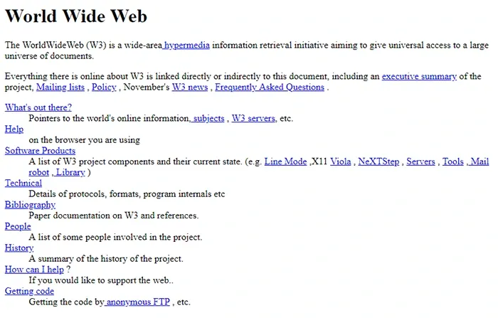
The first websites to appear at the beginning of the ’90s had no concern of design whatsoever. It was all about information, HTML and bright blue hyperlinks.
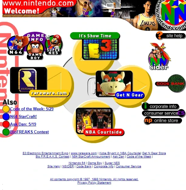
As the years went by, more and more websites began to appear. From the mid ’90s to early ‘00s “design” was introduced to websites, although they had little to no regards towards user experience. I chose to put design between “ ” just because it was more of a mishmash of colors, fonts and shapes, all fighting for the user's attention.
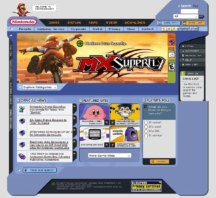
Jump a few years to the ’00s and the Web 2.0 Era, and we can see that the websites started to be more complex both in content and design. Things calmed down, hierarchy was introduced along with important elements to educate users on how to navigate websites.
When did minimalism start?
From that point on we entered a minimalism period. We, humans, don’t like things to be stagnant for long periods of time. You see it all the time in art, if a movement becomes the norm for too long a countermovement will arise. We always find ways to react to and disrupt stagnation, and that’s how things evolve.
After years of putting our eyes through the abuse of websites screaming for our attention, with loud colors, wild graphics, and by introducing understandings of user behavior, design thinking, and process, websites started to focus on what's important: content and usability.
Sites became simpler, cleaner, and clearer. In one word, minimalistic.
SO, WHY MINIMALISM?
When we talk about Minimalism, more than only a visual style, we talk about an approach. It is influenced by the minimalist background in architecture and design. Minimalis approach in web design translates by focusing on content, drawing attention to it in the best way possible and giving the user what he needs in the quickest and easy way. In a nutshell, minimalism is simplicity. Is keeping what is fundamental and embracing that “less is more”.
Like any established practice, UI Design has a set of best practices as a result of years of researching and testing, that has been in some way proven to be effective amongst users. This set of best practices is strongly based on the minimalist approach. So, in my opinion, this answers the question if either Minimalism is a trend or not. The answer is no. It is a concept, and a really good one, that’s why it has become so… let’s say...popular.
So here's the problem with the Minimalist websites: we, the designers, began focusing too much on the visual aspect of minimalism. We found a recipe that works and we repeat it again and again and again with the same elements, colors and fonts. This results in an almost homogenized Web. Add to this the release of Material Guidelines by Google and all sites start to look the same. That’s just boring.
Material Guidelines are presented as an universal and neutral language for web design that synthesises the classic principles of good design.
Ultimately it is a good thing for both designers and users to create some usability patterns. But as designers, we should not get too comfortable with blindly using these guidelines because. Either like it or not, they also came with a certain aesthetic associated and you end up closing the door on other possible stylistic choices.
To homogenize should never be a goal. Things only get value in comparison.
When did Brutalism start to influence web design?
As we established before, stagnant things don’t evolve. They need adversity and, most importantly, disruption. After years under the ruling of the minimalist style and witnessing the almost homogenization of the web, our eyes were craving for something different. We, as designers, were craving for something different, creative, chaotic, something brutal, something brutal(ist). Web-brutalism was all we needed.
Brutalism, like Minimalism, started as an architecture movement.
My mother always told me to never throw clothes away just because they were out of fashion, because in a few years they would be in again. Well, moms do know best because web-brutalism is heavily influenced by those first websites I talked about earlier.
WHY IS BRUTALISM POPULAR
First things first. Brutalism is the designers’ reaction to the homogenization of the web. Pure Brutalism is raw, rough, with no regards for the User Centered Design, and some people go as far as to call it plain “ugly”.
“In its ruggedness and lack of concern to look comfortable or easy, Brutalism can be seen as a reaction by a younger generation to the lightness, optimism, and frivolity of today's web design.”Brutalist Websites
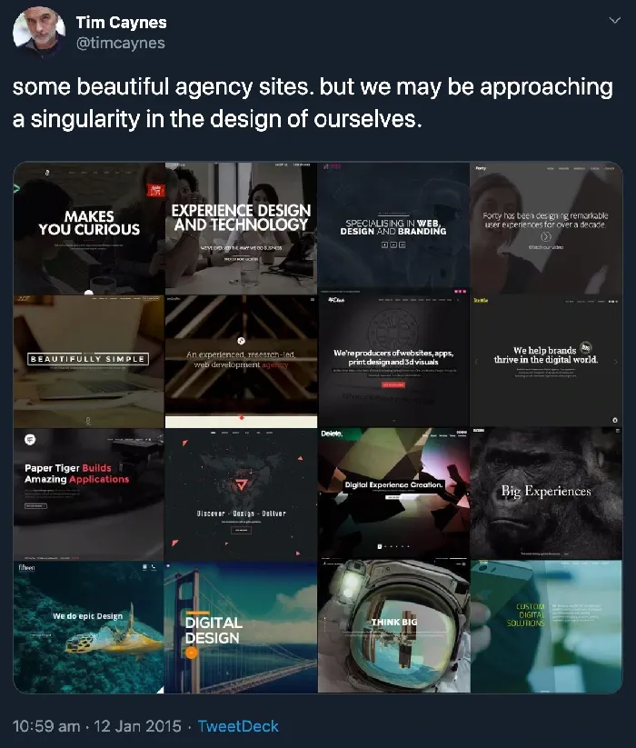
The first brutalist websites were mainly connected in some way with the art scene, they were portfolios, exhibitions, studios and others, such as these:
They are erratic, chaotic, punk, pure brutalism.
The trend started to gain some traction and we started to see some websites that, while still complying with the UI Design good practices, had a strong brutalist style influence. That influence would be translated as the use of bold colors, different fonts, edgy visual choices, and sometimes by just having the minimum visual elements possible and being text centered. No matter how that influence was translated it was clear that they were no doubt functional and set apart from all the others.
THE SPECTRUM
There’s always room for a little disruption or rebellion. In fact, in recent years there have been some examples of websites that try to mix things up and still have a functional and easy to navigate website. We ended up with a spectrum of websites that go from pure brutalism to the ones that fully comply with the user interface design good practices.
Here are some examples.
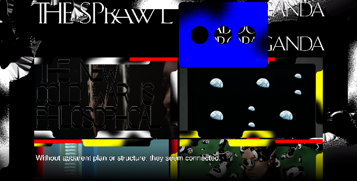

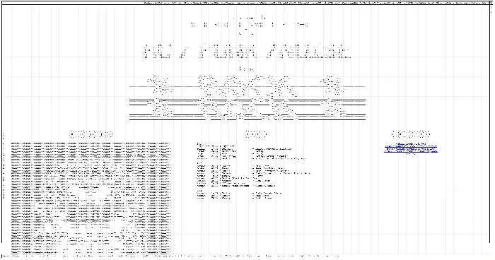
In 2014 the radical Dutch design studio Metahaven created an online documentary about propaganda in the age of social media, focusing on the Ukraine War, called The Sprawl. This is their website for the documentary. All its elements are fighting for our attention: the background, the videos, the text. I find this to be a great example of a Pure Brutalism website. This is a documentary, so, clearly, the content matters and the goal of the website should be for the users to watch the videos. Nonetheless, the design does not put a spotlight on the videos. It’s visually chaotic and not so easy to navigate. However, due to its context and content, it works.
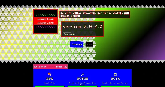

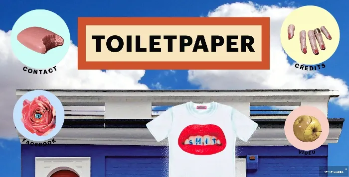
In this case, the website is “An open-source framework for the brutalist web design trend.” At first glance it’s also a bit chaotic, mostly because of the color palette and the graphics. With that being said, everything is on display. Everything that the user may need is easily found.
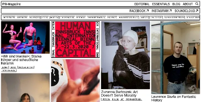

This website is more on the “Functional Brutalism” side of the spectrum. Looking at it, it is organized, you have explicit menus and the navigation is pretty organic. It has almost no visual graphics or identity. The content is privileged and it’s clear that they wanted to direct the user to it.
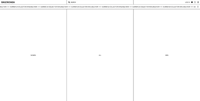

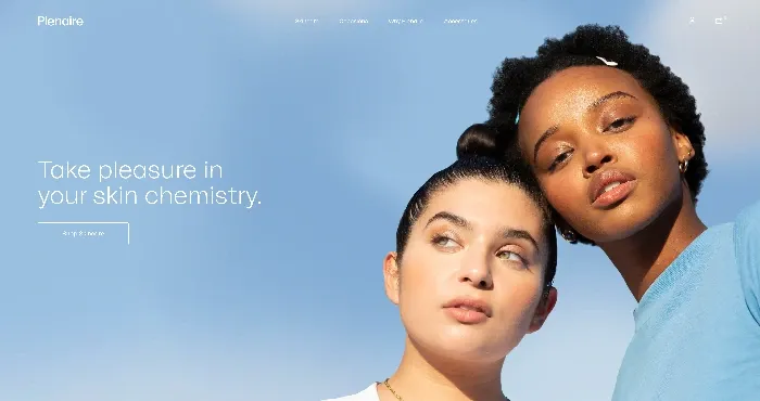
The Balenciaga website is, in my opinion, a beautiful example of “Functional Brutalism”. It is very simple, clean, and completely stripped of visual graphics or colors. You have just lines, text, and black and white. No visual identity is also a Brutalist aesthetic and this one is just beautifully executed. All the tools and functionalities the user may need is right there at hand. In a sense, no visual identity becomes Balenciaga’s visual identity.
Minimalism vs Brutalism - Who’s the winner?
First of all, let me come clean and just say that I’m a huge fan of Brutalism. Brutalism came at a time that things needed to be stirred up, when designers needed to be reminded to be creative and to push themselves out of their too comfortable zone.
When it comes to what should one choose, I think you don’t really have to.
It all depends on context really. It all depends on the project you’re working on, your clients and your users.
Either you choose a minimalist style or a brutalist style you should take into account the following factors:
- What is the project you’re working on? What type of visual style would best fit that project?
- What is the brand identity? Both visual and core values?
- Who are your users? What would best fit them and what are they accustomed to?
It all comes down to the full context of your project. Certainly you wouldn’t make a health app with a brutalist visual design or a metal fest website with a super minimalist one. It’s all about context.
SPICE IT UP, KEEP IT FUNCTIONAL
Despite what real estate says, forget about location, it’s all about context, context, context. Besides thinking about it, you should also think of the User Interface Design best practices.
Before you break some rules first you need to understand them in order to find in which ways you can break them without compromising the efficiency of the project. When deciding which style better fits your project and users, you should also keep in mind that different styles can provide very different experiences.
With that being said, and looking at some examples I’ve shown throughout this article, you can always find inspiration and add some spice to your design whilst maintaining it extremely functional and pleasant for the user to navigate. Just because you feel like you should follow the best practices in your field it does not mean that it should be standardized and boring.
The main thing you have to remember is that your product must be functional, because if it isn’t, it doesn't really matter if it is minimalist or brutalist, it is just purely bad. If you want to have a website or mobile app with a great user experience, you should never put stylistic choices in front of usability.

Found this article useful? You might like these ones too!