Accessible design: the quest for colors

A few weeks ago we introduced 12 new charting colors in Mixpanel, with some additional considerations for vision accessibility. In this post, I walk through our process for choosing these colors, and why it matters to your experience as a Mixpanel user. Let’s go!
The colors we had in Mixpanel…existed, but that doesn’t necessarily make them good. But what makes colors objectively good? Objectively good for us meant expanding our palette, making it more accessible, and making the colors more flexible in more contexts.
Why did we do this?
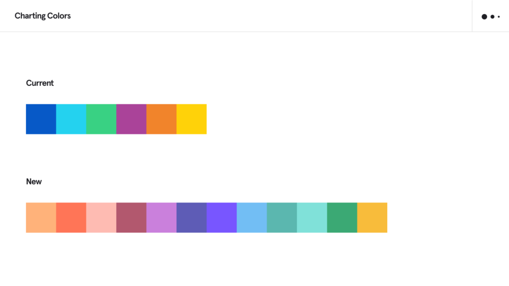
- The previous palette was limited to 6 colors.
- The existing palette had color blindness issues, particularly as it related to repeat colors.
- To increase access to people experiencing vision differences (such as color blindness).
- To increase accessibility across the board.
- To increase the number of segments visible at once without repeat colors.
- To increase the contrast between colors.
- To Increase the range of our palette.
Okay, but from a product perspective, does this even matter?
Yes! Segmentation is one of the most clear cut examples of where color as language is important. Color provides an identifying feature that becomes challenging for all kinds of visibility concerns, and without considering color thoroughly, we’d be ignoring the ability to understand valuable aspects of our product.
But isn’t color subjective?
Yes and no. When it comes to branding, it’s relatively easy for a skilled designer to create compelling logic to make a series of colors make sense together. However, when it comes to this color update specifically—we focused on the constraint of accessibility, flexibility, and identifiability in charting specifically. It’s easier if we break these down to understand our objectives.
Objective truths and color considerations
- Our existing palette only had 6 colors. If you break something down by city, chances are you’ll see more than 6 segments. We wanted to expand as far as we could while being reasonably sure that users could differentiate these segments from one another. This creates an accessibility issue for both people who have the ability to see the full spectrum of color, and those with vision impairment. That’s a problem.
- Our previous palette was bright, but in order to expand the palette, it’s important to use varying tints and shades to provide better differentiation across the board.
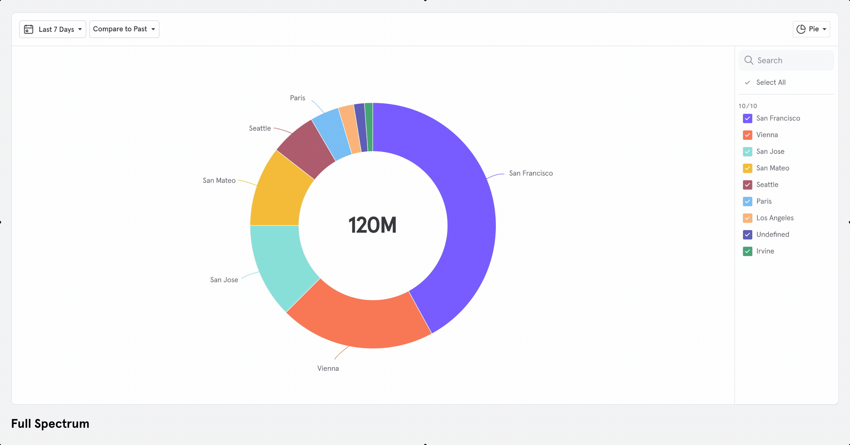
- Line graphs are a clear cut place to see where colors overlap and get lost. Our previous palette broke down after 6 colors, and due to lack of differentiation for color blindness considerations, this means they created visibility issues.
- The order of colors matters. With or without repeating colors, we needed to create the most contrast while making the palette…palatable…
- No matter what colors we picked, there would be people who subjectively liked and disliked: the order, the colors, literally whatever we do. This was okay because of the next point.
- We should envision what it might look like to give users the ability to change colors in the future.
- These colors should work on a light background.
- These colors should work on a dark background.
Okay, I hear you. So what’d you end up with?
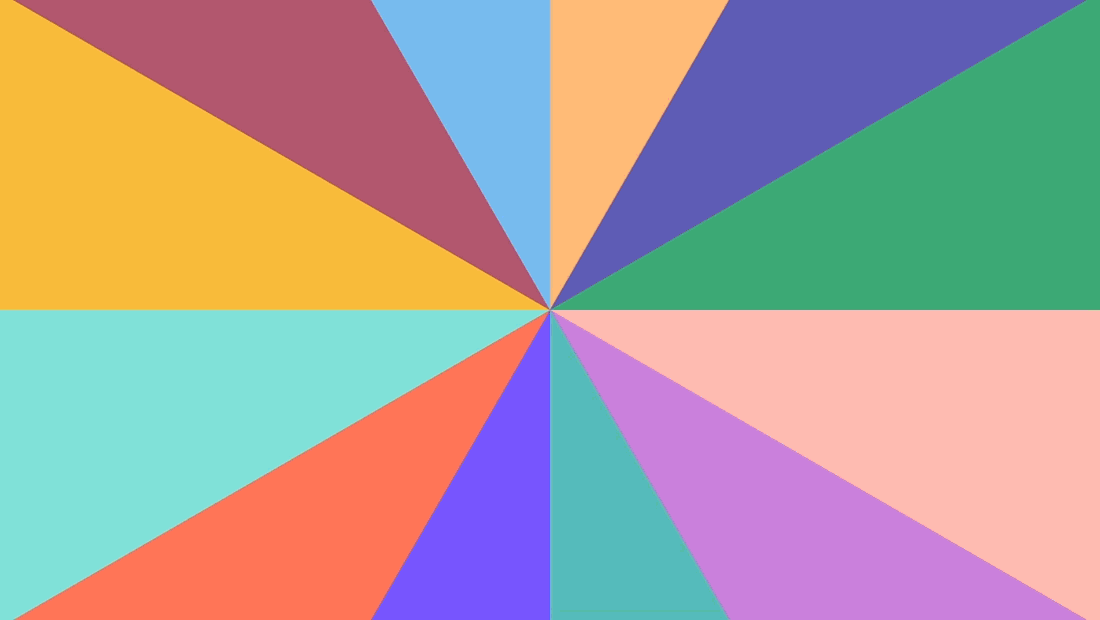
Here’s our new charting palette, compared with our previous charting palette

I mean okay, but why these colors?
Picking colors is hard and takes a lot of patience. It takes showing it to people, iterating, checking color blindness and contrast, and iterating again. Many colors were here before and didn’t make it to the final palette. There was a “puke green” (am I selling it?) I was particularly fond of, but that didn’t make the cut.
Contrast studies
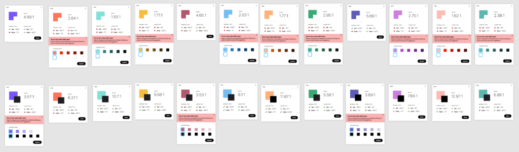
We used Stark to check our contrast ratios with white on the color and black on the color (although we don’t want to display text on top of these colors pretty much anywhere, but if we do end up doing that, it should pass at least AA, and ideally AAA).
Color blindness studies
These studies were particularly fascinating because once you get used to seeing through a deuteranopia, protanopia, or tritanopia lens, it becomes much easier to empathize and understand where you should be pushing or pulling colors in order to create better contrast.


So, that’s where we ended up.
A typical product update might end with something like, “we hope you like it!” And we do, of course, hope you like it—but that’s not really the point.
To return to the objectively good goal state we set for ourselves in the beginning: we hope that our expanded, more accessible, more flexible palette makes your experience of using Mixpanel that much more delightful.