


The eG Enterprise – Microsoft Teams Dashboard
There is no doubt about it that the events of 2020 triggered a huge surge in the use of unified communication products. In the consumer space, everyone and their grandmother became familiar with Zoom; in the enterprise space though, many took advantage of their Microsoft licensing to leverage Teams meetings and calls as a primary communication mechanism. This, in turn, has focused a lot more attention for system administrators on how to monitor Microsoft 365 (O365) and Teams in particular.
eG Innovations has long offered modules to support the monitoring of enterprise applications, including O365, Teams, and applications such as PeopleSoft. We saw many of our Citrix and VMware customers add our O365 monitoring capabilities to facilitate a single pane of glass alongside their existing monitoring. For those unfamiliar, this blog will cover our out-of-the-box Microsoft Teams dashboard and the metrics and signals available to admins to identify and understand challenges with Teams.
What eG Enterprise offers beyond Microsoft Native Dashboards
eG Enterprise offers a complete end-to-end solution to enable you to monitor each layer of your applications and IT infrastructure. Often, the root cause of a poor experience with Microsoft Teams will be in a different layer – so whilst you can look at the symptoms of an issue you will need to resort to other consoles and manual diagnostics to identify the root cause.
Consider some common reasons for poor call quality in Teams:
- Other applications may be starving Teams of CPU; anti-virus software is a common culprit.
- Users on low-specification laptops often open multiple copies of browsers and leave dozens or even hundreds of tabs open, which can leave Teams without sufficient RAM, swapping out to disk continually.
- Unified communication products often behave very differently within virtualized environments such as Citrix/VMware – ensuring appropriate optimizations are made to remoting protocols and settings enabled offloading can be key here.
- Some users will have low-quality home networks with low upload speeds. Being able to correlate users with issues by device or region is necessary to identify common themes or an isolated user issue in their home.
Often the Microsoft Teams administrator will be able to do very little themselves to resolve issues as their critical task is to identify what infrastructure or network is the culprit and supply sufficient information to a different team responsible for maintaining or purchasing (as a service) infrastructure; this is where eG Enterprise really helps.
An Introduction to the eG Enterprise dashboard for Microsoft Teams
The eG Enterprise monitoring console offers a dedicated, out-of-the-box Microsoft Teams Dashboard. The different pages of this dashboard help you find quick and accurate answers to the following questions:
- Is the Microsoft Teams service healthy? If not, then what type of service incidents are affecting the health of the service?
- How long does it take to connect to Microsoft Teams?
- How many users are active/inactive on Microsoft Teams?
- Which type of device was most frequently used by the users for accessing Microsoft Teams?
- When exactly did the Teams chat messages/private chat messages/calls/meetings peak?
- Which type of call stream (audio/video/VBSS) was frequently used by the users?
- How many poor streams were noticed? What was the reason for such poor streams? Which users were mostly affected by such poor streams?
- Do you have users not using Teams calls? Often, this could indicate potential security and HR issues with employees using non-audited or alternative tools, such as Zoom or WhatsApp on personal devices.
The dashboard also embeds smart drilldowns, which enable you to go from problem symptom to source within a click!
To access the dashboard, click the Monitor tile and select Microsoft Office 365 from the Dashboards menu. Then, move your mouse pointer over the Microsoft Teams icon on the left panel of the page that appears, and click the Service Health option within.
To view this dashboard for a particular tenant, choose that tenant from the Tenant list box at the top right corner.
The sections that follow will discuss each page of the Microsoft Teams dashboard in detail.
Service Health
Use the SERVICE HEALTH page (see Figure 1) to monitor the health of the Microsoft Teams service. The Service Health page of the dashboard provides a bird’s eye view of the health, connection status, and the trend of packet loss noticed while calls were initiated by the users using the Microsoft Teams service.
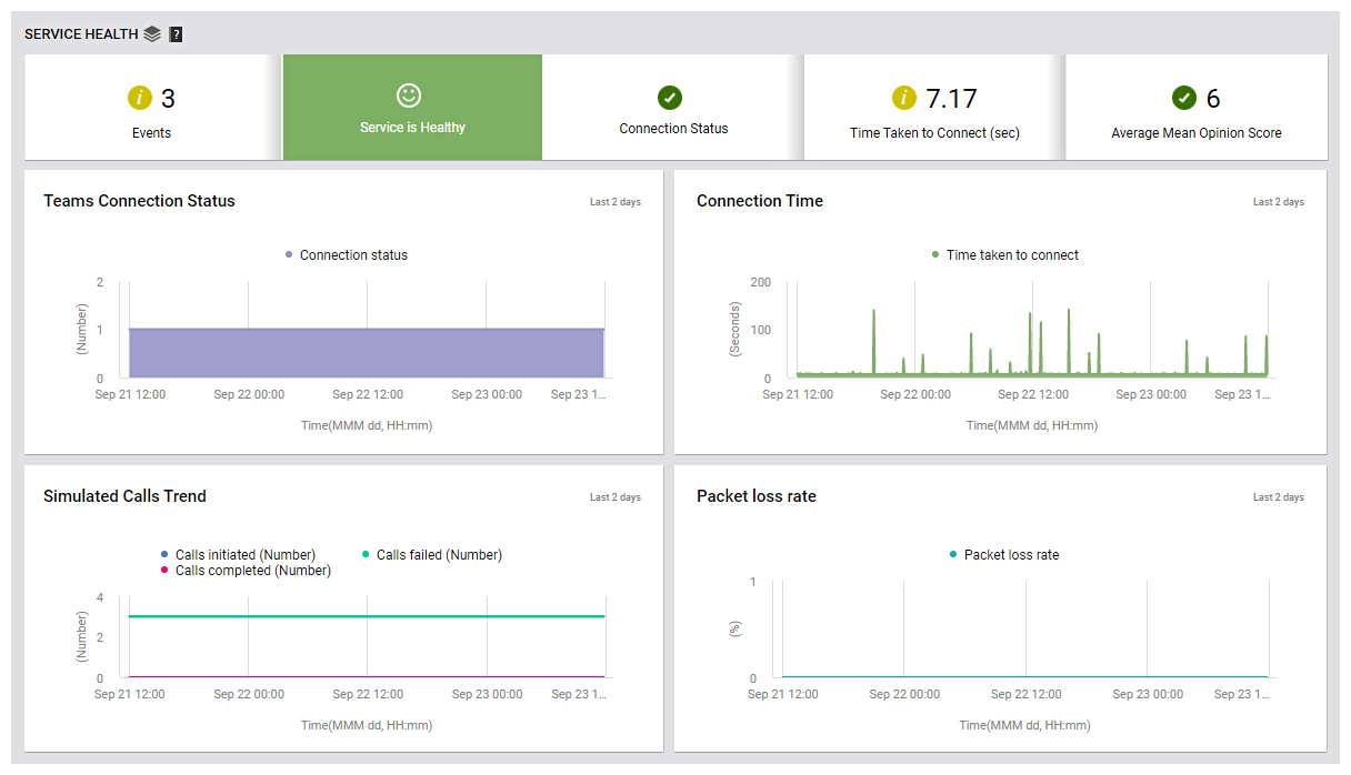
To access the SERVICE HEALTH page, move your mouse pointer over the Microsoft Teams icon on the left panel, and click the Service Health option within.
First up, this page indicates the current health state of the Microsoft Teams service using intuitive text, colors, and imagery. The Events counter in Figure 1 alerts you to problem events that eG Enterprise may have captured on the Microsoft Teams service. To zoom into these events, click the Events count. The All Events page will then open, wherein you can view the complete details of all eG alarms related to the Microsoft Teams service.
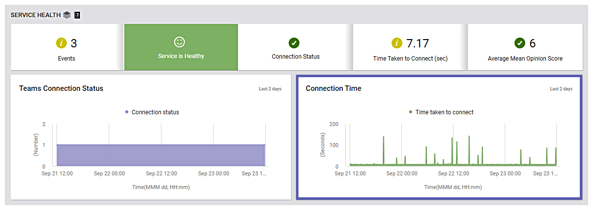
The Connection Status section in Figure 1 alerts you, in case the Microsoft Teams service connection is currently down. You can even drill down from this section to view the Teams Connection Status graph (see Figure 2). With the help of this graph, you can look back at the last 2 days and study how the connection status of the Microsoft Teams was during that time window. In the process, you can quickly figure out how often was the connection status down during that time window -i.e., connection to Microsoft Teams was lost.
This way, the graph sheds light on connectivity issues that may have occurred in the past but may have been missed/overlooked by administrators.
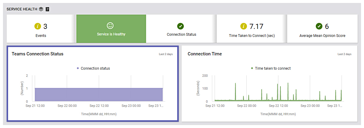
The Time Taken to Connect section alerts administrators on the time taken to connect to Microsoft Teams. Drilling down from this section will lead you to the Connection Time graph (see Figure 3). With the help of this graph, you can look back at the last 2 days, study how long did it take to connect to Microsoft Teams during that time window. In the process, you can figure out the exact time period during which connecting Microsoft Teams took longer than usual.
This way, this graph helps administrators figure out when exactly the time taken to connect to Microsoft Teams was longer than usual and analyze the real cause behind such time delays.
The basis of all measures of voice quality is how a person perceives the quality of speech during a call. The Average Mean Opinion Score displayed in Figure 1 helps administrators gauge the user experience during Microsoft Teams calls.
For effective communication, users often initiate calls on Microsoft Teams. Frequent failure of calls initiated on Microsoft Teams may often lead to delayed communication and hence, affect the productivity of users. Therefore, administrators are required to keep a constant vigil on the calls initiated on Microsoft Teams and figure out how frequently calls failed. The Simulated Calls Trend graph (see Figure 4) helps administrators in this regard.
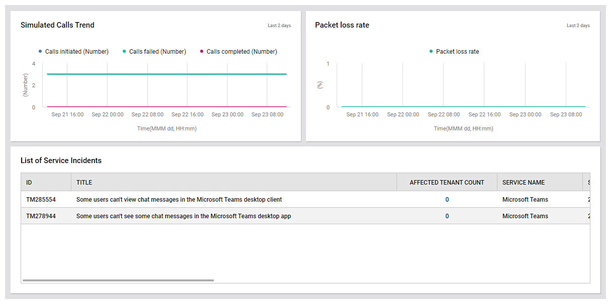
With the help of this graph, administrators can figure out the total calls initiated in the last 2 days, the calls that were completed, and the calls that failed. Also, administrators can figure out the exact time during which the maximum number of calls failed. This way, this graph sheds light on call failures that had occurred in the past and help administrators analyze the reason behind such call failures.
For a great user experience on Microsoft Teams, users should be satisfied with the quality of calls. Frequent disconnection or audio degradation would be a cause for concern and is most likely due to packet loss during transmission/reception of data packets. Packet Loss Rate graph in Figure 4 helps administrators identify the exact time window during which maximum percentage of packets were lost during the last 2 days. This will help administrators in identifying the time window during which the packet loss was at its peak!
Unplanned service incidents can impact service availability and responsiveness. To indicate if such incidents have occurred, the Service Health page reports the service incidents in the List of Service Incidents section (see Figure 4). Using this section, you can figure out what incidents occurred, and which services were impacted.

Users/Devices
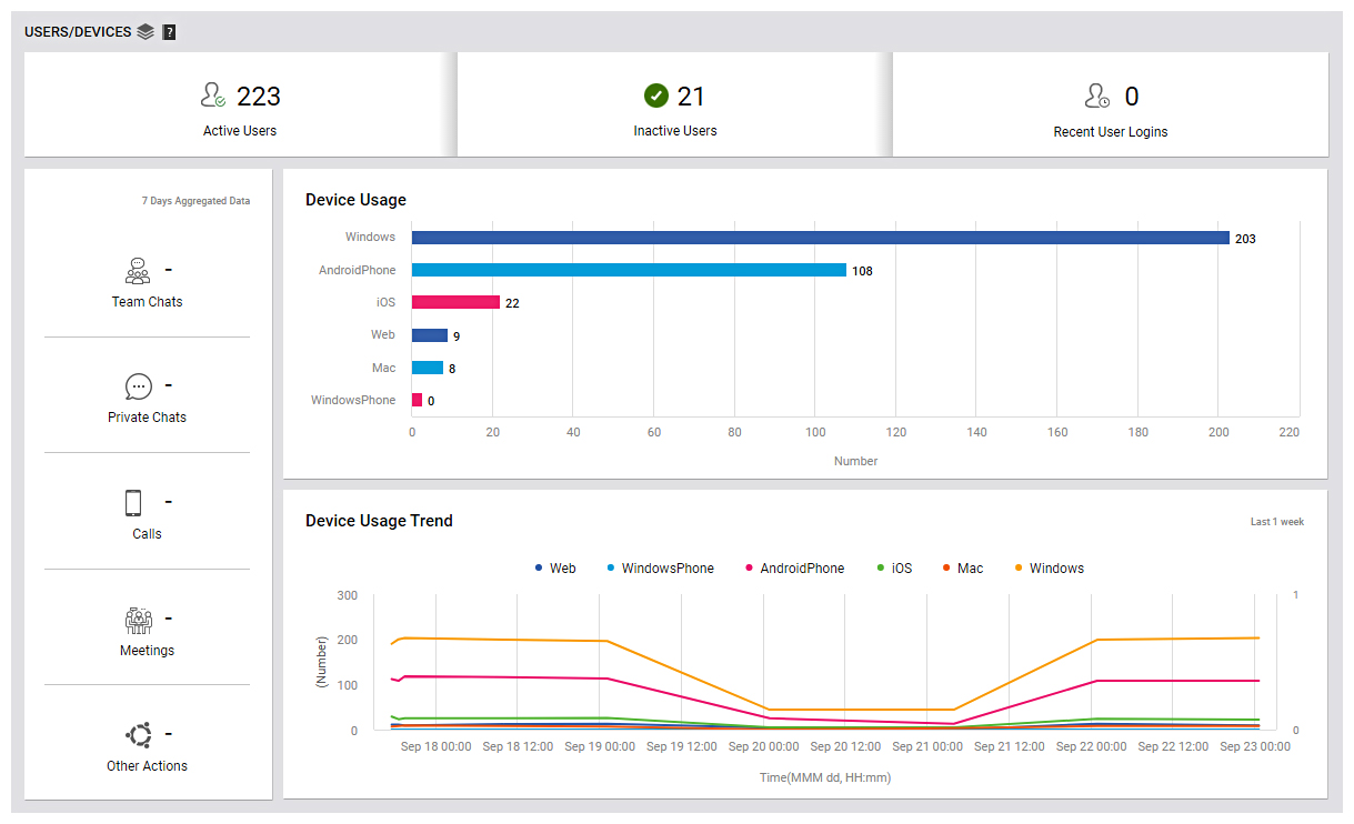
The USERS/DEVICES page (see Figure 5) focuses on the users of the Microsoft Teams service and the devices that they use to connect to Microsoft Teams. A quick look at the dashboard will reveal how actively Microsoft Teams has been used, what type of devices were used by the users, and the unique users who had initiated/attended calls/meetings.
To access the USERS/DEVICES page, move your mouse pointer over the Microsoft Teams icon on the left panel, and click the Users/Devices option within.
The Active Users count displayed in Figure 5 is a good indicator of the current user load on Microsoft Teams. Track this measure over time to proactively detect overload conditions. If there are users, who have subscribed to the service but have not used it in a long time, then the Inactive Users count reveals how many such users exist. Inactive users unnecessarily consume resources and licenses.
To optimize resource and license usage, its best that such users are identified and removed quickly. To know who the inactive users are, click the Inactive Users count in Figure 5.
The Recent user logins count displayed in Figure 5 helps identify how many users have logged on to Microsoft Teams recently. To know who those users are, click the Recent user logins count.Figure 6 will then appear.

The USERS/DEVICES page also groups users based on the devices used by the users to connect to Microsoft Teams. A look at these devices and the count of users for each device in the Device Usage graph (see Figure 5) will help administrators figure out the unique users, who are using each type of device (Windows/AndroidPhone/iOS/Web/Mac/WindowsPhone) to connect to Microsoft Teams.
By quickly looking at this graph, you can figure out the device that is most popularly used by the users to connect to Microsoft Teams.
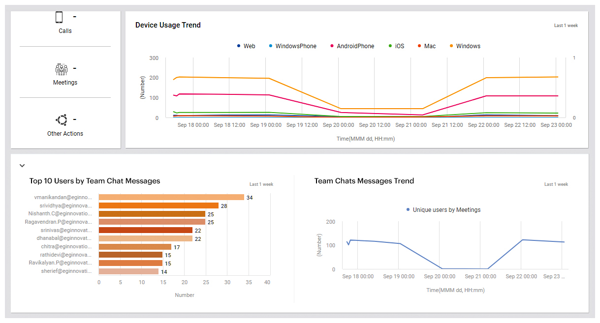
Next, you will find a Device Usage Trend graph (see Figure 7). This graph will reveal which type of device was used by users to connect to Microsoft Teams over the past 1 week. In the process, you can figure out the maximum count of users, who have used each type of device and when did the count of unique users peak with respect to the device used for connecting to Microsoft Teams.
This way, this graph sheds light on not only the most popular device but also the time at which maximum number of unique users used each type of device to connect to Microsoft Teams.
This page also sheds light on the user activity -i.e., the count of private chats, team chats, calls, and meetings of the users (see Figure 5).
The count of Team Chats in Figure 5 helps administrators to figure out the exact count of chats exchanged through teams by the users. You can drill down the Team Chats count to figure out the top 10 unique users, who have exchanged chat messages on Teams in the past 1 week (see Figure 8).
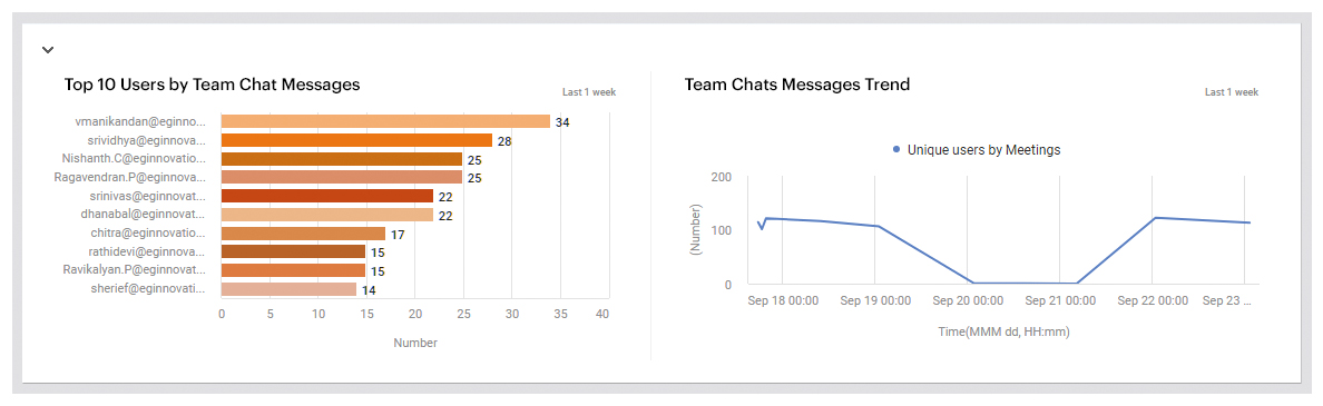
With the help of the Top 10 Users by Team Chat Messages bar graph, administrators can figure out the user, who has exchanged the maximum number of messages through Teams chat.
To identify when exactly did the maximum number of unique users exchange messages on Team chats in the last 1 week, you can use the Team Chat Messages Trend graph (see Figure 8). This will help administrators identify the pattern of traffic and when exactly during the past 1 week wereusers most active in exchanging messages in Teams chat.
The count of Private Chats in Figure 5 helps administrators to figure out the exact count of chats exchanged between unique users. You can drill down the Private Chats count to figure out the Top 10 unique users, who have exchanged private chat messages (one-to-one chat messages) in the past 1 week. With the help of the Top 10 Users by Private Chat Messages bar graph (see Figure 9), administrators can figure out the user, who has exchanged the maximum number of messages through private chat.
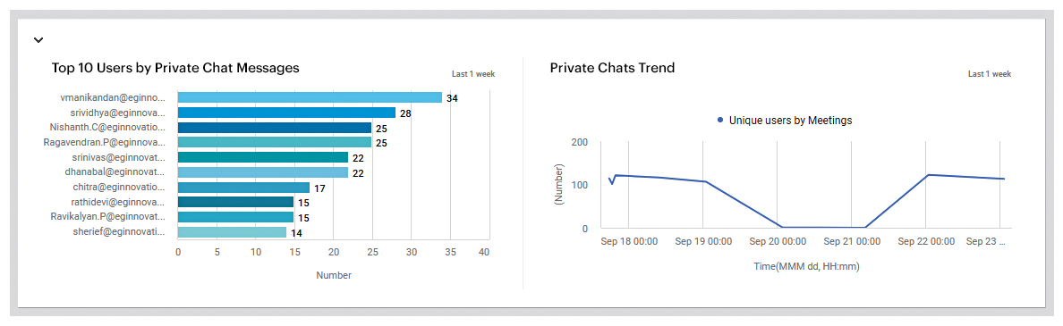
To identify when exactly maximum number of unique users exchanged messages in private through private chats in the last 1 week, you can use the Private Chats Trend graph in Figure 9. This will help administrators identify the pattern of user chat traffic and when exactly during the past 1 week were users most active in exchanging messages in private.
The count of Calls in Figure 5 helps you in identifying the total number of calls initiated by the users. Clicking the Calls count will lead you to the Top 10 Users by Calls graph, which will provide you a sneak peek into the users, who have initiated the maximum number of calls during the last 1 week (see Figure 10).
This will point the administrators to those users who have been active in using calls for communication through Microsoft Teams.
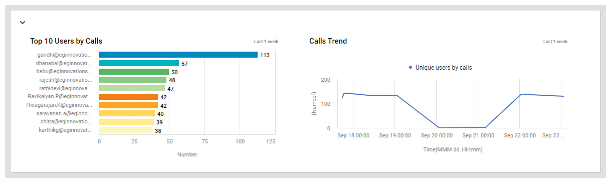
To identify when exactly was the maximum number of calls initiated/attended by users in the last 1 week, you can use the Calls Trend graph in Figure 10. This will help administrators identify the pattern of call traffic and when exactly during the past 1 week, users were most active in initiating /attending calls on Microsoft Teams.
Next, you will find the count of Meetings initiated by the users on Microsoft Teams in Figure 7. Clicking the Meetings count will lead you to the Top 10 Users by Meetings graph, which will provide the details of the top 10 users, who have initiated the maximum number of meetings during the last 1 week. This will help administrators to figure out the users, who have been actively attending meetings using Microsoft Teams.

You can also identify exactly when was the maximum number of calls initiated/attended by the users in the last 1 week using the Meetings Trend graph in Figure 11. This will help administrators identify the pattern of meeting traffic and exactly when were users most active in initiating /attending meetings on Microsoft Teams during the past 1 week.
Finally, the Other Actions count in Figure 7 helps you figure out the count of other actions performed by users such as liking, editing, sharing messages on Microsoft Yammer, etc.
Call Quality Analytics
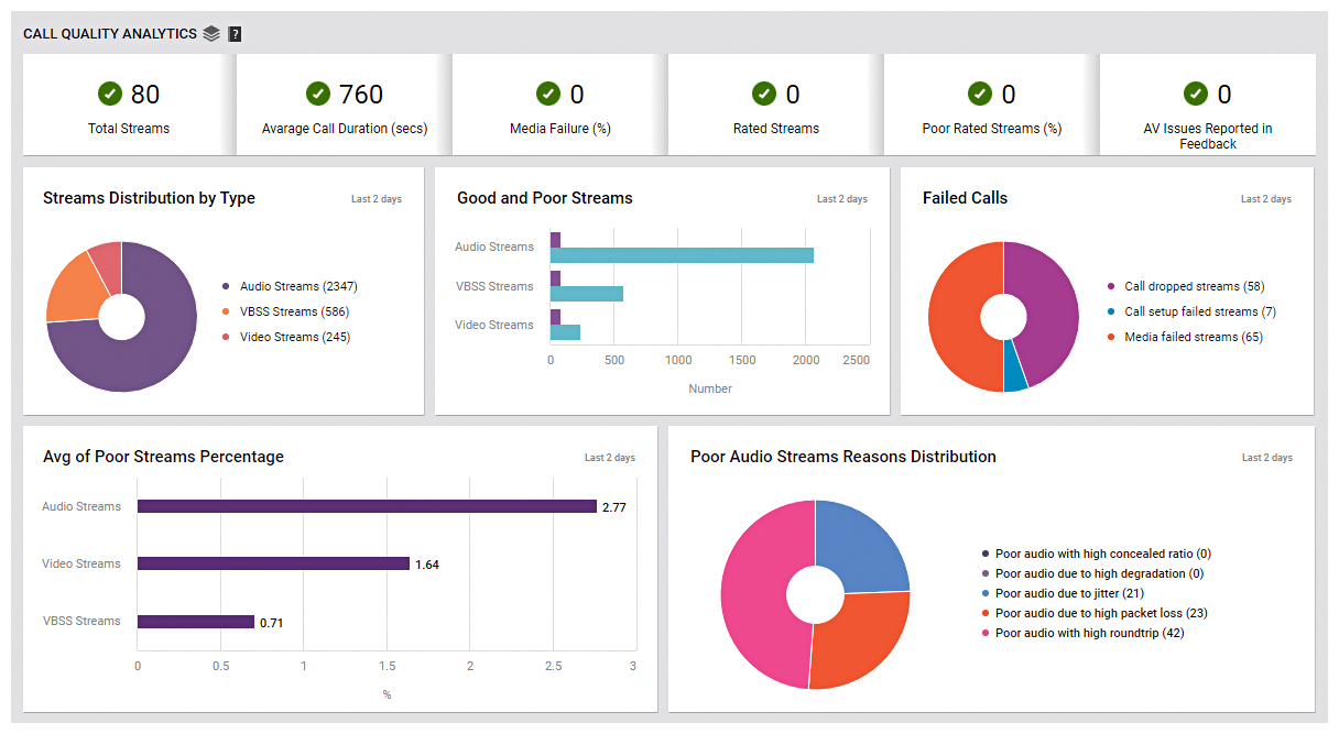
Use the CALL QUALITY ANALYTICS page (see Figure 12) to analyze call traffic handled by Microsoft Teams, and rapidly detect bottlenecks in call quality.
To access the SERVICE HEALTH page, move your mouse pointer over the Microsoft Teams icon on the left panel, and click the Call Quality Analytics option within.
This page begins by providing you with a summary of the calls and the quality of calls. Here, you can view the Total Streams count (see Figure 12), which indicates the total number of streams (audio/video/VBSS) initiated on Microsoft Teams. Tracking variations to this counter over time will quickly help you in detecting any sudden and significant increase in the count of streams.
The Average Call Duration section in Figure 12 helps you in identifying the average time duration for which a call (audio/video/VBSS) lasted.
Next, you can use the Media Failures section in Figure 12 to figure out the percentage of call failures encountered by users on Microsoft Teams. Tracking the variation of this value will help you in detecting sudden increase in the percentage of call failures. If this sudden increase is concerning, then, you may want to investigate further.
The Rated Streams count in Figure 12 helps you to know the count of streams that were rated by the users. This will help you identify if all the streams on Microsoft Teams were rated by the users or not. The Poor Rated Streams section provides you insights into the percentage of streams that were rated as poor streams by the users. Often, streams that were rated as poor have an adverse effect on the user experience on Microsoft Teams. A sudden surge in this value may be a cause of concern and hence, you can investigate further to figure out the real reason behind such poorly rated streams and help improve the user experience.
Feedback plays a major role in improving any service offered to users. By carefully analyzing the feedback provided by the users of Microsoft Teams, you can figure out issues in audio quality. The AV Issues Reported in Feedback section (not shown in Figure 12) will help in this regard! A sudden/gradual increase in the value of this measure indicates degradation in audio quality and this is a major factor in deciding the user experience. Careful analysis by drilling down this section will help you to identify the users, who suffered poor audio quality.
Next, you will find the Streams Distribution By Type pie chart (see Figure 12). This pie chart reveals how users have been distributed across different call streams in the past 2 days. With the help of this pie chart, you can accurately identify the exact call stream that has been used by maximum number of users.
For a great user experience, it is necessary that the call quality of the users is not compromised. However, in any IT environment, administrators may not be able to achieve the ideal user experience unless they continuously track all the call streams and identify the streams that were rated as ‘poor’. The Good and Poor Streams graph in Figure 12 helps you in this regard! A single glance at this bar graph will help you in understanding the count of good and poor audio/video/VBSS streams in the past 2 days. With the help of this count, you can identify the type of stream that was rated as poor by maximum number of users and start investigating on why the streams were rated as ‘poor’.
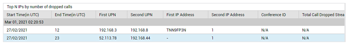
Next, you will find the Failed Calls pie chart. This pie chart reveals the reason due to which maximum number of calls failed during the past 2 days. You can figure out by yourself which type of call failures were encountered by the users in the past 2 days – is it due to call dropped streams or call-dropped failure percentage? If you click on the slice representing Call dropped streams (or the corresponding legend entry), you will be able to view the top IP addresses in terms of the count of dropped calls.
A sudden/gradual increase in the count of poor streams plays an adverse effect on the user experience. The % of Poor Streams graph in Figure 14 helps administrators keep a constant vigil on any sudden increase in the streams that were rated as ‘poor’ in the past 2 days. A singe glance at this graph is sufficient to figure out which type of call stream was rated more frequently by the users as poor – Is it audio stream? Or video stream? Or VBSS stream?
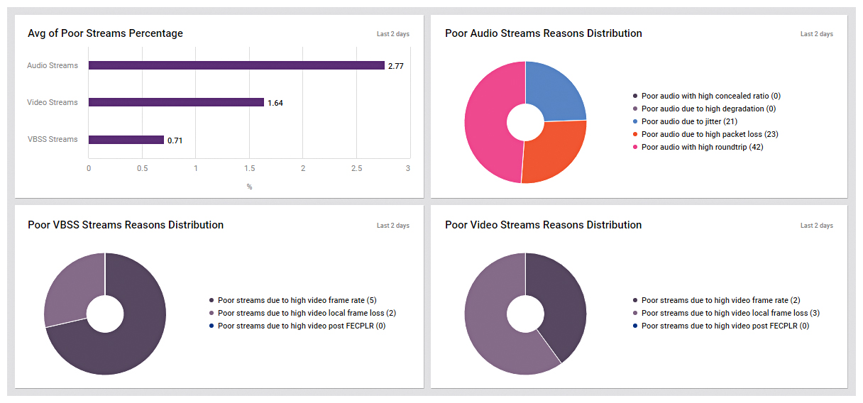
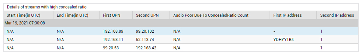
Next, you will find a Poor Audio Streams Reasons Distribution pie chart (see Figure 14). Audio streams may be rated as ‘poor’ by the users due to various reasons. In the event of a spike in such poor audio streams in the last 2 days, you can use the Poor Audio Streams Reasons Distribution pie chart to instantly identify the reason for such poor audio streams – is it due to high degradation? Or jitter? Or high packet loss? Or due to high roundtrip? Or due to high concealed ratio?
To identify such audio streams which were affected due to a particular reason, click the slice representing that reason in the pie chart (or click the corresponding legend entry). Figure 15 will then appear.
The next section is the Poor VBSS Streams Reason Distribution pie chart of Figure 14. VBSS streams may be rated as ‘poor’ by the users due to various reasons. In the event of a spike in such poor VBSS streams in the last 2 days, you can use the Poor VBSS Streams Reasons Distribution pie chart to instantly identify the reason for such poor VBSS streams – Is it due to high video frame rate? Or high video local frame loss? Or high video post FECPLR? To know what caused the quality of a VBSS stream to deteriorate, click the slice representing that reason in the pie chart (or click the corresponding legend entry).
Finally, the last section is the Poor Video Streams Reason Distribution pie chart of Figure 14. Video streams may be rated as ‘poor’ by the users due to various reasons. In the event of a spike in such poor Video streams in the last 2 days, you can use the Poor Video Streams Reasons Distribution pie chart to instantly identify the reason for such poor video streams – Is it due to high video frame rate? Or high video local frame loss? Or high video post FECPLR? To know the reason that caused the quality of a video stream to deteriorate, click the slice representing that reason in the pie chart (or click the corresponding legend entry).
While the Poor Audio Streams Reasons Distribution pie chart reveals the reason behind why the audio streams were rated as ‘poor’, the Poor Audio Streams Details section (see Figure 16) helps you in identifying the users involved in such poor-quality audio calls. This will help you figure out what exactly is causing the experience of the users to suffer while initiating/attending audio calls. You can also begin further investigation and help improve audio quality for those users.
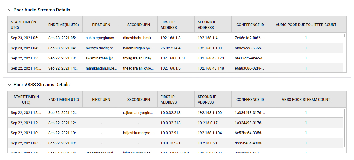
While the Poor VBSS Streams Reasons Distribution pie chart reveals the reason behind why the VBSS streams were rated as ‘poor’, the Poor VBSS Streams Details section (see Figure 16) helps you in identifying the users involved in such poor quality, video-based screen sharing calls. This will help you figure out the reason that is the highest contributor of such poor quality VBSS calls. You can also begin further investigation and help improve VBSS call quality of those users.
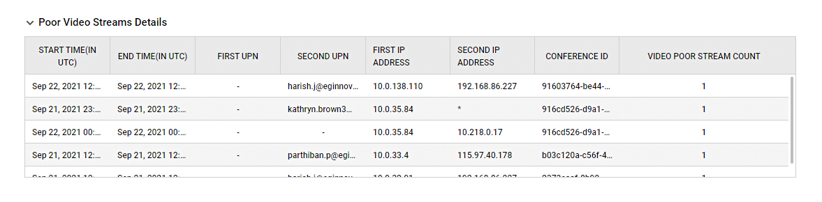
While the Poor Video Streams Reasons Distribution pie chart reveals the reason behind why the video streams were rated as ‘poor’, the Poor Video Streams Details section (see Figure 17) helps you in identifying the users involved in such poor quality video calls. This will help you figure out the reason that is the highest contributor of such poor quality video calls. You can also begin further investigation and help improve the video call quality of those users.
Long term planning and user-satisfaction
All the data from Teams and other Microsoft 365/O365 products collected by eG Enterprise is available historically in the core product via custom or out-of-the box reports allowing administrators to plan for future usage and optimal sizing as well as allowing management to receive regular detailed reports on how well employees can communicate and indeed how employees are communicating. Understanding how users use core communication tools is often the key to understanding how effective and productive an organization is enabled to be.
eG Enterprise is an Observability solution for Modern IT. Monitor digital workspaces,
web applications, SaaS services, cloud and containers from a single pane of glass.
More Information
- You can read more about monitoring Microsoft Teams, in our documentation here – Monitoring Microsoft Teams (eginnovations.com)
- Some details on how eG Enterprise’s monitoring capabilities for Microsoft Office 365 are focused on addressing the needs of organizations.
- What is Microsoft Office 365 | eG Innovations
- Microsoft also maintains a knowledge base regarding troubleshooting for Teams: Information about Teams known issues – Microsoft Teams | Microsoft Docs
eG Enterprise is available as a SaaS-based service or an on-premises solution for Microsoft Office 365 monitoring. Learn more at: www.eginnovations.com/Office365.
“Microsoft Office 365 is at the heart of most businesses today. Any service outage or performance slowdown affects user productivity and business continuity. We have seen a great demand from our customers for monitoring Office 365.”
– Sean Martin, Technical Director of eGSolutions Ltd., a long-term eG Innovations partner and certified reseller in Australia and New Zealand
eG Enterprise is an Observability solution for Modern IT. Monitor digital workspaces,
web applications, SaaS services, cloud and containers from a single pane of glass.


