

In 2017, Gartner introduced the concept augmented analytics in its Augmented Analytics is the Future of Data and Analytics report. In broader terms, the concept can be defined as data preparation and presentation through the use of machine learning and natural language processing (spoken or written).
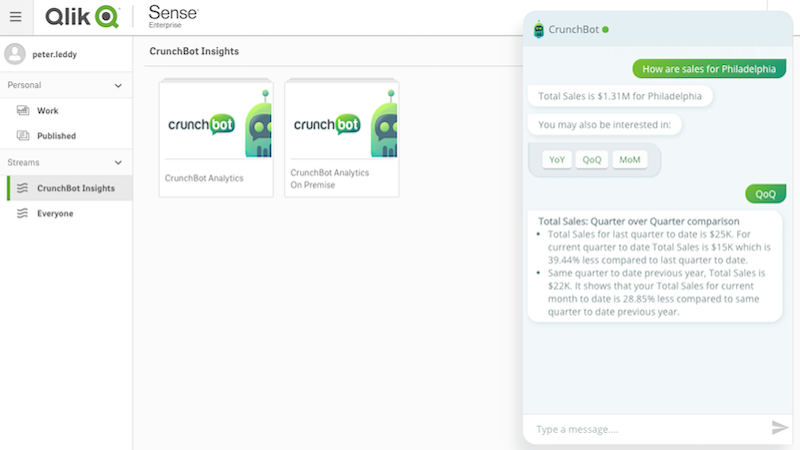
In the last year, major companies in business intelligence (BI) digital solutions, such as Qlik and Tableau were already investing in it. Qlik acquired CrunchBot "to enable users to type questions in conversational language through the company's own Qlik Sense UI or with other popular collaboration tools, such as Slack, Microsoft Teams, Skype and Salesforce Chat, and receive data insights directly within those applications". Also, Tableau already introduced natural language processing and generation in its 2019 release.
Much has been written in subsequent articles about the potentials of augmented analytics for businesses. Namely, its potential to provide companies with actionable insights rather than with abstract raw data. Nevertheless, very little has been written about the user experience and the design aspects involved in this new way of accessing and visualizing data.
This may be due to this new paradigm coming from, and still being restricted to, the realm of data scientists. However, it's essential that businesses don't underestimate those tools' UX design. It doesn’t matter how much potential a tool has if it’s too difficult or too unpleasant to use.
In Gartner's report, the main risks pointed to augmented analytics are related to the way humans will receive it. One of them is the user's resistance due to the fear of the black box (AI tools that make crucial decisions in an opaque way without explaining the rationale followed). Issues such as this one can't be handled by the data-scientists themselves for two different reasons:
-
They have too much on their plates already regarding the technical aspects involved in machine learning and natural language processing;
-
They are professionals that focus on data, rather than on people and human behavior, which is especially important taking into consideration the democratization of analytics and the rise of citizen data scientists.
UX/UI designers too can’t continue to ignore the augmented analytics paradigm. The predictions point that by 2020 "90% of BI platforms will have artificial intelligence and 50% of analytical queries will be generated via search, natural-language processing or voice, or will be simply automatically generated." Since both AI and natural language push user interaction from graphic user interfaces to conversational interfaces, we're about to witness a complete change in the industry, similar to what we saw with the smartphones.
So, let’s now dive into how conversational interactions impact UX, what challenges and possibilities they bring and how to properly design them.
Voice interaction as an option, not the main form of interaction
As mentioned already, one of the main features of augmented analytics is the interaction through natural language, which demands conversational interfaces. Those interfaces can be either voice-based or written-based.
Voice interaction definitely has a wow factor. However, besides that dazzling effect, voice interfaces have very poor usability and limited potential when talking about augmented analytics and business intelligence.
The first and most obvious limitation of voice interactions is the context in which the users feel comfortable using it. When they are talking about BI, where sensitive information is involved, users may not be open to speak or to receive the information in a way that can easily be heard by people around them. This limits the situations in which audio interactions are positive to a couple of scenarios, like driving a car alone or taking a shower, for instance.
The second limitation regards the capacity of the human working memory. Studies show that humans can only retain an average of 3 to 5 items in their working memory. If augmented analytics solutions stay with actionable instructions only, some may say that working memory will have a minor role. However, a large part of BI decisions require strategies involving many pieces of information, and not just yes or no inputs. This is especially true if we take into consideration that most decision-makers want explanations about how and why the system is advising them in a certain way.
As such, BI solutions that rely solely on voice interaction are useless by themselves. They should always be complemented with written-based interactions in order to better answer to the user needs.
Actionable history
Conversations are messy by nature. They are not linear processes, despite how vertical chat streams make them look like.
People go back and forth with questions, doubts and decisions. They hesitate, take pauses, interrupt things before finishing, wait to think about it. Then, they forget things, lose the context in which things were said, they misinterpret things. Meaning, users will constantly need to get back to previous processes to recover certain pieces of information.
The obvious solution to allow this is to provide a conversation history. However, as we all know, researching through a conversation history can be a painful and time-consuming task. Conversations are long and often users don’t remember when specific parts of it took place or which words were used. So, in most cases, simple scrolls or searches by words or dates are not enough.
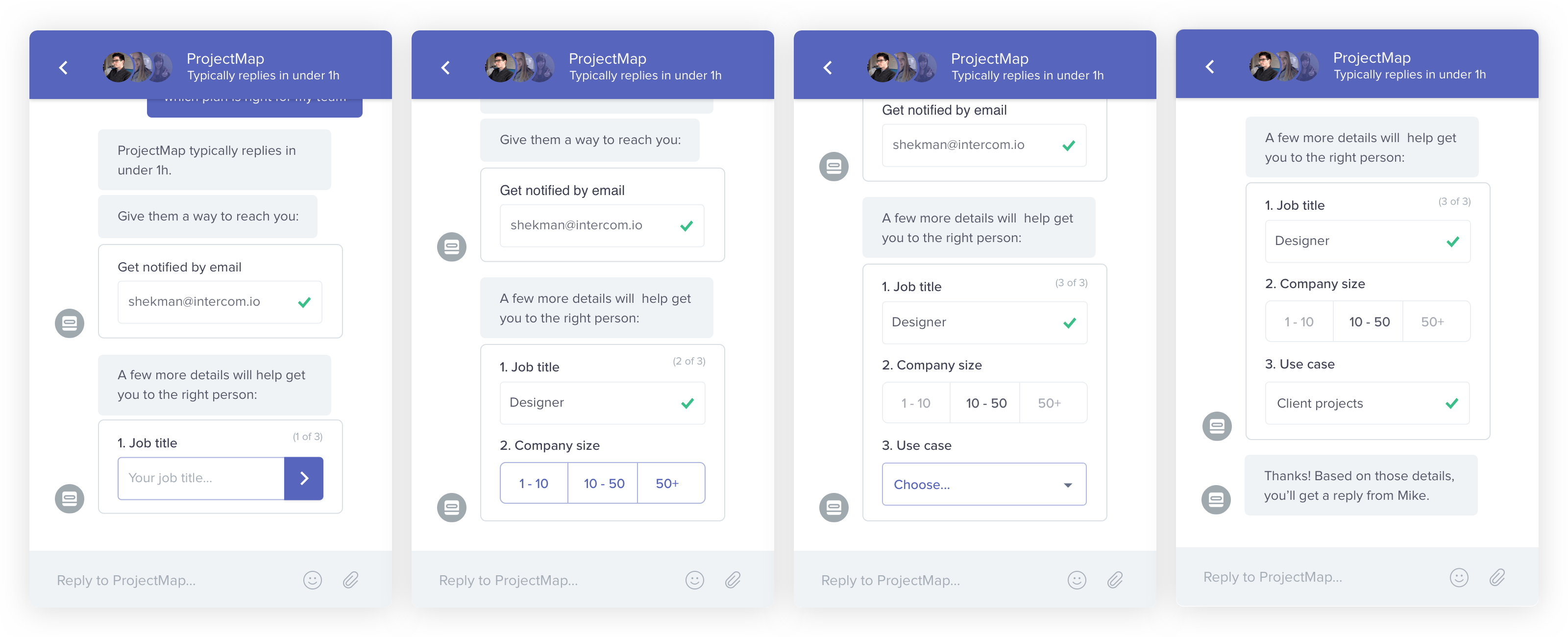
Additionally, in several use cases, users will be interested not only in reviewing an output but in repeating complex questions to get updated answers. In those use cases, the problem is that re-writing questions would demand wasting time writing sentences. As Shekman Tank, product designer at Intercom says:
Conversational UIs might mirror the way we naturally like to communicate, but they actually required more mental load than traditional GUIs. If you’re asking a user to engage in a conversation instead of tapping a button or two, are you really making things any easier?
Shekman Tank
To improve your user experience you should think about providing easily searchable histories that don’t rely solely on discursive memory, but also take advantage of information recognition and visual memory. One way of achieving that is to style differently different pieces of information (we will talk a bit more about next).
Besides that, you can have shortcuts that allow quick access to frequently asked questions. Lastly, you should think about actionable messaging cards that can act as anchors in the conversation, allowing users to get back to a previous conversation point and continue from there.
Visual hierarchy for content
Most conversational applications nowadays use just plain text with an occasional color styling, almost like a command line. This makes scanning through information slower and more demanding for users, especially taking into consideration that natural language features long sentences.
If you want to keep the human communication style but overcome this issue, you can apply visual hierarchies, playing with elements such as font sizes, paragraphs, spacing, color backgrounds, notification badges or many others that suit your specific situations.
This way, you catch users' attention for the most crucial pieces of information and allow them to ignore the chitchat in use cases where their attention span is limited. For instance, when a user is quickly checking a piece of information during a meeting or while on the move.
Available menu-based navigation
As many UX design experts already pointed out, message exchanges do a poor job regarding two fundamentals aspects of usability: discoverability and understanding. Or, in other words, in letting the user know what are the system capabilities, requiring them to articulate their needs in every step.
Some applications try to overcome this issue by recurring to an onboarding where the system options are presented to the user. However, this is an insufficient solution. The most likely scenario is that users will pay attention only to the options that they are interested in at that moment. All the other possibilities will soon disappear from the users' minds.
Another complementary solution is to have the system suggesting contextual actions to the users. The problem with this approach is that is limiting the discoverability of the system based on the user current behavior, not presenting them the triggers that allow exploring new paths. Please, please, please, don’t annoy people with suggestions to try some random feature at times when they are not interested in it!
What to do, then? A possible solution is to keep a traditional menu that can be hidden or shown in the interface. You would not be able to do a traditional page-based menu, but you can go with subject-based or action-based menus that show a bit of the conversation tree underlining the system (in a format that users are used to). By doing so, you give users visual clues to explore what the system is capable of.
Don't discard forms
There are several use cases in which you need users to input data, building queries or simulating scenarios, for instance. As already mentioned, conversational interactions are long and wordy. And the bigger the information exchange needed, the longer they get.
If you ask too many questions at one time, the message will come out as confusing and it will demand extra effort from the user to process and to answer it while assuring they have written everything they need. If you ask one thing after the other, it gets frustrating for users who see their expectations to get to the end goal delayed again and again.
That’s the reason why current web forms have either a one-page format or a stepper indicating the current step and the total that's missing until the end. The same applies to blog articles that have the average reading time, so the user can check if they actually have time for it at the moment, before starting the task.
Also, while in futuristic utopias AIs understand what users want to say despite what they have actually said, in the real world systems still have to deal with input validation. This is yet another issue for which purely conversational interfaces don’t offer a good user experience.
Do you validate inputs after submission, without giving hints to the user about its format beforehand? Do we explain by message what the input's format is each time we request it? Do we make users remember it? What do we do if an input comes in a format that is not valid? Give the validation feedback, ask it again, and delay the achievement of the goals, plus spam the conversation feed with validation error? In all these scenarios, we will end up with the user feeling frustrated.
Once again, the solution is to not discard good old partners. In this case, forms. No one likes forms, I know, but they give users visibility from the start on what information is required from them, they give visual hints (and constraints) about data formats (reducing input format error) and allow immediate validation, reducing users' frustration. This makes forms a much more quicker and efficient way to input information, with way less back and forth.
Offer detailed graphic views on data
As mentioned already, you can go with solutions that mix conversational interfaces with conventional navigation systems and forms, increasing interface efficiency. In a similar way, keeping graphic data visualization elements can help solve some of the identified problems of augmented analytics, namely the fear of the black box.
In the first instance, you can present to the user the straightforward actionable insight, keeping the advantages of a quick unbiased approach. But then, you can let users explore the data charts and tables by themselves, in progressively more detailed graphic-based views, if they want to. Even if the end-users don’t actually dive into all the provided options afterwards, having the possibility to do it can increase their confidence in the system. It also empowers users, as they feel they are still the ones in control.
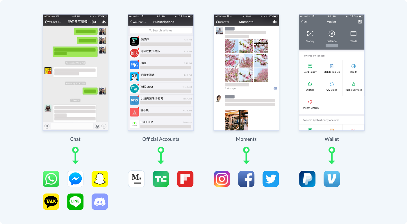
One possible way of doing this is to present users with conversation cards that can be expanded to open graphic views. This can be done through an approach similar to the one used by WeChat, an application that merges the concept of chat and min-apps.
Use design systems
As we've been advocating in this article, instead of going with purely conversation interfaces, you can go with interfaces that merge conversation-based and GUI-based interfaction. In this hybrid interfaces, graphic views and forms have a huge advantage: they can present only the relevant information to a specific use case, previously clarified through the conversational interaction. This allows us to avoid cluttered and confusing interfaces (so common in traditional BI solutions). The thing is, since graphic views are generated by the system in front of a specific use case, we, as designers, will not have the control anymore about each graphic view.
As such, it's required that we stop thinking about pages and start thinking at a more abstract level than ever before, focusing on hierarchy rules, information architecture principles and the mechanisms of human visual perception.
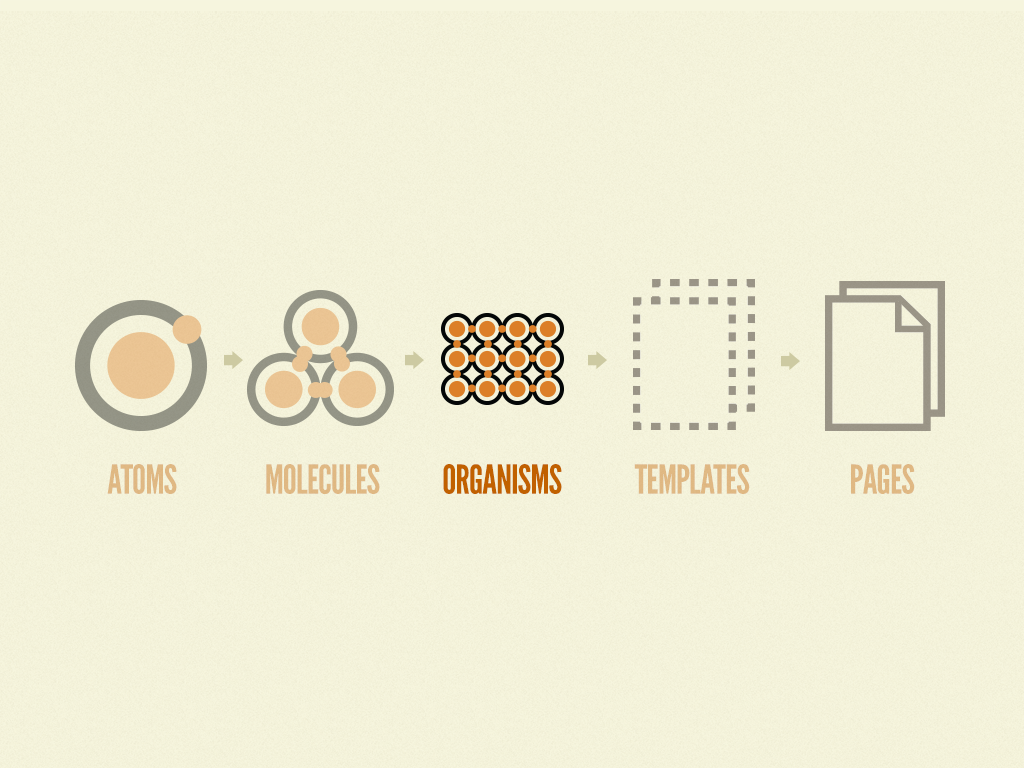
Design systems are crucial to that, as they rely on guidelines and principles to allow for the generation of new interfaces. An approach we find especially suited for the design of AI-generated interfaces is the atomic design system. This approach is already based on a generative approach where small elements are organized in progressively more complex elements. When designing for AI-generated interfaces we just have to focus on designing two of the components identified in the atomic approach: molecules and especially organisms.
Don't underestimate visual details
As interfaces get more minimalistic, it becomes more critical to know how to play with simple elements like color and typography to reinforce visually the desired user experiences and to better convey information.
In a framework where the text has a central role, minor typography differences, for instance, may have a huge impact on how the system is perceived by users (Is it a humanistic font or a monospaced one? Is that font choice aligned with the tone of voice of your AI? How does the font perform regarding readability? Are the characters too similar to each other making the reading speed slower?).
Be mindful about personal assistants
Augmented analytics, and even conversational interfaces, don’t necessarily require a virtual personal assistant. However, quite often, the two go together. If that’s the case, the choice of the assistant attributes should be made carefully. People may find weird to talk to a machine but giving the assistant a human-sounding name and a tacky avatar will not solve that.
Users are still able to identify that the assistant is not a real human and the fakeness of it can make the experience even more frustrating and reduce the chances of users trusting the insights the system is given them, as the entire platform is then perceived as deceptive. As the principles of calm technology tell us: "Machines shouldn't act like humans. Humans shouldn't act like machines." So you may want to consider keeping the virtual identity of your assistant. You can have a robotic concierge, for instance.
In any case, be conscious to not fall in the outdated clichés that we’ve been seen regarding personal virtual assistants and gender.
Companies have repeatedly launched these products with female voices and, in some cases, names. But when we can only see a woman, even an artificial one, in that position, we enforce a harmful culture.
Chandra Steel, PCMag
Stereotypes are so 90’s, and there is so much potential in AI for creating new realities!
It’s not this way or the highway!
As we've seen in this article, conversational interfaces have a huge potential, but they also have clear usability problems of their own.
The good news is that there is no reason why we have to compromise.
It’s a mistake to believe a conversational design means every user input and output has to be handled in a purely chat format. Whenever it makes sense, it’s fine to consider a hybrid approach and use other interactive elements within the conversation (e.g. buttons, cards, forms) to help users complete their goals faster and with less friction”.
Rajat Harlalka, Hackernoon
So, since the future belongs to hybrid interfaces, take the insights presented here and the lessons from the B2C apps that already started to use the hybrid approach and think critically on when to use one interaction model or the other and how to merge them in one coherent user experience.
There is a universe of possibilities waiting for us who work in UI/UX design for business intelligence solutions!

Found this article useful? You might like these ones too!