
Contents
Some members of UX studio had a nostalgic discussion about video games not too long ago. About halfway through the discussion, we realized that none of us clearly remembered or even cared that much about a game's UI design, even though most of us met UI design for the first time by playing video games. When we are reminiscing about these games, typically the UI is the last thing we think about. A video game review mainly focuses on the storytelling, characters, graphics, and gameplay mechanic, but the user interface is only mentioned when it is critically bad. Let's dive into this negligent area through a few examples and find out what factors might make the UI of a video game flawed or exceptional.
Role of UI in games
A video game is mainly considered as a creative platform for interactive narrative storytelling, but from a technical standpoint, it is merely a software requiring mostly traditional but sometimes modern types of inputs from the user. Even in the most basic games, you’ll need to interact with a navigation menu in order to start, load, or save a game.
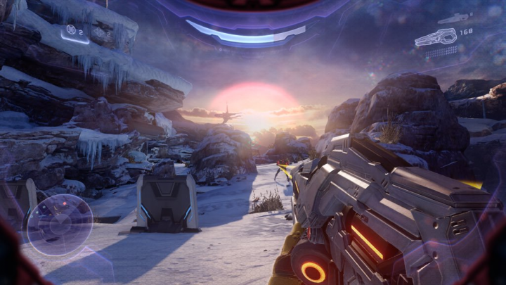
Since you have limited sensory perception in a game, you have to rely on a HUD when you are placing yourself into a digital environment. Heads-up display is not exclusive to gaming; its first application was in modern aircraft where fighter pilots could check important information on the actual windshield, causing a reduced distraction while flying. A commercialized version appeared in cars as well, where the most important statuses of the vehicle are projected onto the windscreen so drivers can access these pieces of information without taking their eyes off the road. The purpose of HUDs in games is the same: Glance at important information and statuses without the least amount of obstruction of the gameplay. Health status or direction of enemy fire is something our in-game persona would feel and sense, but it must be visualized for someone limited only to looking at a screen. The https://www.slotsformoney.com/casinos/roulette/ is where you must go if you want to get gambling with real money.
Game disciplines will affect the UI
The UI, the menu system, and navigation within this system are defined by the gameplay’s actual complexity or even the nature of the storytelling. Imagine more cinematic gameplay experiences where the game feels almost like a movie, and you experience it in a very linear fashion. These games are usually not focusing on level-up systems, sidequests or truly open-world gaming, so the interface structure will most likely be very basic. The Uncharted series falls under this type: the menu-experience is mainly limited to the pause screen without any deep navigation, but it is suitable since the gameplay doesn’t demand more.
The addition of complex gameplay elements will make things exponentially more complicated. Control is a game released in 2019 and critics universally praised it, but the UI, menu-system, and the map were far from perfect. The extensive upgrade system was overwhelming at first, and the overuse of indicators did not help the already lacking visual hierarchy.
But still, the most obvious problem was the visual under-representation of the masterfully complex, layered, and expanding levels. A limited, sometimes glitchy, dark-monochrome map could not translate the 3D level-design into a 2D map, which caused a lot of frustration for gamers. Since its first release, developers tweaked and addressed the map design issues in multiple updates, making it more user-friendly from update to update.
The usual suspect: Clutter
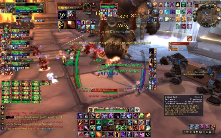
Clutter is the number one reason why a game’s UI can fail. Online multiplayer games are the main offenders of visual clutter: In addition to taking part in the gameplay, you also have to pay attention to upgrading, strategizing, using special attacks, reading a map, and communicating person-to-person simultaneously while being limited to a single screen to execute all of these.
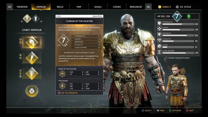
Modern narrative-driven games primarily present clutter and unclear hierarchy in the upgrade section. If you landed in the upgrade-system of God of War for the first time, you’d feel a bit disoriented by the number of stat-bars, numbers, and unnecessary abbreviations. You could even feel discouraged to implement truly strategic upgrades for your characters and weapons. Navigating this section is especially tricky in a console-exclusive title because the user is limited to gamepad input only.
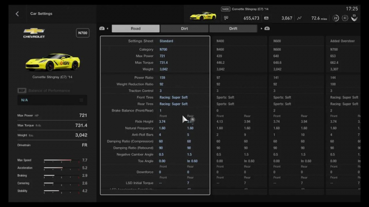
Developers are aware that clutter might be present in their game. Gran Turismo Sport includes a lot of customization options for cars, making it difficult to navigate it with a gamepad. To help the users, Polyphony Digital included a “mouse cursor” into the menu system. Obviously, it is not a great solution in a console exclusive title since it is a bit awkward to handle it with a controller, but this is the price of including way too much customization options. An extensive list of options might also give decision paralysis for the player, who in return might neglect gameplay improving settings.
Unexpected style is not everything, but it definitely helps to make UI memorable
Imagine this: We are at the beginning of the new millennia, you are back from school on a gloomy afternoon, you need to relax a bit, so you hit up a typical racing game. Now try to imagine the overall tone of the game’s menu — probably big flashy buttons, over-the-top colors, distorted guitar licks every time you press the arrow buttons, and a background that renders every font less readable. That is like every racing game from that era, right?
Well, take a look into Colin McRae Rally 2. This twenty-year-old game UI absolutely differed from the expectations and presented a simple, monochrome, swiss-minimalist feel to the menu system, which still comes back as a fond memory to the rally game enthusiasts.
The menu displays only the absolutely necessary information, making the complicated actions, like tuning parts of the vehicle, much easier. You were able to navigate a well-structured menu system using only the arrow keys and the space bar. This stylistic approach and the 100% clutterless design were typically reserved for the high-end print media at the time. This decades old user interface proved that well defined design principles will make any design timeless.
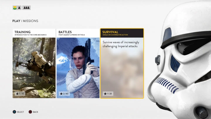
A similarly great example is the first Battlefront game from 2015. The most obvious motives of the franchise are usually imprinted all over the UI design in a typical Star Wars game: Holograms, lightsabers, and ancient Jedi calligraphy were expected to appear everywhere, but when you’ve launched the game for the first time, a streamlined, clean interface welcomed you. Refreshingly minimalist UI and great hierarchy immediately communicated a break from the usual Star Wars aesthetic. Unfortunately, Battlefront’s sequel lost this charm when it steered away from this positively uncharacteristic UI design.
Immersion through UI is rare as hen’s teeth
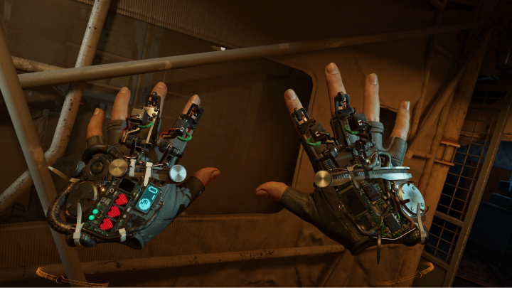
It is interesting and memorable to play games where the UI is presenting a wall break. Diegetic Interface is when the UI is not limited to the actual gamers but exists in the universe of the playable character as well. It is fun because the UI is part of the narrative but also beneficial as user interface design is part of the core development. Simulators, by nature, often implement this idea, but diegetic UI shines the brightest in story-driven games like Dead Space.

The back of the character’s suit presented the health and status bar, while the ammo-status is projected from the weapon as a small hologram. This immediately makes the screen less cluttered, creating a more cinematic atmosphere within a complex gameplay frame.
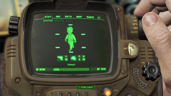
The Fallout franchise introduced Pip-boy, another sample of the diegetic interface design. This atompunk-style wearable device provides important stats, upgrade options, maps, and even hidden mini-games to the gamer and the protagonist. A Pip-boy app is also available to download, allowing the player to connect and interact with the game on a smartphone, further blurring the lines of user-interactions in video games.
Horizon Zero Dawn is probably a more up-to-date example. The player experiences a regular UI, but the main character’s point of view is also planted into the narrative. The game’s story is kickstarted with the discovery of a wearable AR-device called ‘Focus’, which allows the protagonist to see what we usually see and experience when we play a video game, helping her survive the vicious post-apocalyptic setting.
This creative infusion is a welcomed but rare phenomenon in traditional game UI design. On the other hand, the rise of VR games might introduce it more frequently in the future, where a diegetic interface is almost an obvious direction for game designers.
So what should I consider when designing a game UI?
- A game’s UI should be defined by the complexity of the game. If the overall gameplay is simple, complex interfaces will most likely disorient the user.
- Well defined visual hierarchy is a key factor in good UI. The most important information should always be available by a quick glance.
- Diegetic interfaces: Video game UI can support immersion even in traditional games. If my character is experiencing exactly what I experience, the game instantly becomes more relatable.
- Drifting away from the most obvious look and feel can make the UI as memorable as the game itself.
Searching for the right UX agency?
UX studio has successfully worked with over 250 companies worldwide.
Is there anything we can do for you at this moment? Get in touch with us and let’s discuss your current challenges.
Our experts would be happy to assist with the UX strategy, product and user research, UX/UI design.

