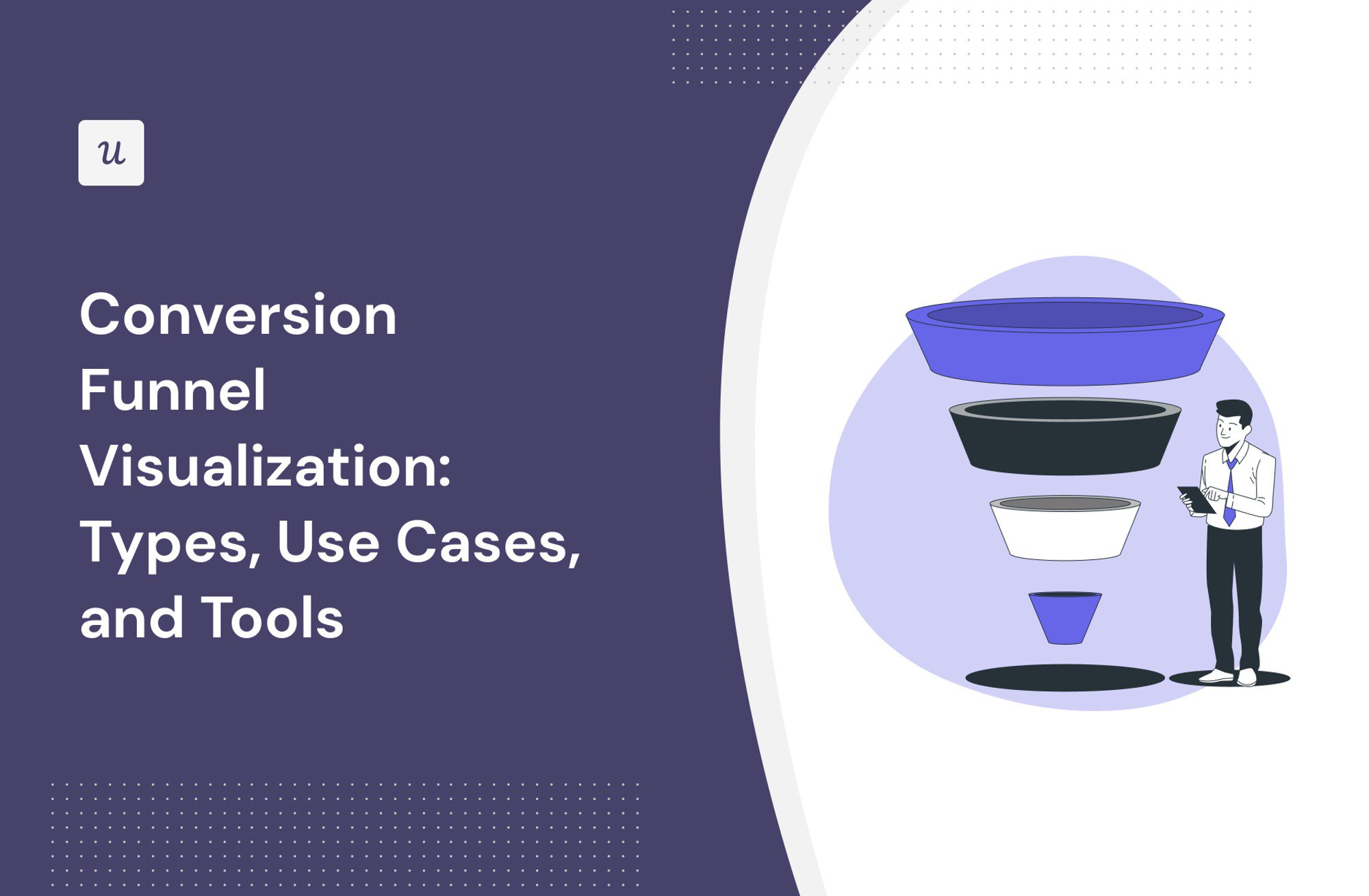
Conversion Funnel Visualization: Types, Use Cases, and Tools
What’s conversion funnel visualization?
If you’re looking for the answer to the question, we’ve got you covered!
This article also explains:
- Why it is important to visualize conversion data.
- Different kinds of conversion funnel visualizations.
- The use cases for funnel visualization.
- How to create a funnel visualization report in Userpilot and Google Analytics.
Let’s dive right in!
TL;DR
- Conversion funnel visualization is a graphical representation of how customers move across various journey stages. They are used by marketing, sales, product, and customer success teams to evaluate the effectiveness of their processes and strategies.
- Funnel visualizations make it easier to digest conversion data and identify trends and patterns.
- Funnel steps are the most common way to visualize funnel data. Each bar in the chart represents one funnel stage.
- In a pie chart, each slice illustrates how many users (from a particular segment) are currently at individual funnel stages.
- It’s also possible to visualize conversion rates as a trend to track changes over time.
- The Sankey diagram is a flow diagram representing how many users complete individual activities at different funnel stages: the wider the band or the arrow, the more of them.
- Product teams can use funnel visualizations to track the performance of their onboarding flows. This is done by monitoring conversion rates at each stage of the process and optimizing the stages if necessary.
- Funnel visualizations are invaluable for identifying friction and drop-off points in the customer journey.
- Visualizing the time to convert data can help teams identify the ideal free trial length.
- Google Analytics is a popular free tool used for visualizing funnel data for websites while Userpilot is a product growth platform that allows you to do it for web apps.
- If you want to learn more about conversion funnel visualizations in Userpilot, book the demo!
Try Userpilot and Take Your User Experience to the Next Level

What is conversion funnel visualization?
A conversion funnel visualization is a graphical representation of the stages that the customer goes through during their relationship with the business.
In the context of SaaS products, we often talk about the marketing funnel, the sales funnel, or the product funnel visualization. They all focus on different stages of the customer journey, from the moment they learn about the product until they become loyal customers.
Common stages in the SaaS product funnel include Awareness, Interest, Evaluation/Consideration, Decision, Conversion/Purchase, Retention, and Advocacy.
Why is it important to visualize the funnel process?
Funnel data visualization makes it easier for teams to analyze the data.
Think about it:
Where can you spot trends more easily, in a table with data or a chart?
In a chart, naturally.
Of course, it may not give you such granular insights – not without digging in a bit deeper – but a visual data presentation is much easier to digest.
For example, if you’re experiencing a massive drop-off rate at a particular stage, you will know it immediately from the funnel chart, because the bar representing the next funnel step will be dramatically narrower.
How do you visualize a conversion funnel?
There are a few ways to visualize a conversion funnel: as funnel steps, as a pie chart, as a trend graph, and as a Sankey diagram.
Let’s have a quick look at each of them.
Funnel steps
I bet that when you hear funnel analysis or funnel chart, this is probably the kind of visualization that comes to your mind. In fact, that’s where the term ‘funnel’ comes from.
The funnel chart consists of bars, each representing consecutive stages of the funnel.
The further towards the bottom of the funnel you are, the narrower the bars get. This is because users gradually drop off from the journey.
In most tools I’ve tried, hovering over the bar reveals detailed data on the number of unique users at this stage, as well as the conversion or drop-off rate. In Userpilot, when you click on the bar, you also get a list of all the users who started the stage.

Pie chart
Representing conversion data as a pie chart is less popular than as a funnel but still useful.
In this kind of chart, each slide of the pie represents one stage and the labels provide information about the total count of users at each stage or a breakdown into segments.
What’s the application of this kind of visualization?
You can use it to get a snapshot of the funnel state at a particular time.
Such insights could be useful in allocating resources to push conversions at a stage where users are stuck at a particular stage.
It’s also useful for comparing how different user segments convert at each step of the funnel. For example, marketers could use it to analyze the effectiveness of different acquisition channels.

Conversion trend
Funnel trend visualization is a line graph illustrating the funnel conversion rates or the time to convert over a period of time.
The line graph can include just one data set, for example, the total funnel conversion rate, or multiple, like conversion rates for different stages or different user segments, depending on the capabilities of your analytics platform.

Sankey diagram
Sankey diagrams are a kind of flow diagrams characterized by thick ‘arrows’ or ‘bands’ showing the flow of users (or other resources). The thicker the band, the more users move in that direction.
In SaaS products, this kind of diagram is used in path analysis to map out all the user actions leading up to or following an event. SaaS teams can use this to outline different conversion paths and identify the most optimal ones for different user personas.

What is the best visualization for a funnel?
There’s no simple answer to this question as this depends on your goals.
For example, if you’re looking for friction in the user journey, the funnel steps can show you where it is, and if you’re building a user journey map, the Sankey diagram may be more insightful.
What are the use cases for analyzing and visualizing funnel data?
I’ve already mentioned a few use cases when discussing different visualizations but only very generally.
Let’s look closely at a few that are particularly important for SaaS product, marketing, and customer success teams.
Tracks the performance of the onboarding process
The onboarding process normally consists of several steps so tracking its performance is a perfect use case for conversion funnel visualization.
Let’s imagine that the user needs to complete 4 tasks to activate:
- Sign up.
- Complete the welcome survey.
- Complete the onboarding checklist.
- Use 3 core features.
Each of the actions becomes one stage in the onboarding funnel. By visualizing the data, you can easily see how users navigate the process and which step may need optimization.
Shows the conversion rates across the customer journey
How do you go about conversion rate optimization?
For starters, you need the data. This includes the total funnel conversion rate as well as conversion rates at each step of the customer journey.
And guess what?
Funnel visualization allows you to track conversion rates across all touchpoints in the customer journey.

Identifies drop-off points in the conversion paths
One of the main reasons why teams conduct funnel analysis is to identify friction in the customer journey.
There’s a good reason for their popularity:
Conversion funnel visualizations can help you identify the drop-off points in the user journey in no time.
As I mentioned above, sometimes one look is enough to find the step that is underperforming. And if not, the metrics, including the drop-off rate and time to convert, will shed light on friction points in the conversion paths.

Finds the ideal trial period
For product-led SaaS companies to thrive, they need to find a way for users to experience the product value. Otherwise, they’re not going to convert to paying customers.
To achieve this, companies choose either the freemium model or offer free trials.
The catch is that it’s difficult to decide how long the free trial should be: if it’s too short, users won’t have enough time to reach the Aha! moment. If it’s too long, they will get all their jobs done without converting.
Funnel visualization can help though.
You can simply analyze how long it takes the most users to reach the activation time and use it as a starting point for further experiments.

Monitors user behavior over time
Conversion funnel visualization is useful for tracking user behavior data over time.
For example, you can use it to analyze how the funnel conversion rate and time to convert changes over a specific period to evaluate the impact of changes or identify the best time to engage users.
For instance, you could find out that the conversion rates have increased after you modified your sign-up form or onboarding checklist, or that users tend to convert better on specific days.
How to carry out funnel visualizations in popular analytics tools?
With the theory covered, let’s see how you can visualize conversion funnels in two popular analytics tools: Userpilot and Google Analytics.
Userpilot
Userpilot is a product growth platform with powerful analytics features as well as customer feedback and user engagement functionality. This means you can use it to analyze user behavior inside your product, supplement the insights with feedback data, and act on it to improve user experience.
Here’s how to create a funnel report in Userpilot:
- Log into your account.
- In the sidebar menu, click on Analytics and select Funnels.
- In the Events tab, define the conversion events. These will mark the end of one stage and the beginning of the next one.
- Continue by defining the Conversion criteria below. You can choose:
– Unique users or Unique companies
– Specific (event ) order or Any order
– The time frame for the users to complete the events to be included in the overall conversion rate. - To narrow down the data for analysis, head over to the Filters and select the properties, like a specific user segment. This step is optional.
- Head over to the Breakdown tab and select a user or company property. This is useful when you want to compare conversion data for different user segments, for example, users from various geographical areas, speakers of various languages, or users of various operating systems. This step is also optional.
- Hit Run Query to generate the report.
- To change the way your funnel is visualized, use the drop-down menu in the top right corner.

Google Analytics
Google Analytics is a popular analytics platform that you can use to track user engagement with websites and digital products. It’s the go-to solution for monitoring web traffic and analyzing website performance.
Here’s how to conduct funnel analysis in GA4:
- Log into your Google Analytics account and navigate to your property.
- From the sidebar menu, choose Explore.
- From the template gallery, choose Funnel Exploration.
- In the Settings drop-down menu, choose the visualization type, either Standard funnel or Trended funnel.
- Choose the Segments to compare (Advanced segments in General Analytics).
- Define the funnel Steps by clicking on the pencil Icon. That’s where you can edit their names and choose conversion events.
- To break down the data, click on the Breakdown drop-down menu and choose one of the dimensions (optional).
- You can use the dimensions also to filter the data (Filters – optional).

In addition to standard funnel visualizations, you can also visualize the flow of traffic to the conversion page in Path Exploration, which replaced the Goal Flow report and Reverse Goal Path report from Universal Analytics.
Conclusion
Conversion funnel visualization makes it easier to extract the key insights from user behavior data. Thanks to that, teams need less time and energy to make data-driven decisions to optimize the customer journey and improve the user experience.
To learn more about how to visualize your conversion funnels in Userpilot, book the demo!
![]()
Try Userpilot and Take Your User Experience to the Next Level

