Notification UX: How To Design Notifications For A Better User Experience
Notification UX is critical for the success of your communication strategy and customer experience. In fact, a bad notification user experience can ruin the whole product for the user and even cause churn.
We’ve all been in this situation at least once: you open up a new website, and suddenly, you’re bombarded with four different notifications simultaneously: a popup to accept cookies, a newsletter request banner, a live chat widget, and a banner ad.
Let’s take a look at how you can design effective notifications that seamlessly blend into your product experience.
TL; DR
- Notifications are used to inform users about product updates, enhance customer engagement, guide users throughout their customer journey, and collect valuable feedback.
- The difference between in-app notifications vs. push notifications lies in the user state. While the former appears inside an app, the latter is triggered when the user is outside the app.
There are different use cases for notifications, including:
- Guide new users in discovering relevant features during the onboarding process.
- Announce new feature launches and product updates within the app.
- Remind users that their trial is ending and upsell them to upgrade their account.
- Automate customer feedback collection after users complete a new milestone.
- Celebrate customers at the end of a milestone and tell them what’s next.
Notification UX design best practices:
- Make notifications valuable by sending the right message to the right user at the right time.
- Split users into multiple user segments and create dedicated in-app messaging to personalize the user experience for each segment.
- Let users have more granular control over your app’s notifications. Add a visible “X” for users to dismiss notifications as quickly as they appear.
- Localize product and in-app messaging to suit the culture, location, and language of users in various target markets.
- Avoid over-cluttering your UI with too many notifications to create a better user experience.
- Carry out A/B testing on multiple notification design variations to find one that your users respond to best.
- Want to start implementing notification design best practices? Book a demo with Userpilot to get started!
![]()
Try Userpilot and Take Your Notification Experience to the Next Level

What are notifications?
Notifications are short messages that help you communicate with your users, inform them of relevant events, and eventually engage them with your app.
Notifications come in different shapes and types, they can be in the form of in-app messages such as modals, tooltips, and slideouts, and they can be triggered outside of the app (push notifications) or they can be even sent via email.
What’s the importance of notifications?
Notifications can guide users through key setup steps in onboarding, encourage exploration, and help users discover the value they initially signed up for. With them, global brands can create omnichannel experiences and speak directly to each user.
Notifications are only valuable if they’re designed to enhance the user experience – and sadly, the user experience is often ignored when it comes to design.
In-app notifications vs push notifications. What’s the difference?
In-app notifications appear within an app while it’s in use and are typically used to lead users to find value in your product, thereby boosting product engagement, customer retention, and increasing lifetime value.
On the other hand, push notifications are system-level and give notifications outside the app to get the attention of users who don’t currently have it open.

Varieties of notification design
Different types of notifications are triggered at different instances and for different reasons. Here are some:
- User-generated notifications are triggered when a user sends a message to another user. For example, when you send a message to a friend on WhatsApp.
- System-generated notifications are triggered by the application or system, irrespective of the user’s actions. For example, security updates or when a user loses network connectivity. These types of notifications are great for customer re-engagement.
- Context-generated notifications are triggered based on user permission. For example, when you give permission to receive a promotional offer like discounts, that’s context generated.
- Task-generated notifications are generated to get users’ responses when performing an action, e.g., confirmation messages.
- Passive notifications are purely informational. They’re triggered to notify users about an event without necessarily requiring them to take any action, e.g., system status.
- Smart notifications allow you to receive customized, interactive notifications from your favorite mobile apps. It’s a convenient way to receive relevant notifications, personalized according to your preferences.
What are the different types of in-app notifications?
- Modals: Modals are UI design elements that display in front of and deactivate all other page content.
- Tooltips: Tooltips are in-app messages that display additional information about a certain part of your product when a user hovers over it.
- Slideouts: Like modals, slideouts provide additional content to users and make it easy to digest it all at once.
- Checklists: Checklists are in-app to-do lists used to remind users of important tasks and actions they need to complete in order to use the app successfully.
- Notification banners: A notification banner is a small user interface pattern that appears on the top of your user interface to display information like an update, security warning, or promotional messages. A banner covers only a small part of the screen, unlike modals which cover a large area.
- Hotspots: In many ways, hotspots are similar to tooltips, but they are far less intrusive. This UX/UI pattern aims to draw users’ attention to a specific area or spot on the screen and provides additional information once users click on it.
- Microsurveys: Microsurveys are in-app, that allow you to collect user feedback and other valuable insights.
What are notifications used for in SaaS?
Here are some typical use cases of the notification types we discussed in SaaS:
Onboard new users
You can use notifications to guide users throughout the onboarding process and prompt them to complete it.
For example, you can use explanatory tooltips to communicate the value of each feature as users interact with the elements on the UI.
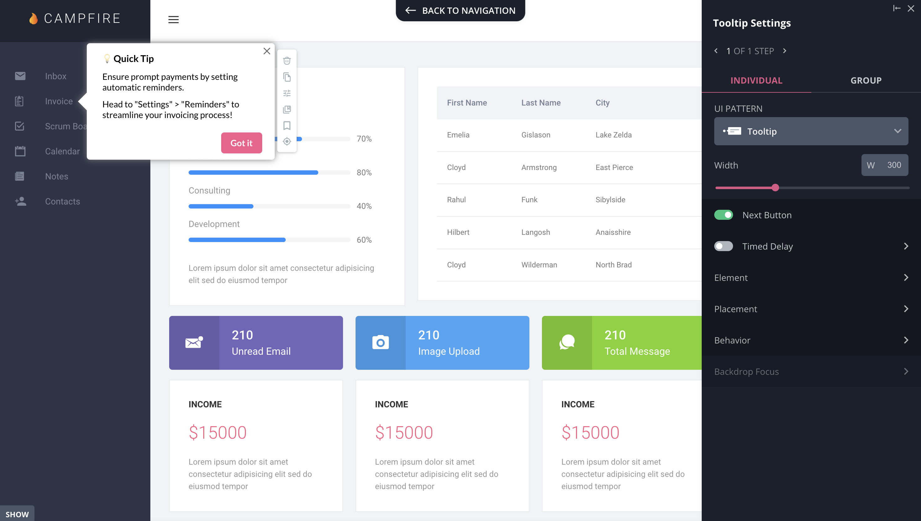
Tooltip created with Userpilot.
Announce new features
Notifications are great for announcing new feature launches and product updates. They capture the user’s attention right away, showcase the feature benefits, and drive engagement.
Usually, for important announcements, UX designers create the notification on a modal, which is a large attention-grabbing UI element that covers the screen and forces the user to interact with it in order to move forward.
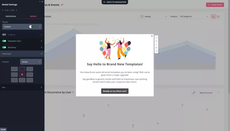
Modal announcement.
Drive account expansion
Notifications are widely used to remind users of their trial ending, and at the same time, encourage them to upgrade their account and retain them.
A simple slideout works fine for this. You can go even further, and add a short survey to collect user feedback and make sense of their experience.

Collect user feedback
Trigger notifications based on user actions and automate customer feedback collection after important user actions.
Keep questions simple and straightforward. Combine multiple-choice and open-ended questions to allow more room for users to drop comments.
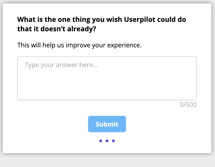
Create user feedback surveys code-free with Userpilot.
Celebrate customer success
Use notifications as part of your gamification strategy to acknowledge and celebrate customer success.
This simple gesture will show your users that you care about them and their success and result in an emotional bond with you.
Create gamified notifications with Userpilot.
Notification UX design best practices
How you design your notifications has a big impact on the overall customer experience and perception of your brand. So, it’s important to follow UX design best practices when creating notifications.
Let’s take a look.
Notification UX best practice N1: Trigger notifications contextually
Every notification must be relevant, add value to the user, and help them achieve a goal.
Personalize each notification message to appear at the right time on the user’s journey. For example, during the onboarding experience, use notifications as in-app guides to introduce product features.
To successfully personalize notifications, split users into groups, also called user segments, and create dedicated in-app messages for each segment.
An example of this couldn’t be filtering disengaged users and sending them helpful notifications with the goal of re-engaging in the app.
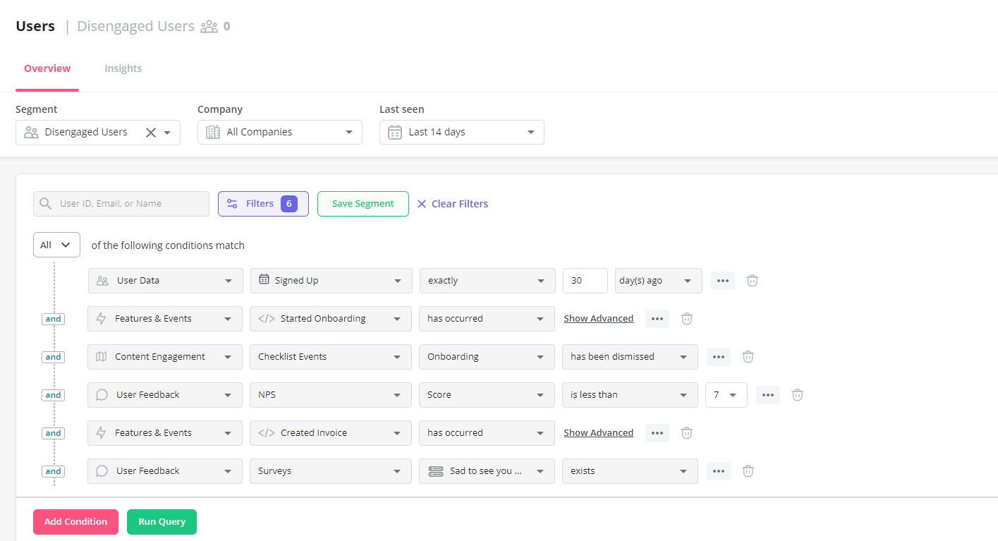
User segmentation in Userpilot.
![]()
Personalize the Notification Experience with Userpilot
Notification UX best practice N2: Always give users a chance to dismiss the notifications
Every time an in-app notification appears, it interrupts the user’s experience and distracts busy users. Not giving the option to dismiss them is only going to frustrate these users.
Let users have more granular control over your app’s notifications. Ensure notifications disappear after users interact with them. Add a visible “X” for users to dismiss it quickly, or take inspiration from Basecamp.
Basecamp gives users the flexibility to set their notification preferences. You can choose to receive notifications on specific days and hours, and turn off all, or at least some, of the notifications.

Notification UX best practice N3: Localize notifications for better user engagement
Localization is the process of adapting a product and messaging to the culture, location, and language of users in a target market.
This way, the product, and notifications are more relevant to users, which increases engagement.
Here’s an example of a tooltip automatically translated into German with Userpilot.

Notification UX best practice N4: Don’t clutter the UI with too many notifications
Over-cluttered UI results in a poor user experience and confuses users as to where to focus, making it hard for them to engage with your product. Users will either ignore your message, leave negative feedback, or worse, churn.
Here’s an example of a notification overload from Storychief. While using the app, they trigger a modal for educational purposes and an NPS survey to rate the app simultaneously.

Now, this is quite contradictory; a user who’s eligible to rate their experience on the app would surely not need “educational content” to get started, right?
You can declutter your UI by creating a notification center. Simply put, a notification center is where all recent activities and updates are stored on your app. It helps keep notifications organized and grants easy access to them.
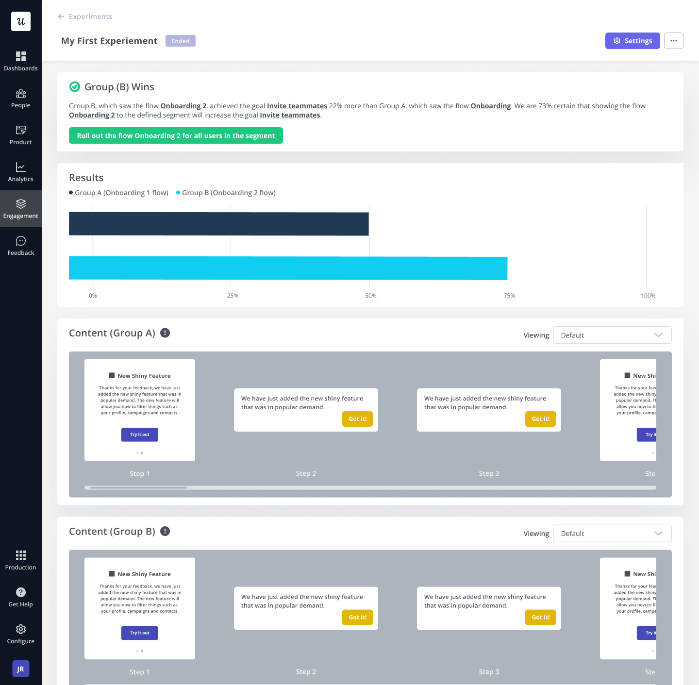
Notification UX best practice N5: A/B test your flows and find the notification UX that works best for your product
With notifications, there’s no one size fits all. Every product is different and will respond uniquely to different notification types. So, you need to A/B test various notifications to see which one works best.
Create multiple notifications UX and test them to see how they affect the user experience and product conversion. Test the notification design, frequency of display, positioning, etc.
Split-test multiple versions on different user segments and observe which one drives more activity than others. When you find what works for your users, keep optimizing it.
Conclusion
Notifications greatly impact the user experience; they refocus the user’s attention on the app and provide a sense of urgency to take quick action. If properly implemented, they can become a valuable asset for building customer engagement.
With Userpilot, you can get hold of creating a better notification experience without the stress of coding. Get your free Userpilot demo today to get started!
![]()
Try Userpilot and Take Your Product Experience to the Next Level

