13 Pricing Page Best Practices to Boost Conversion Rates [+ Examples]
![13 Pricing Page Best Practices to Boost Conversion Rates [+ Examples] cover](https://blog-static.userpilot.com/blog/wp-content/uploads/2023/10/13-pricing-page-best-practices-to-boost-conversion-rates_9ed114f23646294070e20201d7e512e5_2000.png)
When it comes to product-led growth, every step of the customer journey needs to be highly optimized for SaaS companies to see the results they’re looking for. Pricing page best practices are particularly important since complicated pricing drives away leads that would otherwise contact sales.
In this guide, we’re going to go over 13 best practices for designing a pricing page that converts!
TL;DR
- The SaaS pricing page helps customers understand your offer, shows them the information they need before buying, and heavily influences overall conversion rates.
- Pricing pages should always be clear and transparent to avoid confusing or misleading potential customers.
- Shopify only offers three plans (each targeted at a different user persona) to avoid causing analysis paralysis.
- Zoom prominently displays their recommended or highlighted product plans to help prospects make their purchase decision.
- Hotjar offers annual discounts to garner longer-term commitments from new customers.
- Mailchimp has a comparison table on its pricing page to help visitors compare plans.
- Mixpanel has sticky headers that always display the name and cost of pricing plans no matter how far down the pricing page a visitor scrolls.
- Kissmetrics lets prospects customize their subscription based on their specific needs.
- Baremetrics has a pricing calculator that automatically updates the cost of each plan as visitors adjust the MRR slider.
- Loom uses size, color, and placement to make its CTA buttons stand out against the rest of the pricing page.
- Asana has a live chat widget on its pricing page to ensure that users get answers to any questions/objections in real time.
- Canva has an FAQ section on its pricing page to proactively address common questions.
- Userpilot displays its awards on the pricing page to send trust signals to prospects.
- HubSpot uses customer testimonials to acquire leads through social proof.
- Combining two or more of the practices outlined in this guide will produce the best results (and highest conversion rates).
- Not all the tactics in this guide will be the right fit for your target audience and user base pay attention to how your leads or customers respond to each change.
- Want to go product-led and increase your trial conversion rate? Book a demo to see how Userpilot helps!
Why is pricing page design important?
A well-designed pricing page will have a bigger impact than most people realize since it can:
- Impact conversion rates (positively or negatively)
- Help potential customers understand your offerings
- Quickly show visitors the information they need to make a purchase decision
13 Best practices for designing high-converting pricing pages
Building a high-covnerting pricing page is no easy task but the good news is that it’s as much a science as an art. This means that you’ll be able to apply existing best practices during the pricing page design process.
Without further ado, let’s go into the 13 practices that will help you build the best pricing pages possible!
Present fewer pricing plans
Offering too many choices will overwhelm customers and put them into a state of analysis paralysis.
This paradox of choice makes it harder to actually make a decision. Even if particularly confident users do make a decision, they’re less likely to feel satisfied with it because they’ll always be wondering if they chose the right option.
Instead, have a transparent pricing structure that’s based on clear models like how many team members there are or which features can be used. You can even target different buyer personas with each plan to ensure that your pricing page stays simple without alienating any prospects.
Take Shopify for example:

Why it works
Shopify’s pricing page works because it:
- Only has three plans (each one clearly targeting different buyer personas)
- Prices each tier based on the number of staff accounts and level of reporting capabilities
- Gives its users (e-commerce business owners) a cost-effective option for each growth stage
Highlight your best pricing options
Highlighting specific plans on your pricing page will draw attention to the offers that provide the most value or generate the most revenue. This simplifies the decision-making process for potential customers by showcasing the options that you’d recommend.
Take Zoom for example:

Why it works
Zoom’s pricing page works because it:
- Highlights the plan with the best value to avoid analysis paralysis
- Leaves a small gap between the two publicly-priced plans
- Redirects leads to the sales team for higher-ticket closes
Offer a discount for annual payment
Offering a discount for customers who agree to pay annually reduces churn by incentivizing long-term commitments. While annual plans aren’t an excuse to create a poor product experience, they can keep users from leaving due to more minor bugs or inconveniences (giving you time to fix the issue).
Discounts also motivate customers to finalize their purchases because they feel like they’re getting a good deal. If you want to add some urgency into the mix, then you could structure annual discounts as limited-time offers or only offer them to users who are currently lingering on the free plan.
Take Hotjar for example:

Why it works
Hotjar’s pricing page works because it:
- Highlights the price difference on both the CTA button and pricing page columns
- Tells prospects exactly how much they’ll save by paying annually (20%)
- Represents the discount as both a percentage and dollar value
Show clear pricing tiers without hidden fees
The worst pricing page examples are those that lack transparency and bait users in with a cheaper plan’s price before battering them with hidden fees. Your pricing pages should be as clear as possible to remove any conversion barriers.
Avoiding any hidden fees and clearly communicating the total cost on your pricing pages will also protect you from customer frustration or backlash (usually in the form of negative G2 reviews). Lastly, transparent pricing pages make it easier for customers to understand the value they’re getting.
Take Userpilot (hey, that’s us) for example: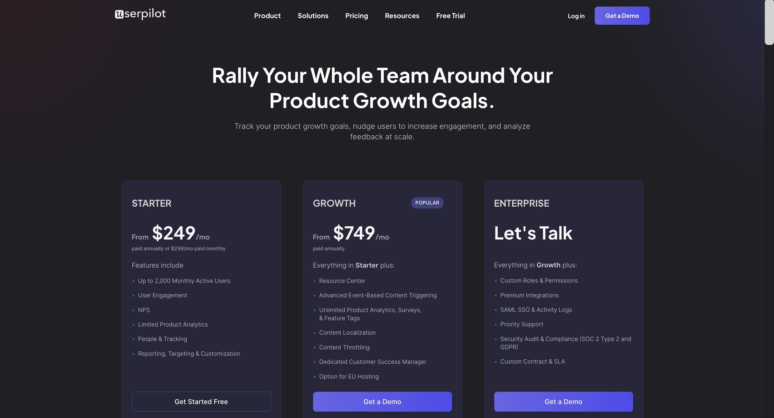
Why it works
Userpilot’s pricing page works because it:
- Clearly lists the different features that are included with each plan
- Gives prospects the ability to customize plans based on their specific needs
- Doesn’t hide any hidden fees, surcharges, or price increases upon subscription renewal
Include a pricing table for plan comparison
Comparison tables are arguably the most important part of a pricing page because they showcase the value of each tier relative to one another. This simplifies the comparison process since visitors can quickly compare usage limits or see which plans include a specific feature.
Take Mailchimp for example:

Why it works
Mailchimp’s pricing page works because it:
- Visually represents the feature availability across every plan being offered
- Utilizes usage limits like monthly email sends and user seats to represent the value difference
- Highlights features that are available on all plans (such as the landing page builder and 300+ integrations)
Note: Mailchimp also uses price anchoring by displaying its most expensive packages first to make the other price plans seem cheap in comparison.
Use sticky headers for pricing tiers
There’s nothing more annoying than finally deciding which plan you want, only to have to scroll back up the pricing page to figure out which pricing tier you’re looking at. Adding sticky headers will make the pricing tier order clearly visible for users even as they scroll down to the comparison table.
This improves the user experience and helps them compare each pricing plan without getting confused.
Take Mixpanel for example:

Why it works
Mixpanel’s pricing page works because it:
- Has sticky headers so prospects can see which plan they’re looking at as they scroll down
- Includes the monthly cost of each plan in the sticky headers to streamline cost comparison
- Uses both colors and symbols to denote which features are included (for maximum accessibility)
Offer customization options based on specific needs
The most successful pricing pages come from SaaS companies that let prospects adjust plans based on their needs. This is a far better alternative to creating a dozen plans for each buyer persona and confusing every visitor that lands on your site.
Customization options could let prospects set the price (through a slider) based on their predicted usage or offer a pay-as-you-go pricing strategy that reduces the barrier to entry. Those on a usage-based pricing model will organically upgrade their subscription as their needs expand.
Take Kissmetrics for example:

Why it works
Kissmetric’s pricing page works because it:
- Offers monthly, yearly, and pay-as-you-go options to maximize flexibility
- Has a sliding scale with a brightly-colored button to draw the attention of visitors
- Makes the pay-as-you-go plan look attractive by highlighting the exceedingly low cost per event
Include a pricing calculator for customers to estimate cost
Letting potential users calculate the cost of each plan based on their requirements and use cases will help them find the best pricing option on their own. This enables a self-serve decision-making process that removes conversion barriers and reduces the need for sales representatives.
Take Baremetrics for example:

Why it works
Baremetrics’ pricing page works because it:
- Each plan’s price is automatically calculated and updated as you adjust the MRR
- Doesn’t require any text input or manual calculation to figure out the total cost
- Has an ROI money-back guarantee that reduces risk for customers
Highlight the CTA to attract clicks
An eye-catching CTA with compelling microcopy will encourage leads to take the next step (either signing up for a free trial, getting a freemium plan, or making their first purchase). The more prominent — whether in size, color, or placement — the CTA button is, the higher conversion rates will be.
Take Loom for example:

Why it works
Loom’s pricing page works because it:
- Uses purple CTA buttons that stand out against the black-and-white page layout
- Has different CTA microscopy for each plan (free, free trial, and enterprise sales)
- Utilizes lighting and depth to make the Business plan the most obvious choice
Include a live chat on your own pricing page
Having a live chat on your pricing page will ensure that leads are able to get real-time support and immediate answers to any questions/objections they may have. This will increase conversions, guide customers to the right choice, and help you identify recurring objections for future reference.
Take Asana for example:

Why it works
Asana’s pricing page works because it:
- Automatically has a help message popup as visitors browse the pricing page
- Uses a bright orange button to separate the widget from the pricing information
- Opens the conversation with a relevant question (in this case, the size of the company)
Build a FAQ section for your pricing landing page
Having a pricing page section that answers frequently asked questions (FAQs) can help proactively address recurring questions or objections. This will reduce friction, offer additional context on different features without cluttering your comparison table, and give prospects all the data they need to decide.
Take Canva for example:

Why it works
Canva’s pricing FAQs work because they:
- Eliminate any cost-related concerns by stating that Canva is free, forever, for everyone
- Tie in the price plan to their FAQ answers to guide prospects towards converting
- Address the objections of each buyer persona, company role, and/or use case
Display trust signals and badges
Showcasing industry awards, certifications, and other trust signals can alleviate any fears that hesitant buyers may have. These are just a few examples of trust signals that can assure customers of your pristine track record and ongoing commitment to quality.
Take Userpilot’s social proof badges for example:

Why it works
Userpilot’s social proof works because it:
- Displays badges awarded by a trusted product review platform that customers are familiar with
- Validates the award through a customer testimonial to further reinforce trust
- Specifically states which award was given and in which year it was awarded
Include your customer testimonials or social proof
You don’t need awards to make your pricing page trustworthy. Trust and credibility can also be built by leveraging authentic feedback from your most satisfied customers. Displaying quotes from real-world users who have received value from your product will encourage others to try it out for themselves.
Take HubSpot’s customer testimonials for example:

Why it works
HubSpot’s social proof works because it:
- Displays the name of the company so that prospects can fact-check each testimonial
- Focuses on the impact of each success story (e.g. more leads or higher sales efficiency)
- Specifies the country, industry, and company size along with the relevant growth metrics
Conclusion
Most pricing pages fall short of the crucial job they’re tasked with. However, the tried-and-tested strategies for a high-converting pricing page above can shift user behavior to make them more likely to sign up (whether for a paid plan or free trial option).
While it may take some time to implement these improvements on your pricing page, the conversion benefits will pay off for years to come. If you want to ensure that all the customers you acquire stay on your software platform, then it’s time to get your free Userpilot demo today!

