What is a Heatmap and Why It’s a Game-Changer for Data Visualization
A heatmap is a vibrant data visualization tool that showcases variations in values through a spectrum of colors, making it easier to visualize data and interpret complex datasets by highlighting areas of intensity or interest – like spotting user engagement zones on a website. As you dive into this article, discover “what is a heatmap”, how heatmaps work, their applications, and why they’ve become indispensable in data analysis and website optimization.
TL;DR
- Heatmaps are visual tools that use color gradients to represent data, helping to identify user engagement hotspots and guiding interface optimization for websites and applications.
- They are particularly useful in SaaS products for enhancing user experience, boosting feature adoption, and increasing conversion rates by providing insights into user interaction patterns.
- Different types of heatmaps, including scroll maps, click maps and mouse-tracking or eye-tracking heatmaps, offer unique data analysis perspectives for a better understanding of user behavior on web pages and applications.
Try Userpilot and Take Your User Experience to the Next Level

What is a heatmap and how does it visualize data?
Fundamentally, a heatmap serves as an instrument for data visualization that uses various shades of color to denote different levels of values. A heatmap is essentially a graphical representation of data where values are depicted by color, offering an intuitive means to understand complex datasets at a glance.
By employing gradients and hues, heatmaps effectively surpass challenges in comprehending data by illustrating the degrees of activity or interactions contained within the information set. Imagine a heatmap akin to an infrared image that showcases areas with intense user engagement on your digital platform.
In this context, deeper colors signify greater intensities of user interaction, providing instant visual indicators that pinpoint where users are directing the most attention.
The basics of heatmaps
A successful heatmap utilizes a carefully selected spectrum of colors to make data easy to comprehend. Lighter shades convey lesser amounts while darker hues suggest greater amounts, forming an easily understood gradient that quickly conveys information. Legends are included with heatmaps so that users can precisely decode the relationship between color and value.
By adding annotations, one can augment the clarity of the story told by the data, which offers precise numbers and pertinent details from sources encompassing both quantitative and qualitative data.
Applications of heatmaps
Heatmaps are utilized in a wide array of fields, from analyzing website user behavior to examining how products are used. These tools are crucial within the digital space for pinpointing specific areas on a web page that draw user attention and those that remain overlooked. Heatmaps help in visualizing ‘data points’ to understand user behavior on web pages, offering insights into how users interact with different elements.
For teams responsible for product development, heatmaps act as an evaluation visual instrument. They illustrate levels of user engagement using various color schemes, which provides direction for refining both interface designs and enhancing product features.
The power of heatmaps in SaaS products
In the SaaS ecosystem, where user experience takes precedence, heatmaps prove to be invaluable tools. They transform complex data on how users interact with a product into clear and actionable insights by visualizing clicks, scrolling behavior, and mouse movements. This allows UX teams to improve product design and functionality through an approach grounded in hard evidence.
Heatmaps have become more than mere visual supports. They are now key strategic assets that significantly improve every stage of the user journey.
Enhancing user experience
Heatmaps serve as more than mere monitoring instruments. They reveal patterns of user navigation and shed light on the ways in which users interact with various components within a SaaS product’s interface. These insights are invaluable for product managers who aim to refine page structure and boost the prominence of elements, consequently elevating the user experience.
The detailed nature of heatmap data, particularly when derived from sophisticated AI-generated heatmaps, is adept at identifying unforeseen clicks or engagements with interactive content by users. Such information offers a guide for improvements in usability.
Boosting feature adoption
The adoption of product features is crucial for the success of SaaS offerings. Heatmaps serve as a valuable tool that enables product teams to monitor and understand how users engage with different features. They highlight which parts of a web page are receiving the most interaction from users, assisting teams in making informed decisions aimed at improving visibility and increasing engagement with features that are not being used to their fullest potential.
Specifically, heatmaps generated by artificial intelligence provide anticipatory knowledge about where users might interact on a webpage, thus enhancing the process of feature refinement even further.
Increasing conversion rates
Heatmaps serve as performance enhancers for a SaaS business by capturing and visualizing patterns in user behavior. These tools are crucial for identifying the optimal locations to place key conversion elements like sign-up forms and call-to-action buttons, as they reveal areas of high user engagement. Heatmaps help uncover obstacles to conversion by highlighting regions of low activity, offering chances to improve design and positioning with the aim of increasing overall conversion rates.
Types of heatmaps: Uncovering the layers of user behavior
Delving into the realm of user behavior, we uncover a range of heatmap variations that shed light on different aspects of how users interact with web pages and applications. Tools such as scroll maps, click maps, and attention heatmaps provide distinct insights into the complex behaviors by which users engage.
The employment of these tools through data analysis offers rich visual representations that expose hidden patterns and preferences within user interactions—insights critical for understanding engagement on websites and apps.
Feature heatmaps
Feature heatmaps serve as specialized instruments for SaaS products, meticulously monitoring user engagements with distinct functionalities. These tools highlight regions of intense activity and engagement by revealing the frequency of clicks on advertisements, links, and calls-to-action.
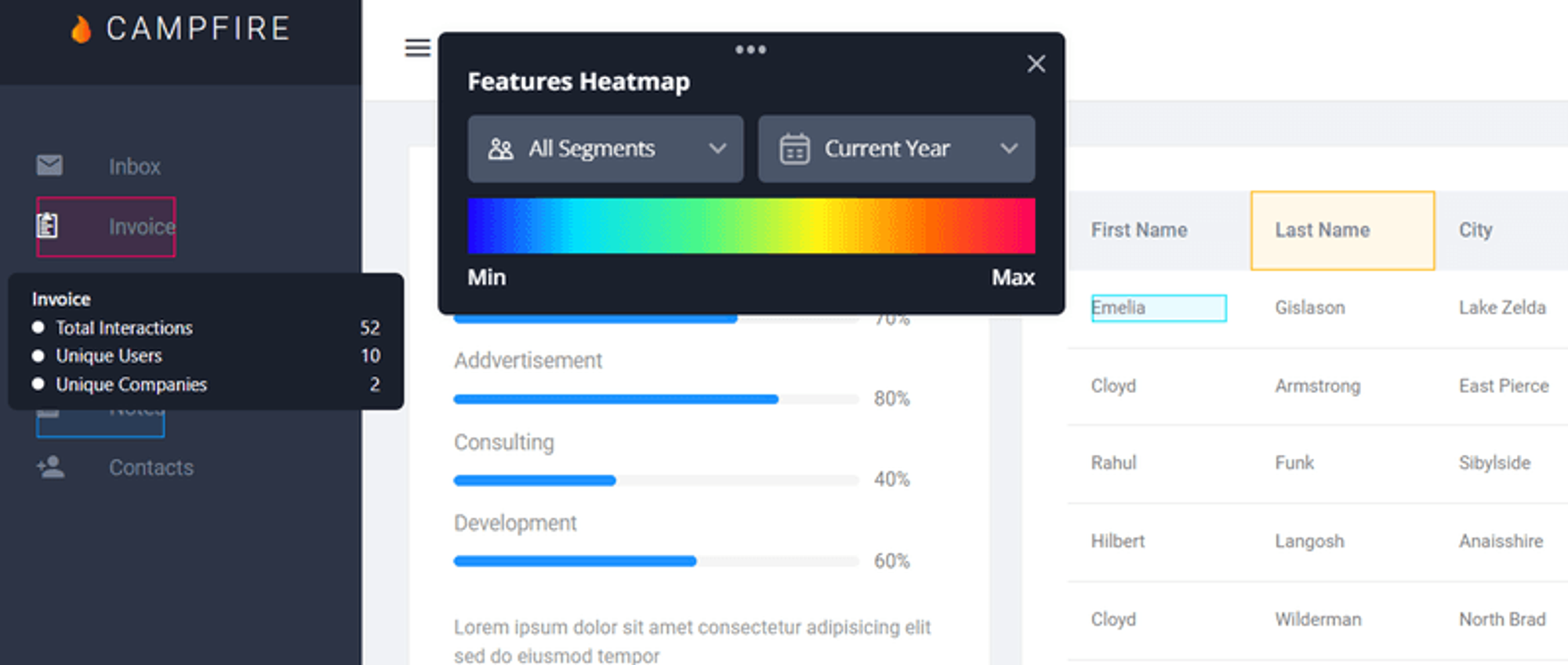
Such data is crucial in grasping the performance level of various elements within a web page. This intelligence aids in refining product features and enhancements to ensure they resonate with user behaviors and anticipations.
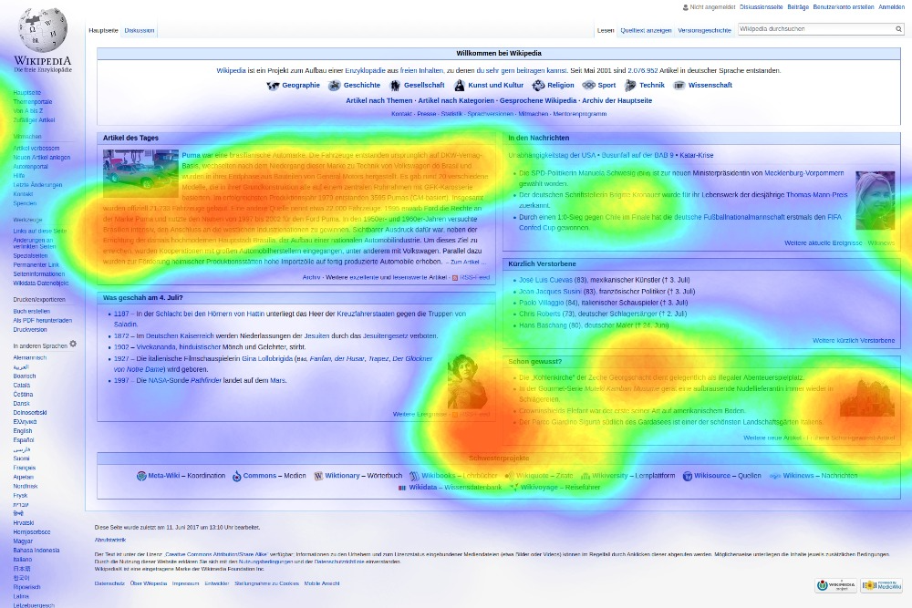
Scroll heatmaps
Heatmaps, commonly referred to as scroll heatmaps, provide a visual representation that demonstrates the extent of user engagement with various sections of a webpage as they scroll, visualizing how deep users scroll on a page.
By showcasing what percentage of users interact with specific areas on a page, these tools are essential for pinpointing the content that captures the most attention and strategically positioning vital elements to minimize user drop-offs.
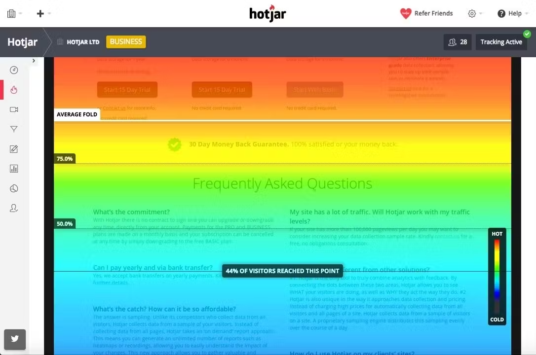
These heatmaps expose differences in how users behave depending on their device types by accounting for variations like screen size which can alter how content is seen and engaged with by users.
Click heatmaps
Click heatmaps serve as investigative tools in the realm of heatmaps, exposing which components on a webpage are clicked most often. They aid in enhancing both the location and style of elements that rely on user interaction by showing where users focus their attention and where they engage with the site most.
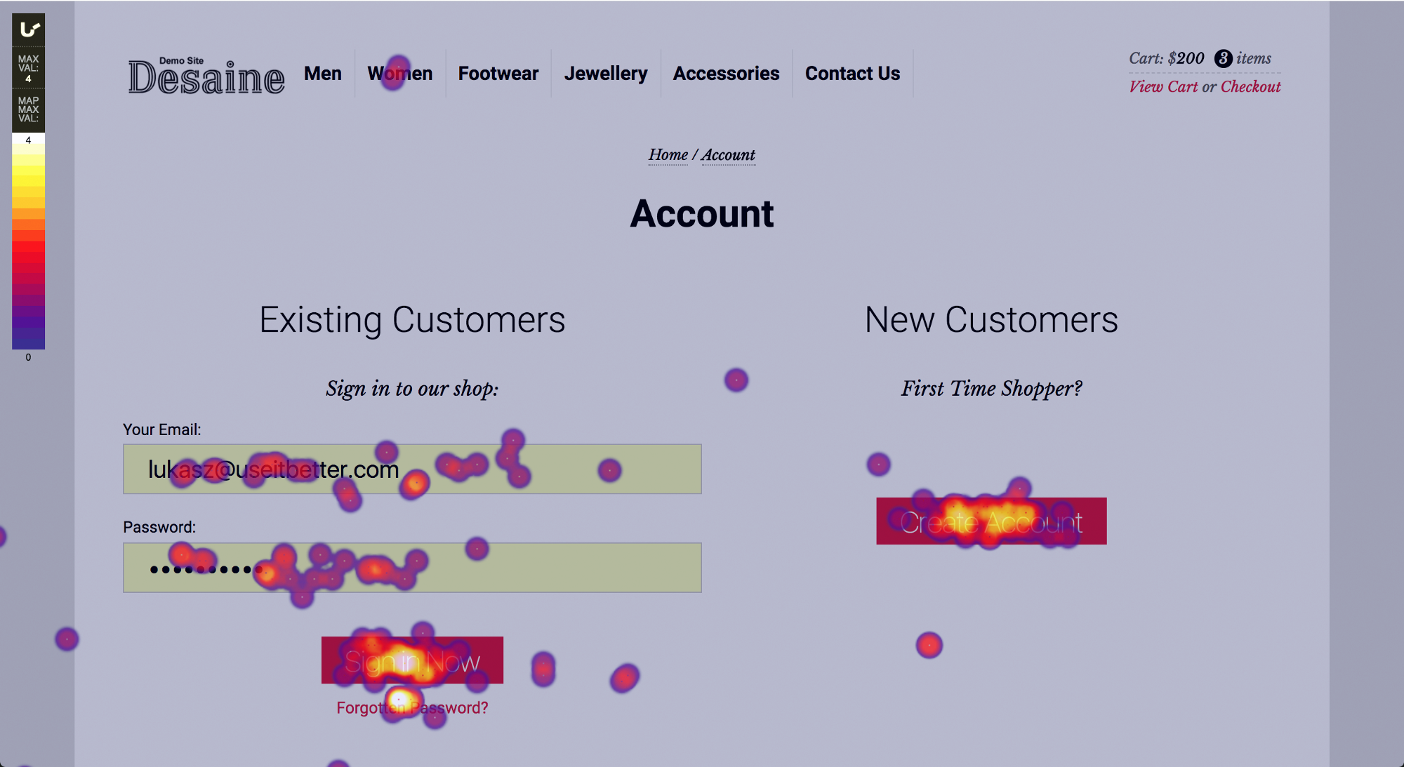
Through utilizing click heatmaps, companies can delve into understanding what features users prefer and what aspects of their website are more popular. This allows them to adjust their website to align precisely with user anticipations.
Mouse tracking and eye-tracking heatmaps
Mouse tracking heatmaps, sometimes called move maps, forecast potential focal points on a webpage by analyzing cursor movement to anticipate where user attention may be drawn. These provide an accessible alternative for numerous businesses due to their ease of implementation compared to the more precise eye-tracking heatmaps.
Eye-tracking heatmaps deliver accurate observations regarding users’ gaze locations on a screen. They necessitate structured experiments that tend to be expensive and require significant time investment. Consequently, mouse tracking serves as a widely adopted substitute when in-depth analysis isn’t feasible or available.
Choosing the right heatmap tool for your needs
Choosing the right heatmap tool hinges on a clear grasp of your data visualization requirements. If you’re looking to enhance user experience, increase conversions, or acquire more insights into customer behavior, it’s essential that the heatmap tool you select matches these goals. You must weigh options from simple visual presentations of data to more sophisticated functionalities such as real-time monitoring and compatibility with additional analytics tools.
Comparing popular heatmap tools
Exploring the optimal heatmap tool can lead to an abundance of choices, each with distinct capabilities tailored to various user groups. Noteworthy heatmap tools comprise:
- Userpilot: Celebrated for its detailed feature heatmaps that delve into the intricacies of how users engage with SaaS offerings.
- Mouseflow: Distinguished by its prowess in session replay and analysis of conversion funnels.
- Smartlook: Stands out for its automated event tracking and identifying instances of frustration clicks.
Employing these instruments will allow you to acquire a critical understanding of how users behave, enabling you to enhance your website or product based on those insights.
Conclusion
As we wrap up our exploration of heatmaps, it’s clear that these tools are more than just pretty color schemes. They are the bridge between data and decisions, providing insights that drive user experience, feature adoption, and conversion improvements. With the right heatmap tool in hand and a strategic approach to data visualization, businesses can turn user interaction data into a wellspring of growth and innovation.
Frequently asked questions
What exactly does a heatmap show?
A heatmap offers a color-coded visual representation of data, which reveals the patterns in user interactions on applications and web pages.
Why are heatmaps important for SaaS products?
Heatmaps play a critical role in SaaS products by providing a visual representation of user interactions, which aids in enhancing the user experience, promoting feature adoption, and refining conversion optimization efforts.
How do different types of heatmaps offer unique insights?
Distinct types of heatmaps, including scroll maps, click maps, and attention heatmaps, provide valuable perspectives on user behavior. They unveil patterns of navigation, areas with high engagement levels, and focus points of users’ attention. Every type presents a specific angle for understanding how users interact with content.
What should be considered when choosing a heatmap tool?
When selecting a heatmap tool, it’s essential to keep in mind your main objectives, the granularity of data you require, whether sophisticated functionalities are necessary for your tasks, the price point that fits within your budget, and how well it aligns with both your existing technology stack and operational processes.
By carefully evaluating these considerations, you will be positioned to make a knowledgeable choice.
Can heatmaps predict user behavior?
AI-generated heatmaps are capable of forecasting user behavior by scrutinizing past engagement data, thus offering predictions about potential future interactions.
![]()
Try Userpilot and Take Your User Experience to the Next Level

