Analytics Dashboard: How To Build It To Improve Product Growth (+ 7 Examples)

Data analytics dashboards help you visualize user behavior so you can make informed decisions for improving product engagement.
In this article, you’ll learn:
- What is a data analytics dashboard and why do you need it?
- What metrics to track in your dashboard?
- Step-by-step process to build an analytics dashboard.
TL;DR
- An analytics dashboard visually displays important metrics for your product, campaigns, or business, all in one place.
- You need an analytics dashboard to track business performance, enable cross-team collaboration, and act on real-time data.
- From CEOs to product managers and marketing executives, many user types can benefit from data dashboards.
- Three types of metrics you should track with product dashboards are product usage metrics, customer loyalty metrics, and customer funnel metrics.
- Explore seven data dashboard examples in this article to help inspire you, from a website analytics dashboard to NPS performance.
- To build your analytics dashboard, first decide your goal for analyzing data, shortlist the metrics and reports you need, and finally build your custom dashboard with a product analytics tool to save time and ensure data accuracy.
- Userpilot, Mixpanel, and Google Analytics are some popular product analytics tools that you can explore.
- Userpilot is a product growth platform that comes with ready-made analytics dashboards. Track feature usage, create user segments, and then build custom flows that improve user experience. Book a demo now to explore the product.
![]()
Try Userpilot and Take Your Product Analytics to the Next Level

What is an analytics dashboard?
An analytics dashboard is a data visualization tool that displays all your key metrics and reports in one place. This collection of data helps teams look at the full picture to extract meaningful insights.
An example of an analytics dashboard in Userpilot
Why do you need an analytics dashboard?
There’s often a lot of raw data available to product teams but collecting and analyzing it to drive insights is time consuming. This is where an analytics dashboard comes in.
Here are the benefits of using an analytics dashboard for performance tracking:
- Track overall product performance and see the most important data at a glance, all in one place.
- Share the dashboard with others in your team and enable cross-team collaboration.
- Detect changes in user behavior and act on real-time data.
- Make data-driven product roadmaps and performance projections.
Who can use an analytics dashboard?
From web analytics dashboards to product usage dashboards, there are a lot of actionable insights that people can extract from data analytics. Here are the user types that can benefit the most:
- CEOs and senior management executives: CEOs and C-suite finance executives use dashboards to gain transparent access to product and company performance. This helps them track revenue growth and make business projections.
- Product managers: Product managers rely on product usage analytics to monitor product growth, decide product direction, and make data-driven enhancements.
- Marketing executives: Marketing managers need a marketing and web analytics dashboard that helps them monitor campaign performance. These dashboards feature KPIs such as traffic sources, organic traffic figures, and paid ad performance.
Types of metrics to track with a data analytics dashboard
An analytics dashboard displays relevant data to help you improve product performance (and customer experience). Here are the top three types of product metrics to track with your dashboard.
Product usage metrics
Product usage metrics help product managers see in-app engagement patterns. For example, what features do power users use the most? Or where are users facing friction? Here are few key metrics that you can track.
- Product adoption rate: Track how many new users integrate your product into their everyday lives.
- Time to value: Monitor how long it takes for users to experience value from your product.
- Product stickiness: This metric measures the ratio of daily users versus monthly users to signal product stickiness and how regularly users return to your app.
Customer satisfaction and loyalty metrics
Customer loyalty metrics help you see how loyal your users are. Moreover, you can use satisfaction metrics to identify friction points and improve the overall customer experience.
- Customer retention rate: Tracks how many customers keep using your product in a given period.
- Net Promoter Score (NPS): Measure how likely users are to recommend your product to their friends.
- Customer satisfaction score: Monitor how satisfied your users are when they experience different aspects of your product.
- Customer effort score: This score tracks how easy or difficult it is for customers to complete actions in your product.
Customer funnel metrics
Customer funnel metrics help you measure the effectiveness of your funnel. It sheds light on where drop-offs happen in your user journeys, so you can make improvements to drive growth.
- Cost per acquisition: Track the total cost of gaining a paying customer. This includes marketing and sales costs.
- Customer lifetime value: Monitor how much an average customer spends during their entire journey with your business. For SaaS, this includes all lifetime subscription costs, including add-ons.
- Trial to paid conversion rates: Track how many new users upgrade to paid plans during or after the trial period.
7 Analytics dashboard examples commonly used in SaaS
Here are some of the most common examples of dashboards in SaaS.
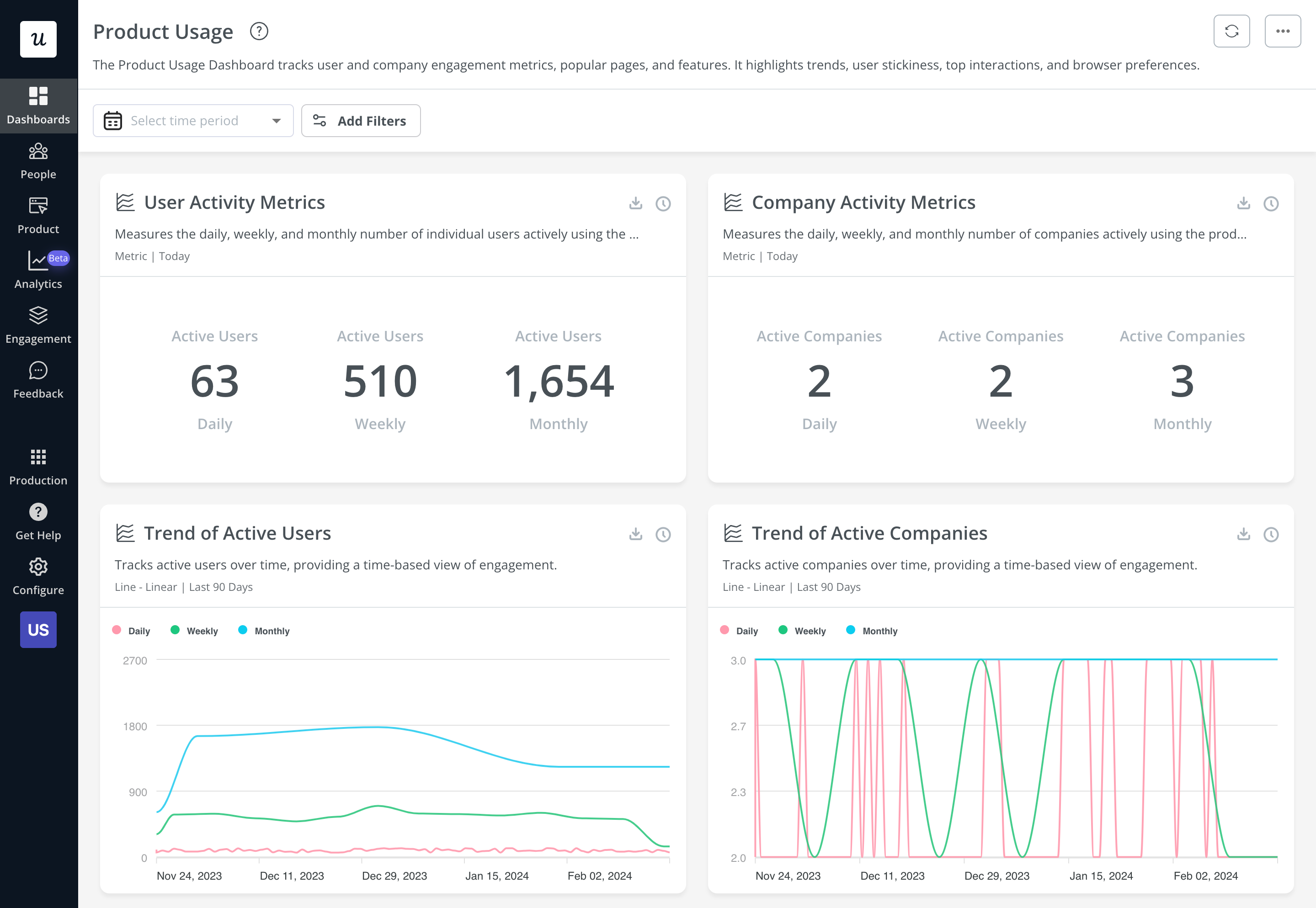
1. Product usage dashboard
Product usage analytics provide insights into how customers utilize your product, aiding in data-driven decision-making that enables businesses to enhance user engagement, conversions, and retention.
By tracking usage metrics across customer segments, you can also identify user preferences for each segment. Userpilot’s analytics dashboard offers detailed user interaction data, allowing users to deliver personalized experiences and enhanced engagement.
A product usage analytics dashboard can help gain the following insights:
- Analyze free trial vs paid user behavior.
- Identify popular features with trend analysis.
- Reveal potential churn triggers by tracking funnel reports.
- Find areas with low event occurrence and fix it with in-app flows.
Product usage dashboard in Userpilot
2. Core feature engagement dashboard
This dashboard tracks usage trends, adoption rate, product stickiness, and retention metrics for your core features. Core features in this context refer to features that drive product activation and power product success.
The main aim of the dashboard is to closely monitor the impact of high-value features and their relationship with your customers so you’re able to improve their impact and fix any roadblocks in the product experience.
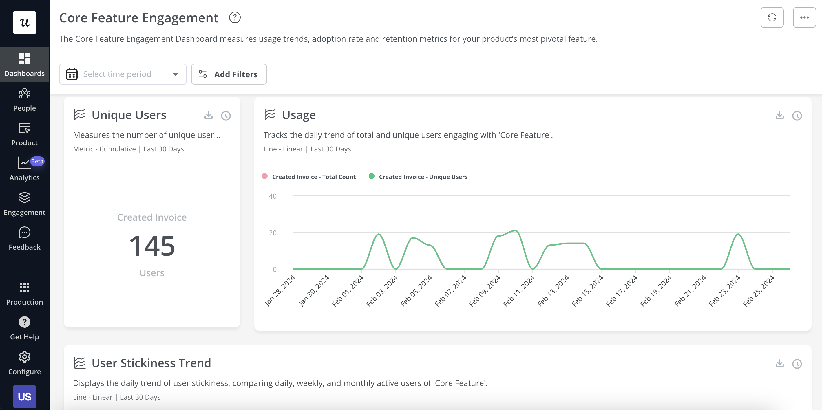
A core feature engagement analytics dashboard in Userpilot
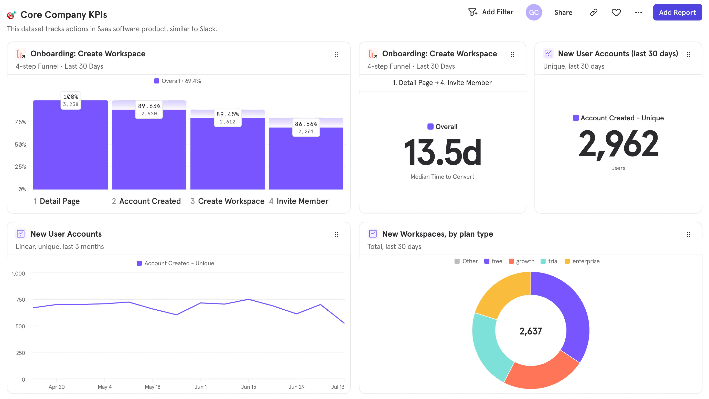
3. New users activation dashboard
This dashboard tracks how well new users are getting activated and reaching the Aha! moment with your product. You can monitor reports related to activation rates, time to value, activation funnels, and trend analysis. These help monitor friction areas and keep a pulse on changing user preferences.
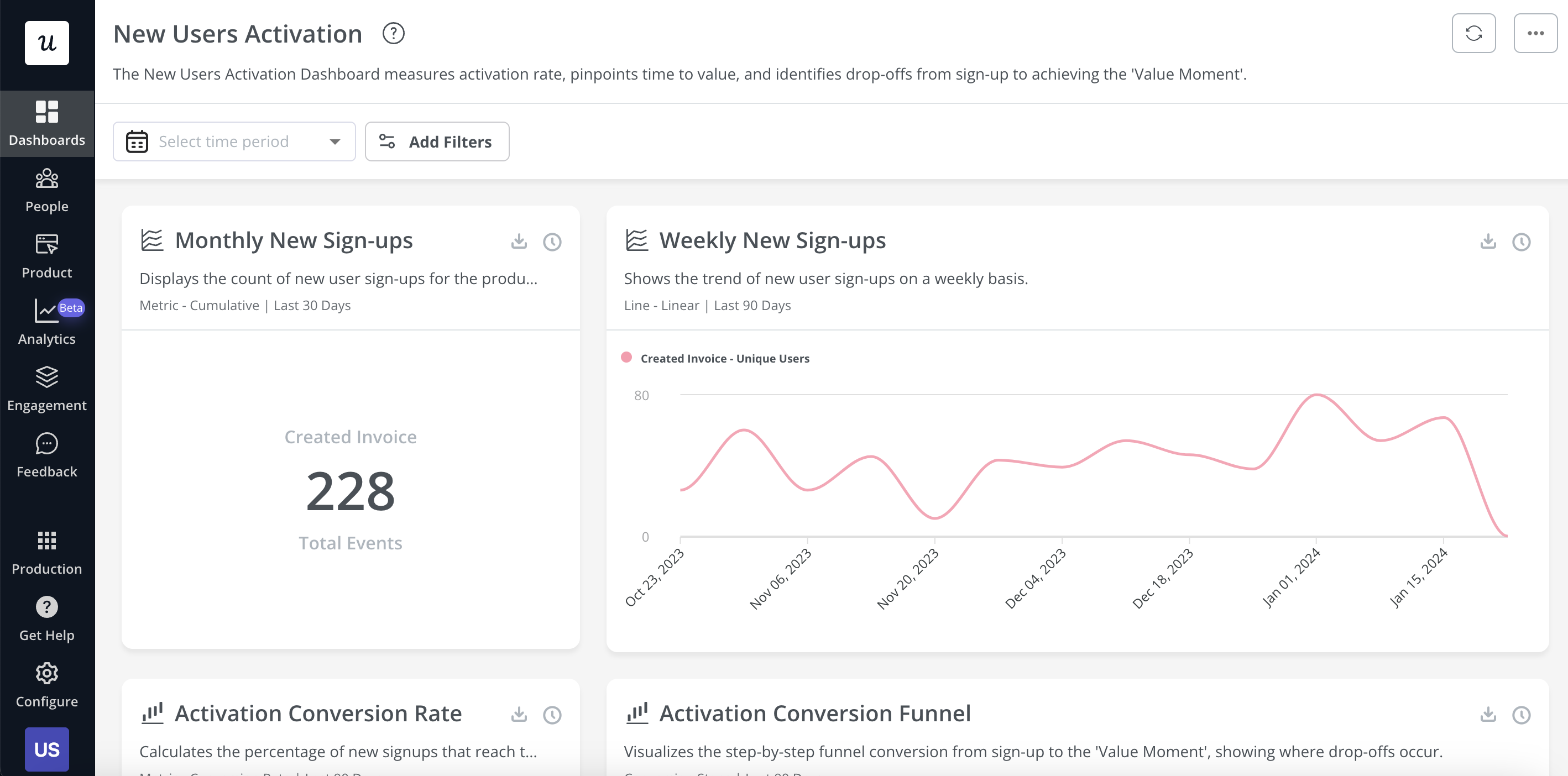
A new user activation dashboard in Userpilot
4. User retention dashboard
As the name suggests, this dashboard is used to track user retention more deeply. You can track changes in retention over daily, weekly, and monthly time periods for all new users and sign ups as well. Examples of reports that you can analyze in this dashboard are retention tables and retention trends.
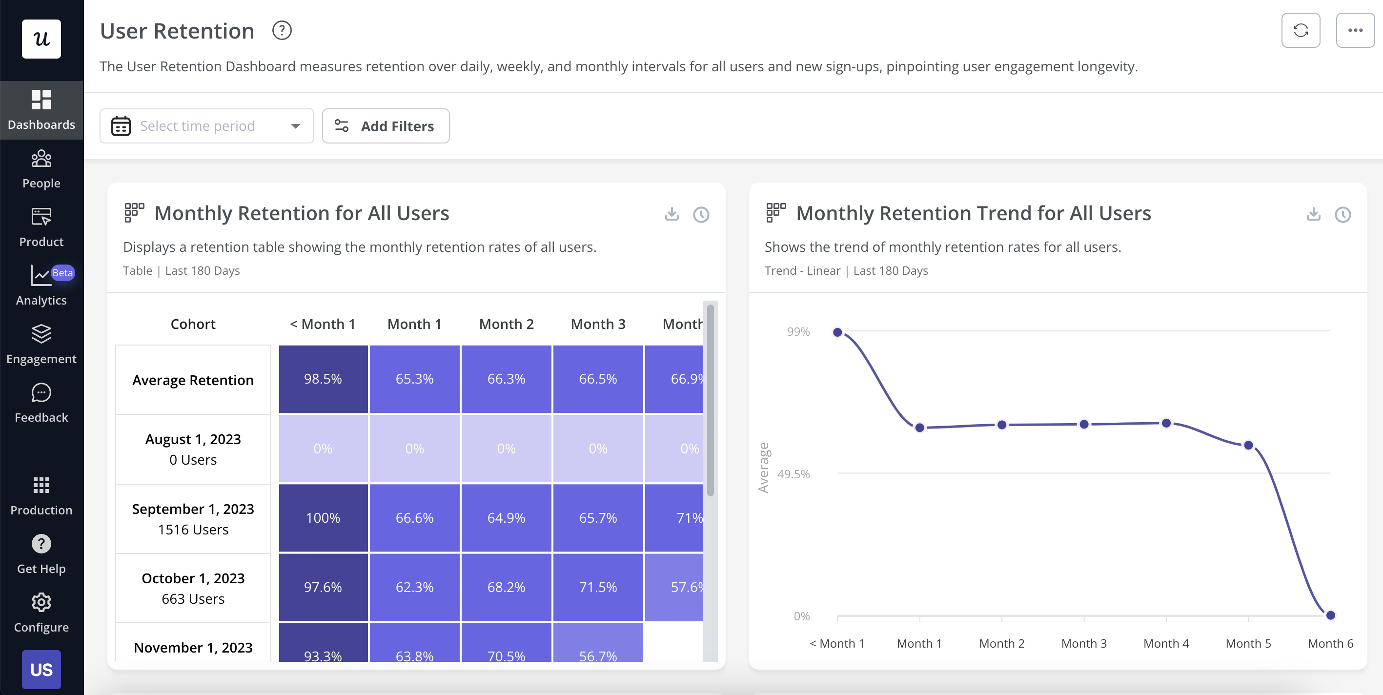
User retention analytics dashboard in Userpilot
5. Features and events dashboard
The features and events dashboard lets you explore feature usage and event engagement metrics in one place. This allows product managers to closely track feature popularity and adoption. You’re able to extract insights such as:
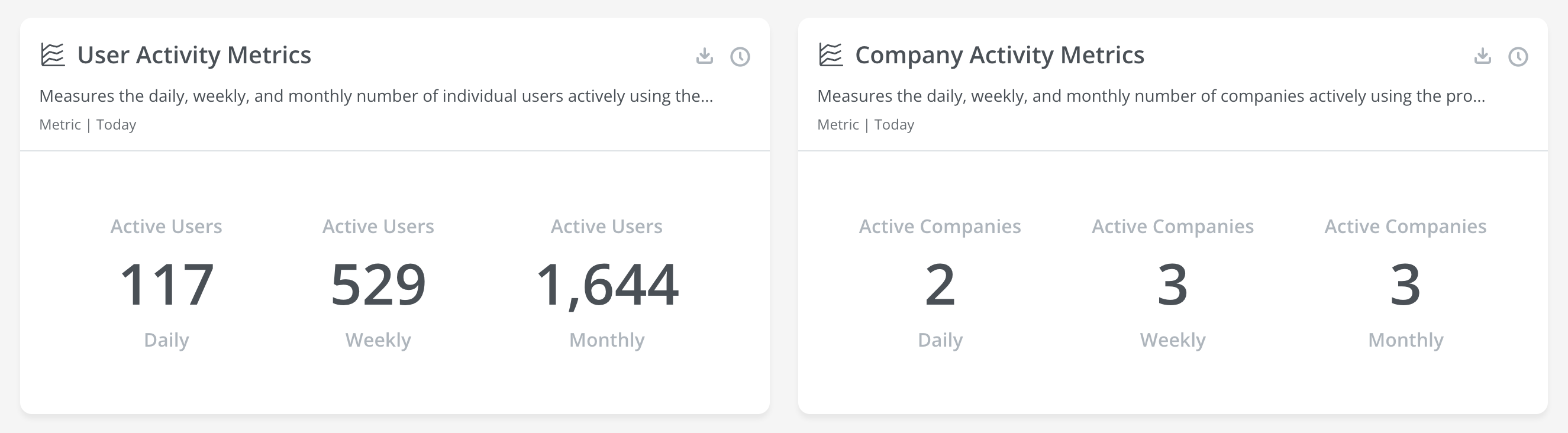
- Active users and companies.
- Most popular features that are driving adoption.
- Changing trends in feature popularity.
- Features that aren’t getting discovered.
- User response to new feature releases.
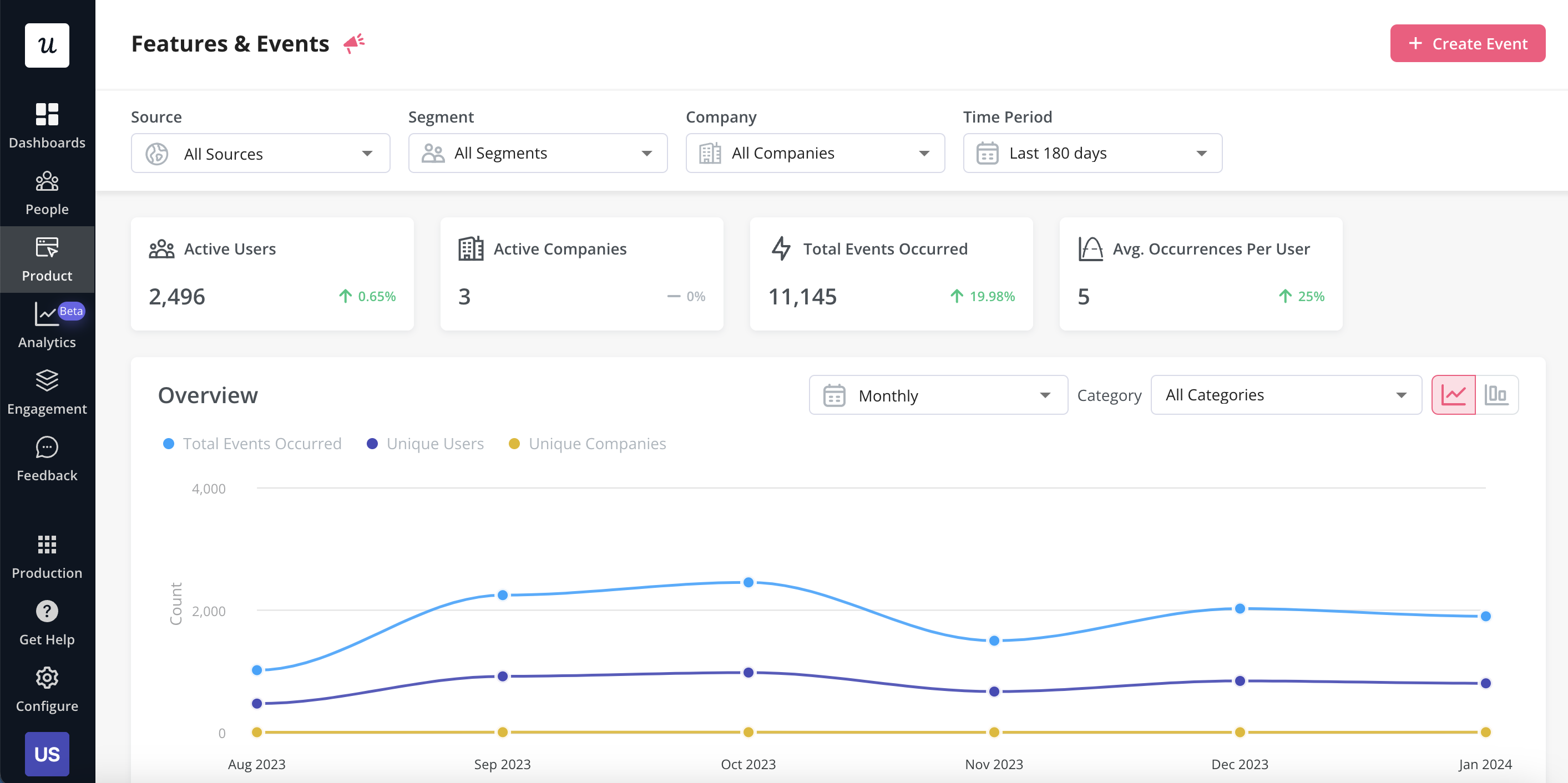
Features and events dashboard in Userpilot
6. Resource center engagement analytics
Many SaaS companies heavily rely on self-service support to enhance the user experience. But exactly how helpful is their resource center?
A resource center analytics dashboard helps answer this question. Product teams can track how user engage with the knowledge base content by tracking metrics such as unique opens and module click rates. This helps understand where the content can be updated and improved, and which product areas are the most popular.
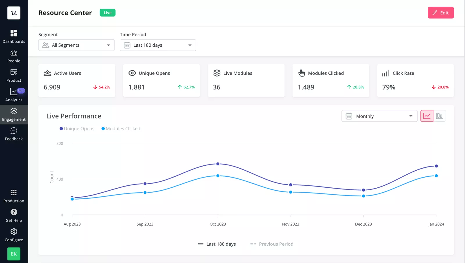
Resource center analytics dashboard in Userpilot
7. Net promoter score analytics dashboard
NPS dashboards allow you to track your overall NPS score along with the percentage of promoters, detractors, and passives. You can also track changes in NPS scores over time or take a closer look at open-ended responses to investigate the reasons behind customer dissatisfaction.
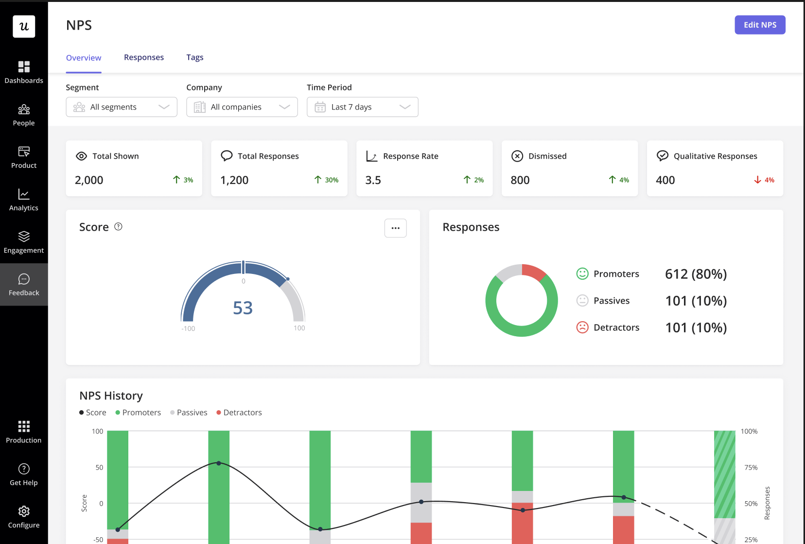
An NPS analytics dashboard in Userpilot
Step-by-step guide to creating an analytics dashboard
Follow this easy four-step process to build your data analytics dashboard.
1. Define the goal behind building your dashboard
Decide who the dashboard is being created for. For example, are you creating a web analytics dashboard or social media dashboard for the marketing team? Or a business analytics dashboard for the product team? This helps understand the needs of the team so you’re able to customize the reports accordingly.
Then, define why you need a dashboard. Does the marketing team need to monitor its marketing efforts and improve conversion rates with a web analytics dashboard? Defining your goal helps offer much-needed direction when building your analytics dashboard.
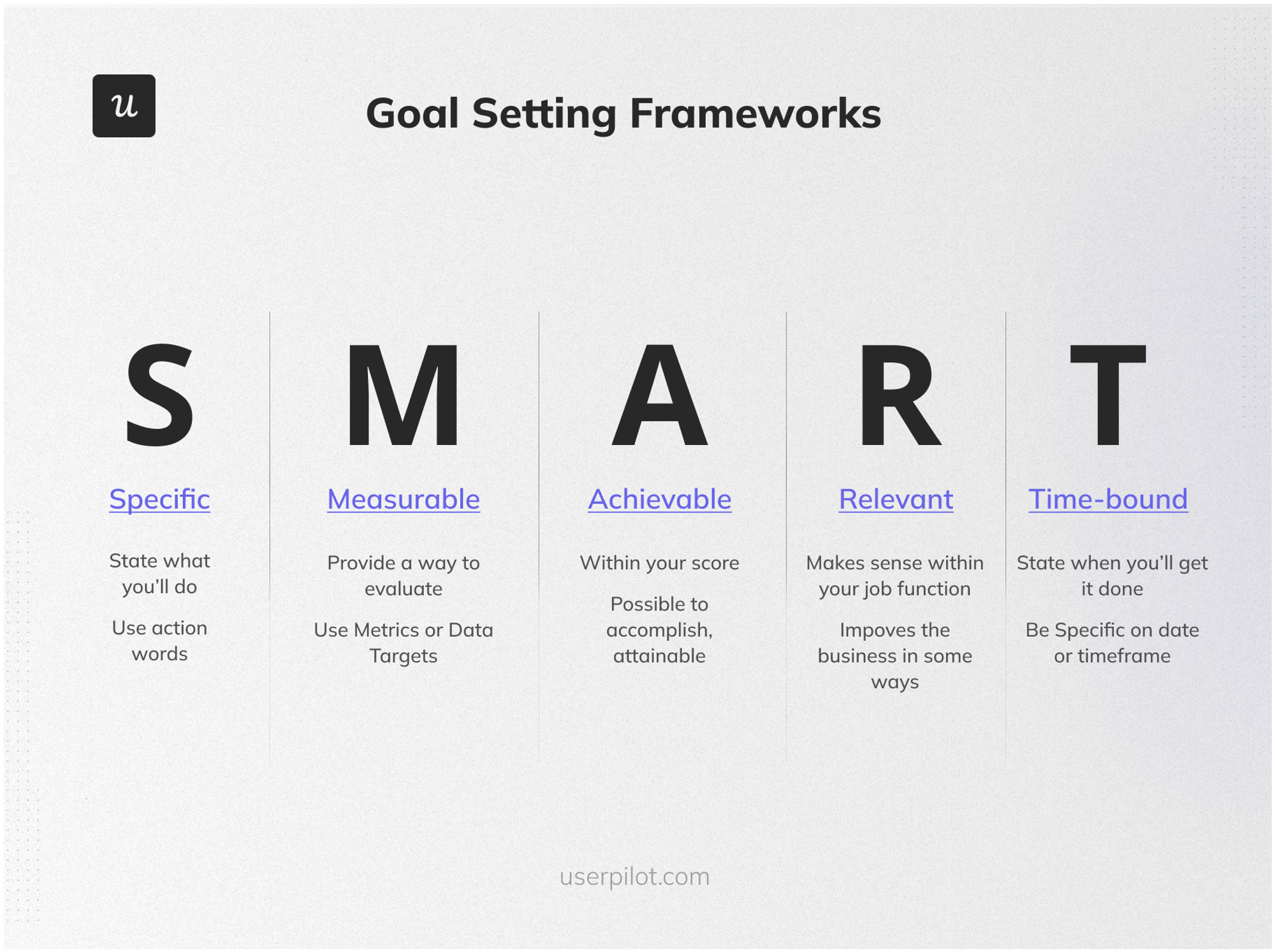
Goal setting framework
2. Shortlist the KPIs and reports you require
Start by creating a list of data points you want to track and include in your dashboard. You’ll also need to choose the reports that your team needs to run an in-depth analysis of their functions.
The KPIs and reports in your dashboard will depend on your teams and their needs. A product team tracking in-app conversions will need to access metrics such as conversion rates and conversion time periods along with reports such as funnel analysis.
Examples of metrics to track
3. Bring all of these together with an analytics tool
Building an entire analytics dashboard from scratch is time-consuming and runs the risk of data inaccuracy.
A product growth and digital adoption tool helps you bring all your pre-existing reports in one place for better data visualization. It makes it faster, easier, and cheaper to drive insights from dashboards and act on the data by improving in-app experiences.
An analytics dashboard example in Userpilot
4. Perform an analytics dashboard analysis
Use your collection of reports and KPIs to track periodic trends and identify shifts in user behavior over time. You will have to repeat this once a week or once a month to stay up-to-date with user behavior data.
Once you’ve analyzed the data, prioritize initiatives that have the greatest potential impact on your growth goals and align with your overall business objectives.
3 tools for creating your analytics dashboards
Here are three of the best analytics platforms for building your analytics dashboards.
1. Userpilot
Userpilot is a product growth platform that comes with ready-made analytics dashboards and in-app experience builders. It allows product teams to monitor product performance, take steps to increase product engagement, and improve retention – all without knowing how to code.
With Userpilot, you can take advantage of the premade dashboards:
- Product usage dashboard
- New users’ activation dashboard
- Core feature engagement dashboard
- User retention dashboard

Types of analytics dashboards available in Userpilot currently
With Userpilot, you can create your analytical dashboards from scratch or use an existing template.
Create custom analytics dashboards with ease.
Achieve the perfect visual presentation with complete control over report placement, resizing, and order. You can also add context, insights, and layout descriptions using our new WYSIWYG text block integration.
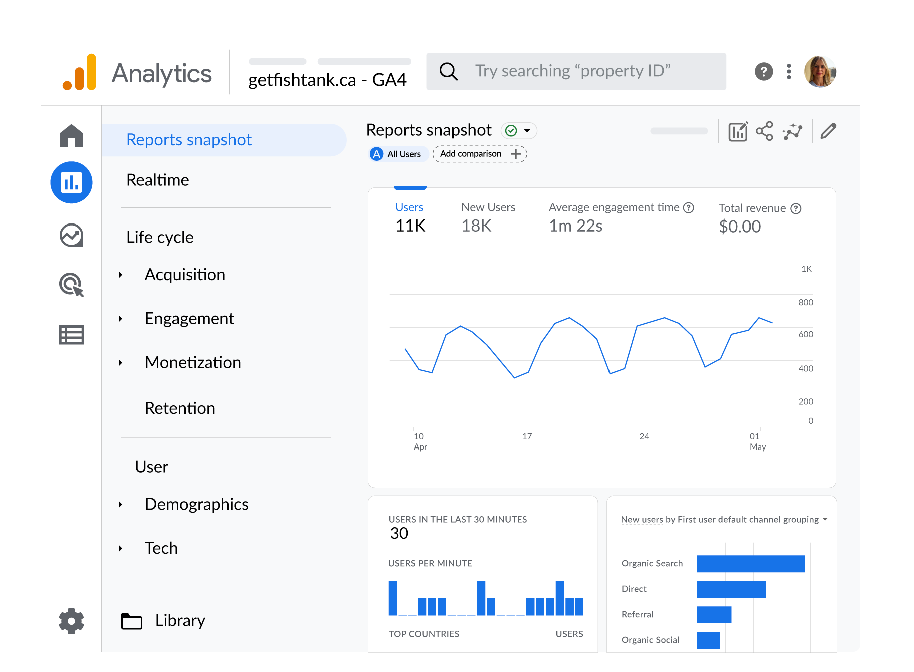
2. Google Analytics
Google Analytics 4 offers a web analytics dashboard that allows users to track website performance and monitor metrics such as website traffic and average session duration.
The website analytics dashboard lets you get a comprehensive understanding of how well your marketing efforts are performing.
Google Analytics 4 also comes with a free version that is very popular amongst SaaS companies for tracking web analytics.
3. Mixpanel
Mixpanel is a website and product analytics software. They have dashboards and reports that showcase key performance indicators like conversion rates, retention rates, and more.
They also have user segmentation features that let you dial in on what’s working and what’s not within specific segments.
Mixpanel integrates with Userpilot. You can use Mixpanel to get a detailed look at your analytics, and then take action on those insights by building product experiences with Userpilot.
Conclusion
All in all, analytics dashboards give you relevant data that helps you make better product decisions. This contributes to higher conversion rates, more sales revenue, and lower operational expenses.
Want to get started with building a product analytics dashboard? Get a Userpilot Demo and see how you can track user behavior and build product experiences, code-free.
![]()
Try Userpilot and Take Your Product Analytics to the Next Level