NPS Dashboard: How Can It Help You Track and Analyze Customer Loyalty?

Wondering how an NPS dashboard can help you track customer loyalty?
While Net Promoter Score (NPS) measures customer satisfaction and loyalty, NPS surveys give you valuable customer feedback that you can analyze to gauge user sentiment about your product. This is where the NPS dashboard comes in.
Let’s see how the dashboard can help you extract insights from NPS responses and improve customer loyalty.
TL;DR
- The Net Promoter Score dashboard gathers all feedback from an NPS survey and uses multiple visualizations to display data.
- An NPS dashboard helps you get an overview of the overall NPS score, track the progress of NPS performance, and discover trends to make informed decisions and improve retention.
- Key NPS data that should be included in the dashboard are weekly/monthly NPS, percentage change in promoters, passives, and detractors, NPS by user segments, and more.
- After receiving the NPS data, product marketers should factor in performance trends, next focus topics, benchmarking, and segmentation.
- Five key NPS visualizations are bar chart, pie chart, line chart, response tag analysis, and word cloud.
- Userpilot lets you create and style your NPS survey, add qualitative follow-up questions to get more context, select when and to whom to trigger the survey, localize content through translations, and view all the reports in one dashboard for further analysis.
- You can also compare your NPS data with data from other analytics dashboards to get a holistic view of customer sentiment and behavior.
- Get a Userpilot demo now to create your own NPS dashboard.
![]()
Try Userpilot and Take Your User Analytics to the Next Level

What is the NPS dashboard?
The NPS dashboard gathers all data from your NPS survey and displays it in various charts. Examples of such charts include NPS trend charts, sentiment analysis charts, NPS score charts, and distribution charts.
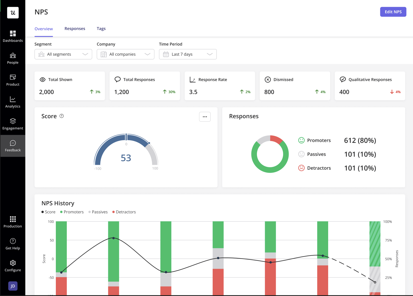
An NPS dashboard example from Userpilot
Why do you need an NPS dashboard?
SaaS business models depend on repeat subscriptions, making it crucial for companies to retain as many customers as possible. One of the most effective ways to retain customers is to understand their perception of your product’s value.
NPS surveys help you tap into user sentiment and gauge product perception. To do this, you collect customer feedback on how likely customers are to recommend your product to others.
However, the NPS data will be useless unless you analyze and interpret it. That’s precisely where the NPS dashboard comes in. Let’s look at the benefits in detail.
Get an overview of the overall NPS score
An NPS analysis platform automatically computes the survey findings and visualizes them on a dashboard.
To identify trends within a given period, you’ll need to compare the NPS data for the current period with that of the previous period.
Moreover, an NPS analysis platform offers a breakdown of promoters, passives, and detractors and the percentage change in each of them. Here’s a quick explanation of the NPS groups based on their NPS responses.
- Promoters are your most loyal customers.
- Detractors face the risk of churn.
- Passives are indifferent to your product and may or may not switch to competitors.
Identify NPS trends and make data-backed decisions
You can track your net promoter score periodically and use an NPS dashboard to reveal trends in user responses.
The qualitative feedback from an NPS survey helps you focus on specific issues. You can segment the qualitative responses to understand why certain users are dissatisfied and reach out to them with relevant solutions.
An NPS analysis tool like Userpilot allows you to tag recurring responses and observe recurring patterns. For example, if 90% of your detractors have complaints against your customer support team, you can take action to improve your customer support, such as creating an in-app knowledge base.
Track the progress of your NPS performance
The NPS dashboard also lets you track your NPS performance. Regular data collection lets you track trends in NPS scores over time so you’re able to keep tabs on your customer satisfaction levels.
For example, if your NPS score is poor and does not increase significantly within a given time, you should revise your strategies to improve customer satisfaction.
What NPS data should be included in the dashboard?
Here are the most crucial NPS data points to track with an NPS dashboard.
- Monthly/weekly/version-wise net promoter score
- Global NPS score
- Data organized according to the NPS categories: promoters, passives, and detractors
- Total number of users who participated in an NPS survey
- Comparison of the net promoter score with the time spent on your website or app
- NPS by customer segments
- NPS feedback participation compared with the number of daily active users (DAUs).
4 questions that PMs should ask after looking at the NPS dashboard data
Here’s a look at the questions every product manager should ask after looking at the NPS dashboard.
- Trends in performance: How has your NPS score changed over time? What does this mean for your customer satisfaction levels?
- Focus point: Which part of your product should you focus on next?
- Benchmarking: What is the current industry benchmark, and how does your score compare to it?
- Customer segmentation: How did your power user segment perform last month? Are they still giving your product a high score, or is the number decreasing? What about other customer segments?
5 NPS visualizations you can leverage in a dashboard
When you open your NPS dashboard, you’ll see different visualization types across the screen. How do you interpret them and use them to your benefit?
Let’s discuss the five most useful NPS visualizations that help glean more insights into your product.
Bar charts
A bar chart is one of the most popular and effective visualizations.
It displays the number of promoters, passives, and detractors, along with the exact NPS score they gave you. This is pretty handy, especially when you want to see how close detractors are to converting to passives and vice versa.
Moreover, knowing the responses and the response rate helps understand which customer group you’ll need to target first. This creates a huge impact on your net promoter score.
For instance, if most detractors have a score of 6, they are likely to become passives soon. This would signal that you need to develop re-engagement strategies to improve customer satisfaction.
NPS bar chart visualization
Pie chart
A pie chart is easy and simple for anyone to read. It provides a quick glance into high-level NPS scores that don’t require you to have a background in statistics.
Imagine cutting an apple pie into different-sized pieces to determine the proportion each slice takes up. That gives you a gist of how pie charts work.
In a quick second, you can access the NPS percentages of your promoters, passives, and detractors.
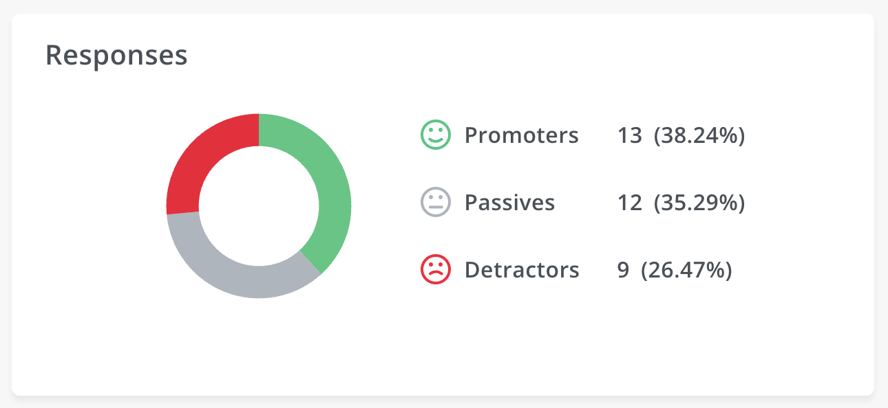
NPS pie chart visualization
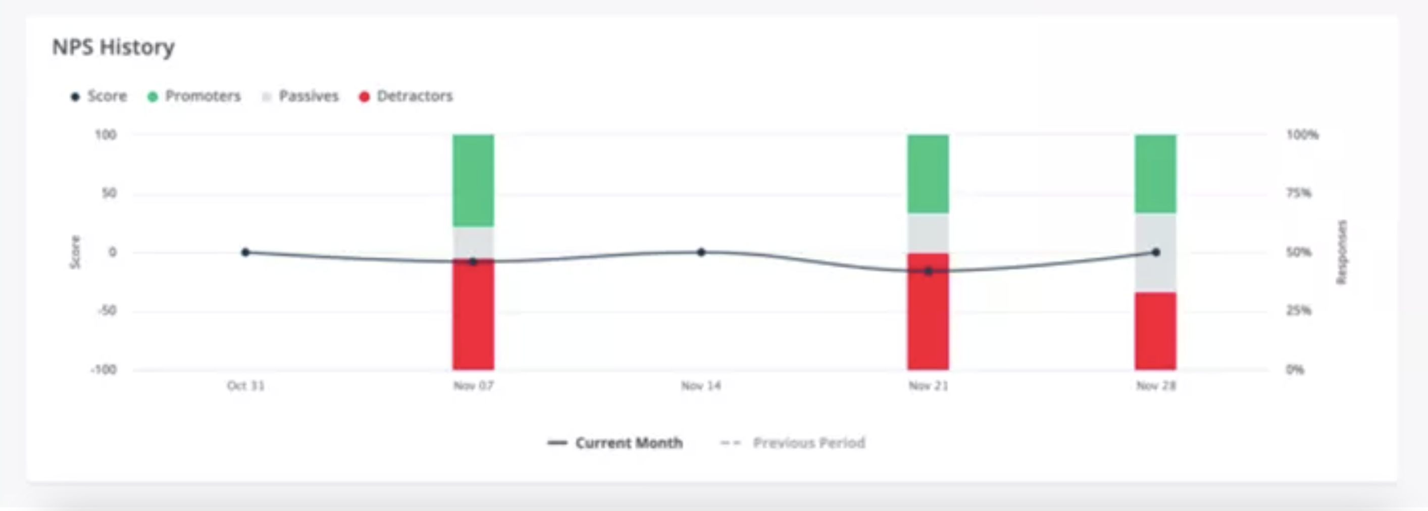
Line chart
The line chart shows the variation in the percentage of promoters, passives, and detractors over time. This tracks changing user sentiment and NPS survey fills over time.
The trends change over time because customer loyalty can shift. Loyalty is affected by a number of factors, such as any corrective measure you used or poor experience with customer support.
Therefore, if the business implemented a corrective strategy based on the insights, it can use the line chart to check whether the improvements had any positive impact on your NPS score across the timeline.
NPS line chart visualization
Net promoter score response tag analysis
NPS response tag analysis is also called aspect-based sentiment analysis. This is because it lets you identify product aspects that users talk about the most and how they feel about them.
You can group customer feedback into tags or theme buckets. Let’s say some of the responses are concerned with your product bugs. Consequently, you can group these responses under the ‘Bugs’ tag and check the NPS score.
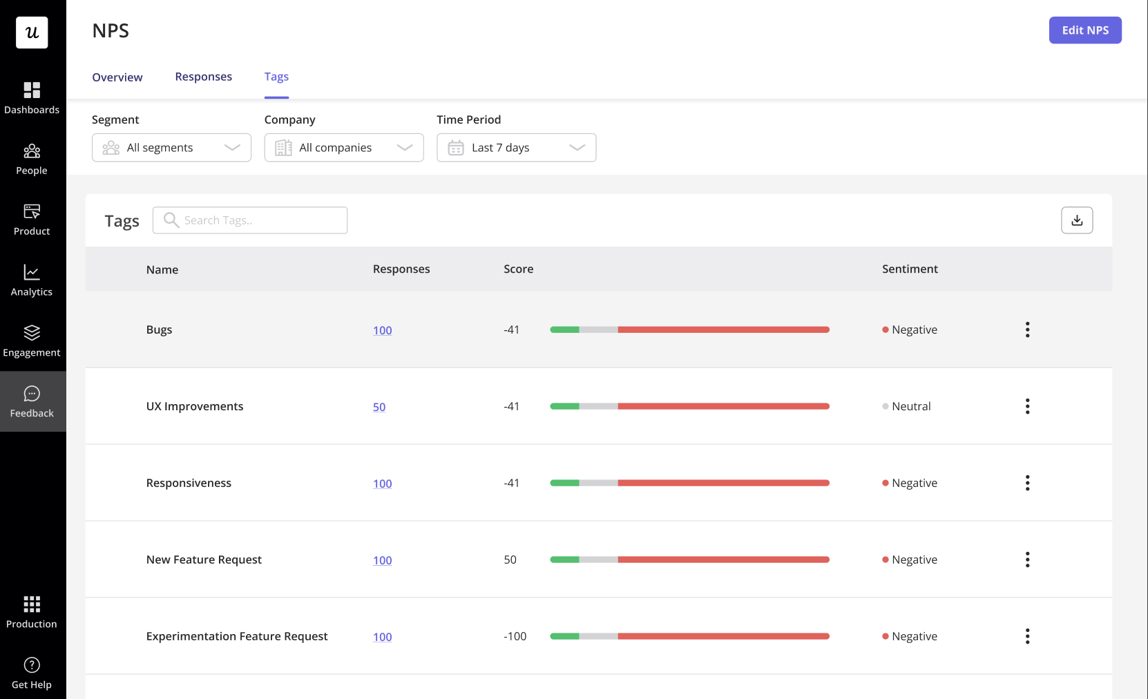
NPS survey tags
Word cloud
A word cloud is perhaps the simplest visualization in the NPS dashboard. It exhibits the most commonly used words from customers’ open-ended responses. The more words with positive connotations, the happier users are with your product.
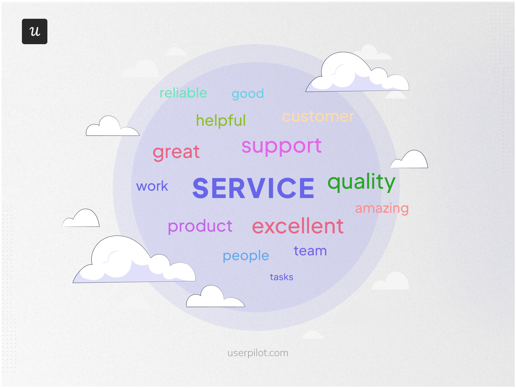
A word cloud from NPS responses
How to create surveys and track customer loyalty with a Userpilot NPS dashboard
Userpilot is a product growth platform that, among other things, functions as a customer feedback tool.
Thus, you can create NPS surveys, track trends in NPS scores, pair your analysis with feedback from customer surveys, and develop strategies to improve customer experience.
Create and style your NPS survey
First, create an NPS survey from the Feedback module. The question usually goes like the one shown below, where you ask users how likely they are to recommend your product to others on a scale from 1 to 10.
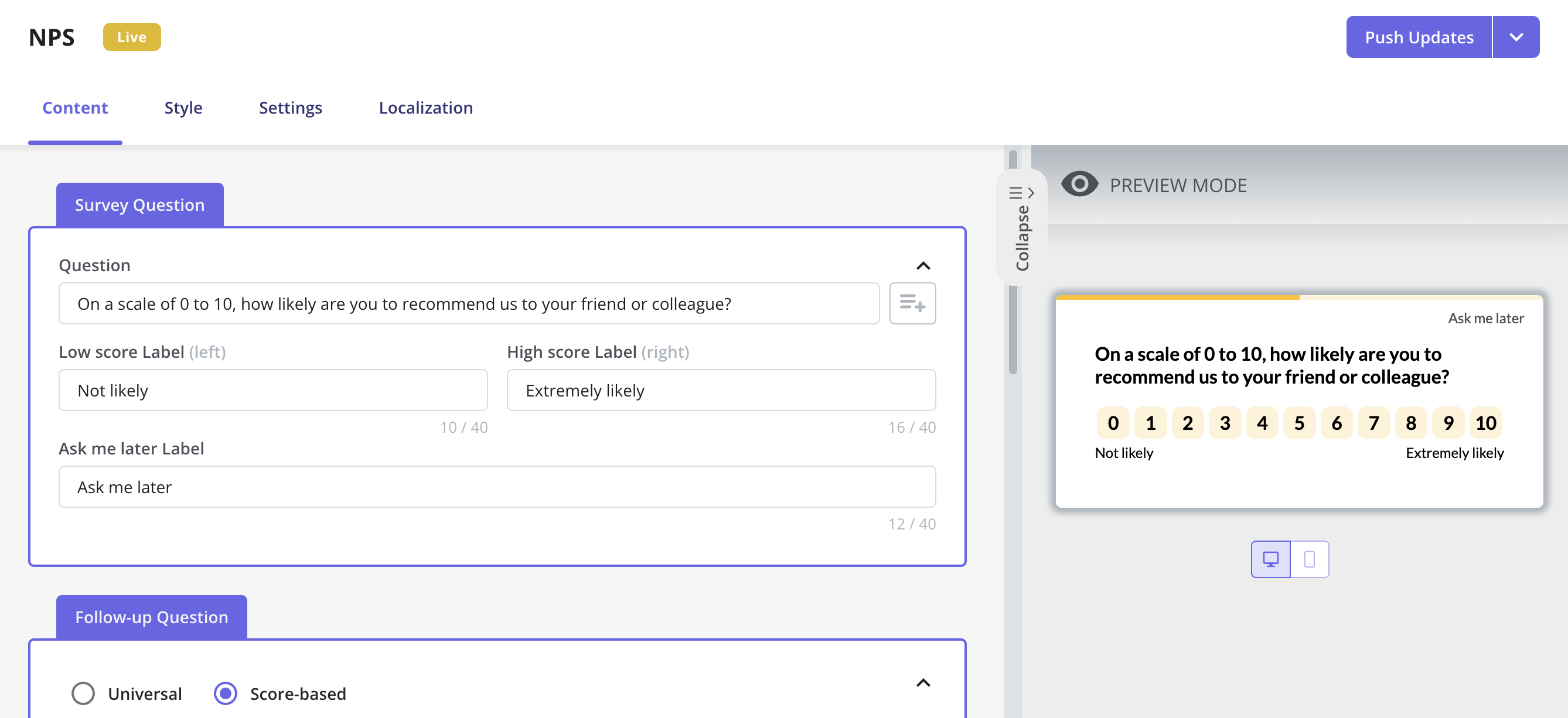
How to create an NPS survey in Userpilot
From the Style tab, you can customize the survey to match your brand colors. Plus, you can add your logo, a progress bar, a box, and a border and change font styles and colors. Make sure you check the preview before publishing the survey.
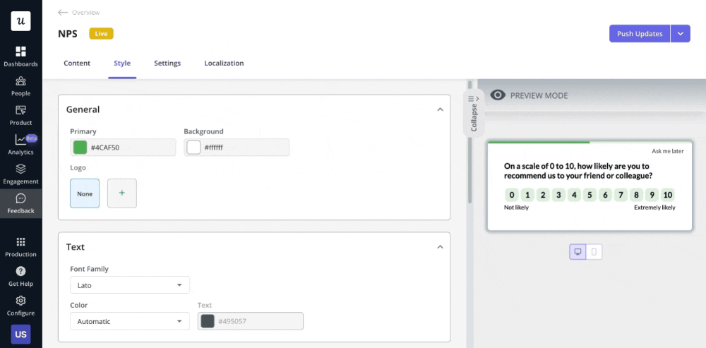
How to style your Userpilot NPS survey
Add a follow-up question to get more context
Although NPS is one of the most effective CX metrics, a single NPS score can’t tell you the “why” behind that score. A qualitative follow-up question allows users to provide their reasons.
Userpilot gives you two options for adding follow-up questions:
- Universal: All respondents get the same question regardless of the selected score.
- Score-based: The question is personalized based on the score. For instance, the question meant for detractors could specifically ask for the source of discontent.
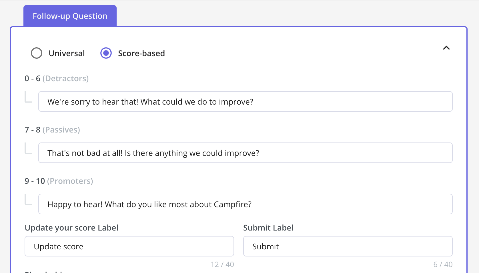
Add a follow-up question to NPS surveys using Userpilot.
Choose who and when should the NPS survey be triggered to
With Userpilot, you can target surveys to specific segments. Here are four options that you can choose between from the survey settings.
- Only me: This option is useful for testing and covers all users who have access to your Userpilot account and have installed the Chrome extension builder.
- All users: This is the default option that triggers the survey for all users.
- Users who meet specific conditions: Define a subset of users with certain rules to decide which users can see the survey. The conditions can include user and company data, actions/events that users perform in your product, etc.
- Specific user segment: Use a segment you’ve already created, such as the ‘inactive users‘ segment. It can be effective when you have a saved criterion that can be used multiple times to trigger a survey.
Furthermore, you can also choose the frequency of the survey. Set feedback cycle intervals for users who respond to the survey.
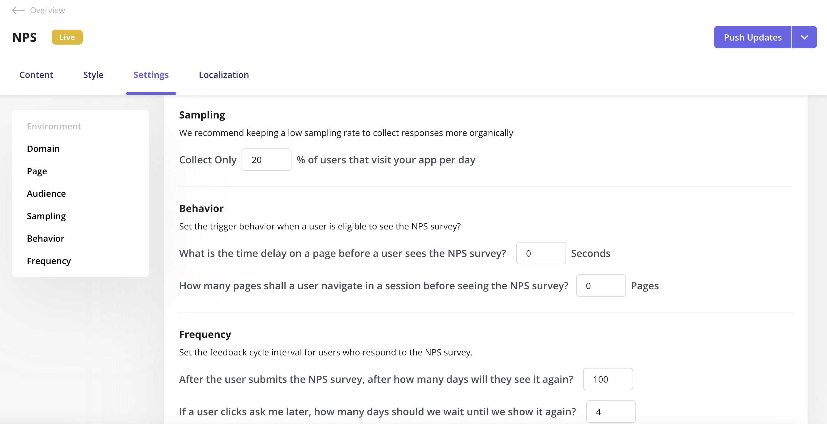
Set the NPS frequency, sampling, and behavior parameters with Userpilot.
Localize your NPS content to collect customer feedback in multiple languages
Userpilot lets you translate NPS content into multiple languages so you can collect feedback in the language that customers prefer.
This localization feature helps attract more of your target audience and improves customer satisfaction.
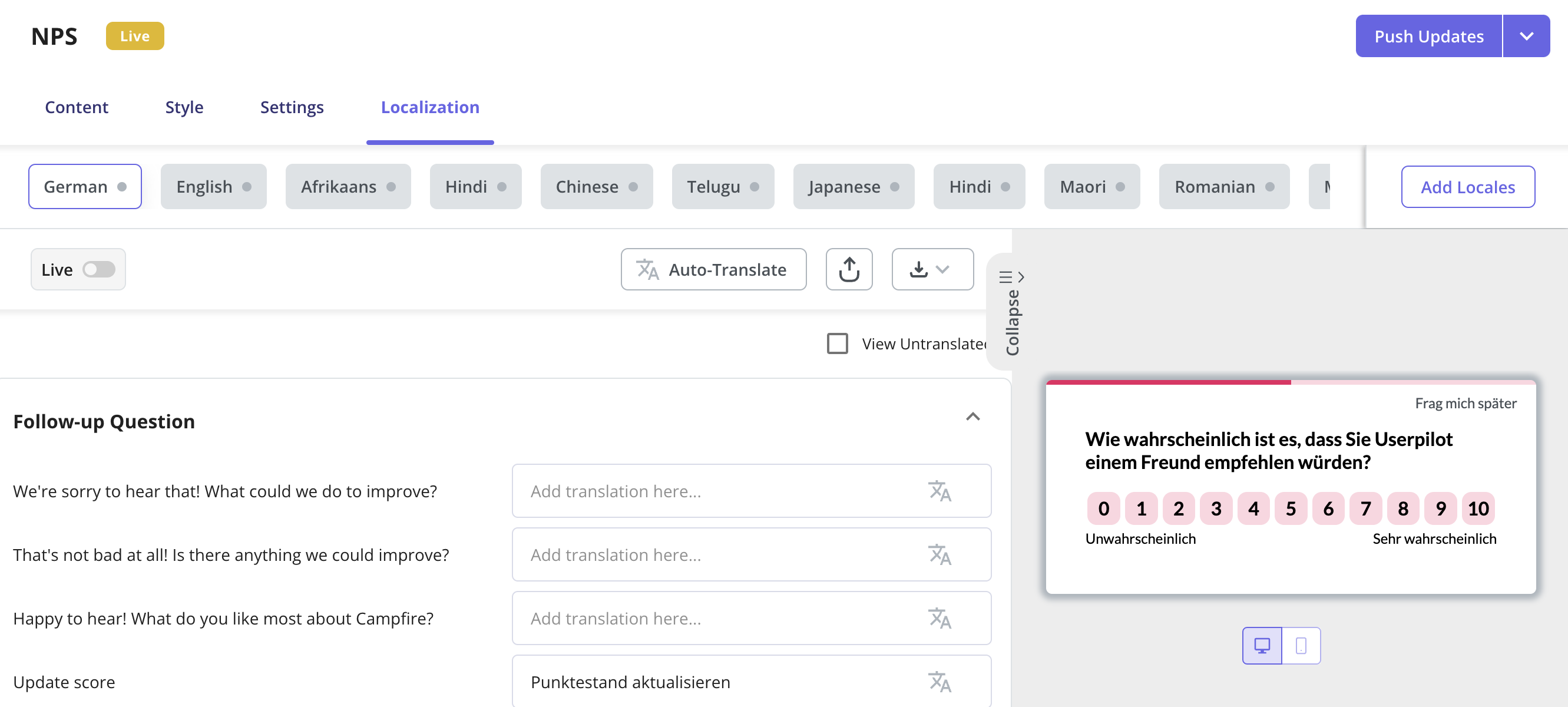
Localize NPS surveys through translations.
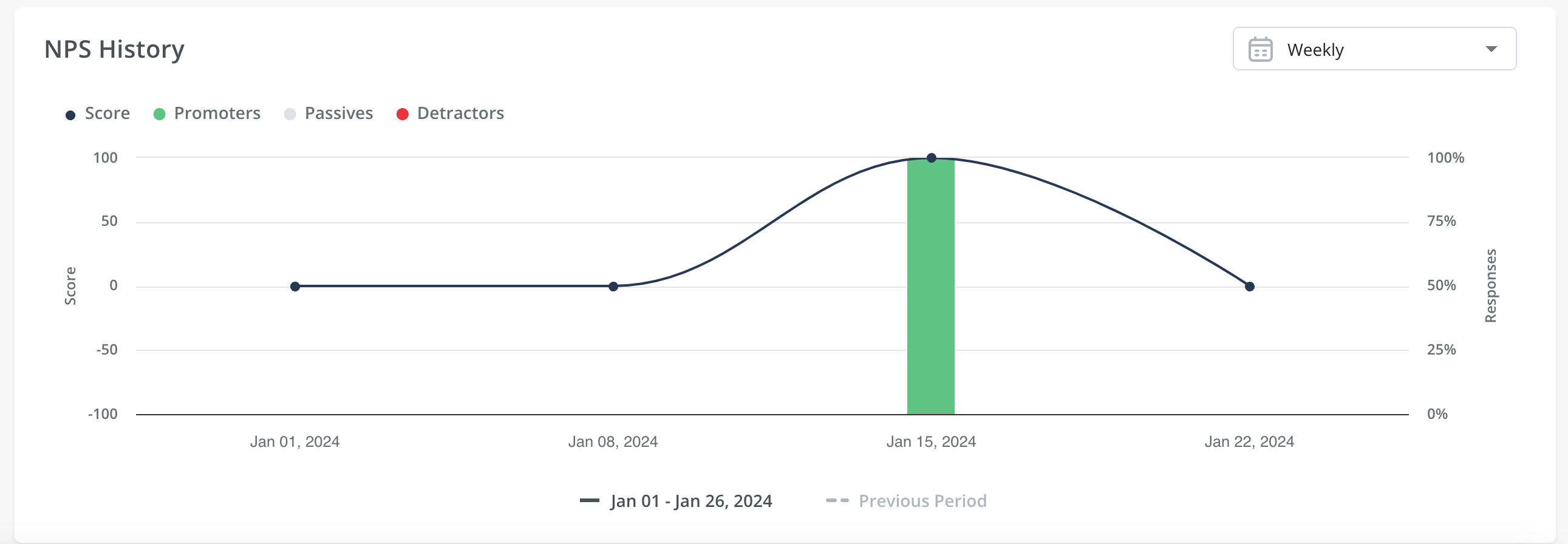
Analyze your NPS responses and get reports in a single dashboard
Finally, Userpilot lets you keep all your NPS data in a comprehensive NPS dashboard.
You can view your NPS score and the percentage of promoters, passives, and detractors in one place. You can also monitor the scores along with respective responses to detect recurring patterns over time.
Analyze the responses and tags in-depth to understand the impact of your strategies and tweak them if necessary.

NPS dashboard analytics in Userpilot
Track individual responses from the User Profiles section
You can also dig deeper into each user’s NPS score and compare it with other user properties from the User Profiles section. This helps you build correlations between their NPS data and other stats, such as feedback from other surveys, user industry, session duration, and so on.
A big advantage of this is learning more about your customer segments so you can improve the customer experience with personalization.
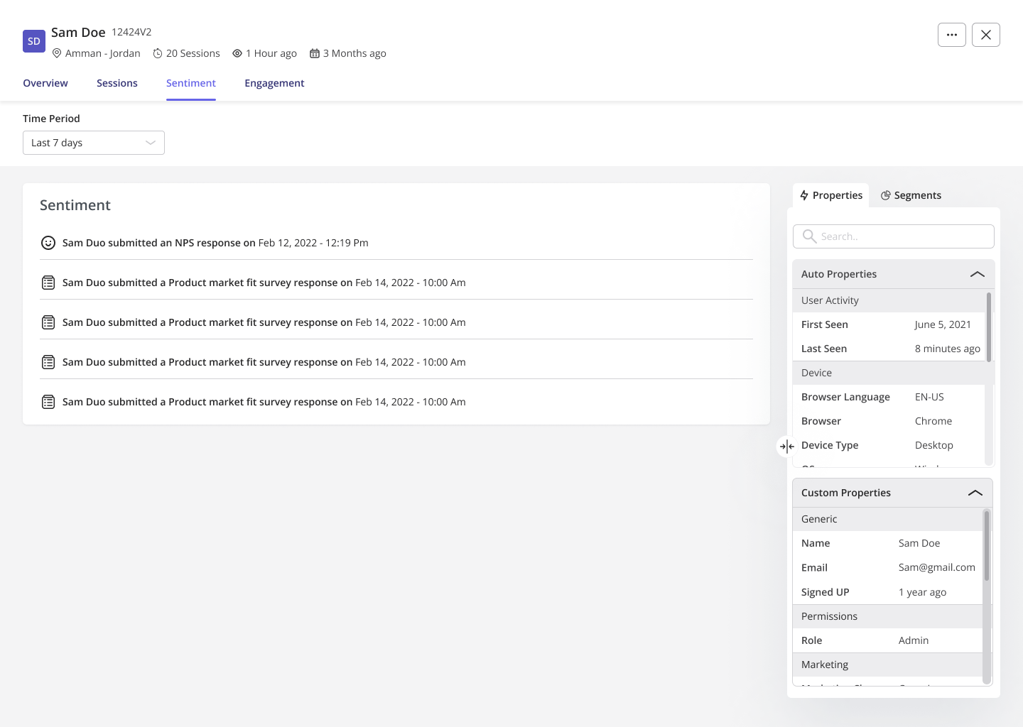
User profiles with NPS data in Userpilot
Compare data with other analytics dashboards
You can also get a holistic view of how your users feel and behave by referring to other analytics dashboards in Userpilot. This helps you gain overall customer satisfaction insights in a given period. You can also create a custom dashboard that lets you add report widgets of your choice so you can track all data points of value.
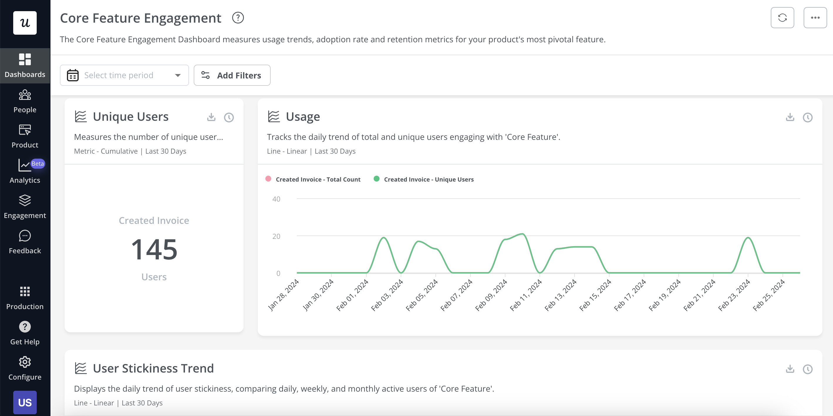
Analytics dashboards in Userpilot
Conclusion
An NPS dashboard gives you an in-depth understanding of the customer experience and helps you identify areas of improvement that you may not have noticed otherwise. This makes NPS analysis critical to achieving customer success.
Want to collect in-app user feedback code-free and analyze the NPS data in a comprehensive NPS dashboard? Get a Userpilot demo now and see how easily you can do it.
![]()
Try Userpilot and Take Your User Analytics to the Next Level

