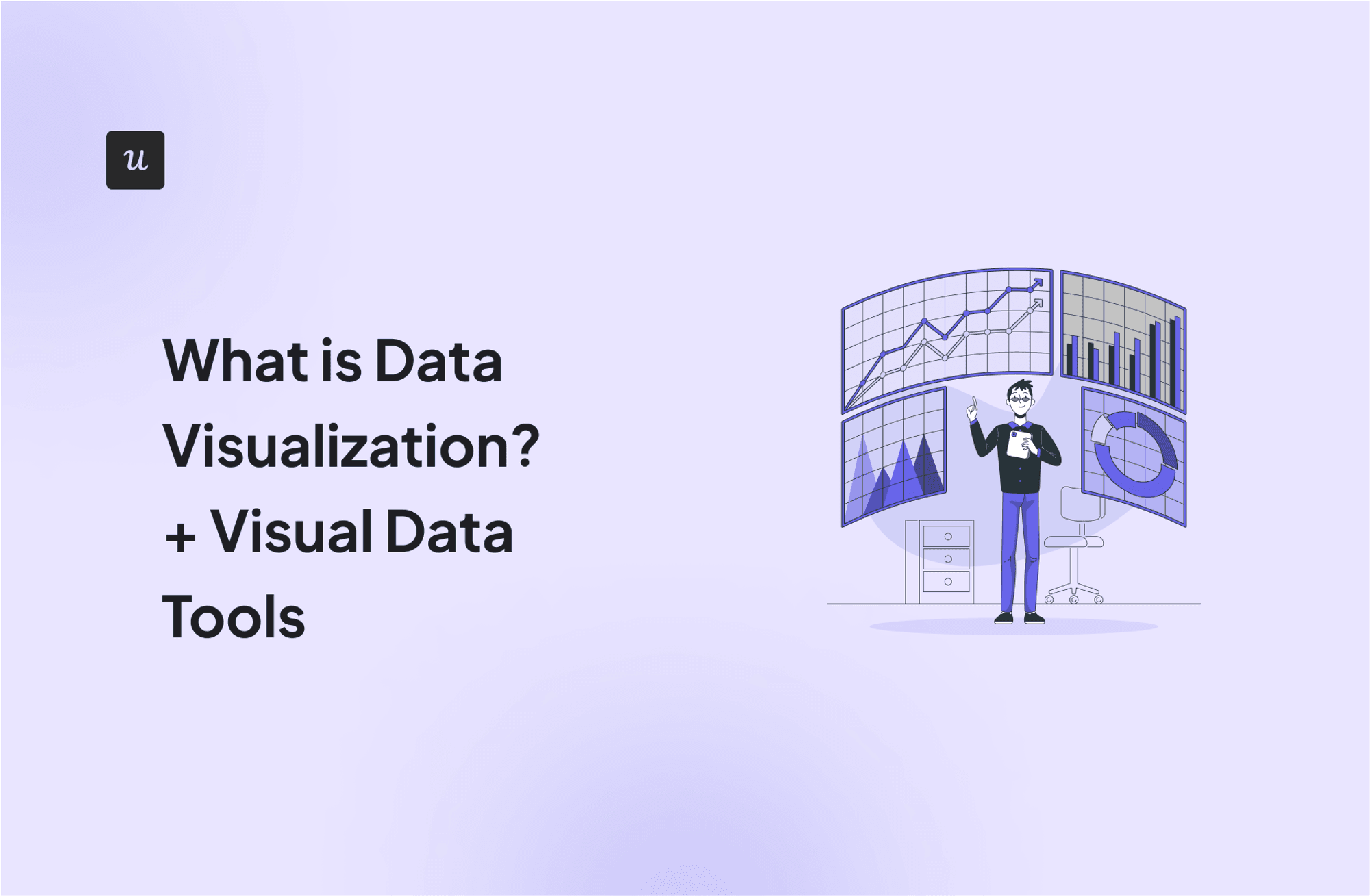
What is Data Visualization? + Visual Data Tools
Visual data surrounds us – colorful charts on weather reports, infographics on the web and in social media articles, map charts in presentations, etc.
In the SaaS industry, data visualization is a powerful and widely used tool – from product managers tracking product performance to executives tracking revenue and user growth.
To help you get started with data visualization, this article explores various visualization methods and their use cases. It also provides a guide to effective visualization and tools to help you along the way.
TL;DR
- Data visualization is the visual representation of numbers and data using elements like graphs, maps, and charts to make it easier to understand.
There are a variety of data visualization methods, including:
- Heatmaps.
- Funnel charts.
- Bar charts and Bar graphs.
- Pie charts.
- Line charts.
- Gantt charts.
- Area charts.
- To create effective visualizations, you must clearly define your objectives, collect the right data, know your audience, and select an appropriate visualization type for your data and audience.
- When creating the visualization, choose consistent colors, add context using keys and annotations, and optimize it for your delivery platform.
- Some of the best tools for visualizing data include FusionCharts, Tableu, and Userpilot.
- Userpilot helps you generate product usage reports using various dashboards, charts, and graphs. To begin, book a demo session today.
Try Userpilot and Take Your Product Growth to the Next Level

What is data visualization?
Data visualization is the art of visually representing numbers and information using charts, graphs, and maps.
Visualization is used by data scientists and data analysts to communicate complex ideas in an easy-to-understand manner.
Different visualization methods
Data visualization helps you present data in a compact and easy-to-understand manner.
Notably, though, the best charts and graphs for your data depend on the data type (numerical values, categorical variables, etc.). Some of these include:
Heatmaps
A heatmap uses colors to help you easily identify patterns in your data. Hotter colors (like red) indicate higher values, while cooler colors (like green) indicate lesser activity.
There are different types of heatmaps, such as eye-tracking heatmaps, scroll maps, feature heatmaps, and mouse-tracking heatmaps.

When to use a heatmap in data visualization
Heatmaps are commonly used in SaaS to understand feature usage/engagement levels.
For example, you can use a heatmap to compare feature usage over a period.
You can also use it to visualize how users engage with a feature or a web page.

Funnel charts
A funnel chart is a visual representation of the transition from one step to another. Also known as a conversion funnel, it shows the completion rate for each step in a series (or funnel).
Funnel charts look like literal funnels. The opening at the top is wide, representing the number of users who begin the process, then, it progressively gets smaller to represent the drop-off at each stage.

When to use funnel charts in data visualization
Funnel charts are ideal for tracking conversion processes (otherwise known as funnel analysis).
For example, you can use a funnel chart to track how users progress from first-time visitors to paying customers.

Bar charts and Bar graphs
Bar charts are incredibly popular and are perhaps the most used type of graph. A bar graph is excellent when analyzing big data and comparing multiple variables.
Each bar represents a variable. The length of each bar, thus, corresponds to the size of the value it represents, allowing for the easy comparison of values.

When to use a bar chart or a bar graph in data visualization
Pie charts are suitable for visualizing growth trends (such as the number of new customers acquired in a month) and comparing averages/numbers across categories (such as the average users in a month/week/day).

Pie charts
An equally popular chart type, pie charts show how different parts make up a whole. It divides a circle into slices, with each slice representing a portion of the whole relative to its size.
Considering a pie (circle) to be 100%, therefore, the size of each slice shows how big it is relative to the rest. Combined, all slices sum up to 100% (or the size of the full circle), making the raw data easier to read.

When to use a pie chart in data visualization
Pie charts are equally versatile data visualization tools.
You can use them to compare types of customer accounts, represent the number of customers by acquisition channels, or even visualize feature usage data.

Line charts
A line chart is a type of data visualization that uses a line to connect data points. Line charts are excellent tools for visualizing data trends and changing patterns over time.
A line chart compares two variables – an independent variable, such as time on the horizontal- or x-axis, and a dependent variable on the vertical- or y-axis.
Multiple dots show the point of intersection of both variables, which are then connected using a line.

When to use a line chart in data visualization
Line graphs are ideal for visualizing time series data. For example, you can use them to plot customer growth over time, sales trends over a period, etc.
You can also combine multiple line charts to compare the growth of different variables over the same period.

Gantt charts
A Gantt chart is a type of bar chart that depicts a project schedule. It is a project management tool for planning, tracking, and coordinating tasks over time.
The vertical axis lists all tasks and activities involved in the project. The horizontal axis displays the timeline (typically in days/weeks/months). Finally, a horizontal bar shows how long a task is expected to last.

When to use a Gantt chart in data visualization
Gantt charts are especially useful in SaaS when planning feature or product development processes.
You can also use it to plan and schedule marketing activities or to structure your content calendar.
Project planning with a Gantt chart helps you keep project timelines on course by allowing you to plan action items, assign tasks, and update statuses seamlessly.

Area charts
Area charts are essentially line charts with the space between the line and the horizontal axis shaded (or filled with a color).
When used for a single chart, the shaded area emphasizes the magnitude of the changes in a value over time. But multiple area charts can also be combined to represent part-to-whole relationships.

When to use an area chart in data visualization
Area charts are excellent additions to SaaS dashboards and reports as they easily showcase trends and volume changes.
They can be used to track signup numbers, visualize growth or feature usage trends, and more.

How to create effective data visualizations
Effective data visualization doesn’t happen by chance. To deliver data visualizations that are relevant to your data and useful to your audience, you need to:
- Define your objectives: Before jumping into design, define the goal of your data visualization. What question are you trying to answer? What story are you trying to tell?
- Collect data: Once you’ve defined your goal, it’s time to retrieve relevant data from different sources. Ensure your data sources are both accurate and relevant.
- Know your target audience: Who will be viewing your visualization? Are they data experts? To be effective, your visualization must be understandable to your audience.
- Select the appropriate visualization type: Different charts are suited for different purposes. Line charts, for example, are great for comparison, while treemaps are great for hierarchical data.
- Choose appropriate colors and fonts: As a rule of thumb, keep your colors consistent. Each new color in your visualization should add a new insight. Your font should also be bold, legible, and readable.
- Add context and annotations: Contextual cues can help your viewer decipher information at first glance without stress. For example, keys provide context to the viewer. Similarly, images, symbols, and annotations can make your visual data easier to understand.
- Consider interactivity: If possible, consider making your visualization interactive so that viewers can get even more information by clicking a few buttons.
- Optimize for the delivery platform: Create visual representations of data that can be viewed on any browser. Your visualization should also be mobile-friendly.
- Test and iterate: Collect feedback to determine if your visualization was effective. Did it clearly communicate the intended information? Iterate based on the feedback you receive.
- Document and share your process: Finally, ensure you document your process for future reference. This should help you make better visualizations in the future.
Data visualization tools
Just as the importance and appreciation of big data has grown over the years, so too has the number of data visualization tools.
These tools vary in ease of use, scalability, etc. Here are some of them:
Userpilot – For visualizing product usage
Userpilot is a product growth platform that helps product teams drive product growth. It allows you to collect data via tracked and custom events and then visualize it in different ways.
Here are a few ways you can visualize data with Userpilot:
- Analytics Dashboards: Userpilot offers various analytics dashboards, including product usage, Core Feature Engagement, user activation, and user retention. These dashboards allow you to track key performance indicators such as active users, page views, and average session duration, amongst others.

- Cohort Tables: Track and analyze retention rates among different user cohorts, providing valuable insights into user engagement and loyalty over time. You can also apply filters and segment data for more granular analysis.

- Funnel Reports: Userpilot’s funnel reports feature allows you to monitor how users progress through different steps of your funnel. You can then identify potential drop-off points and act on them to improve conversion rates.

Tableau – Best for dynamic storytelling
Tableau excels at crafting clear narratives through data. Although it has a bit of a learning curve, it’s a powerful tool once you get the hang of it.
You can create dynamic dashboards using the drag-and-drop functionality, allowing viewers to explore your data from different angles. This is great for monitoring metrics like user growth, revenue, etc.
One of Tableau’s bigger advantages, though, is its ability to receive and combine data from various sources like CRMs, marketing platforms, etc.

FusionCharts – best for web mobile dashboards
FusionCharts is a JavaScript-powered tool that integrates nicely with various JS frameworks and server-side programming languages.
It boasts over 150 chart types and 1,000 map types and provides ready-to-use code for all chart and map variations. This means you can embed its charts into your website with limited programming knowledge.
If you have a level of technical knowledge and are interested in creating robust and responsive dashboards that are embedded into your website, then this is the tool for you.

Conclusion
Choosing the best chart and graph for your data visualization is a data analyst’s superpower. In this article, we’ve shed light on some of these visual data tools and their use cases.
If you’re interested in seamlessly visualizing your product usage and user behavior patterns, look no further than Userpilot. Book a demo today, and we’ll be in touch to demonstrate how it works.
![]()
Try Userpilot and Take Your Product Growth to the Next Level

