Pendo Paths: An In-Depth Review [+A Better Alternative]
![Pendo Paths: An In-Depth Review [+A Better Alternative] cover](https://blog-static.userpilot.com/blog/wp-content/uploads/2024/03/pendo-paths-an-in-depth-review-better-alternative_e6f423e72aa8a759b8bf2f23e8c8826c_2000.png)
User path analysis is incredibly important for understanding the paths that users take when navigating to or from different parts of your product.
This guide will go over what Pendo paths are, the pros/cons, how to create path-tracking reports, and better alternatives for tracking your product analytics.
TL;DR
- Pendo is a digital adoption platform for user onboarding and product adoption.
- Pendo’s paths show you the paths that users take to or from a specific event, feature, or page (maximum of 20 steps).
- Pendo path reports can automatically detect duplicate paths, help you visualize data with Sankey diagrams, and let you zoom in on individual paths.
- Unfortunately, Pendo paths are limited to 20 steps, have an unintuitive interface, and run into limitations when it comes to filters.
- You can create a path report in Pendo by going to the Behavior menu, clicking on Create report, setting the starting/ending point, selecting the date range/segment, and running the query.
- You might need a Pendo alternative if you want real-time data, struggle with the steep learning curve, or desire additional data visualization options.
- Userpilot could be a better alternative to Pendo paths due to our expanded visualization options, period filtering, and combined reporting.
- Creating a path analysis report in Userpilot is as simple as clicking on Paths, choosing your conversion criteria, filtering by date range, and viewing all paths or top paths.
- If you want to learn more about Userpilot’s path analysis capabilities then get your free demo today!
![]()
Try Userpilot and Take Your Product Analytics to the Next Level

What is Pendo?
Pendo is a product experience and digital adoption platform for onboarding users and driving product adoption. Its features include UI patterns that can be used for in-app guidance and analytics reports for tracking product analytics.
What are Pendo paths?
Pendo’s path reports show you the exact actions that a user takes, in sequence, before or after interacting with a specific feature, event, or page within your product.
You’ll be able to see multiple steps that users take to or from that specific anchor event.
Pros of Pendo paths
Pendo paths offers multiple benefits such as:
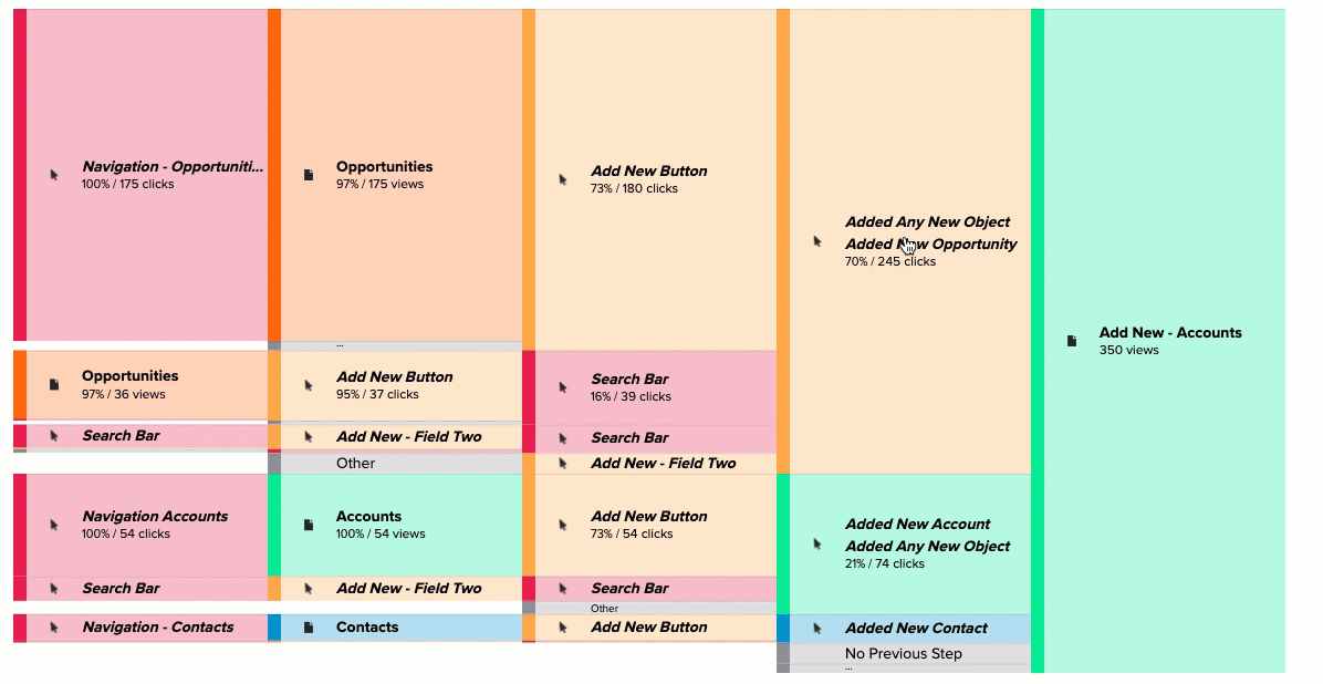
- Duplicate detection. When users perform the same actions on multiple occasions, Pendo’s analytics algorithm will automatically remove the duplicates and show the user path as a single occurrence. This gives you a more accurate picture of user paths that represent actual use.
- Data visualization. Pendo lets you display your path data as a Sankey diagram that uses a collection of nodes and links to help you visualize data from the paths that users take. This also makes it easier to share reports with others on your team without the need for further explanation.
- Path comparison. Finally, Pendo helps you identify the most-used paths within your product. You’ll be able to select a specific event and zoom in to show a more detailed view of all the paths that lead into/away from that particular event (which aren’t visible by default).
Cons of Pendo paths
There are also some drawbacks to using Pendo paths:
- Path lengths. While Pendo does offer a fair amount of flexibility when analyzing user paths, it falls short when it comes to path lengths. The maximum path length that you can analyze using Pendo is 20 steps. This means that any additional steps before/after won’t be represented in the data.
- User interface. The UI/UX of Pendo’s path reports could use some work. In addition to some data being hidden in the default view, you can’t see the user list whenever you click on a data point, which could lead to scenarios where you need to switch between views multiple times.
- Filter limitations. Pendo’s filtering options aren’t as robust as some of the other product analytics platforms on the market. For instance, you can’t even filter path reports by top path. This makes it harder to narrow down the data and find the insights you need promptly.
How to create paths in Pendo step-by-step
Now that you know what Pendo paths are and their pros/cons, it’s time to get into the nitty-gritty of creating paths within the platform.
The sections below will go over the steps you need to take to create your first path report with Pendo.
Step 1: Select Create report, then Path from the left-side menu
Open the Behavior menu from the navigation panel on the left side of your screen, click on Create report, and then select Path from the dropdown.
You can also click directly on Paths in the behavior menu to be directed to a library of all existing funnels and create new reports from that screen.

Step 2: Choose the starting or ending point of the path
Next, you need to decide if you want to analyze the path leading to a specific event or starting from a specific event.
Paths that lead to a specific event create a reverse path showing all the steps a user takes before reaching the designated event.
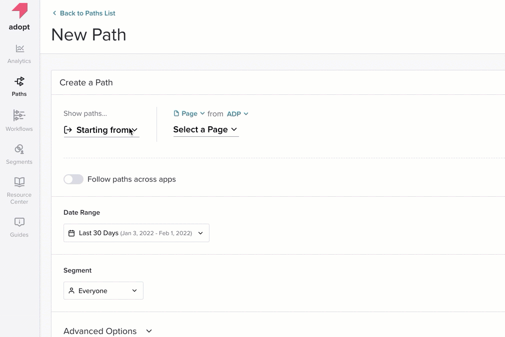
Conversely, paths that start from an event display a forward path of all the actions the user took after the designated event. Reverse paths help measure feature discovery, while forward paths offer insight into user activation.
Tip: You can also generate cross-application path reports if you have multiple products linked to your Pendo Portfolio.
Step 3: Select the appropriate Date Range and Segment from the dropdown menu
With your anchor event selected, it’s now time to set the date range and target segment from Pendo’s dropdown menu.

This will help you hone in on actionable insights instead of being overwhelmed by raw data. By default, the date range is set to last 30 days while the segment is set to include everyone.
Step 4: Run the query and save the report
Once you’re done building your query, you can click on Save & Run to generate the report, give it a name, and edit its visibility to determine which team members will be able to access it.
You’ll also be able to access the report at any time from the aforementioned library of existing reports.

Pendo paths pricing
Pendo offers a freemium version with its Free plan that you can use indefinitely until you exceed the limit of 500 monthly active users (MAUs).
The entry-level Starter plan starts at $7,000/year for up to 2,000 monthly active users. Also, by upgrading to the paid version, you’ll also gain access to additional features like NPS data.

Pendo has two more premium plans, Growth and Portfolio, both of which use quote-based pricing. The Growth plan unlocks additional features not available on the Starter plan but is aimed at those with a single product.
In contrast, the Portfolio plan is targeted toward businesses that develop multiple mobile and web apps. Those who go for the Portfolio plan will be able to view cross-application data that tracks actions, events, and paths between multiple products.

Why you may need an alternative to Pendo paths
There are a few scenarios in which you might need an alternative solution to Pendo paths:
- Data lag. Pendo paths — and all other analytics functions on the platform — updated on an hourly basis rather than in real time. This means that you’ll need to wait for data to refresh before you can see up-to-date data on a certain report, page, or feature.
- Learning curve. Pendo features can be quite complex, and the interface isn’t always intuitive. This step learning curve could lead to feature usage lagging among your team members especially when trying to track events or narrow down on data related to a certain feature.
- Path visualization. Pendo users often complain that the path visualization options are too limited in their scope and customizability. Product teams are essentially stuck with the Sankey diagrams that come default in the paths section.
Userpilot Paths: A better alternative to Pendo paths
If Pendo paths aren’t the right fit for our needs, Userpilot’s built-in path analysis capabilities might be more suited to your use case.
Like Pendo, Userpilot’s path reports let you choose an anchor event, filter by date range/segment, and visualize the resulting data.
However, Userpilot’s path-tracking interface is far more intuitive and we have a breakdown feature that you can use to add complex filters to your reports.
This makes it possible to filter by individual user attributes and extract data insights that are as actionable as possible.
Pros of Userpilot paths
Userpilot’s path reporting features have a few unique benefits that current path-tracking tools on the market lack:
- Visualization options. Userpilot lets you track user behavior using two different types of path visualizations — the all paths report and the top path report. We’ll go over the differences between these two path types in the section below.
- Period filtering. Userpilot’s path reports let you filter by period to generate advanced insights that are specific to a certain date range. This makes it easy to conduct cohort analysis and see how user paths change over time.
- Combined reports. While you can use Userpilot’s path reports in isolation, you also have the option to combine them with the platform’s other analytics capabilities, such as funnel analysis, retention analysis, and analytics dashboards.

Cons of Userpilot paths
As with every tool, Userpilot also has its limitations and drawbacks, such as:
- Userpilot focuses exclusively on web applications. It isn’t compatible with mobile apps. This means that you can’t track product usage on mobile devices on our platform.
- Userpilot doesn’t offer a free plan and can be costly for small businesses.
How to create a path report in Userpilot step-by-step
Product managers looking to create a new path report with Userpilot can use the steps below to generate their first report:
Step 1: Click on Analytics on the dashboard, then click on Paths
The analytics tab on your navigation sidebar will let you generate reports by clicking on Paths.

Step 2: Select conversion criteria
Next, choose the conversion criteria that you’d like to use in your path analysis report.
You can choose from several criteria, such as custom segments, product usage, or user properties, when creating the report.

Step 3: Filter by date range
After selecting your conversion criteria, you can filter your data by date range to conduct a path analysis for a certain period.
You can also remove specific pages from each path by disabling the Include Pages option.
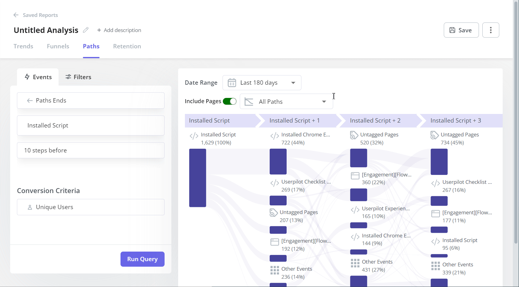
Step 4: Choose the path type you want to visualize
As we mentioned earlier, you can either visualize all paths or visualize only the top path.
When visualizing all paths, every path that your users have taken to/from the designated event will be visible on your dashboard.
Each step on the path represents a sequence of actions — with both percentages and user counts visible to maximize clarity.

When viewing only the top path, your dashboard will show data exclusive to the single path that the highest number of users have taken when navigating to or from the designated event.
This is useful for optimizing happy paths and identifying friction points in the most popular paths.

Userpilot pricing
Userpilot’s transparent pricing ranges from $249/month on the entry-level end to an Enterprise tier for larger companies.
Furthermore, Userpilot’s entry-level plan includes access to all UI patterns and should include everything that most mid-market SaaS businesses need to get started.

Userpilot has three paid plans to choose from:
- Starter: The entry-level Starter plan starts at $249/month and includes features like segmentation, product analytics, reporting, user engagement, NPS feedback, and customization.
- Growth: The Growth plan starts at $749/month and includes features like resource centers, advanced event-based triggers, unlimited feature tagging, AI-powered content localization, EU hosting options, and a dedicated customer success manager.
- Enterprise: The Enterprise plan uses custom pricing and includes all the features from Starter + Growth plus custom roles/permissions, access to premium integrations, priority support, custom contract, SLA, SAML SSO, activity logs, security audit, and compliance (SOC 2/GDPR).
Conclusion
As you can see, despite some of its handy features, Pendo paths may not always be the best option.
The limited freemium version, unintuitive interface, and feature limitations all hinder the functionality of its otherwise impressive reporting.
If you’d like to learn more about Userpilot as a Pendo alternative, then it’s time to get your free Userpilot demo today!
![]()
Try Userpilot and Take Your Product Analytics to the Next Level

