What Is Secondary Navigation? [+ Examples]
![What Is Secondary Navigation? [+ Examples] cover](https://blog-static.userpilot.com/blog/wp-content/uploads/2024/03/what-is-secondary-navigation-examples_34e870db42db45024f1e630ba5749822_2000.png)
How often have you clicked away from a page simply because you couldn’t find what you were looking for?
The secondary navigation of your website or application can make or break product engagement—that’s how essential it is.
That said, let’s explore some secondary navigation examples, the role of secondary navigation in UX, the key differences between primary and secondary navigation, and share some strategies to aid your navigation.
TL;DR
- Secondary navigation refers to UI elements that guide users to additional information that may not be of primary importance but is still necessary for a comprehensive user experience.
- Primary navigation gives users immediate access to the main sections of a website or application. Meanwhile, secondary navigation serves as an auxiliary guide to less prominent but still significant content.
- Secondary navigation is essential to enhance feature accessibility, streamline the user journey, optimize space, and increase feature adoption.
- Now, there are two types of secondary menus:
- Separate menus are independently placed, offering complementary navigation without distracting from primary tasks.
- Combined menus that integrate within primary navigation, expanding for detailed access and maintaining user focus.
- We go over 6 secondary navigation examples from other SaaS businesses:
- Userpilot’s combined secondary navigation blends seamlessly within the primary menu for contextual access.
- Mixpanel uses separate primary and secondary menus on its navigation bar for clear, organized access to features and settings.
- Qualtrics broad combined menu under primary navigation elements that offers a comprehensive, all-in-one navigation hub.
- Zoom places a thin secondary navigation bar atop the page for straightforward, unobtrusive access to secondary options.
- HubSpot’s combined navigation allows detailed content exploration within major categories through a hierarchical structure.
- Amplitude provides a side panel for historical navigation and resource discovery.
- Let’s explore some best practices for implementing secondary navigation menus:
- Using path analysis to tailor secondary navigation based on actual user behavior and preferences.
- Organizing content with card sorting to reflect user expectations and make navigation intuitive.
- Implementing in-app guidance for new or less visible secondary navigation to direct users to secondary features.
- Collecting navigation feedback with surveys to refine and improve secondary navigation based on user insights.
- If you need to improve your platform’s usability and user engagement, why not book a Userpilot demo to see how you can implement your navigation strategy?
![]()
Try Userpilot and Take Your Product Engagement to the Next Level

What is secondary navigation?
Secondary navigation refers to UI elements that guide users to additional information that may not be of primary importance but is still necessary for a comprehensive user experience.
It provides easy access to secondary pages without cluttering the primary menu, enhances usability, and improves the overall site structure.
For complex websites or apps, a well-designed secondary navigation system leads to a more intuitive and efficient user journey.

Differences between primary and secondary navigation
Primary navigation gives users immediate access to the main sections of a website or application. Meanwhile, secondary navigation serves as an auxiliary guide to less prominent but still significant content.
A clear distinction between the two is crucial for a clean and effective navigational structure. So here are their main differences:
- Hierarchy: Primary navigation houses the most important categories or pages, while secondary navigation supports additional, often more specific content.
- Visibility: Primary navigation is immediately visible, often as a top horizontal bar or a sidebar, whereas secondary navigation may be hidden behind actions like hover or clicks.
- Frequency of use: Users typically frequent primary navigation paths more often, while secondary paths are for less common but targeted tasks.
- Design elements: The design of a primary navigation menu is usually more prominent with bold text and larger buttons; secondary navigation often uses smaller text or icons to take up less visual space.

Secondary navigation use cases
In SaaS, secondary navigation enhances the user interface by providing a clear path to different features or settings.
However, its implementation is not a one-size-fits-all solution and must be tailored to the specific needs of your application and its users. Its use cases are too many, and they can include:
- Feature accessibility: It grants users easy access to secondary features or settings that are not immediately visible, improving the adoption of secondary features.
- User journey streamlining: It helps you understand and improve the user journey by making it easier to advance through the next stage.
- Space optimization: Secondary navigation can make effective use of interface space when implemented correctly.
- Enhance discoverability: Secondary navigation increases the visibility of underused features, encouraging users to explore beyond their usual paths.
Types of secondary menus
The design and functionality of secondary menus vary depending on the content’s complexity and the website’s or SaaS application’s goals.
That said, understanding the different types is key to implementing the most user-friendly navigation possible.
Separate menus
Separate secondary menus are independent of the primary navigation system, and they’re typically found in a separate section of the user interface.
They serve as a complementary guide and lead users to additional resources without competing for attention with the main navigational elements.
In terms of design, it must be differentiated from the primary menus, including colors, fonts, and placements. The idea is to offer users additional navigational paths without disrupting the user experience.

When to choose separate menus for secondary navigation?
This type of navigation is especially effective when the user’s primary tasks are well-established and secondary tools or features aren’t too many. That way, you can make the most out of the white space available and keep it balanced.
Combined menus
Combined secondary menus are typically accessed through interactions with the primary navigation items. You can see related sub-items or drop-down menus when hovering or clicking through primary icons.
This design requires a hierarchical structure that guides the user’s journey through the product. This way, the user experience becomes more intuitive and accessible without increasing cognitive overload.

When to choose combined menus for secondary navigation?
This navigation style works best when there’s a wide array of content that can be categorized into groups or hierarchies. It’s particularly effective on desktop environments as users can easily navigate through cascading menus by hovering the mouse (while on mobile, you need to rely on touch screens).
Examples of secondary navigation menus
The design and utility of secondary navigation menus are best illustrated through real-world scenarios.
That said, let’s explore 6 secondary navigation examples from other SaaS apps:
Userpilot’s combined secondary navigation
Userpilot integrates a combined secondary navigation within the main sidebar menu.
The interface uses subtle design tactics to avoid visual overload, such as differentiating between levels of navigation while maintaining a sense of continuity across the entire user interface.
This way, related secondary options are shown contextually as users select a primary category, creating an intuitive structure that includes all options without increasing the cognitive load for users.
This not only helps users find what they need more efficiently but also exposes them to additional features they may not have been initially seeking.

Mixpanel’s separate primary and secondary menus
Mixpanel’s UI creates a clear separation between its primary and secondary menus using the navigation bar. Where the primary options are on the left side (accessing main features like reports & dashboards), while secondary options are on the right side (profile settings, apps, etc.).
This provides users with a full spectrum of navigation options without spending too much space or without making it look cluttered—while also creating a clear differentiation between both types of options.

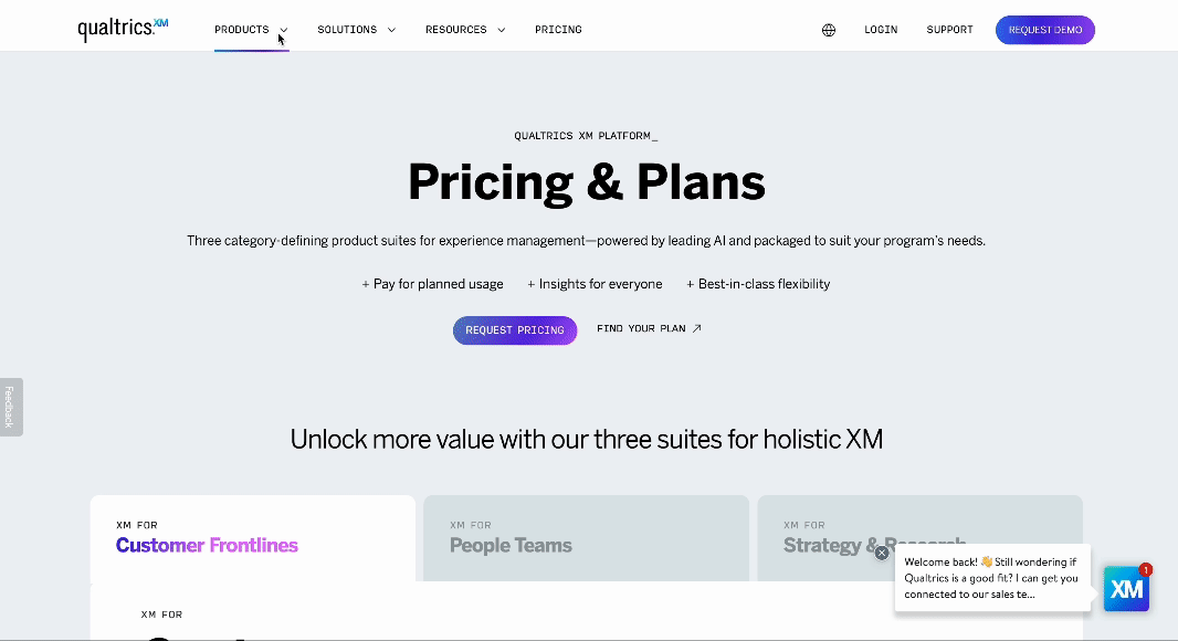
Qualtrics’s combined secondary menu
Qualtrics’s website features a large combined menu that’s well structured by categories such as products, resources, and pricing.
As you interact with a primary navigation element, secondary pages are presented in a wide drop-down menu—acting as an all-in-one hub and reducing the need for multiple clicks and page navigations.
Plus, it even includes other secondary options to create a free account or view a demo to make it more actionable and keep visitors just one click away from converting.
Zoom’s secondary navigation bar
Zoom’s website clearly separates the primary and secondary menus by adding a thin secondary navigation bar at the top of the page.
This bar runs across the top of the site, working almost as an informational ticker that provides access to secondary options like pricing, resources, and support. It remains constant and accessible regardless of where users find themselves on the site.
A navigation bar like this works as long as it’s designed to be unobtrusive, taking as little space as possible to not distract from the primary content.

Hubspot’s combined secondary navigation
Hubspot’s website has excellent combined dropdown menus where you can navigate its content by multiple categories.
Here, users can navigate through major categories, and within each, they’re met with a depth of subcategories and topics that cater to multiple users’ intents, all accessible through the same navigational flow.
For example, within the Blogs section, users can explore content segmented by categories, like marketing or customer service—while also adding a separate menu to explore by topics.
This visual hierarchy makes it easy for users to find precisely what they’re looking for or to explore the exact topics they’re looking for.

Amplitude’s separate secondary navigation
Amplitude’s app has a separate secondary menu on the left panel, where users can access help resources and previous pages.
It’s specifically designed for historical navigation and allows users to jump to frequently accessed resources such as documentation or support.
Thus, with the primary navigation menu horizontally and the secondary options on the side, it’s more intuitive for users to understand how the app can be navigated and then use it more effectively.

Best practices when applying a secondary navigation menu
Applying a secondary navigation menu involves more than just adding additional links to your platform. So let’s go over some best practices for implementing secondary navigation interfaces:
Use path analysis to understand user navigation
Path analysis traces the steps users take as they navigate through your platform, providing insights into their behaviors and preferences.
This allows you to identify the most frequented paths and those that may benefit from enhanced visibility. This way, you can integrate secondary navigation based on these insights to ensure that users find what they need without unnecessary clicks or feeling confused—optimizing the user journey so each user can navigate the product intuitively and effectively.

Use card sortings to organize pages by primary and secondary levels
Card sorting is a research technique where you, your team, or a group of users sort a bunch of labeled cards into groups or categories.
It helps you organize content into logical structures that reflect the user’s expectations and understanding (even more so when involving actual users). Plus, it can be done online with tools like Optimal Workshop, which allows you to both design and test your UX design with users to understand what type of secondary navigation works better.
For secondary navigation, card sorting can help determine which items should be readily accessible at the top level and which can be tucked away in secondary menus—resulting in a content hierarchy that is both user-friendly and easy to explore.

Implement in-app guidance when introducing secondary navigation menus
In-app guidance tools like tooltips, walkthroughs, and highlights can serve as a way to direct users’ attention to secondary navigation elements. They act as on-the-spot training for users and reduce the learning curve of your app.
It’s particularly important to add in-app guidance when introducing new features or when the secondary navigation is less obvious. The worst it can do is to ensure that users are aware of the navigation options available and use them.
When done well, in-app guidance increases user satisfaction and retention as users can fully adopt your product and use it to its full potential.

Use surveys to collect navigation feedback
Feedback is crucial, and surveys are a direct line to understanding user opinions on your navigation structure.
To improve secondary navigation, triggering Customer Effort Score (CES) surveys after interactions with secondary menus can provide a quantitative measure of how users perceive it.
This data can uncover friction points and highlight areas where the secondary navigation meets or falls short of user expectations. This way, you can keep a feedback loop where you listen to what your users say, refine the navigation experience based on actual user feedback, communicate the implementation to your user base, and then collect new feedback for continuous improvement.

Conclusion
With these secondary navigation examples and best practices, we’ve provided the basic information you need to make navigation intuitive and user-friendly.
Whether through path analysis, card sorting, in-app guidance, or feedback collection, the goal is to ensure users can effortlessly navigate your product.
So if you need to improve your platform’s usability and user engagement, why not book a Userpilot demo to see how you can implement your navigation strategy?
Try Userpilot and Take Your User Engagement to the Next Level

