
Diversify and Scale Your Team by Making UX Design More Accessible
Visual design has a high barrier of entry that increases costs and inhibits diversity—but there’s a fresh way to approach this problem.
Scaling up your design team on a budget is no small task. This is especially true when UX and visual design skills often require higher education, costly formal training, and experiences that bring candidates into the world of software development.
These are significant barriers to entry that mean design is confined to a homogenous group of people. This tends to have unfortunate effects: wealth gaps based on race, gender, and other social factors are exacerbated by technology that is designed without appropriate representation.
We end up with facial recognition software that incorrectly identifies Black people, financial experiences that don’t account for the unbanked, search algorithms that reinforce racism, and face filters that promote stereotypes.
None of these things are intentional, but they also aren’t accidents.
Jump to
Understanding visual language from a linguistic perspective
Before we dive further into the challenges of sourcing diverse UX design talent—and streamlining the language of design to be more accessible for all—it’s important to understand why it’s so complex right now in the first place.
If you were to ask me to build an app, there are a couple of different ways that I could document these requirements. Most obviously, I could write them down.
As a designer, the other option I have is to draw them. I could map out user flows for scope and create screens that reflect content and functions. These tactics also crystallize the requirements, but instead of words, I’m using pictures.
The former method translates the spoken word into a written language, while the latter translates the spoken word into a visual language.
Like all languages, only a subset of the population is fluent in visual design—and here, I’m talking specifically about design that’s used for digital experiences. Being fluent in this language is valuable in several ways. For one, we can charge money for it. But even more importantly, we can play an active part in the evolution of technologies that shape our collective human experiences.
Viewing visual design through the lens of linguistics
Letters are the basis of our written language, and we put different letters together to make words. Words are assigned meaning based on what they represent, and words also become much more meaningful when arranged with other words into sentences.
Like letters, front-end components such as checkboxes, dropdowns, and grids, are the basis of our visual software language. We put the most granular components together to make more complex ones, like how a checkbox and a dropdown make a multi-select dropdown. Similar to words, components are also assigned meaning based on what they represent.
For example, a grid is empty until we fill it with information about different shirts that meet our outfit needs—then it becomes a shopping experience. Components arranged with others into pages create even richer experiences. Once we put a multi-select dropdown that allows users to choose desired colors, they’re able to find a top according to their specific parameters.
Applying “grammar” principles to visual design
Because the written language has been around a lot longer than the digital design one, we’ve established methods for formatting it. Spelling and grammar rules are what help us ensure we’re putting letters and words together in a way that makes sense.
We learn the different sounds that different symbols make, that adjectives go before nouns, and present versus past tense. Knowing these things means we can create increasingly complex words and sentences to make paragraphs and stories from there.
By contrast, the language of digital design lacks clear spelling and grammar rules. A quick scan of different design systems, like Material or Polaris, shows that our means of putting components together are inconsistently documented. While we might have general agreement on high-level best practices, as an industry, we don’t have an established set of specific rules that govern component arrangement into patterns.
The lack of explicit rules for our visual design language is one of the key things that makes it that much more difficult to learn, hence the extensive training and experience necessary to qualify someone for a role.
The implications of this are twofold:
- There is talent scarcity, so design services can be very expensive, which results in corporations unable to meet their business needs and startups incurring design debt because they can’t afford to prioritize the expertise.
- There is a severe lack of diversity and representation, which results in lower-quality and non-inclusive products.
Creating a system for design literacy
Let’s say that we’re given the directive to make as many people literate in the written language as possible by any means necessary. If our aim is scale, then we need to consider our biggest leverage points.
If we only consider tactics that promote teaching the rules, we’d be focused on getting more funding for learning centers or educational initiatives. But if we shifted our focus to simplifying how written language is constructed to make it easier to learn, we’d be effective for many more people.
In short, if we want to make as many people literate in the shortest amount of time possible, we should change the way we spell—or rather, simplify the rules that govern our language.
For example, while we do have spelling rules that dictate which letters represent which sounds, those rules can change or get confusing. There are so many examples of this convolution, many of which are demonstrated in the word “psychology”, which has “s”, “k” and “j” sounds using different combinations of letters (“ps”, “ch”, and “g”).
The context of the surrounding letters changes the sounds into something totally different. If we are exceptionally fluent in the English written language, we understand this. But if we’re unfamiliar and trying to learn it, we would sound out this word totally differently. That same notion applies to our visual language as well.
"While our components (or letters) are pretty established, our rules for putting them together are not. If we can create a simple, replicable set of rules that generate predictable outcomes, we can make visual design that much easier to learn, therefore reducing costs and creating opportunities."
Head of User Experience, Commvault Systems
How to scale design without reinventing the wheel
We’ve reached a point in the technical age where redundancy has become a key part of digital design. The reason that most e-commerce sites resemble each other, or common actions like applying filters are recognizable across different applications, is because it’s important to leverage learned behavior in order to make a more usable experience.
It’s not to say that these things can’t be evolved—look at what Google did to search—only that once something has proven to work really well, it should be used so that we can focus on other areas worth innovating.
It’s the digital equivalent of not needing to reinvent wheels. We might make improvements to adapt to changing conditions, but evolving our modes of transportation has been much more dependent on other aspects of the experience, like the engine.
Common patterns are things that designers tend to know because of their experience. It’s like we can read words, but we don’t necessarily think about how they’re spelled in order to teach others. We need to shift our focus from writing the words to writing the rules for writing the words.
"The next frontier for UX is less about what we design and more about how we design."
Head of User Experience, Commvault Systems
When it comes to my duties as a UX leader, I’m a big believer in two things:
- It’s my responsibility to achieve scale across an organization. I need to make the design team as effective as possible while keeping costs as low as possible (as in, pay people the right amount, but pay the right amount of people).
- I need to help diversify the field as much as possible to protect us against a dystopian future where technology exacerbates inequality as opposed to minimizing it.
At my current organization, to scale my team to meet demand I was looking at an additional four headcount, which Glassdoor says would run me anywhere from $240k-$320k annually (starting salaries being between $60k and $80k).
I could potentially outsource this overseas for cheaper cost, but the quality would suffer with me juggling multiple timezones, and I would be taking opportunities away from the local economy. I wanted an alternative resourcing option that would be a cost-effective investment for the company and our community.
Approach design with object-oriented principles
Up until that point, the UX team and I had been very conscientious about how we design, and recording that within our design system. We wanted to better integrate design into the overall development process, and externalize a logical framework that made our design decisions explicit.
We also had a lot of success organizing our patterns by borrowing concepts from object-oriented programming. We took the concepts of objects, attributes, and values, and organized our components according to their role.
We came up with a few different types:
- Layout components - Invisible to the eye and provide column and row guidelines
- Container components - Provide formatting rules for attributes
- Attribute components - Display and allow users to adjust values
- Action components - Initiate workflows
- System feedback components - Triggered when certain conditions are met
This categorization schema helped us communicate how to arrange components in relation to each other according to their purpose. It makes rules or guidelines much easier to see, because if it’s clear what a component is supposed to do, it’s easier to know how to leverage it in the design.
We also took CRUD concepts from object-oriented programming and applied them to our patterns. Our templates are organized according to CRUD actions and data context.
First, we look at what the user is doing:
- Creating an object (i.e. adding it)
- Retrieving an object (i.e. searching or filtering)
- Updating an object (i.e. editing)
- Deleting an object (i.e. removing)
Then, we cross-reference that with the data context, meaning the level in the data hierarchy that this action is taking place:
- Main object (i.e. single)
- Object set (i.e. group)
- Reference object (i.e. child)
Answering these things helped us determine the arrangement of container components we needed. When we layer on the specific content, or data object, we can drill even further down to find the right sequence of templates (such as arrangement of container components), as well as system feedback ones.

Our content, or data objects, are specific to the application that we are designing for. There are broad categories, which in the programming world are referred to as “interfaces”. These high-level objects define the different attributes that need to be displayed by our attribute components, and permissible actions displayed with our action components.
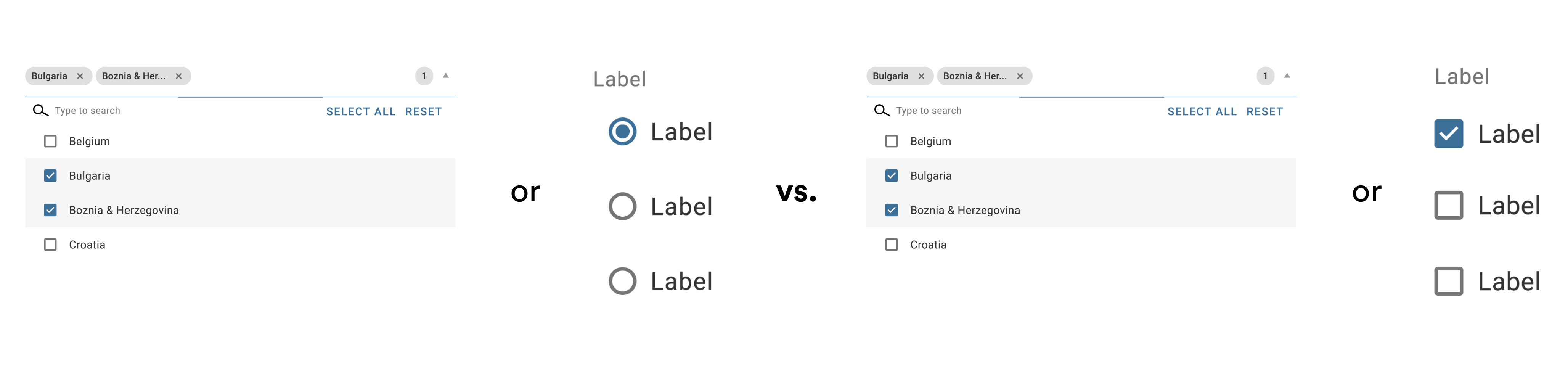
We can create rules around attribute component usage as well. For example, if the user can adjust the value of the attribute from a defined option set, and they can only select one, then we’re using a dropdown or radio button list.
If they can select multiple, then we would use a multi-select dropdown or checkbox list. By figuring out the characteristics of the attribute, we can determine the final level of granularity in the design by plugging these other components into templates.
Results: How the new approach impacted our team
We saw our design system as a key means to scale our abilities as a UX org. The purpose of any design system is to generate consistency while still optimizing the UX for specific use cases. Infusing it with object-oriented principles meant we could create a clear picture of the logical framework by which we design.
In doing so, we were able to open up the opportunity to join our team to people with no UX skills. We partnered with a non-profit that provided professional readiness skills to youth with non-traditional education backgrounds, and sourced candidates that way.
We were able to utilize money through government funding to pay these UX students for 175 hours of training at zero cost to the company. At the end of this journey, they joined us as full-time contract workers.
This was achievable not because of a huge time commitment from our team or the students. Rather, we focused on making design that much easier to learn in order to enable them much more quickly. This reduced our onboarding time, and also made it less intimidating to meet headcount needs if we expanded the team further.
"Not only did we strengthen our organization by employing a diverse candidate pool, but we also saved ourselves hundreds of thousands of dollars in salaries with candidates that we’ve been able to vet for several weeks throughout the training."
Head of User Experience, Commvault Systems
Multiple studies show that this has long-term effects on cost too, since providing training for people also helps cultivate loyalty and results in lower attrition rates.
Even more importantly, we created access to opportunities to work in software design. Not all of these newly-minted designers will stay with us forever—maybe other companies or aspects of product development will interest them.
The point is that by making it easier to learn how to design, we’re not only able to alleviate our own concerns about resourcing, but we can help all kinds of people contribute to our evolving digital ecosystem.
Interested in more articles like this? Check out...
Parisa Bazl leads the UX team at Commvault Systems. She's worked in UX for 12 years, beginning while in graduate school for Information Science. Throughout that time, she has been interested in challenges of scale. Much of her leadership work is focused on optimizing the impact of a UX team within an organization while also opening opportunities for diversity, equity, and inclusion in the design world.
She enjoys living in New York City, traveling outside of it, and working with people who bring out the best in each other.


Subscribe To People Nerds
A weekly roundup of interviews, pro tips and original research designed for people who are interested in people


