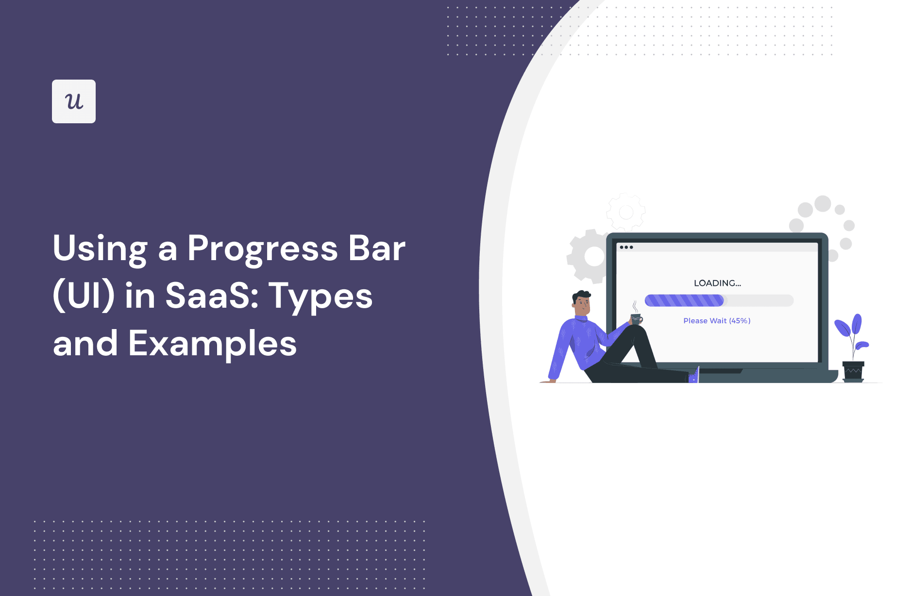
Using a Progress Bar (UI) in SaaS-Types and Examples
On top of serving as a handy progress indicator in your UX design, user interface progress bars are also a great way to set and manage expectations as users interact with your product.
In this article, we will explore what they’re all about, the different types of progress bars when you might use them, and the best tools to build them.
Let’s dive in!
TL;DR
- A progress bar refers to a visual representation of how a user is progressing in your SaaS.
- They primarily help orient your users to where they are in a particular journey: they help set expectations, provide instant feedback, and reduce user friction.
- There are many types of progress indicators, including determinate/indeterminate, loading wheels or spinners, percentage, time, or steps-remaining.
- These can be combined in several ways – this article contains multiple examples for you to draw inspiration from across the SaaS marketplace.
- Want to get started with progress bars? Get a Userpilot Demo and see how you can design and deploy helpful progress indicators that help your users in a range of contexts.
Try Userpilot and Enhance Your User Experience
What is a progress bar?
A progress bar is a graphical user interface element demonstrating a user’s task process in your SaaS i.e. data uploads, onboarding task completion status, loading progress, software installations, etc.
Progress bars are a universally recognized symbol: they’re used much further afield than just the SaaS world -think about charity or community fundraisers.
Why use progress bars in SaaS?
A fundamental principle of user-centered design is to reduce friction and tension wherever you can (to avoid a poor user experience).
Think from the user perspective: they don’t want to wait, be kept guessing about where they are in the process, or worry about what’s loading in the background of your app.
Using some kind of bar as a progress indicator (i.e. status icon) is a great way of providing feedback to the user across all these fronts.
There are many ways of showing progress.

Progress bars provide instant feedback
Speed and clarity are equally important: typically, users want to have a good idea about what’s going on, as quickly as possible.
Providing visual feedback immediately via a progress bar should be an aspiration for any product manager. At a glance, it’ll enable users to understand:
- Current: What’s happening right now?
- Recent: What has just happened?
- Future: What will happen next?
Now, there will be times when your app latency means an instant update isn’t possible.
In those instances, make sure to communicate with your users: create a message telling users you’re working on it.
That’ll help allay their concerns, even if it takes longer.
Progress bars reduce friction and drop-offs
You wouldn’t embark on a journey if you had no idea how long it would take.
Building a progress bar helps reduce friction and prevents users from abandoning a flow because it gives them a sense of certainty. The less friction, the fewer users will drop off and leave your application.
Types of progress bars
Progress bars come in many shapes and sizes. To maximize user value and get the most out of them, you need to carefully consider which might fit best.
Determinate or indeterminate
Progress bars can give an idea of time – but they don’t necessarily have to do so to remain effective.
Determinate progress bars indicate how long an operation will take when the percentage complete is detectable. For example, if a file is being uploaded, a determinate progress bar might show that 70% of the file has been successfully uploaded.
Indeterminate progress bars ask a user to wait while something finishes and are primarily used when it’s not necessary (or possible) to indicate how long it will take.

Looped animation or spinners
Another engaging UI pattern to consider is a spinning wheel.
This is a simple CSS animation that instantly communicates a couple of things to your user: the app is booting up, and it’s taking a while to load.
Including a wheel or spinner is a pragmatic, sensible move if you expect your user might have a slow connection (or delay) i.e. when loading data and have to sit there waiting for it to load.

Percentage progress bar
Research shows that people find longer waits preferable to uncertain waits. As human beings, we hate uncertainty in general – so anything that can be done to reduce it helps.
Percent-complete progress indicators are one of the more information-dense variations of wait-animation.
They include three critical pieces of information: progress so far, current position, and how much work is left to achieve your goals.
As a general rule of thumb, you should use percent-done animation for actions that take 10 seconds or more. Anything shorter, and a spinning wheel animation above might be a contender.

Time estimate progress bar
The principles of the percentage progress bar stand, but with a slightly different onus here: rather than counting ‘up’, we’re working backward.
This is particularly useful in the context of an application update.
For example, Apple uses a horizontal bar to communicate with users on file downloads and helps inform how much longer they’ll have to wait. This can be more tangible and helpful than a percentage (e.g. guessing how long the final 27% might take).

Steps left progress bar
This type of progress bar is an example of a tooltip. You can chain small screens together in a series, showcasing a handful of steps (which you’ll indicate in the tooltip itself).
This can be a better alternative to simply showing time or percentage.
Particularly if you want to drive a user to complete a range of specific tasks to get to an outcome, ‘steps left’ are a much more effective option.
Airtable uses steps left on its onboarding flow to keep users engaged.

Best SaaS progress bar UI examples
We’ve gone over the basics and started to look into the many varieties of progress bars.
In this section of the article, we’re going to explore a selection of relevant examples and best practices from a range of SaaS companies.
For each example, we’ll cover:
- Type of progress bar
- When it makes sense to use one
- What makes it work (and why each SaaS is a good example)
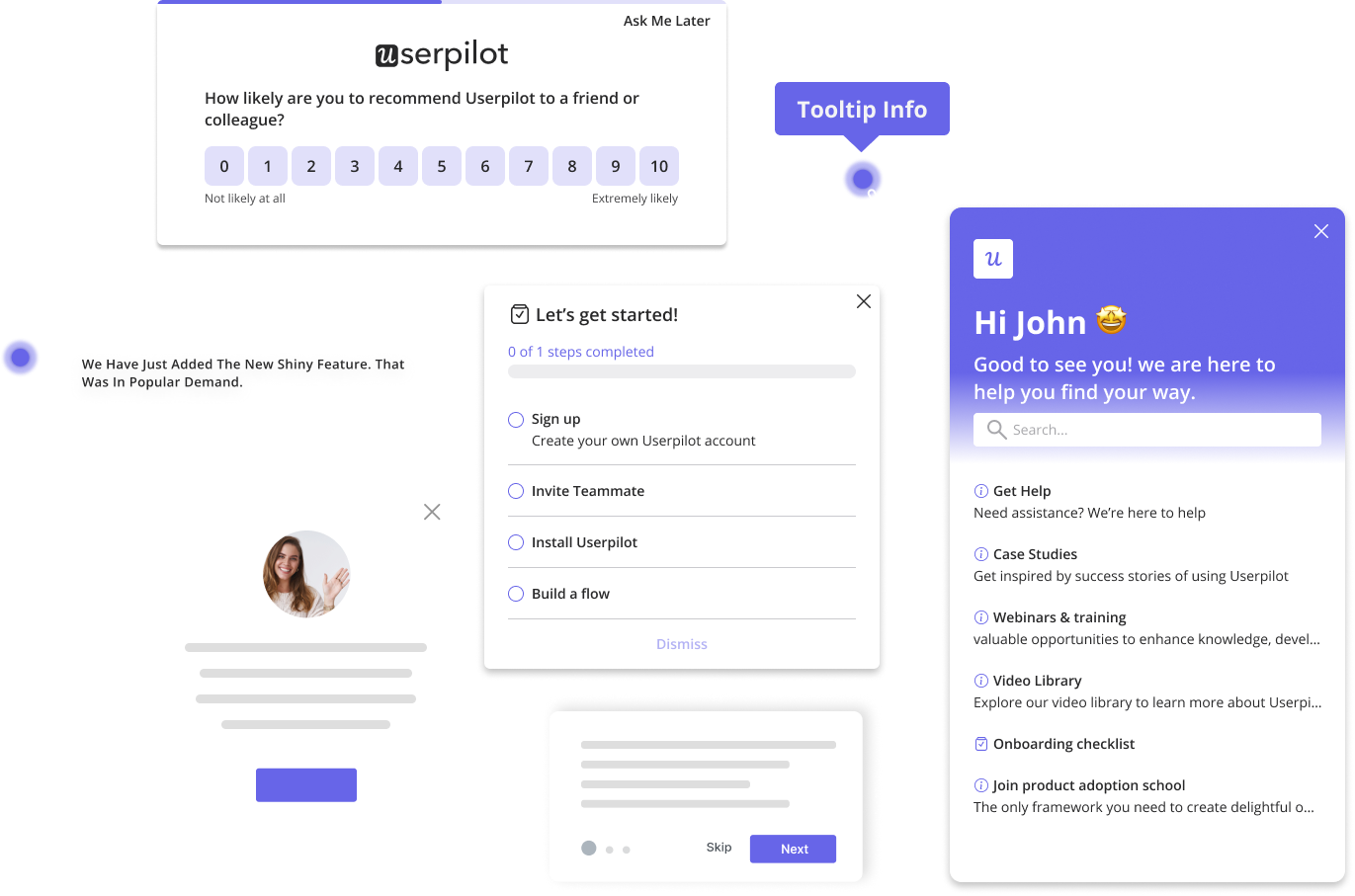
Userpilot percentage progress bar driving users to activation
Type of progress bar: Userpilot combines a range of styles here: steps remaining, and percentage completed.
When would you use it: To help drive users through a series of tasks and get to a specific point in the journey (in this instance installing Userpilot).
What makes it work: In this example, the percentage of the steps alone wouldn’t give a user enough information. Instead, they’ve got an excellent balance: they know what they need to do to progress and have a sense of where that leaves them in the process.

Airtable uses progress indicators during the signup flow
Type of progress bar: Airtable has gone for a very clean, simple determinate progress indicator underneath the sign-up form.
When would you use it: To help give users a sense of how they’re progressing in a journey without cluttering the browser with too many unnecessary details.
What makes it work: When trying to get users to submit sign-up details (capturing useful data along the way), every effort should be made to reduce friction.

Fullstory uses checkmarks and steps to show progress
Type of progress bar: Fullstory has gone for an adapted steps-remaining progress bar, breaking onboarding into four distinct stages and showing checkmarks once they’ve been completed.
When would you use it: In a sequential journey without too many stages (creating an account might be a good example) for a quick status update.
What makes it work: Keeping users motivated and engaged is always a challenge. Seeing how many steps are left before the process is complete helps drive users to the end of the sequence. On top of that, showing a checkmark as a user successfully progresses onto the next screen is a fun little motivator.

Backlinkmanager’s checklist progress bar to prompt users to engage
Type of progress bar: Backlinkmanager has gone for a clever option here, using a checklist as a progress indicator.
When would you use it: To draw your users into engaging with your app and get more value (perhaps once they’ve already reached the activation point).
What makes it work: A checklist is a much better alternative than asking users to fill in a form. One task at a time, helps users unlock value from your app.

Loom steps left checklist progress bar
Type of progress bar: Loom has created a fusion sort of progress indicator, combining a steps remaining bar with a checklist.
When would you use it: In a complex process with multiple phases, and relevant subtasks to complete within those phases of work.
What makes it work: This is a particularly successful example because it helps break what could be a hefty, overwhelming process down into something far more manageable.

Mural uses a progress bar and adds tips while the app loads
Type of progress bar: Loom uses an indeterminate progress bar, combined with a handy tip displayed on the screen above the bar.
When would you use it: Mural whiteboards can be large, complex pages with many elements that take a while to load – if you have a similarly large page, this example could work well for you.
What makes it work: The indeterminate option makes perfect sense here. But it can run the risk of leaving users in the dark, stuck on a loading page. But rather than make users wait with no end in sight, Mural takes advantage of the opportunity to share handy tips.

Slack onboarding numbered steps progress bar
Type of progress bar: Slack uses a tooltip indicating the steps remaining as part of an in-app onboarding experience.
When would you use it: To help users get up to speed with your app, by indicating a specific task to complete on a page.
What makes it work: Using a tooltip for this sort of progress indicator is a bit of a masterstroke: it helps users quickly focus on the task at hand and navigate the page effectively.

ClickUp progress bar highlighted steps using ”ball progress”
Type of progress bar: ClickUp has created a subtle steps version of a steps-remaining progress bar using small balls to indicate users’ position in a multi-step setup flow.
When would you use it: If you want to quickly show users how they’re progressing with a more time-consuming activity.
What makes it work: The ball UI pattern is minimalistic, and means a user can focus on the content on the page (in this case, personalizing a dashboard). It emphasizes how a progress bar can add to the experience without overwhelming the display.

ActiveCampaign uses a spinner, steps, and a linear progress bar
Type of progress bar: ActiveCampaign uses a broad array of different progress indicators: an in-depth checklist, steps remaining, and a spinner.
When would you use it: In a complex process, why wouldn’t you look at a range of options to help communicate progress in different ways?
What makes it work: Signup can be an overwhelming procedure. Some users might be put off by the sheer number of form fields. By carefully choosing which indicators to use, ActiveCampaign helps reduce that feeling of overwhelm (and therefore reduce user drop-off).

Trello mixes a percentage progress bar with numbers
Type of progress bar: Trello opts for a percentage progress bar (supplemented with numbered steps).
When would you use it: To give users a sense of clarity about how much they’ve done, while helping them understand how to progress to the final step.
What makes it work: Percentage bars can sometimes be unhelpful in the abstract. The combination of numbered steps (and checkmarks when they’re completed) helps users form a more realistic expectation.

Adding a progress bar to your in-app UI patterns with Userpilot
Userpilot is a powerful platform that’ll help you boost adoption and engagement. You can easily build checklists, tooltips, interactive guides, and progress bars – you have a range of templates (e.g. for loading pages) at your disposal.
You can even customize the completion message a user sees when they’ve completed a form.

If you’re building a series of tooltips to guide users through completing a task, it’s simple to add a progress indicator – either as a bar or balls (like we saw in the examples earlier).

Try Userpilot to Build Interactive UI Elements without Coding
Conclusion
In this article, we’ve explored what’s possible with progress bars: what they are, why you’d use them, and when you’d use them. We’ve taken inspiration and looked into examples from across the SaaS world to try and draw out important lessons.
With all of that knowledge, ultimately you should feel equipped to nail the use of progress indicators in your own company.
Want to get started with progress bars? Get a Userpilot Demo and see how you can design and deploy helpful progress indicators that help your users in a range of contexts.

