Feedback UI: Humanizing The SaaS User Interface Design With Visual Feedback
Does UI feedback affect the in-app experience for users?
Short answer, yes.
UI design is one of the most valuable ways you can enhance users’ experience and drive product adoption. And you can do that using feedback that engages and explains how your product works.
This article will show how you can offer valuable user feedback and improve usability using visual feedback.
TL;DR
- User interface (UI) feedback refers to how your product UI is designed to respond, and the type of output it generates based on how users interact with it.
- UI feedback is important when designing a product and its UX as it helps users achieve their goals easily. This reduces friction, improves the experience, and drives product stickiness.
- There are different types of UI feedback you can use, most falling into one of these categories:
– showcasing loading progress through loading screens
– feedback progress bars
– empty states UI feedback
– contextual guidance feedback (tooltips, modals, banners, messages, and microcopy) - Mural, Airtable, Slack, Miro, and more, all use different types. Check out the examples below and replicate them in your product.
- Get a Userpilot demo to see how easy you can create tooltips, prompts, hotspots, and more using a no-code platform.
What is user interface (UI) feedback?
User interface (UI) feedback refers to how your product UI is designed to respond, and the type of output it generates based on how users interact with it.
This is not the same as asking users for feedback about the system’s look and feel.
When users navigate the UI, a good feedback UI system is meant to engage and explain, making the user experience less confusing.
For example, when a user clicks on a button and nothing happens, it causes friction. But when an error message shows, this is how the system offers feedback.
Why is feedback important in UI and UX design?
Your product aims to help users achieve their goals easily while providing a good UX. Good usability helps with that but feedback is what makes the difference.
UI feedback improves user experience
Feedback is how you create a connection with your users and communicate contextually, setting the right expectations from the product.
When you tell users what they’ll get and when they’ll get it, you automatically improve their experience.
And since UI feedback comes in many forms, for example the change of button color, a small tooltip, an embedded message, etc., there are many ways you can offer meaningful interactions that improve user experience.
A simple example here is a pre-loader.
Pre-loaders are generally the first thing your users see when waiting for your app to load. Keep them staring at an empty screen and they’ll think something is wrong, reload the page and at some point, abandon the page. A simple animation, spinning wheel, or message displayed while the app is loading will greatly improve their experience.
Userpilot pre-loader.
UI feedback removes friction
Friction distracts users from achieving their goals and can lead to them dropping-off. With UI feedback, you can keep users on the right path and reduce friction with small guidance messages.
For example, incorporating feedback error messages in your signup forms can reduce friction and increase conversions.

Userpilot shows clear error messages.
UI feedback improves engagement
Less friction also means more engagement. But think bigger than just a small error message or a button color change.
With the right in-app prompts (UI patterns triggered based on how the user engages with the UI), you can drive more engagement with your app and help users adopt it faster.
For example, use native tooltips to offer more information about a UI element when the user hovers over it. Or add action-oriented messages to replace the empty state and drive action.
UI feedback drives product stickiness
Users churn when they don’t get to experience the promised value. Most of the times this is due to poor user experience and bad UI design causing users to not engage with your product as they don’t know where to start or how to do it.
So they do nothing.
The right UI design feedback drives users to take action and continue to progress through the user journey. Engaged users become addicted to your product. In other words, product stickiness increases when your UI is built to guide users.
Feedback types: How to provide UI design feedback?
As mentioned above, there are multiple ways to provide feedback through the UI to engage, set expectations, and guide users through performing multiple tasks.
Here are the most important types you as a UI/UX designer should consider.
Feedback loading progress
This is the type of meaningful feedback you should provide while the user is waiting for an action to be performed. Preloaders, loading pages, and skeleton pages are the UI designs to consider here.
The purpose of these tools is to inform users that the system is performing an action and that there aren’t any errors.
You can create interactive design (animations/spinners), or add messages that reinforce your brand and positioning. As a best practice, designers generally reinforce the brand along with a few tips that can help users further in the process.
Userpilot has a really good loading page that showcases what the product does and displays progress through a short message that clearly communicates the systems activity.

Userpilot loading page.
Feedback progress bar
Progress bars are used to communicate, you guessed it- progress. But there’s more.
When the user has to perform an action that involves them engaging with more than just one web page, a progress bar can keep them engaged. Seeing how far along they are in the journey, or how close they are to the finish line helps them finish the task.
The most common use case for progress bars is during signup and onboarding flows, but they can also be used to showcase any type of progress when you want to prompt the user to complete a task.
FullStory uses this type of UI feedback during their signup flow.

FullStory progress bar.
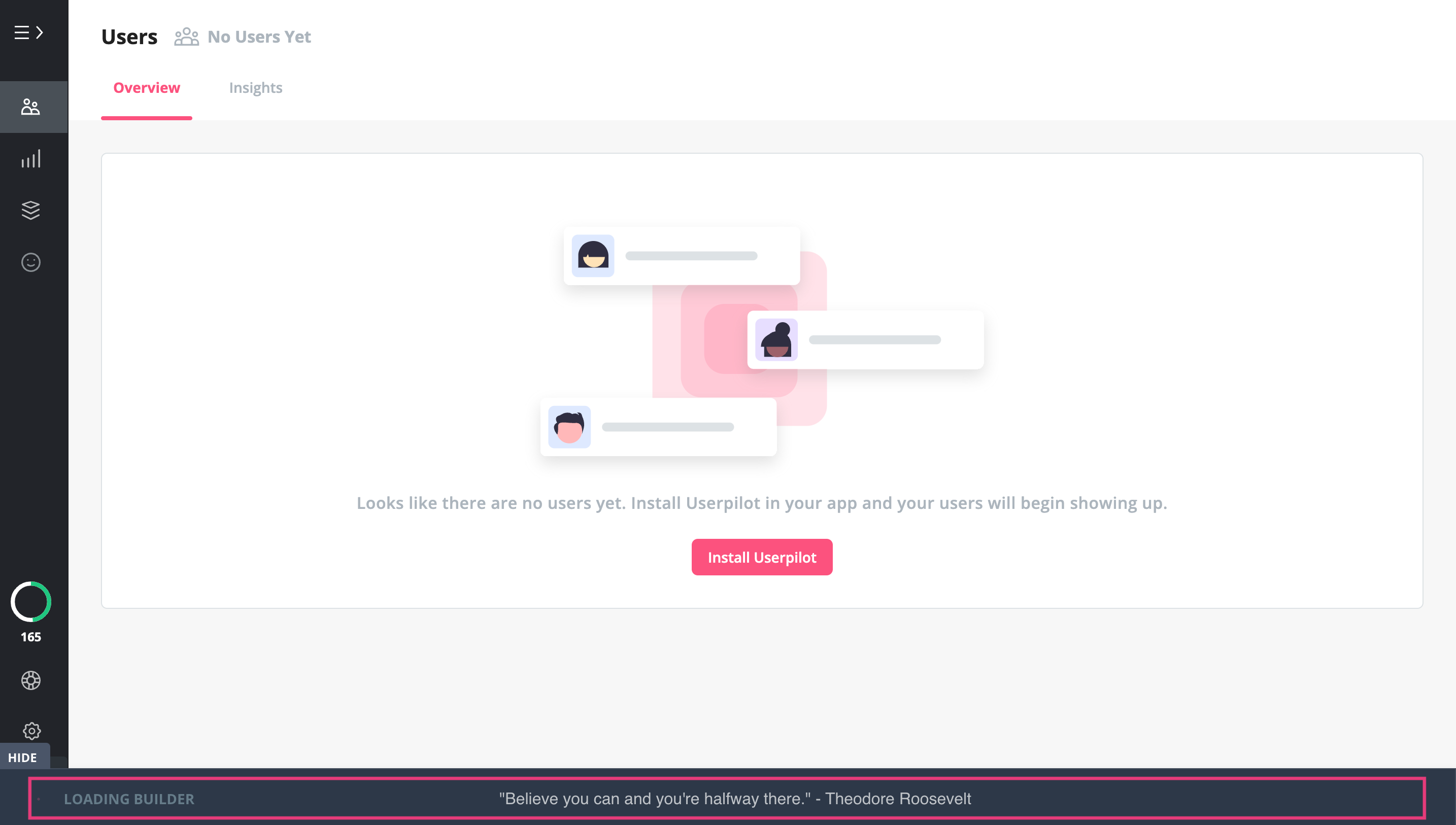
Empty states feedback
An empty state is a blank screen that users see when they log in to your platform for the first time. And it’s usually blank because there is no data to be displayed since the user is just starting out.
Often overlooked, this is a critical point in helping users get started with your app.
You don’t want your users to do nothing on their first experience with your product.
You should design your UI in a way that prompts users to quickly find their way around, take action, and get to experience value, fast.
If your app is a bit more complex, you can add demo data to replace an empty dashboard.

Mixpanel empty state.
Contextual guidance feedback
The above was static feedback that designers should consider adding to make the UX more engaging. But that’s not all.
Contextual feedback refers to the short messages, prompts, or other visuals that happen when users perform specific actions.
These can be an error message, small prompts, tooltips, button color changes, etc.
Look at Asana’s error message.
When the system encountered an error, a message was displayed telling the user what happened and what to do next to fix the issue. On top of that, they replaced the boring standard error code with a funny message that helps the user forget about the friction.

Asana’s contextual funny error message.
Visual UI feedback examples for SaaS companies
Now that you’ve seen different types of feedback, let’s check how other SaaS products are using these in context.
Mural – user interface feedback example
Mural uses a progress bar to show the current status, that is the app is loading. Notice the clever use of the white space on the loading screen that they filled with useful tips on how to use the app.

Mural’s progress bar with a pro tip.
Airtable – user interface feedback example
Airtable’s empty state screen is designed in a way to help users get started. The clear CTA prompts users to take action and the types of apps you can add that are displayed above the button set the right expectations.

Airtable’s empty state.
Userpilot – user interface feedback example
Here at Userpilot, we like to greet users to our app using a welcome message. But that’s not all.
A welcome message is a good way to promote UI feedback where you can not only welcome your users, but also tell them where to get started.

Userpilot’s welcome page.
Slack – user interface feedback example
Slack uses tooltips during the onboarding flow to set the right expectation about using the app. On top of this, notice the small banner? This UI feedback tells what the channel is about.
Microcopy is also a form of UI feedback, offering small tips and guidance contextually.

Slack’s tooltips for onboarding.
Airtable – user interface feedback example
Airtable uses descriptive tooltips in its interaction design to explain specific features in more detail and pairs them with hotspots to drive the user’s attention to the right UI element that the tooltip is describing.

Airtable’s tooltips and hotspots.
By the way, if you want to learn from the pros, we’ve covered how Airtbale onboards new users and all the user interface elements they use. Plus, how to replicate these using a no-code tool (Userpilot, of course).
Here’s a hypothetical welcome message built with Userpilot.

Hypothetical Asana’s welcome message created with Userpilot.
Miro – user interface feedback example
Miro shows a confirmation message before an action is performed. This is a good practice, especially when dealing with important actions that involve privacy or user data.
This simple message sets the right expectation and is also an upsell opportunity as it leverages FOMO for the premium feature.

Miro’s warning message.
Another Miro user interface feedback example
Another example of immediate feedback in the UI is the small icons displayed on the screen to draw users’ attention to different elements.
Miro uses one to tell users that there are unread messages (the higher the number, the more urgent it feels and pushes the user to engage) and also adds a small tooltip to explain what will happen when they engage.

Miro’s icons and tooltips.
Userpilot – user interface feedback example
Native tooltips are those small icons you place next to an element, like in the Miro example above. When the user hovers over the icon a short message is displayed, providing context.
You can easily build these using a tool like Userpilot, without having to code.
Design tooltips and place them on any UI element, with a few clicks using Userpilot.

Userpilot’s native tooltips.
Simplenote – user interface feedback example
Displaying an error message when the user inputs the wrong data is a classic example of good UI feedback.
Simplenote’s sign-up error message highlights the UI elements that require the user’s attention and displays a message with instructions.

Simplenote’s sign-up error message.
Rocketbots – user interface feedback example
Rocketbots (now respond.io) interface triggers contextual feedback based on users’ actions. Each tooltip is triggered to show once the user performs a specific action.
This way it guides the user to complete a task and engage with the product without encountering friction.

Rocketbots interactive tooltips.
Conclusion
UI feedback elements are essential as they help your users get the most out of your platform. This should be a part of your product design and needs to be implemented, if not already.
If you want to enhance your in-app experience with feedback UI, book a demo with Userpilot today!