Contents
When a voluntary initiative tries to help local businesses, and they need you to design the product in less than two weeks, it’s everything but usual. Here’s how we approached this seemingly impossible task and what we’ve learned.
Content:
- The Pakk idea (Summary)
- Approach and plan (Methodology and project plan)
- Designing Pakk (The project itself)
- Package delivered (Results and conclusions)
The Pakk idea 💡
Pakk’s concept was created by a handful of Hungarian enthusiasts who had a simple goal in mind: to connect struggling small businesses with their customers and help them during the coronavirus outbreak. They envisioned a mobile app that would let users explore local shops nearby, allow them to see what services they offer and enable them to order a custom package put together just for them. Hence the name: Pakk, which means package in Hungarian.
Their initiative reached out to UX studio to ask for help with designing this product. So a team of two UX professionals accompanied the Pakk team for a short period of time. The task was to walk them through the UX process and guide them in creating a useful and easy-to-use app. The UXers were:
- Barbara, UX researcher, 🧪
- and Sandor, Product Designer. ✍️
Approach and plan 🤔
As small businesses struggled to keep up with the lack of customers, shortened opening hours, and other regulations, every single day counted for the Pakk team. So we had to move quickly, too — this meant that we had only hours and days for design and product decisions. We started on the second week of April, and our goal was to deliver the final UI in just two weeks to have Pakk ready and running by the end of the month. Honestly, it seemed impossible.
The main problem was that the core idea of Pakk was shaping right before our eyes. Plus we had to face a short working week as well due to Easter, which clipped off two precious days of the already little time we had on our hands. So here’s what we came up with:
- A kickoff on the second day that aimed to gather as much information as possible
- A working prototype by the end of the first week
- Usability testing, prototype iteration on the second week
- Final UI and UI testing on the second week
- A closing meeting that focused on which parts of the product worth keeping an eye on in the long run
We also recognized that instantaneous communication between our team members was crucial, so we set up a Slack workspace and relied on short, on-point video calls. These helped to make key decisions in minutes and allowed us to react to user feedback immediately. On the other hand, it was clear that many of our design choices could not be validated in just two weeks. So we created a list of problematic/promising points for future reference.
Designing Pakk 🌈
Kickoff
We prepared a kickoff meeting to get to know each other, the product itself, and decide on how to approach the design in general. A widely used mission-vision workshop came handy to define Pakk as a brand, while the value selection workshop showed us how Pakk wanted to represent itself and connect to its users. During the latter, we tied down that Pakk should be accessible, effective, trustworthy and, most importantly, safe. These were the key values we followed when it later came to design choices.
Along with the developers, we also established an impact-effort matrix to see which features could launch with 1.0 and which should be prioritized later. This allowed us to see that the classic webshop experience was way out of scope — the Pakk team simply did not have enough resources to maintain a database in the 1.0 version with items, services and prices. Therefore, we had to convince users that contacting these businesses manually would be an easy way to order and pick up a custom package.
An ever-changing prototype
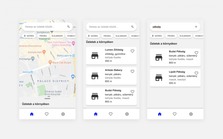
So there we were with a few, easy-to-implement features with a huge impact: geolocation, the option to search on a map, the possibility to see which businesses offered contactless payment, where staff worked in protective gear and a few more. Because of this, it seemed clear to go with a map-focused solution: our first prototype showed local businesses nearby on a map.

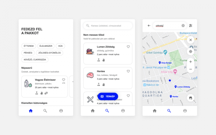
Although we agreed it was a good approach design-wise, we realized Pakk was not something users might use for browsing between different kinds of shops. See, if you want to buy milk, you won’t really consider going to a butcher shop. Instead, you’ll want to see different shops to choose from. So, we figured a more funnel-like flow would better satisfy user needs — and this is how we arrived at the second version, on the first day of the second week.

A home page was introduced, which was beneficial both for the businesses (to gain exposure) and the users, who were able to browse shops sorted into predefined groups. Taking the main values of the brand into consideration, these groups were specified as: “popular” (frequently favorited), “safe” (shops where staff worked in full protective gear), “online ordering available”, and “new shops” (that joined Pakk recently). We moved search onto a dedicated page, which allowed us to keep the list and map views. Since we assumed that search was going to be a heavily used feature, we put tags on the home page that lead to search results outright, speeding up the wayfinding process.
We still had to convince users to contact the shop manually, and the Pakk team raised the need to somehow tease with a full-fledged webshop experience, which would eventually be coming in later builds (and was excluded from this MVP 1.0 version). That’s why this “funneled” flow drew a lot of attention to the vendor’s subpage. This was iterated many times, and the final solution cultivated into a straightforward screenflow that explained the ordering process and encouraged users to contact the shop.
Conducting usability tests and interviews
Meanwhile, recruitment for testing was ongoing. Since this was a pro bono project, we couldn’t offer incentives. Despite this, people were open and excited to participate, so it was relatively easy to find people for the usability tests. This heartwarming experience motivated us along the way, and we are incredibly thankful for all of the participants for their time and precious feedback. Besides intensive recruitment, tight scheduling was also cardinal to be able to jump into tests during the second week.
We started these tests with a short interview session to find out our target audience’s shopping behavior during the lockdown. This made it possible to add quality-of-life improvements to the app. One great example is that we added average walking time instead of simply using meters, which turned out to be a really helpful addition since a lot of our subjects preferred to take a walk to these shops rather than using public transportation.
In the testing phase, we focused on wayfinding. Subjects were given a task (to find a bakery, for example), and we followed them through the prototype while constantly reflecting on problematic points. To bring an example, one of the most frequently encountered problems was the switch between the map and the list view of search results. After trying many different solutions, it was finally decided to use a floating CTA which performed well during the tests — but was marked as a potential problem point that should be monitored closely later on.
Package delivered 📦
Creating a strong visual language
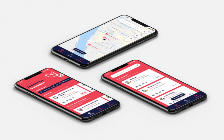
Our team moved on to the UI as soon as we settled on the structure. This happened in the middle of the second week and also posed a great challenge. We proposed various approaches to match the values defined during the branding session. The Pakk team wanted a powerful style that was going to grant individuality to the brand. That’s why the complementary red color became the background color in the final version. At the same time, it suddenly became hard to design even smaller components to maintain visibility and emphasis on key elements.

Because of this bold and venturous design language, the proper final test of the UI became even more crucial. Using Invision, we build a simple UI prototype with a single flow, but this time research aimed to examine specific interface-related issues like readability and recognizability. Issuing minor tweaks, recoloring elements, iterating on icons, letter spacing, and implementing many other smaller improvements, the final screens were slowly taking shape.
We regularly updated the Pakk team on our findings, while continuously pushing new screens to Zeplin (which we used to hand over the screens and explain mechanics to the developers). A UI kit with many elements and their states was also created and kept up-to-date, which made it easier to migrate this system into code. This resulted in a smooth transition into the development phase, where our collaboration officially ended.

Takeaways
During the two weeks we spent on designing Pakk, we created four iterations of prototypes, more than 150 UI elements, 50 screens, 10 usability tests, not to mention the countless calls we had with the Pakk team. All in all, we can proudly say that we created a great digital product together. While we are writing this, the Pakk app is already released on the Hungarian market.
We could mention a lot of things that could have been done more effectively during our collaboration. Still, at the end of the day, we managed to build and optimize the interface with an unusually strong appearance that suits Pakk.
If the main takeaway should be defined, it’s this: you can’t plan everything or prepare for the unexpected. When you have two weeks to build a product from the ground up, you have to create a detailed plan ready for execution, but it also takes a lot of flexibility to adapt to challenges quickly. What we’ve learned is that you have to keep moving forward, whatever it takes.
We want to thank the Pakk team for their exceptional work during our collaboration and everyone who helped us in this project.
Searching for the right UX agency?
UX studio has successfully worked with over 250 companies worldwide.
Is there anything we can do for you at this moment? Get in touch with us and let’s discuss your current challenges.
Our experts would be happy to assist with the UX strategy, product and user research, UX/UI design.


