
Contents
Even if you are far from being a football fan, I’m sure you’ve heard of Barcelona and Real Madrid football clubs at least once in your life. These two teams have been at the top of European football for many years now, and their game called El Clasico always attracts a lot of attention. Ahead of the upcoming game, we, as a UX/UI agency, decided to compare the websites of the two Spanish grandees and find out which club has the better one.
We studied 11 of the most popular sections and compared their usability, user experience, appearance, and functionality. If the section was better, a goal was scored for the winning team. In case of a draw, a goal was added to both clubs.
Let the battle begin!
Home page
Both websites start with an almost full-screen “most recent” article or video. Below, there are three more listed. The only difference is that Barcelona shows the publication date and a team tag. This helps users make sure the content is up to date.
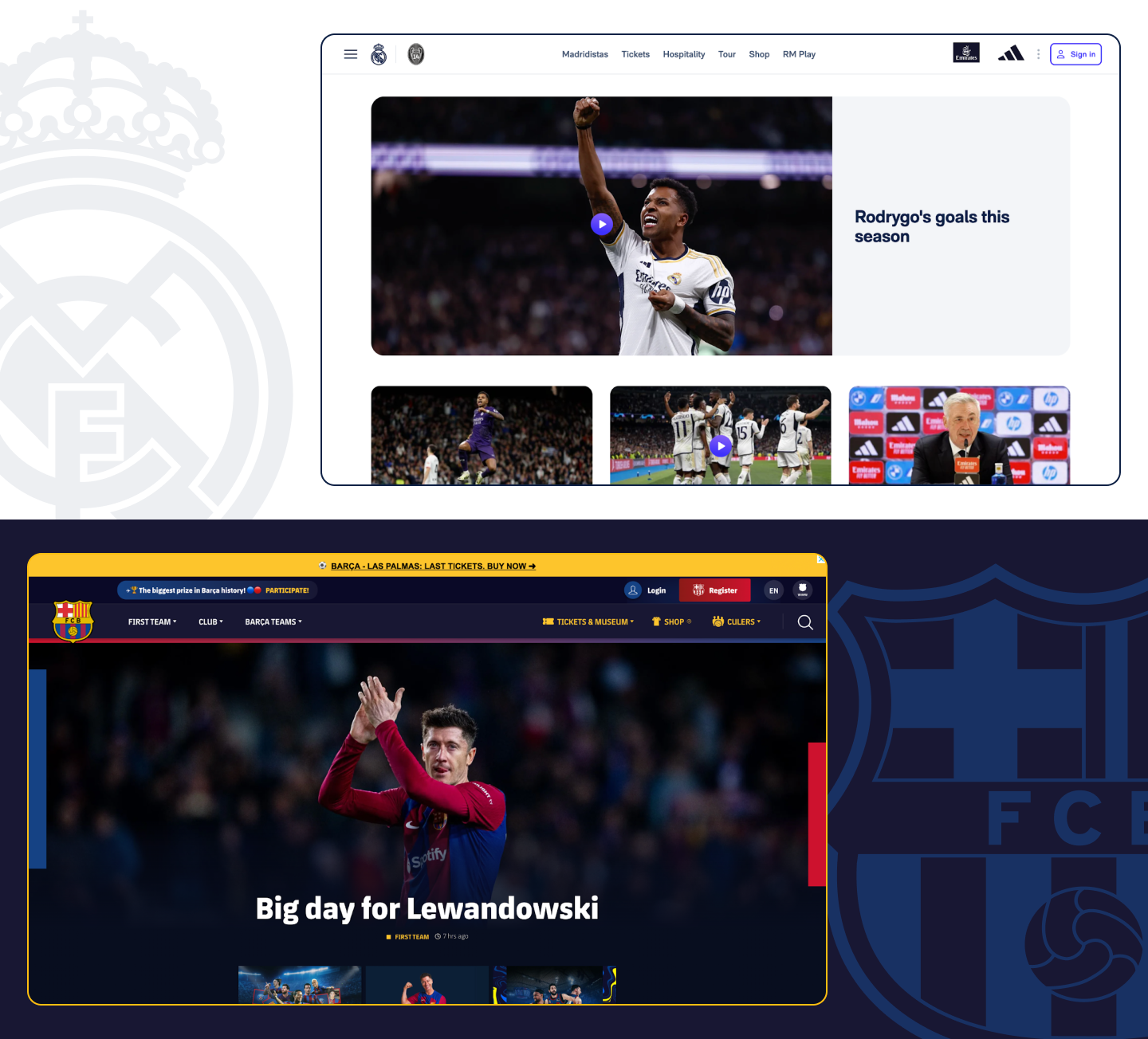
Barça is actively using a stories format, and that’s exactly what you’ll see next on the page. It might be a bit surprising for desktop users, but for the young generation that uses smartphones most of the time, it’s a great way to digest the club’s content.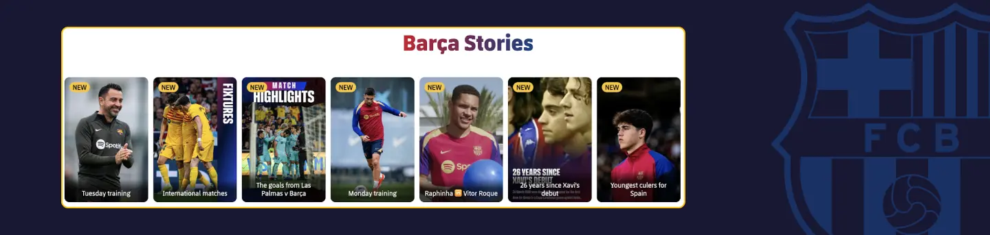
Real Madrid shows content using the same cards throughout the page for articles but does not always include section headings, making it difficult to determine which category these articles/videos belong to. This can confuse readers and cause unnecessary cognitive load. 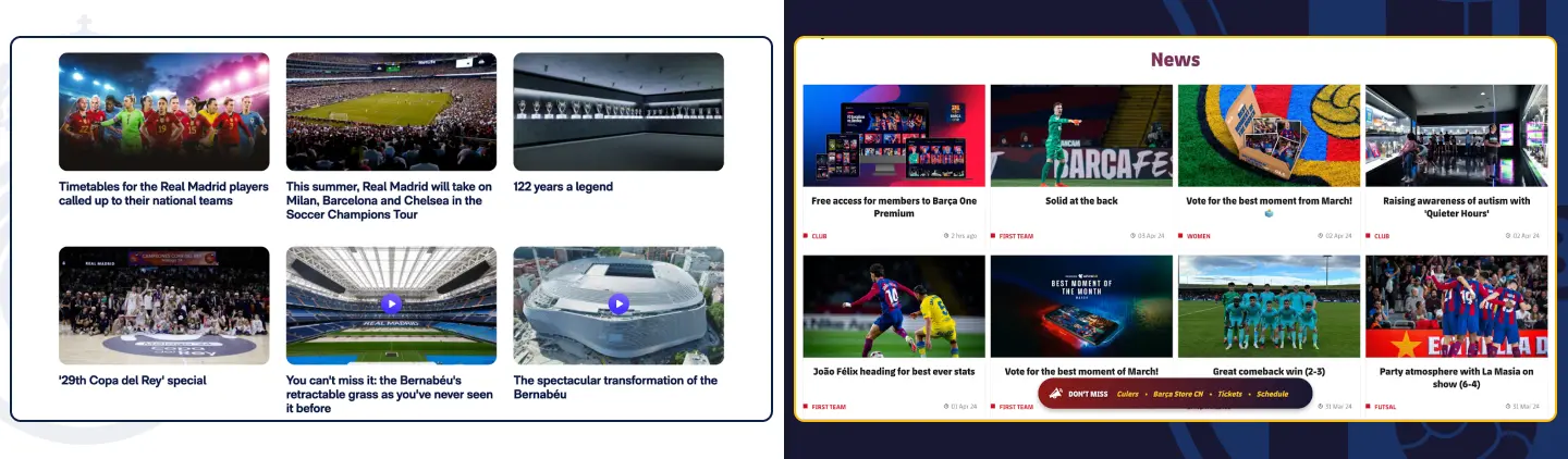
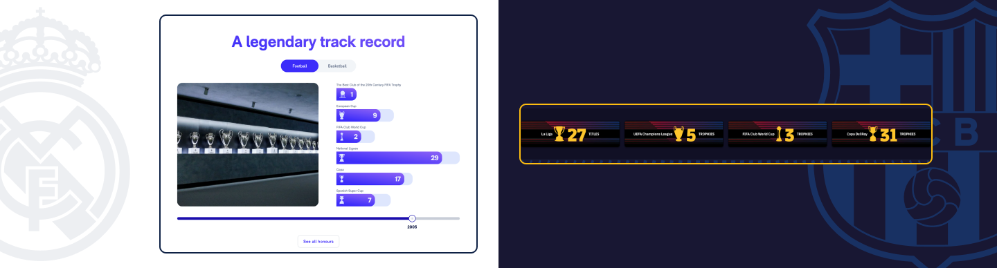
Both clubs have trophy sections. Real Madrid has made it interactive: if you drag the stepper, you can see how the number of trophies changed over the years.
Overall, Barcelona’s home page offers significantly more content and is better structured or grouped than Real Madrid’s.
Navigation
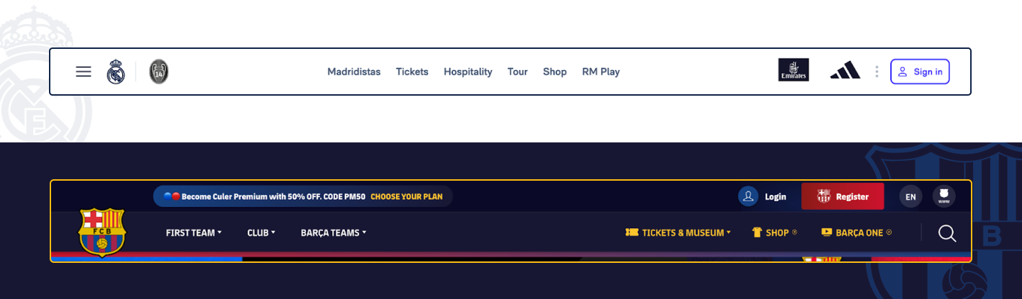 Clubs take significantly different approaches to navigation bars. Barcelona prefers to show all sections of the site there, while Real Madrid prefers a more minimalistic version. On the Real Madrid page at the top, we see only those buttons that can bring the club money. All team information is hidden under the menu icon in the full navigation menu, requiring users to make an extra click to access the information they need.
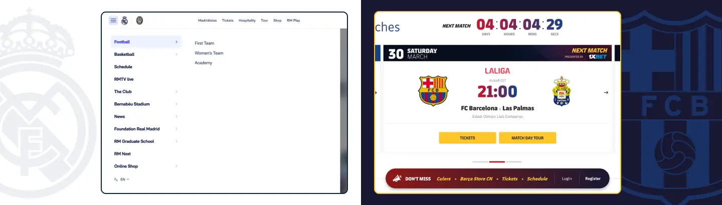 As an additional feature, Barça uses a floating bar at the bottom of the screens with buttons, such as “Tickets”, “Schedule,” and “Barça Store”. Surprisingly, the main navigation bar doesn’t disappear either when you scroll, so you can see both bars at the same time. This duplication can ensure that users always have the menu options available, but on the other hand, the screen space could be utilized more efficiently. For example, the top navigation bar could disappear when the user scrolls down the page to fit more content on the screen.
Functionally, both panels are identical, so there’s no winner here.

Schedule
Let’s start with the Real Madrid calendar page. There, we see cards of club events, which, shockingly, are not clickable. Only the “More” button (which has a relatively small clickable area) is an interactive element that allows you to see information about tickets and proceed to their purchase. This is a serious miss that could be an obstacle for some potential buyers.
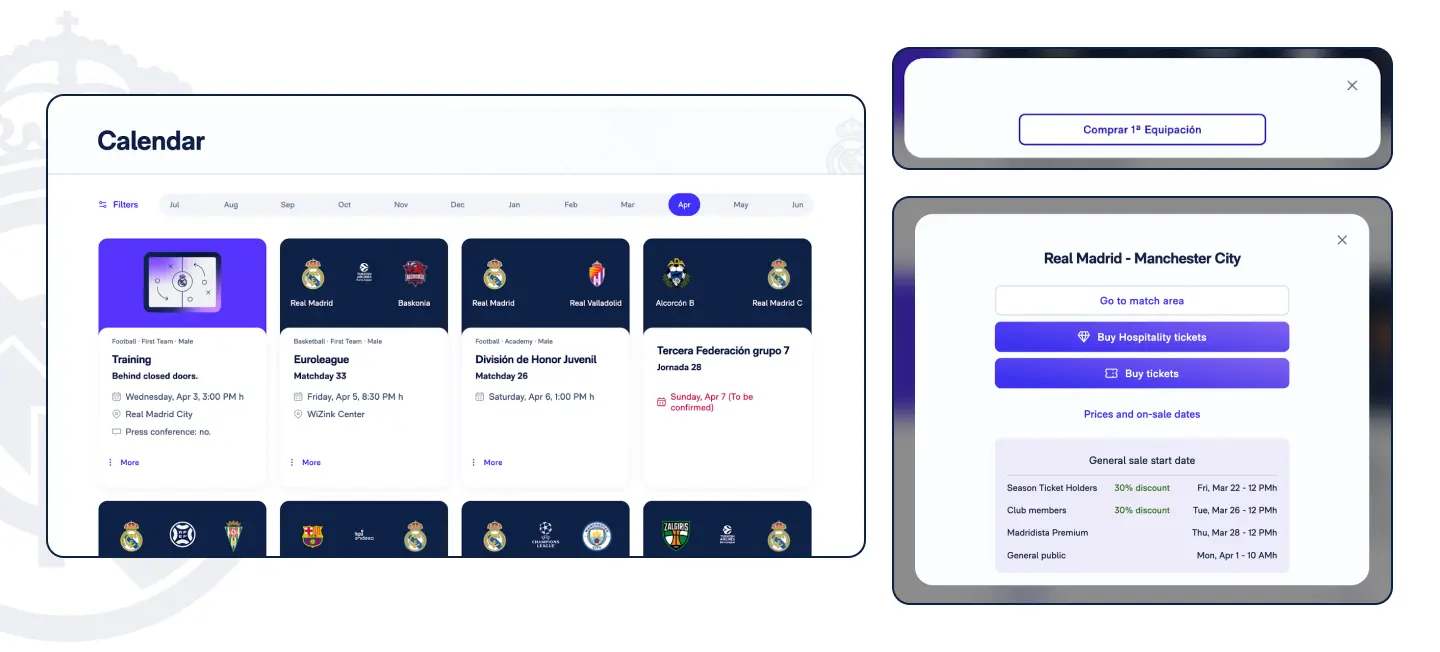
The club also shows training sessions on its calendar you can’t buy tickets for or attend, and if you click on the “More” button, you see a modal that can only take you to the club shop. And yes, the text on the button is in Spanish. All things considered, it’s hard to understand why they were added to the calendar.
I was also surprised by the filters because it took me a few tries to realize that I could scroll down the page and see more of them.
There’s not a lot of information in the match area, sometimes just content not related to any specific matches. There’s a news feed, similar to Instagram, where you can leave reactions.
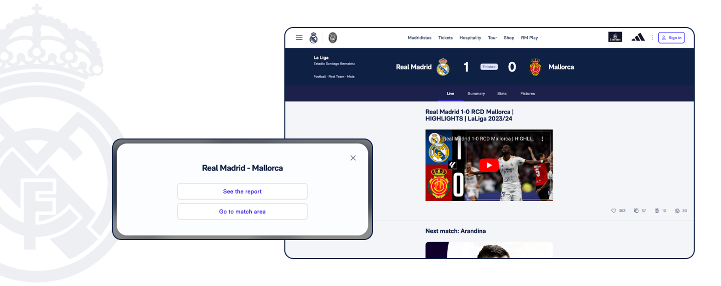
For matches already played, Real offers to see a report and go to the match area. Unfortunately, clicking on the former took me to the home page. In the match area, I found the same news feed with post-match content and a live text feed at the bottom. Its visual hierarchy raises some questions – when there’s no clear separation between different types of content, users can get lost.
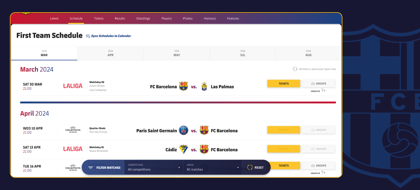
Barcelona has a similar layout but is structured in a more convenient way. It also puts the ticket purchase option in front (even for a group). In addition, you can synchronize your club’s schedule with the calendar and filter matches by competition and venue.
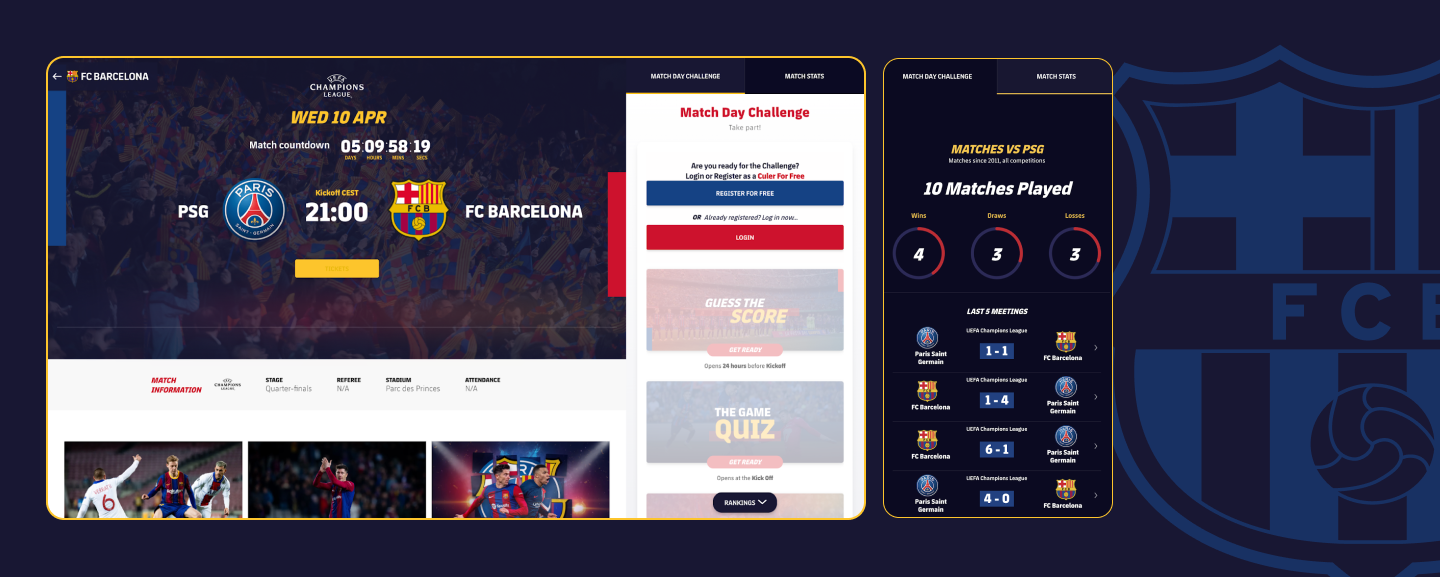
In the match area, you can find content prepared for the specific game and compete in fun activities. You can also read about the history of the rivalry between the clubs and even check the reports of the last five games. That can help users be more engaged and prepared for the next game.
For previous games, Barça offers a text summary of the match, post-game activities, and match statistics.
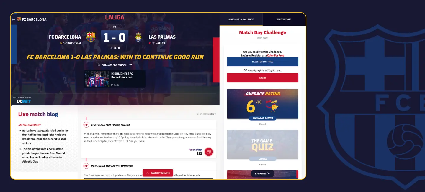
An engaging point of interaction that you can see almost everywhere on the site is the Força Barça button, which fans can click to express their support for their club. By doing that, fans share their emotions and get them from others, seeing how many reactions every post gets.

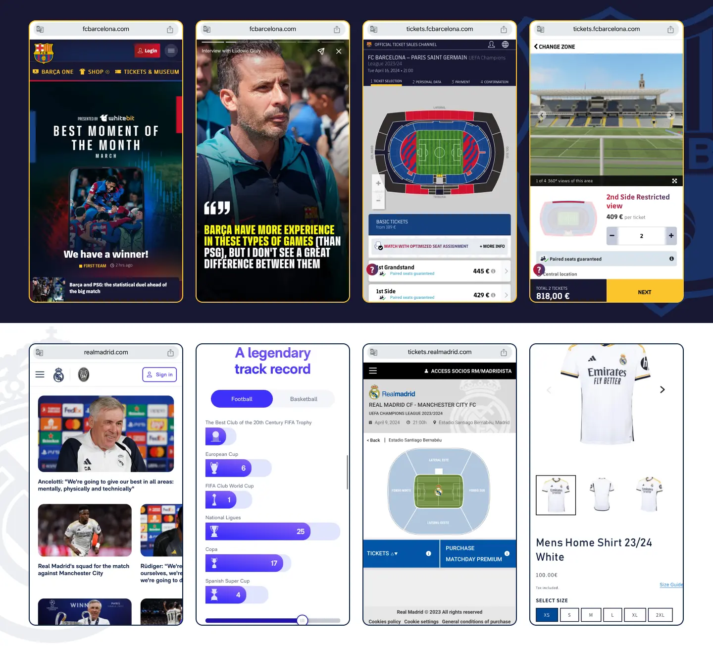
News
The Barcelona news page is called “Latest,” which may not be very intuitive. All news is grouped by day of publication and can be filtered by competitions and categories, making navigation easier.
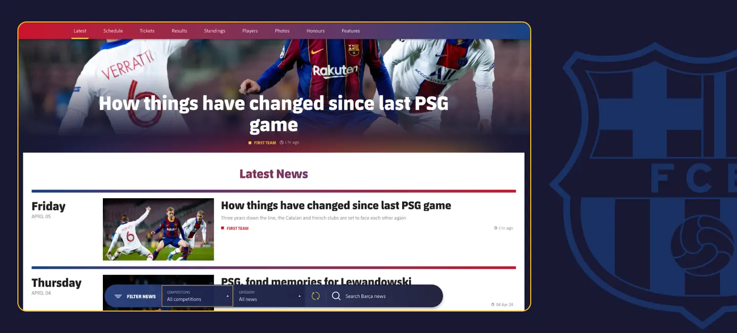
In addition to the text and pictures in the article, you will find buttons for quick sharing, a widget with which you can buy tickets for the game, and more content related to this article at the bottom. In addition, users can react to it with the Força Barça button. One can click it up to 10 times, making superfans rejoice. 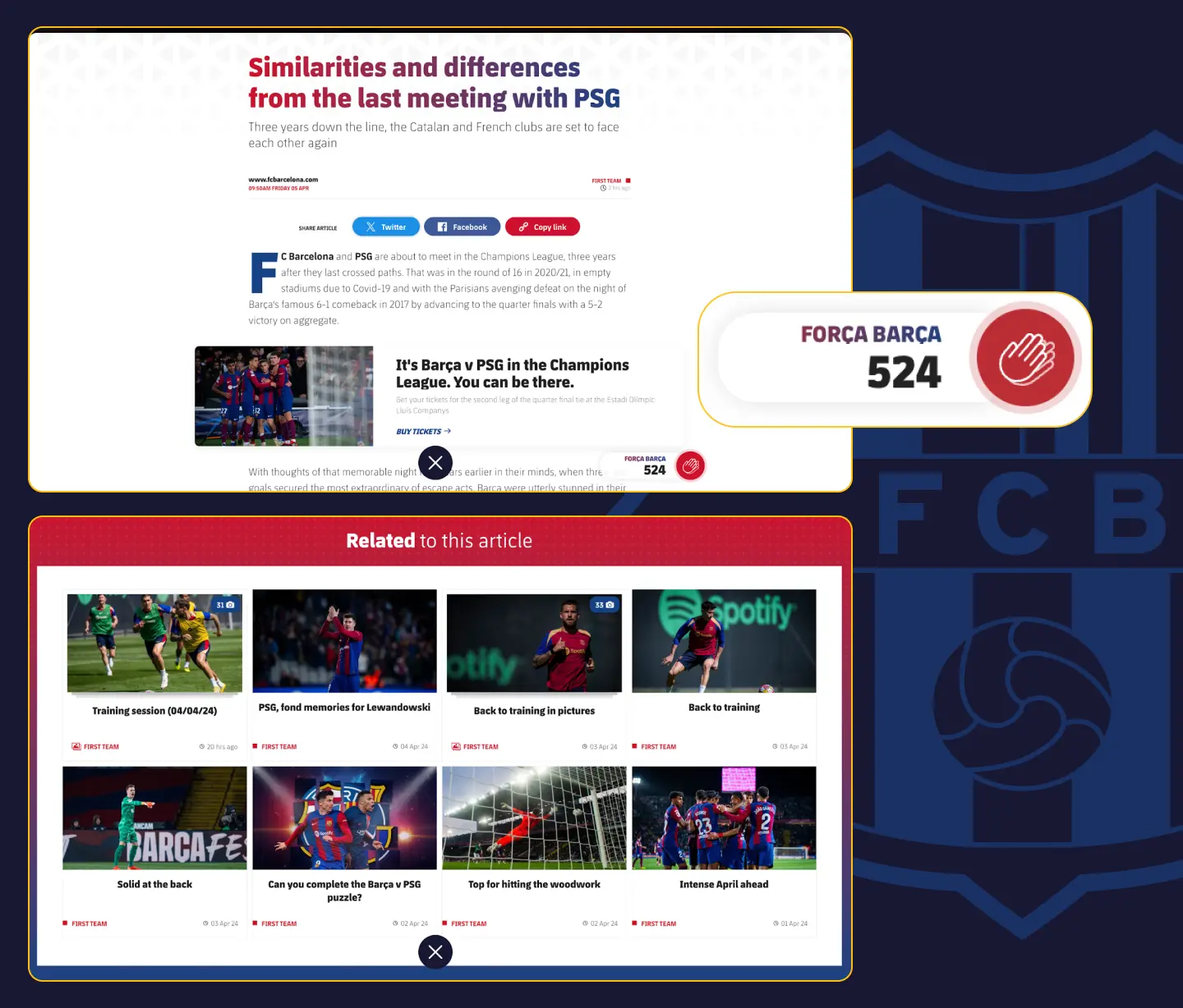
In comparison, Real Madrid is once again taking a more minimalist approach. The news page looks almost the same as the home page. There is no grouping and no publication dates. The articles themselves have a simpler look. There are no quick sharing links and other content offered. While minimalism is in keeping with the classic style of the club, it has a negative impact on functionality.
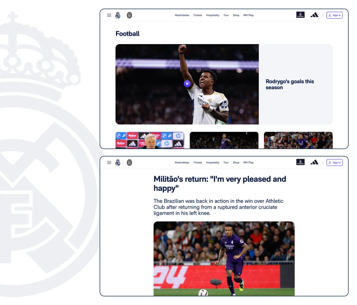
Since Real Madrid’s news page fails to implement several important features that could help users get more content, this round also went to Barcelona.

Stadium reconstruction section
Both clubs are currently in the process of refurbishing their stadiums, so we have an amazing opportunity to compare how they display this on the website.
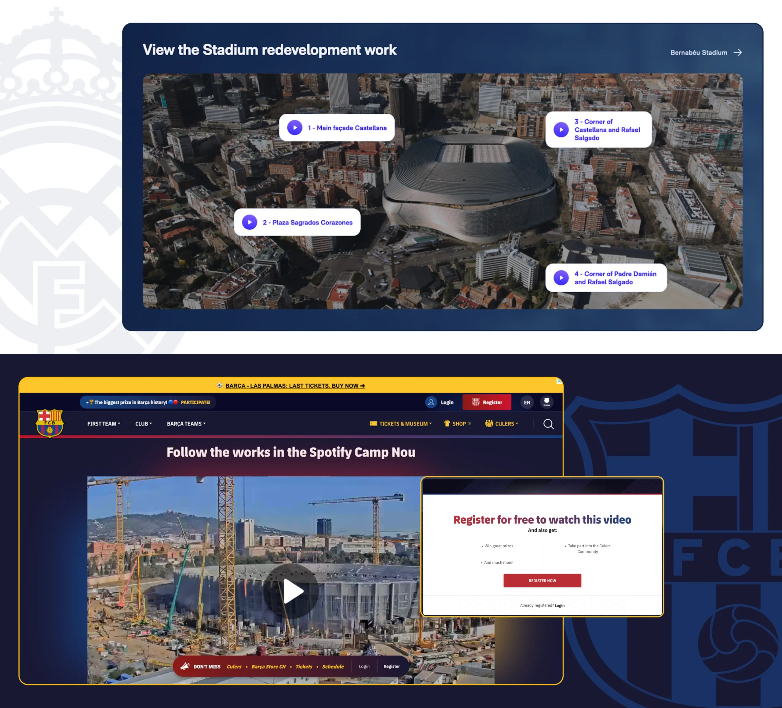
Real Madrid offers a look at how the renovations are taking place from different angles. Each one contains a 3-minute pre-recorded video but no information on when they were shot. I opened it the next day, and the video was exactly the same. This may disappoint fans who want to watch the live video of the reconstruction. Also, when you switch to another video, the previous one is not paused and you continue to hear the audio from it.
To watch the Barcelona live stream, you need to log in. This is a good point to attract users to create an account and sign up for the newsletter, but it can be annoying if you just want to watch a video quickly.
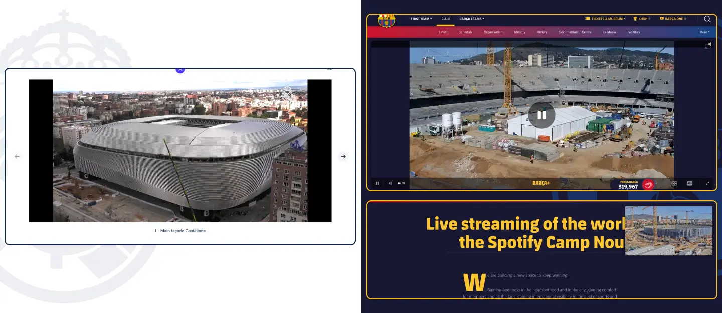
After logging in, you can see live video with auto-switching and rotating cameras. If you scroll down the page, the video will shrink to a compact size, which is very convenient.
Despite the friction of forced log-in, Barcelona clearly won this round.
First team
It’s time to take a look at the team’s squad page.
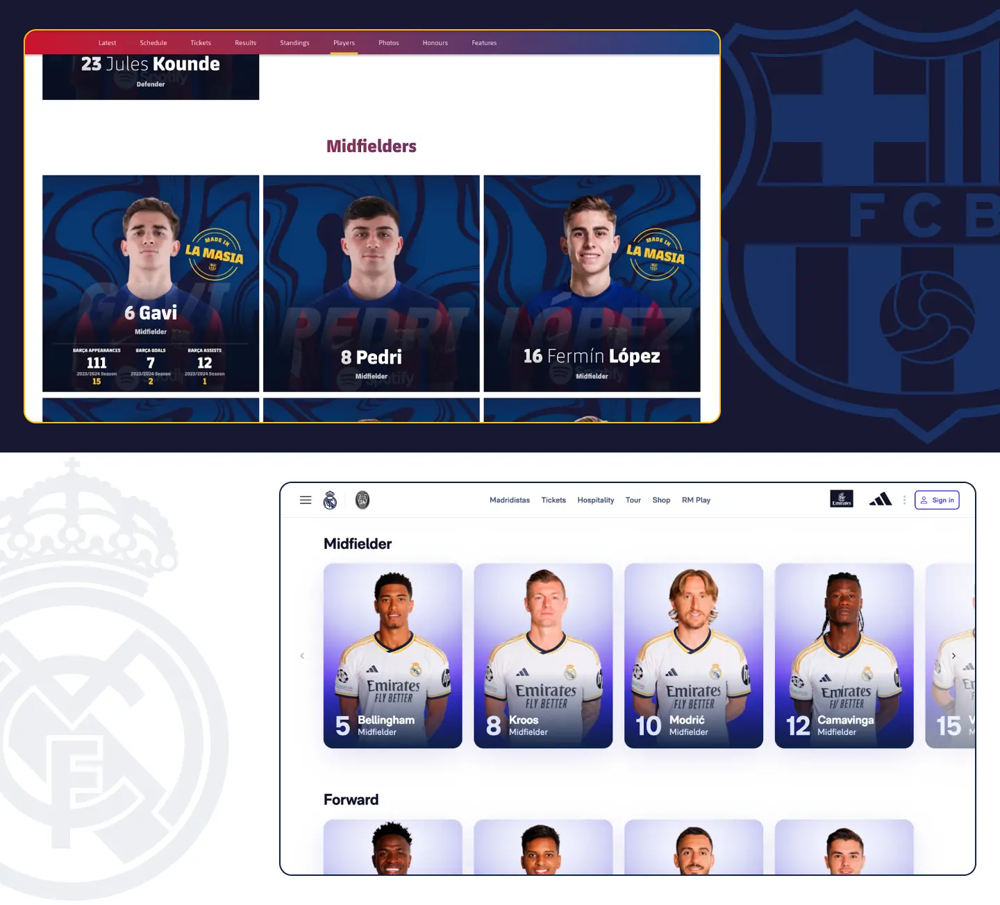
Both team pages have a similar layout, but while Barcelona has all the players in one vertical list, Real Madrid has fixed rows of players’ positions. You need to click on the small chevron icon to see players that don’t fit on the screen since neither horizontal scrolling nor dragging works here. Barcelona has an informative card hover that shows the player’s stats.
In contrast, the clubs have chosen different strategies on their player pages. While Real Madrid focuses more on detailed player statistics, Barça emphasizes content related to the player.
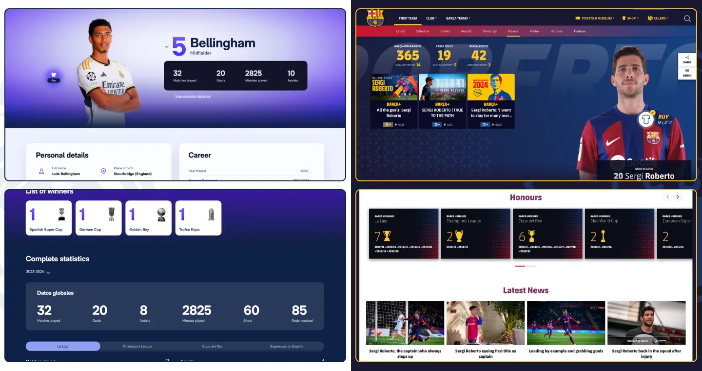
I don’t think there’s a clear favorite because, functionally, both pages are identical. It’s a draw.
Club media
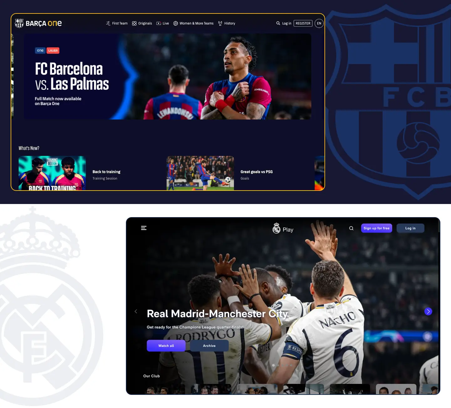
As we analyze two of the best football clubs in the world, they both have huge club media, Barça One and Real Madrid TV, with lots of unique and exclusive content.
As these deserve their separate article, we won’t go into further detail here. But kudos to both teams for having these platforms.
Membership
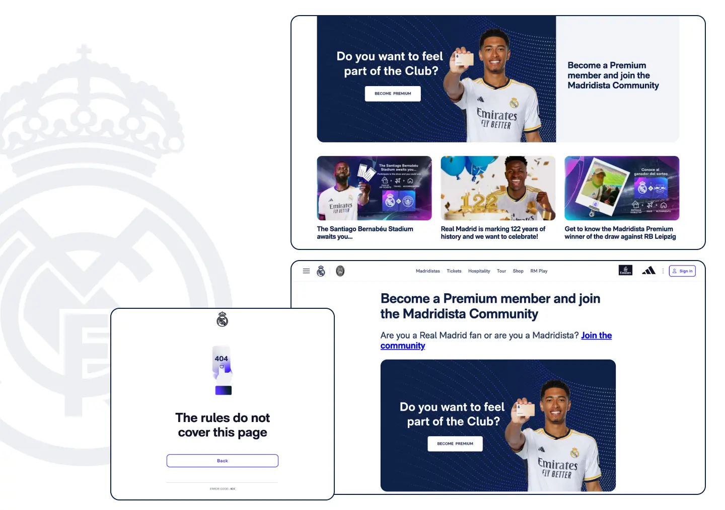
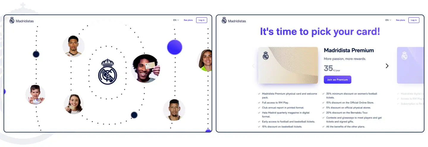
Both clubs offer their fans the opportunity to become premium members. Real Madrid has a huge block on the main screen dedicated to this. But it has one big problem: it is not working (at least on the English site). It takes visitors to a page with the same, but a not clickable picture and you can only go further by clicking on the “Join Community” button in the paragraph. Unfortunately, it lands on a 404 page.
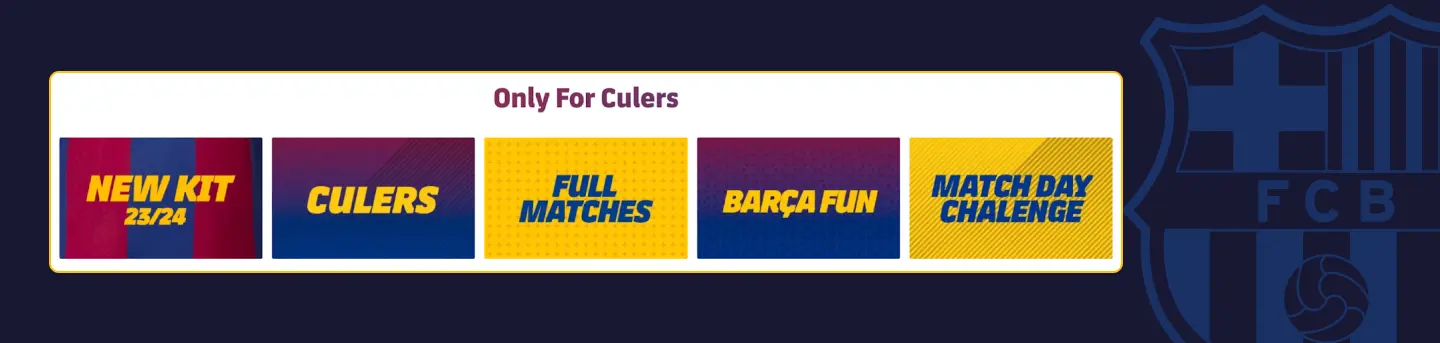
Barcelona also has a similar block on its home page, but it only consists of 5 cards with links.
That’s how the Membership pages of both clubs look.
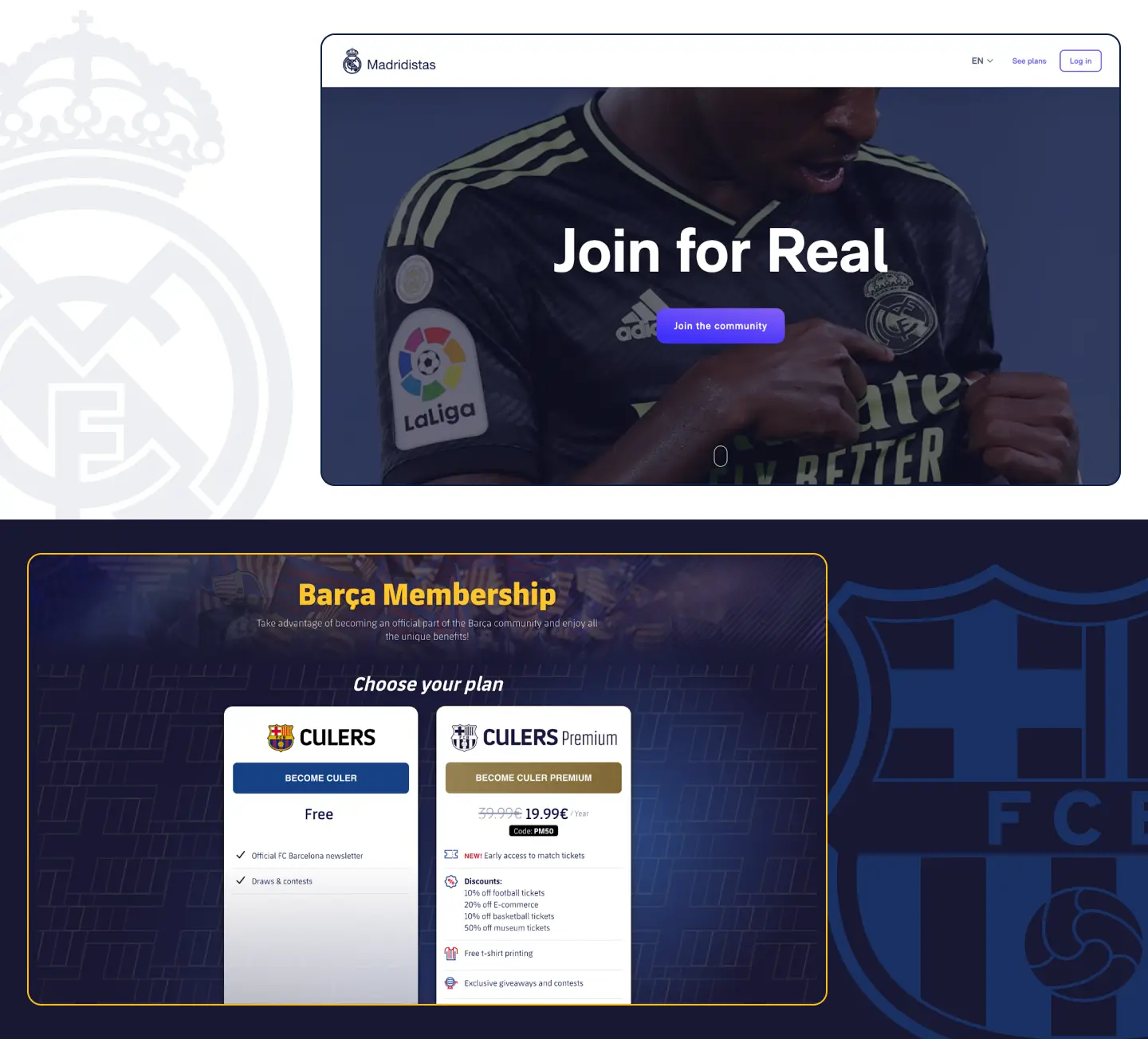 Real Madrid has a large landing page advertising all the benefits of the subscription. Barcelona, on the other hand, has just one page featuring the free and premium Culers Membership plans.
Madrid uses a lot of animated elements, so it’s very engaging to browse the site. This gives users a better chance of seeing benefits that are relevant to them, which can increase sales.
Despite Real Madrid’s membership link not working on their English homepage, they still won this round.
Tickets purchase
One of the main goals of a football club website is a well-designed ticket-buying flow. It’s usually the most profitable and most visited page, so it has to be perfect.
Spanish grandees design their main ticket page differently. Barcelona has the list of games at the bottom and the next game at the top. Users can switch between teams and ticket categories by using two different tab bars.
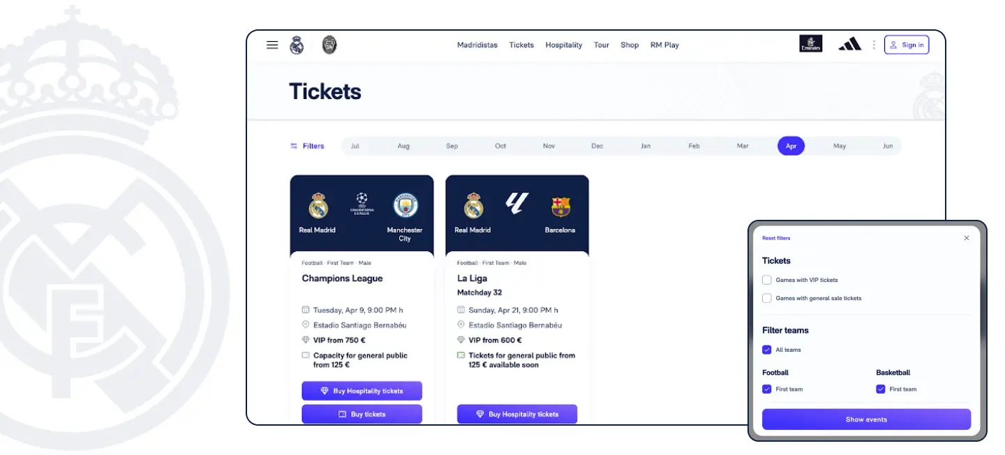
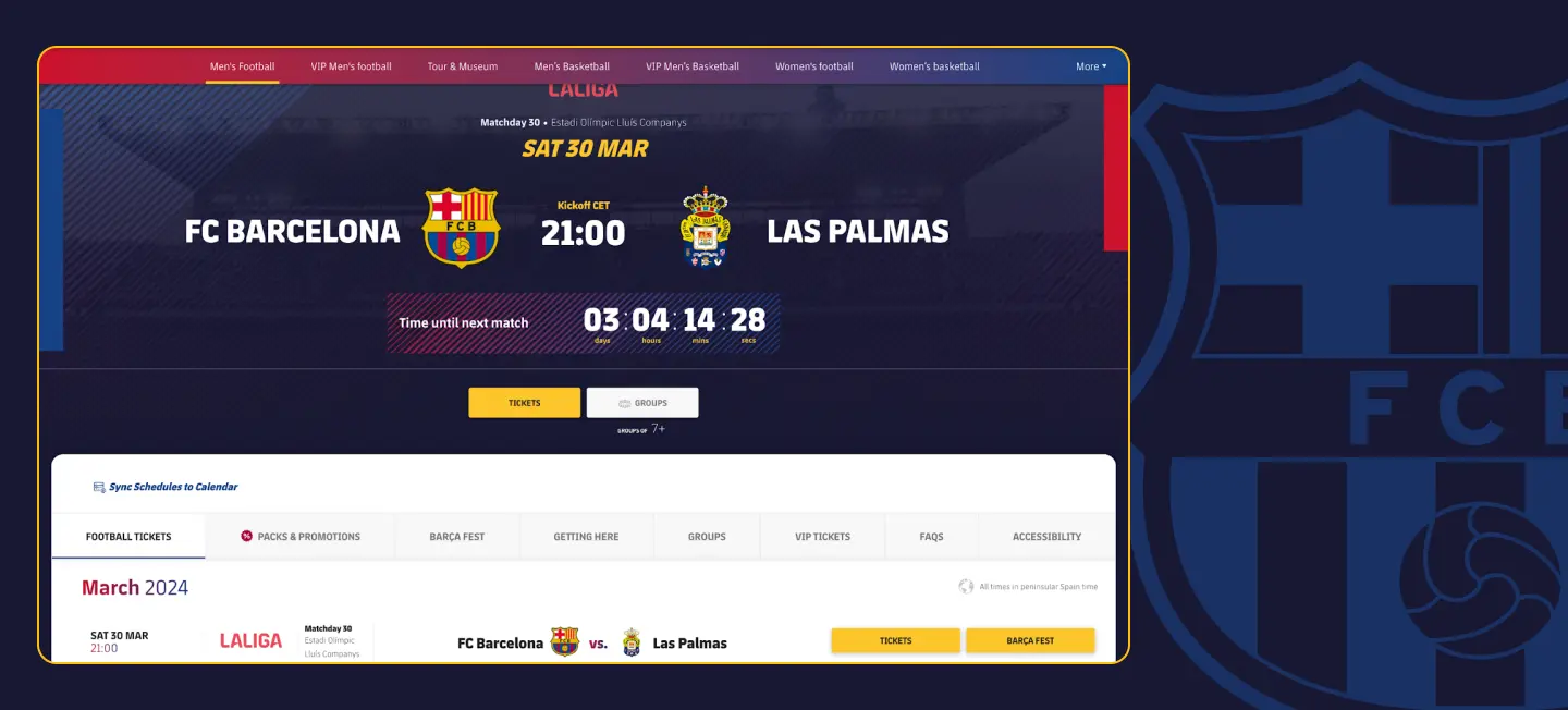
On the other hand, Real Madrid only shows the games of the current month. To see tickets for the matches of the women’s team and academy, you have to select them in the filters. Since the same modal with filters is used as in the schedule, it’s very difficult to see that you can scroll down. This can have a negative impact on ticket sales for those teams. Also, the game cards look too cluttered with information.
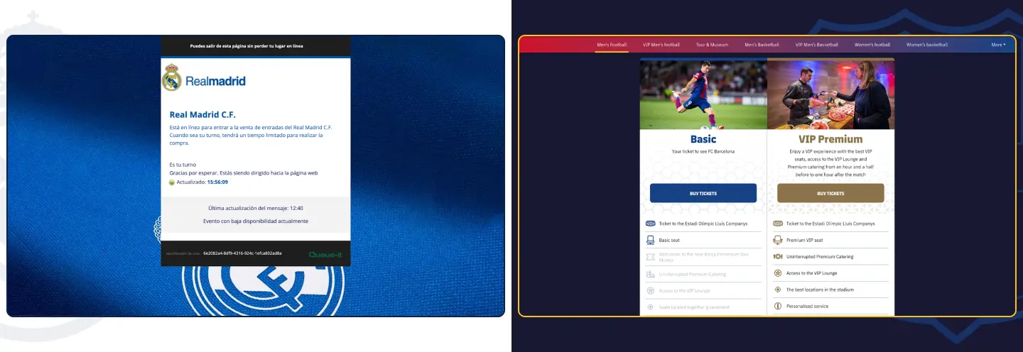
The next step is also different for both clubs. In the case of Real Madrid, you go straight to the queue page, which is entirely in Spanish, and there is no option to change the language. Barcelona, in contrast, allows you to choose between 2 ticket categories.
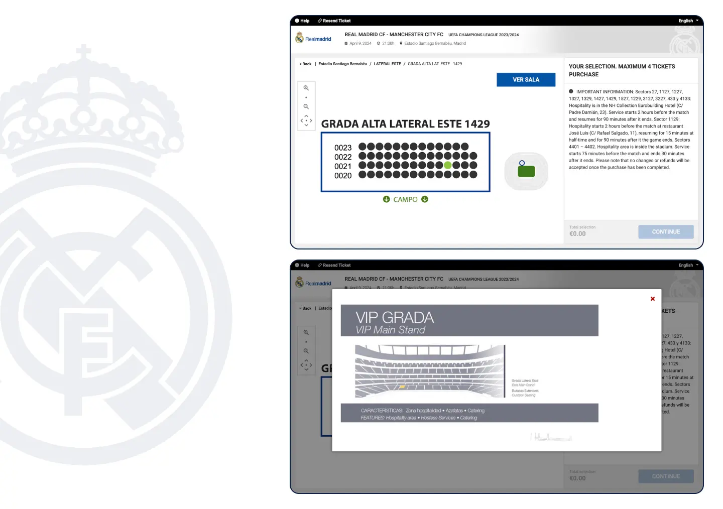
Next up is the seat selection step. The stadium map is standard practice for all clubs, so it’s not surprising that both Real Madrid and Barcelona have one.
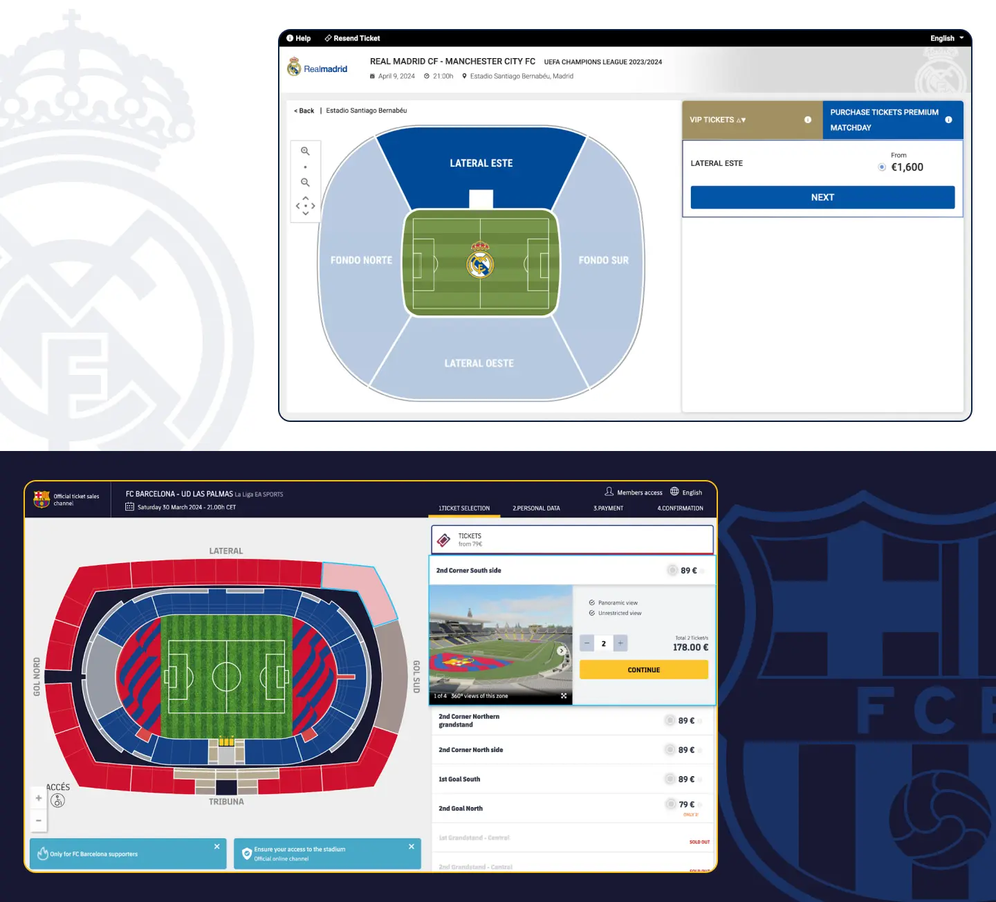
The layout is very similar, with the only difference being that Barcelona’s stadium has a 3D view from every sector. Considering the fact that they are now playing in a temporary stadium, this is very impressive.
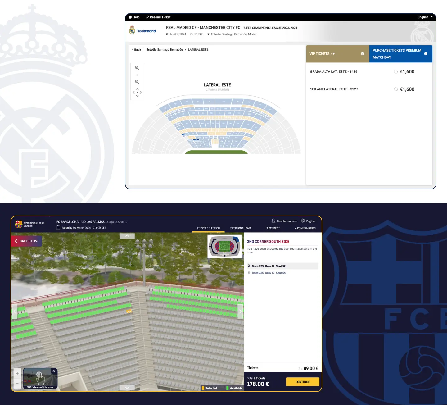
The visualization that Real Madrid presents is a picture of the sector location, which adds no value as it looks exactly the same as the stadium map in the previous step.
The personal data step is also pretty standard for both clubs.
Barcelona’s whole ticketing process looks and feels better than the slightly old-fashioned one at Real Madrid. The main game changer is obviously the 3D seat view. Another Barcelona goal.
Online store
The front pages of the online shops are almost identical. You can quickly buy kits in both, as well as training clothing and products filtered by players. The product pages have very similar layouts, too.
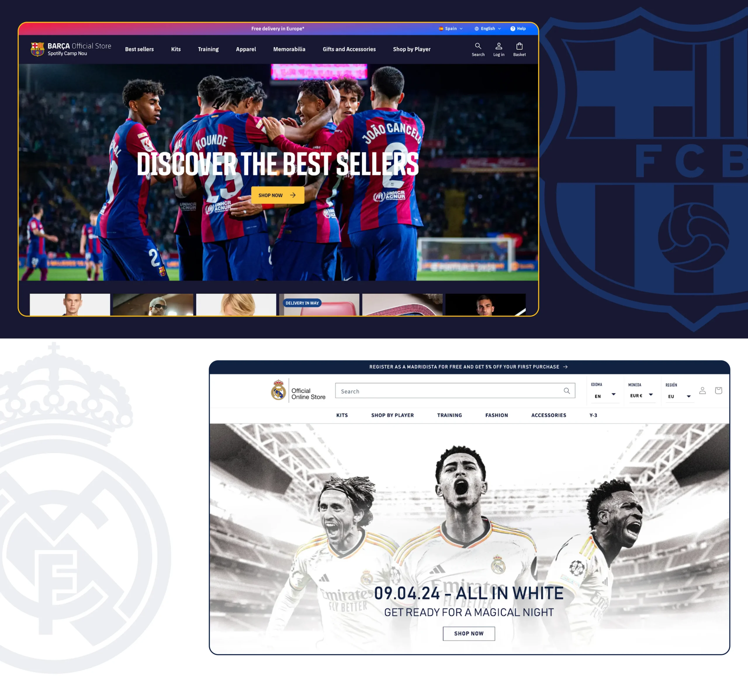
The main difference is that if you decide to customize a t-shirt and have your name printed on it, only Real Madrid will show you a preview. Barcelona doesn’t show it live. But besides recommended items on the bottom they have a specific block offering to complete the look and buy shorts and socks matching the selected kit. The tricky part: Barcelona won’t allow you to add the shirt to the cart if you haven’t chosen the size. Real Madrid, on the other hand, automatically selects the smallest size, and if you forget to select it, you may not even notice and buy the wrong one.
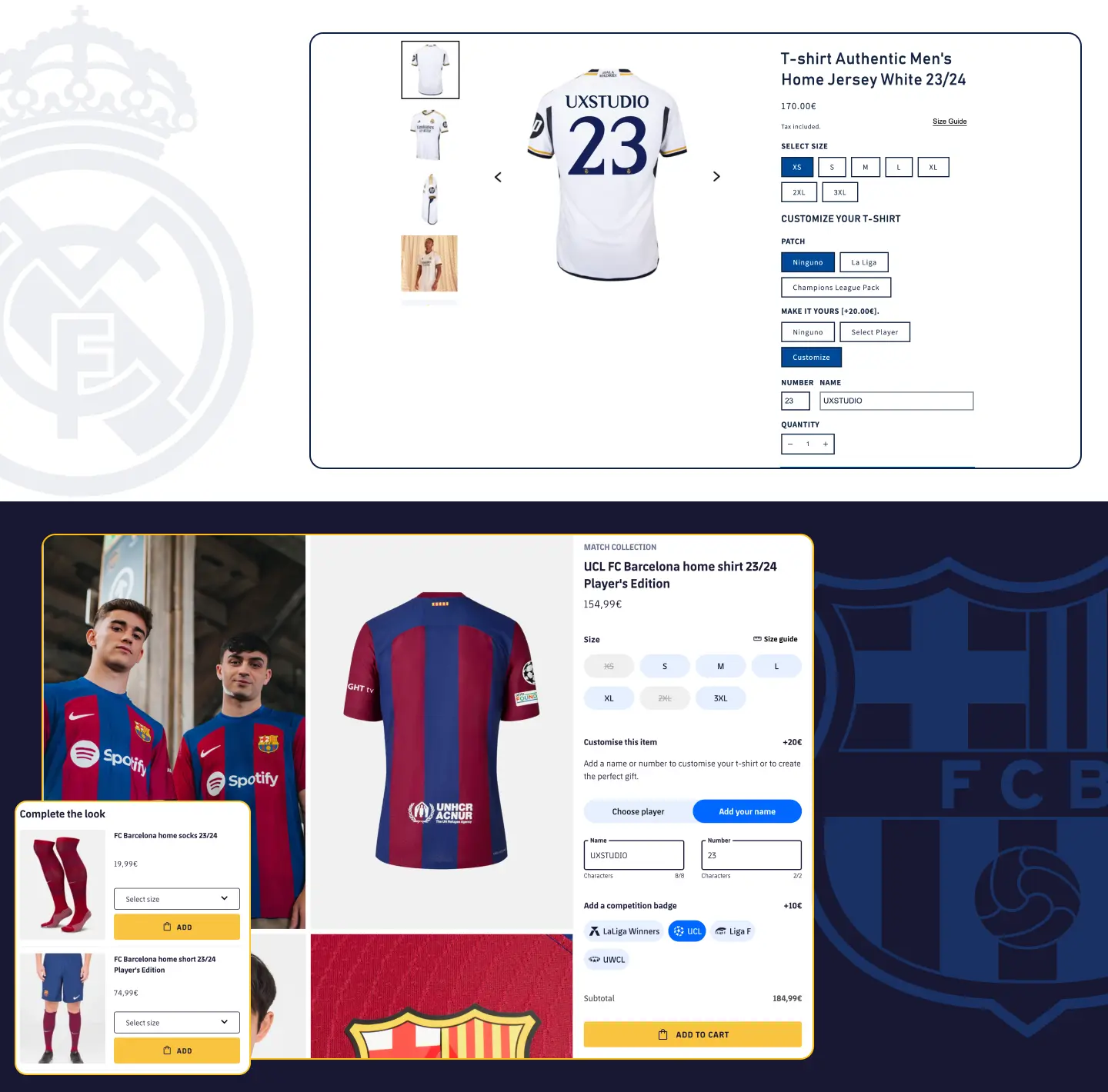
Real Madrid’s shopping basket appears as a modal on the side, while Barcelona uses the whole page for it. It shows some recommended products in addition to the selected product, increasing the chances of users adding something else to the cart. The “Free Shipping” progress bar upfront can motivate the shopper to buy something extra (nobody likes paying for shipping, right?).
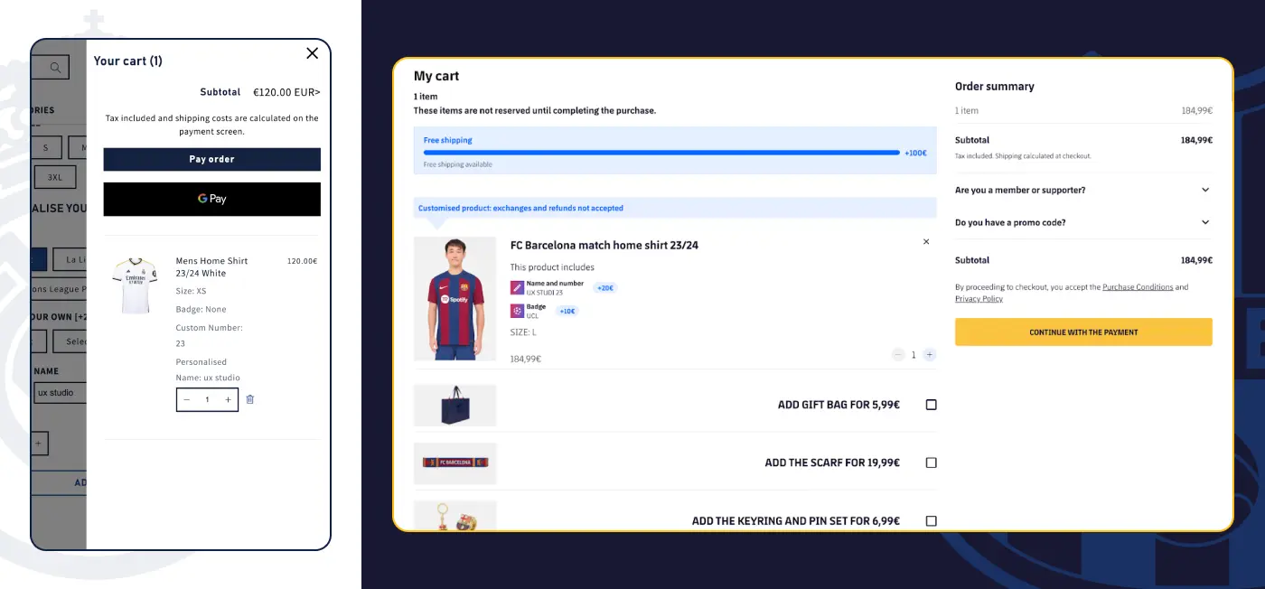
Due to a combination of factors, despite the fact that Barcelona doesn’t show your name on the shirt, they have a store that can potentially bring more money to the club and give more recommendations to users, which will make the shopping process more efficient. This goal goes to Barcelona.
Mobile version
Both clubs have implemented this perfectly, so it works exactly the same as in the desktop version. This is a big goal for both clubs.
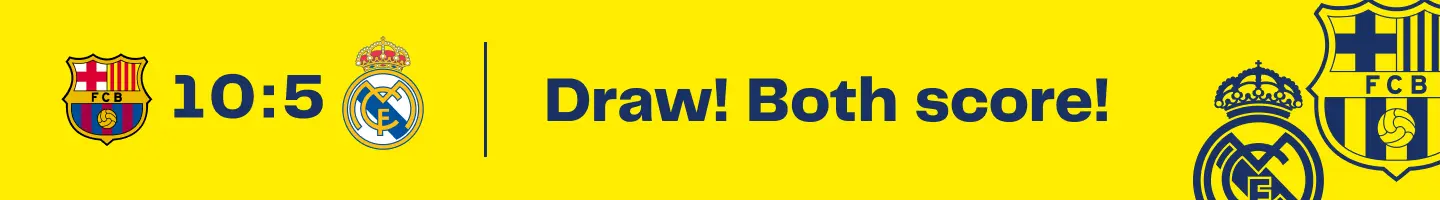
Final score 10:5
The final result should not mislead you. Both clubs have excellent websites, and Barcelona’s dominance in this clash doesn’t mean that Real Madrid’s website is bad. Just like in professional sports, it’s the little details that make all the difference. At the same time, we must admit that Barcelona’s website is designed at a high level in terms of user experience, functionality and appearance, and deservedly wins this match.
Need help with your website?
If you enjoyed this post, we’d be happy to give you a quick expert review or a full UX audit of your site or app. Let’s team up and win the game together.

