
Reveal Roadmap for 2023
Get an idea of what our plans look like, feature-wise, for 2023. Everything we add is based on customer feedback and demand. While we may add items that we believe make us competitive in the market or features that are based on the general market direction or analyst feedback, we are constantly adjusting and adapting to what you need to deliver successful software.
Data Analytics Build for Embed – Simple. Fast. Predictable.
That is our headline for Reveal. Ever since we launched our embedded analytics product, we’ve had 3 main goals:
- Fast & Easy Integration – Provide an easy-to-integrate data analytics solution that customers can integrate into their existing applications with no added requirements. Reveal’s flexible architecture and rich APIs give you control of the features in your app, making it a seamless part of the user’s app experience.
- Superior User Experience – Excite your users by making it easy for them to create, edit, and apply machine learning models to their own data visualizations without leaving your application. Increase adoption of evidence-based decision-making.
- Transparent, Affordable Pricing – Know exactly what you’ll be paying without any surprises. With our simple, fixed price, you can reach an unlimited number of users on any device without paying any extra usage fees.
Our goal is to deliver an amazing end-user UX for self-service BI, deep data analytics, and data storytelling. With this, an SDK experience that is easy to use and get started. This means a simple and beautiful experience with the right level of features that deliver overwhelming value to you and your stakeholders.
With this in mind, we focus our efforts on these 4 areas:
- Data Connectors
- Data Visualization User Experience
- Easy to Use API in the SDK
- Advanced Analytics / Artificial Intelligence
Historically, we are around every 8 to 10 weeks for major features, with monthly and on-demand hotfixes. In other words, you can expect large features every couple of months (like a new data connector or a new chart type) and smaller features or bug fixes on a monthly basis or sooner.
For bugs, if you have a critical bug that we can’t provide a workaround for, we make it available to you as soon as it is fixed – we know that you are building software just like we do, so we can understand the importance and emergency of such a matter.
When you install / update the SDK, you can select the version, as bugs are addressed, we’ll let you know which version to install.
What We Shipped in 2022
2022 was a big year of feature delivery. A couple of the bigger highlights were the NodeJS server, and the Reveal Dom. With the NodeJS server, teams that are building apps in Angular, React, Vue, and other modern web platforms have a new option on top of the existing ASP.NET Core and Java server variants of the SDK. The Reveal Dom project is a Document Object Model (DOM) for the Reveal .rdash file format. It allows developers using the Reveal SDK to load, edit, and create dashboards using .NET.
Along with those larger features, We addressed a ton of feature requests and updates from existing customers and continued to push forward with data sources and updated chart capabilities. Here is a complete list of updates so far this year.
Data Visualizations User Experience
- New API and UI that enables chart zoom level + a scrollbar that sets the initial horizontal or vertical zoom level of a chart that turns on a scrollbar.
- New API that allows color assignment for a chart series.
- New API to customize thresholds on Pie Chart “Other” grouping.
- New visualizations for all chart types, including new series colors & data labels options.
Data Connectors
- Google Search Console Data Connector
- Salesforce Marketing Cloud updates
- Google Analytics updates
SDK
- New NodeJS Server.
- New global CDN option for Reveal Client SDK for Web.
- New Headless Exporting for server-side export operations.
- New interactive chart filtering.
- New callback which allows for custom data source dialog and returns the selected data source and set to the visualization.
- New Data Source Search/Filter textbox to simply find specific data sources to use in a visualization.
- New Localization/Formatting options for JavaScript SDK.
- New Metadata properties for cube-based data sources.
- New property to change the visualization background color.
- New Property to show/hide the Title of a dashboard (name + kebab).
- New server-side filtering for data object names.
- New options to set the Refresh Rate on a data source.
- Remove Puppeteer dependency for exports with Playwright.
- Updated Date handling for REST data sources.
- Updated enumeration for adding additional data sources.
- Updated handling of dashboard file names – now they are case insensitive, meaning you don’t need to write additional code to pass a dashboard name as a variable.
- Updated options for users can view dates in their local time zone where previously dates were displayed as they are obtained from the database.
- Improved file size for compressed Reveal client SDK.
Reveal’s 2023 Roadmap
Our roadmap is customer-driven. Everything we add is based on customer feedback and demand. While we may add items that we believe make us competitive in the market or features that are based on the general market direction or analyst feedback, we are constantly adjusting and adapting to what you need to deliver successful software.
In the first half of 2023, we are focused on a few big-ticket items:
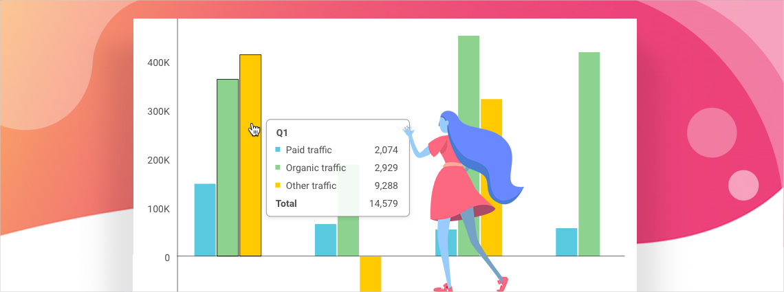
- Improved Tooltip UX for Drilldown & Chart Filtering
- Improving the overall UX of the Chart with Chart Toolbar & Fixed Lines
- Refactoring client SDK to remove jQuery dependency
- Improved API for Reveal View in the client SDK (simplified API)
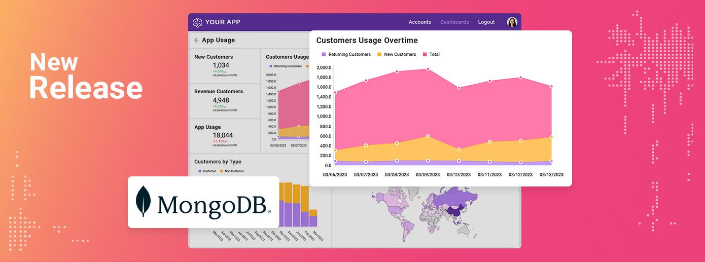
- MongoDB data connector
As the biggest UX feature is the Chart Toolbar work, let’s look at the direction we are headed so you know what to expect.
Chart Toolbar
The chart toolbar feature is aimed at giving the creator and viewer more analysis capabilities in each visualization on a dashboard. Based on the chart type (gauge, pie chart, line chart, bar chart, etc.), you will have different options available to you.
Here is an example of the toolbar on a typical line chart:

The toolbar is not always visible, it will be visible when visualization is in a hover state:
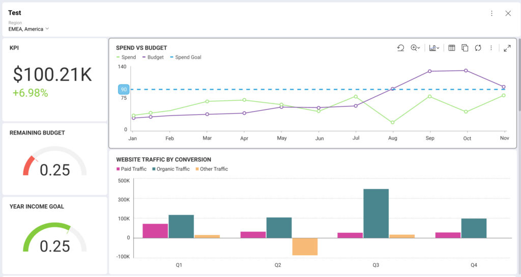
When you click on toolbar items, you’ll see more options for customizing your analysis experience. For example, there is the Analyze toolbar button, where you can add fixed lines, trend lines, do outlier detection, etc., with drill-down menus that give additional features to show / hide on the dashboard.
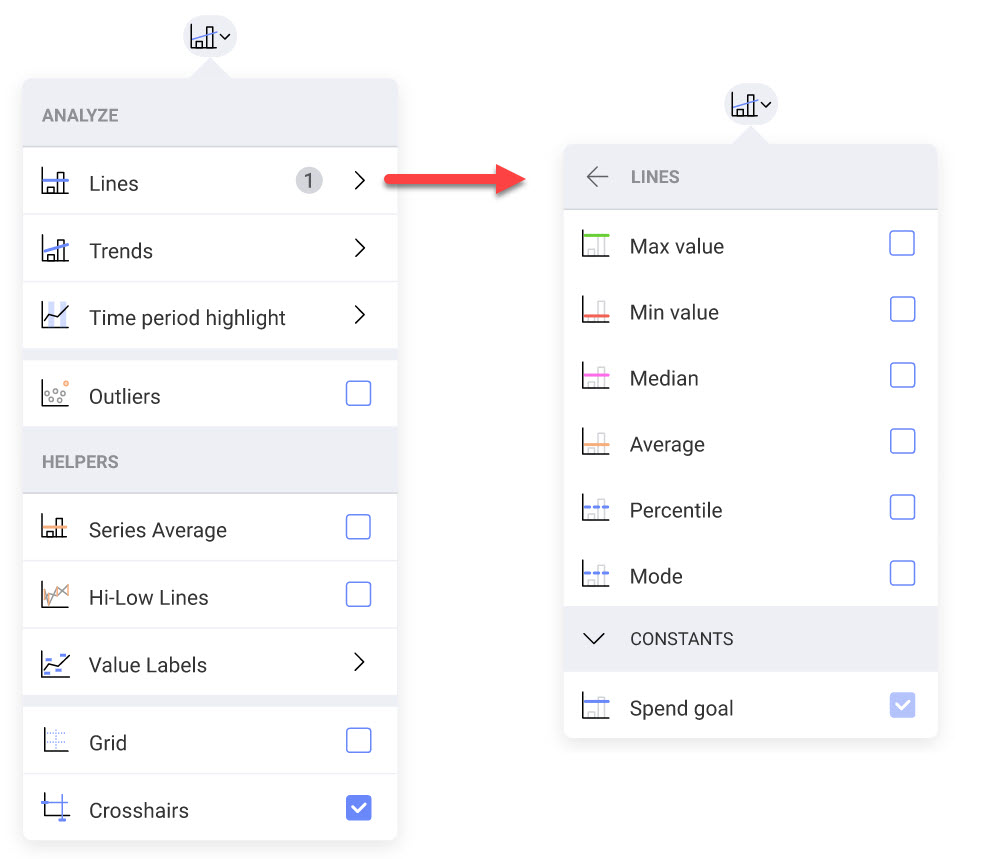
Any fixed line that was added when a dashboard creator built the dashboard is visible by default, but a dashboard viewer can turn the fixed line on or off when viewing. The SDK will give you the options to turn menu items on or off by default, so for example, you may choose to hide the Analysis toolbar option all together, forcing the viewer to only see what the creator defined.
Line Customization
As a creator, you have the same options in the toolbar for Analyze, however, you have more control over what is shown and how it is shown. For example, you can customize parameters on fixed lines, you can add multiple Percentile fixed lines, or custom fixed lines with custom labels, like Revenue Goal or Target Conversion.
Here is what the dropdown looks like when creating a dashboard:
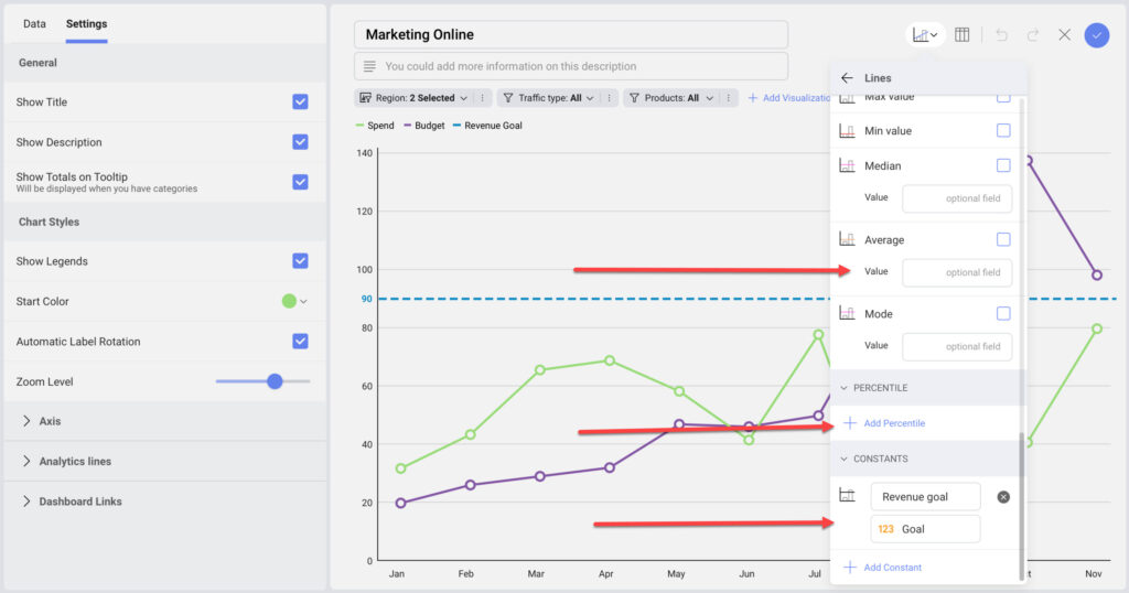
Additionally, you’ll see a new Analytics Lines section in Settings, which lets you further customize the look and feel of the lines you are adding to the visualization.
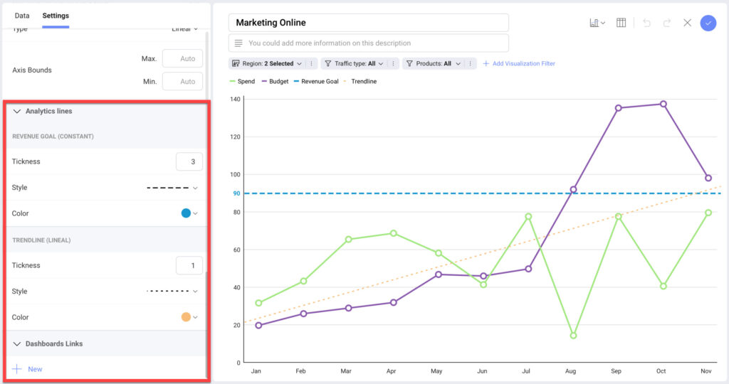
You will see options to customize:
- Color
- Line Thickness
- Line Style (Solid, Dotted, Dash, Mid-Size Dash, Mid-Size Dash / Short Dash, Long Dash, Long Dash / Short Dash, Long Dash / Short Dash / Short Dash)
Wrap Up
I hope this blog gives you a good idea of what we are planning for 2023 with a little more detail in the large Chart Toolbar and Fixed Lines feature. Giving your customers more analysis features is what these features are all about. If there are other options you’d like to see, make sure to let us know! As usual, a quick disclaimer – roadmaps are aspirational – we aim to deliver everything we set out to, but some things will inevitably get pushed. If you are looking for features that you don’t see, have a new product idea, product question, or product problem, send me an email directly at CaseyM@revealbi.io and let’s discuss!
