Remove category heatmaps
article thumbnail

Analytics vs Metrics: What’s the Difference and How to Analyze Metrics?

Userpilot

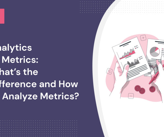
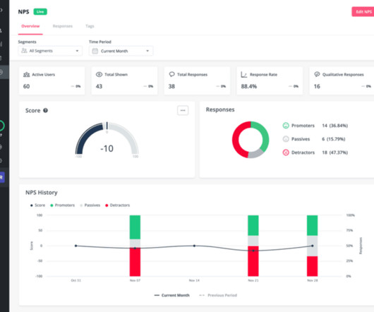
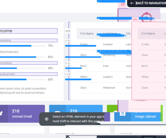
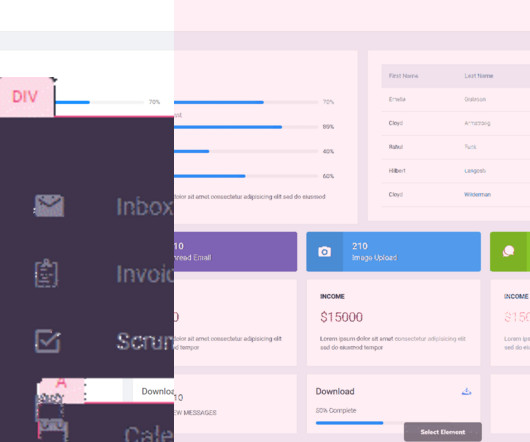
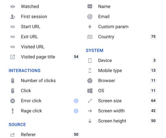
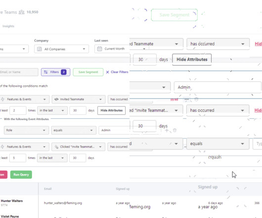
Some analytics categories in SaaS are the journey , experience , engagement , behavior , retention , and loyalty analytics. Tracking in-app user behavior and analyzing feature usage with heatmaps can help you analyze metrics related to your product. Categories of customer analytics. Feature heatmap – Userpilot analytics.

article thumbnail

The 14 Best Event Tracking Tools for SaaS Companies

Userpilot

FullStory, Hotjar, Clicky, and Plerdy all support heatmaps and session recordings for optimization of your UI to remove friction and drive conversions. Heatmaps Userpilot heatmap. The lowest plan, which gives you access to unlimited heatmaps and 35 daily session recordings, is free. Custom events Userpilot custom events.

Insiders

Sign Up for our Newsletter

This site is protected by reCAPTCHA and the Google Privacy Policy and Terms of Service apply.

Trending Sources

article thumbnail

7 Methods To Collect Customer Feedback for SaaS [+ Examples]

Userpilot

Perform product analytics to analyze feature usage and identify patterns, use heatmaps to gather user behavior insights, and track session recordings to find friction points. Collect both qualitative and quantitative feedback , group the data into the two categories of feedback, and conduct analysis.

article thumbnail

Customer Engagement Dashboard: Which Metrics to Track and How to Create One

Userpilot

If your objective falls under the categories considered in the previous section, simply check to see which of the metrics mentioned you should focus more on. Explore heatmaps per feature tagging. You can also use heatmaps to visualize how different user segments engage with your features. The list goes on.

article thumbnail

Customer Engagement Analytics: How To Collect Analytics Data and Increase Customer Engagement

Userpilot

You can use heatmaps to pinpoint areas of high and low engagement. ” NPS divides your respondents into three categories: Users selecting 9 or 10 are your most loyal customers. Use heatmaps to pinpoint areas of high and low engagement. Heatmaps in colors. Passives are users who select 7 or 8.

article thumbnail

UX Analytics 101: How to Collect and Use User Data in SaaS

Userpilot

Use heatmaps to identify what’s dragging customer attention on the UI and what’s ignored. Break down all problems into four categories: blocker, critical, medium, and low. By implementing heatmaps, session replay, or open-ended surveys, you understand where the users get stuck and why. Heatmaps analytics tools.

article thumbnail

Product Conversion: How To Measure & Optimize It for Your SaaS

Userpilot

Use heatmaps to see what users are doing in your app. Heatmaps are graphical representations of data that show the areas of a website or app that receive the most engagement. Using and analyzing heatmaps can let you see what customers are doing from their perspective as apps or website visitors. Heatmaps analysis.