This site uses cookies to improve your experience. To help us insure we adhere to various privacy regulations, please select your country/region of residence. If you do not select a country, we will assume you are from the United States. Select your Cookie Settings or view our Privacy Policy and Terms of Use.
Cookie Settings
Cookies and similar technologies are used on this website for proper function of the website, for tracking performance analytics and for marketing purposes. We and some of our third-party providers may use cookie data for various purposes. Please review the cookie settings below and choose your preference.
Used for the proper function of the website
Used for monitoring website traffic and interactions
Cookie Settings
Cookies and similar technologies are used on this website for proper function of the website, for tracking performance analytics and for marketing purposes. We and some of our third-party providers may use cookie data for various purposes. Please review the cookie settings below and choose your preference.
Strictly Necessary: Used for the proper function of the website
Performance/Analytics: Used for monitoring website traffic and interactions
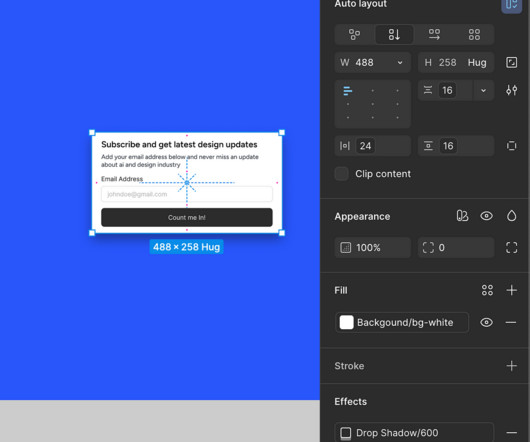
Intrigued by the possibilities, I decided to test this out myself over the weekend, and the results were astonishing! New Figma MCP + Cursor Integration with Example was originally published in UX Planet on Medium, where people are continuing the conversation by highlighting and responding to this story.
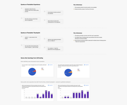
A UX case study on making multilingual music more meaningful. Concept Testing To move swiftly, I wanted to validate the progress with the users. Feature Announcement A/B Testing with 28 Users (Using Figma Mirror) Criteria : Open to all music lovers, not just multi-lingual music lovers.
Teams organize features into an information architecture, then bundle them into menus, apply usability fixes, and run some user testing to improve comprehension. And no, this can’t be achieved by “improving the IA” or running another round of user testing on pre-defined flows. Test for Real Behaviors Not UI mocks.
Your UX teams were so preoccupied with whether or not they could that they didn’t stop to think if they should The race in digital evolution: When “Can We” overshadows “Should We” in product design. In the world of UX design, we face a similar dilemma. Show the value of UX through measurable results (e.g.,
And, “Is the issue a technical breakdown, or is it the UX flow?”, New ways to test, learn, and iterate. then you’ve come to the right spot. In this guide, you’ll learn: 7 detailed steps to infuse data-power into your conversion process. How to define the right events. How to shine a light on where customers drop off.
And, “Is the issue a technical breakdown, or is it the UX flow?”, New ways to test, learn, and iterate to improve feature adoption. then you’ve come to the right spot. In this guide, you’ll learn: 7 detailed steps to infuse data-power into your conversion process. How to define the right events.
We organize all of the trending information in your field so you don't have to. Join 96,000+ users and stay up to date on the latest articles your peers are reading.
You know about us, now we want to get to know you!
Let's personalize your content
Let's get even more personalized
We recognize your account from another site in our network, please click 'Send Email' below to continue with verifying your account and setting a password.


Let's personalize your content