This site uses cookies to improve your experience. To help us insure we adhere to various privacy regulations, please select your country/region of residence. If you do not select a country, we will assume you are from the United States. Select your Cookie Settings or view our Privacy Policy and Terms of Use.
Cookie Settings
Cookies and similar technologies are used on this website for proper function of the website, for tracking performance analytics and for marketing purposes. We and some of our third-party providers may use cookie data for various purposes. Please review the cookie settings below and choose your preference.
Used for the proper function of the website
Used for monitoring website traffic and interactions
Cookie Settings
Cookies and similar technologies are used on this website for proper function of the website, for tracking performance analytics and for marketing purposes. We and some of our third-party providers may use cookie data for various purposes. Please review the cookie settings below and choose your preference.
Strictly Necessary: Used for the proper function of the website
Performance/Analytics: Used for monitoring website traffic and interactions
Instead, the interpretation is added as a result of qualitative sources, namely human expertise, intuition, and domain knowledge. However, based on our experience, a good place to start is by building a better understanding of core UX terms , namely questioning utility and usability. UX analytics FAQs What is analytics in UX?
Even if you are used to dashboards, not every outcome is measurable, and you must not confuse the outcome with your progress monitoring. If you plan for outcomes rather than effort or output (namely, deliver a certain feature), you increase the chance of actually achieving this outcome. But it doesn’t happen in and of itself.
Something as simple as including the users name, referencing their recent activity, or suggesting the next best action can make a huge difference. They include the customers name and regularly inform them when their favourite product is back in stock. Generic blasts feel like spam. Personalized nudges feel like a helping hand.
Based on your current dashboard, it looks like most users churn before completing onboarding. Instead of feeling understood, they feel like just another name in the system. Bad data leads to bad decisions, whether that means duplicated records, misfired onboarding flows, or false signals in your dashboards.
For example, telling users that the dashboard loading time has been reduced by 50% shows commitment to continuous improvement to keep them happy. Improvements [Name of improved feature]: Bug fixes [Bug name]: Explain what the bug is, its impact on user experience, and how the issue was addressed.
Reports & analytics : Provide tailored analytics, dashboards, and reporting capabilities to track customer engagement, identify trends , and enable data-driven decision-making for improved customer success. Reporting and dashboards for outcome tracking. Reporting and dashboards for keeping a real-time pulse on customer sentiment.
No features named. Dry note: “Added smart filters to dashboard.” You’ll exit with an Outcome Statement : “Enable internal facilitators to launch breakout rooms in <30 seconds so engagement stays above 80 %, measured by drop-off rate.” Pure intent. That clarity cascades through prioritization, OKRs, and go-to-market.
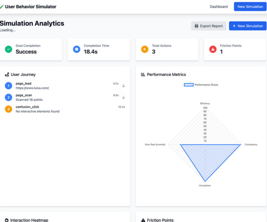
Home Dashboard (left) and Post Simulation Analytics (right) Taking a closer look at the end result, here’s what stood out to me about the process. To begin, it generated a wizard like step by step UI and entirely looked over a project management dashboard type entry point, even after prompting. The visual output felt underwhelming.
If you’re short on time, refer to the summary table below: Tool name Best for… Free plan? Product teams can use Mixpanel to create tailored reports and dashboards to facilitate data-driven decision-making. Free trial? Product feedback software: Mixpanel. Amplitude Type : Product analytics tool.
For example, let’s say a $100k ARR company (enterprise subscriber) reports their custom SSO integration is failing, a $10k ARR company reports dashboard loading slowly, and a $1k ARR company reports an issue with a new feature. They started with Pendo , a big-name product management and digital adoption tool. Pretty cool, right?
Open up a webpage, drop in a script, and boom: clicks, scrolls, and form inputs start flowing into your dashboard without writing a single line of code. It helps avoid duplicated events, mismatched names, and messy data that slows you down when it’s time to actually use it. Each event should have: A clear event name.
Chargebee dashboard for tracking customer behavior (and measuring retention). Practical recommendations for improving CRR Its impossible to name one-fits-all recommendations that will work for all types of products. These platforms allow you to track active subscriptions, cancellations / churned customers, and new sign-ups.
It could include conducting user interviews and surveys, analyzing product usage data, and tracking customer feedback , to name a few. E.g., Identify navigation issues in your analytics dashboard based on real-time user interactions. Survey results dashboard in SurveyMonkey. Dashboard example in Hotjar.
Title: Introducing [New Feature Name]: Transforming Your Experience! For example: “Were thrilled to introduce [Feature Name], designed to help you [specific benefit, e.g., stay organized or work more efficiently]. If its a new dashboard, show them how to find it, tweak settings, or view data more intuitively.
The power players When teams need to level up their business intelligence game, they’re increasingly turning to two leading players: Tableau: The storyteller’s choice, a platform that simplifies turning complex data into compelling dashboards. Data analysis, visualization, dashboards.
By analyzing feature adoption dashboards, you can measure the impact of your campaigns and iterate for better results. You can even pull in user-specific properties like first name, plan level, or custom fields directly into the subject line or email body for high-impact personalization. Did it help users complete onboarding?
At a minimum, your support plan should include: A named support contact or team Response windows for different types of issues Escalation rules Tools and channels that keep support in the loop A good plan builds confidence on both sides. Connect the Tools Set up alerting or dashboards in shared tools like Jira, Slack, Zendesk, or Centercode.
Lazy Loading: Load dashboards and components only when needed to improve app speed. or Greater: <script src="[link] Day,js 1.8.15 or Greater: <script src="[link] Update the Final index.html Your index.html file should now look like this: <!doctype HTTPS: Always use secure connections for data transmission.
Access a unified analytics dashboard that provides a clear overview of key metrics like page views, unique visitors, and bounce rate. As its name probably suggests, LogRocket goes beyond basic session recording by capturing console logs, network requests, and JavaScript errors. Supported device: Web and mobile. Deployment: SaaS.
Here are a few practical tips: For both platforms: Translate your app name, subtitle, description, and screenshots to reflect your apps value in the local language and culture. Localize keywords for SEO and discovery. Dont just translate key terms directly; conduct proper keyword research to understand search behavior in your target market.)
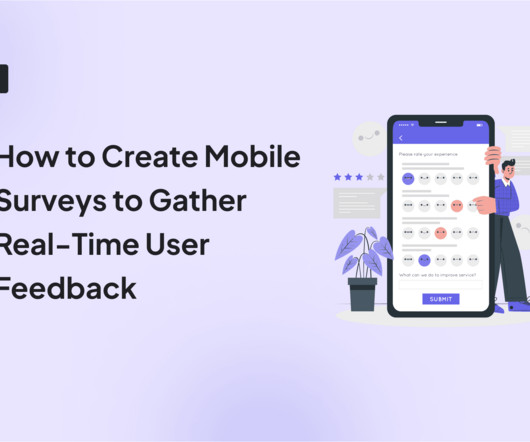
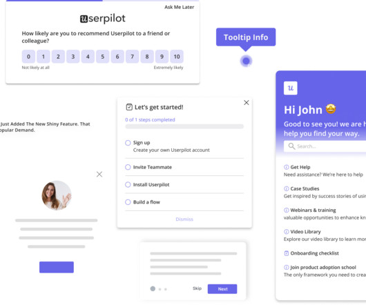
It involves including the user’s name in the introduction or within the question if you have that information. Step 1: Log in to your Userpilot dashboard and choose a survey template from the library. Now, it’s important to note that there are different methods for personalizing surveys.
Reveal Embedded Analytics Today’s business users expect more than static dashboards or delayed reports. Here is what best-in-class embedded self-service BI should deliver: Simple Dashboard Creation : Drag-and-drop editors your users actually want to use. You are not simply looking for drag-and-drop dashboards.
So to dig into the cause of your problem, its best to follow at least one of the following methods: 5 Whys As the name suggests, the 5 Whys method involves questioning the problem by asking yourself why 5 times. They must be validated with data in order to have some weight in the decision-making process.
This new model prioritizes interactive and emotionally resonant touchpoints and can be named Dopamine Banking. As the name suggests, it is used to create a little happiness boost in the brain using bright colors, playful shapes and patterns that evokes a sense of energy and excitement.
They include the full name of the person and team inviting you ( Antoine Milkoff has invited you to the NUMA team), which immediately answers, “Who is this?” ” Inside, the dashboard preview shows exactly what users will see once they accept, building anticipation and encouraging quick action.
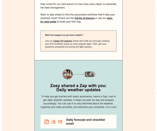
use the recipients name, reference their recent activity, or tie the message to their specific journey inside your product. But something like New feature unlocked: Try Smart Filters in your dashboard now gives both context and direction. But personalized messages make users react as if youre speaking directly to them. Why it matters.
But it could do better by guiding users directly into their personalized workspace after setup instead of using a general dashboard. ‹ › Airtable onboarding. Here are key takeaways: Automatically generating workspace names using user information removes unnecessary friction and makes users feel recognized. What can you learn from Loom?
Product metrics: Track product health and user adoption with analytics dashboards using product analytics tools (like Userpilot) to monitor system performance, error rates, and key activation metrics. Once the tracking script is installed, configure domain settings and enable autocapture in the tool dashboard.
Smart personalization means including the user’s name and referencing their specific behavior or preferences, while strategic timing involves sending notifications when users are most likely to be receptive. But there’s a fine line between helpful reminders and annoying interruptions. Session duration. Feature adoption rates.
We use their first name. It opens with the user’s name and encourages them to reach out for human contact. Hey Julia, saw you started setting up your dashboard but didn’t finish. Based on user properties (e.g., role or plan). We don’t currently send behavioral emails. How personalized are your current user emails?
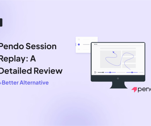
Session recordings dashboard on Hotjar. For example, if a specific user submits a support ticket, you can search for their name and watch their last sessions to see what went wrong. Overview of Hotjar’s session replay feature Now, let’s understand Hotjar’s core session recording functionalities in detail.
How Userpilot can help: Build, schedule, and send each email to the right user segment from one dashboard so every message feels personal and arrives exactly when it matters. A simple “Hey <name>” and a catchy subject line go a long way. A timely reminder can reignite interest and keep your product top of mind.
Filter by user email, name, location, or time spent on your website or app. Imagine you launched a new feature and you see on your dashboard that the engagement rates are low. Some filters include: User identification. Session metadata. Narrow results by session duration, device type, or UTM parameters. Session activity.
The new feature announcement email A feature announcement email, as the name suggests, informs users about new releases. So, make sure users are nudged towards the features and paths that are most relevant to their use case. The email’s goal is to encourage new feature adoption and inform about your product’s constant development.
For example, you could: Equip ICU teams with step-by-step walkthroughs so nurses can confidently use life-support dashboards in under ten minutes. Userpilot is also designed with privacy in mind and doesn’t capture sensitive data like patient names or personal IDs. Create tailored user journeys based on specific conditions.
Going beyond a first name can dramatically improve the impact of your communication. We just use their first name We tailor content based on product usage Our emails are not personalized Which metrics are you using to measure success? Warm, personal).
It doesn’t even address the receiver by name. Personal touch: The sender is a real person with a name, title, and profile image. Personalized greeting: Including my first name in the headline adds a human touch. The personalization: Apart from my name, the email should recommend role-specific automations.
There are usage requirements and limits on the number of user-defined tags that can be added to an AWS resource (see: Tag naming limits and requirements in the AWS General Reference guide). Figure 1: The ”AWS Billing by Tag” test includes the ”GROUP BY TAG NAME” parameter field. See Figure 1.
I also like adding personal touches, like the recipient’s name or mentioning a recent purchase. Segment your audience to send personalized emails Email personalization goes beyond using the user’s name. In our tool’s engagement dashboard , you can schedule when to publish emails by the exact date and time.
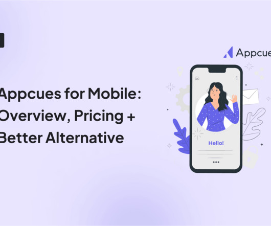
Appcues is a household name in the product adoption world, with thousands of companies using it to create engaging in-app experiences for mobile apps. For example, you can filter flows by app name and easily track metrics such as when the flow started, ended, or had any issues. But will it really live up to your expectations?
For example, below, you can see a rage-click incident flagged up while the user was interacting with the dashboard. With Userpilot, you can filter your sessions using user and company attributes, like their demographics, the devices they use to access your app, or their company role, to name just a few examples.
Spotify’s support page starts with a friendly greeting with a name, which makes the experience feel personal. Tips for your help center design Personalize the experience: A simple greeting with the user’s name makes it feel more engaging. If this happens enough times, it can get frustrating.
Includes : Real take-home case studies, technical and dashboarding skills, and strategies from interviewers at top tech companies. Strategic Projects & Certifications AI-powered data assistant and dashboard projects demonstrate hands-on experience beyond daily tasks.
This service has a dashboard that displays real-time metrics. Click on a metric name to view it as a graph. Create an AWS ECS dashboard by adding your desired widgets for different metrics. Add dashboards to the default or custom Dashboards menu for one-click access. Dashboards are shareable across AWS accounts.
We organize all of the trending information in your field so you don't have to. Join 96,000+ users and stay up to date on the latest articles your peers are reading.
You know about us, now we want to get to know you!
Let's personalize your content
Let's get even more personalized
We recognize your account from another site in our network, please click 'Send Email' below to continue with verifying your account and setting a password.


Let's personalize your content