This site uses cookies to improve your experience. To help us insure we adhere to various privacy regulations, please select your country/region of residence. If you do not select a country, we will assume you are from the United States. Select your Cookie Settings or view our Privacy Policy and Terms of Use.
Cookie Settings
Cookies and similar technologies are used on this website for proper function of the website, for tracking performance analytics and for marketing purposes. We and some of our third-party providers may use cookie data for various purposes. Please review the cookie settings below and choose your preference.
Used for the proper function of the website
Used for monitoring website traffic and interactions
Cookie Settings
Cookies and similar technologies are used on this website for proper function of the website, for tracking performance analytics and for marketing purposes. We and some of our third-party providers may use cookie data for various purposes. Please review the cookie settings below and choose your preference.
Strictly Necessary: Used for the proper function of the website
Performance/Analytics: Used for monitoring website traffic and interactions
Three new dashboards for conversations, support effectiveness, and team performance give you the ability to see what type of issues are taking up the most time, monitor your team’s workload, and optimize your support team’s performance. Easily manage and measure the impact of your help docs with our new Articles API.
Learn about the importance of mobile app KPI dashboards and copy dashboards from real mobile app product managers, engineers and designers. A key performance indicator (KPI) dashboard is a visual representation of data that quantifies how well a team is performing towards its goals. How do I create a mobile app KPI dashboard?
Would you like to learn how to design a SaaS metrics dashboard for your team without any coding? In the article, you will find examples of various SaaS dashboards and learn how to create them with Userpilot analytics. In Userpilot, click Dashboards in the menu and click the ‘ Create New ’ button. To name just a few.
Are you wondering how the new Userpilot custom analytics dashboards can help you drive product growth? In this article, you will learn about the main benefits of custom product analytics dashboards and how to create them in Userpilot. TL;DR Userpilot custom analytics dashboards allow you to display multiple reports in one place.
Please see my article “ Leading Through Shared Goals ” and my book How to Lead in Product Management for more information how to effectively use the goals in figure 1, which includes securing the necessary buy-in from the stakeholders and development teams. You can also access the contents of this article on my YouTube Channel : Sample Goals.
This insight could lead to implementing shared dashboards or concise weekly recaps, fostering clearer communication and smoother collaboration. This article is the third in a four-part series exploring how the product mindset can transform the way we work and live. or How can we make updates easier to access?
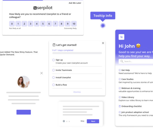
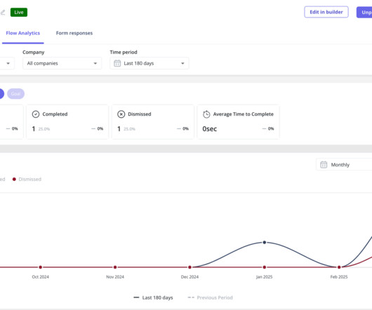
This article will help reduce such churn by refining your product management and UX analysis approach. Like most articles you’ll find online, our article mentions several analysis methods too. Dashboard : Customize the analytics dashboard or choose from pre-built ones to easily visualize and compare key metrics over time.
A customer sentiment dashboard is a great way to visualize customer feedback and see what users love (or hate) about your product. This article shows you a step-by-step process and some of the best tools to use. Customer sentiment dashboards help you generate the following: Sentiment trends over time. Sentiment distribution.
A product adoption dashboard helps you visualize key adoption metrics so you can make data-driven decisions and boost user engagement. In this article, we cover the following: Why you need a product adoption dashboard. Steps to measure adoption using a comprehensive dashboard. Build your dashboard or use a template.
Example: Imagine you’re designing a new dashboard for a fintech app. Example: For our dashboard, we might ask, “How might we create a dashboard that helps analysts quickly spot trends and take action?” Example: Imagine you’re designing a new dashboard for a fintech app. Big difference, right?
Wondering how to build a customer success dashboard for your team? From the article, you will learn what a customer success dashboard is, why you need it, and what metrics it should include. And how to build a dashboard for your customer success team using Userpilot analytics ! Why does your team need a CS dashboard?
Custom dashboards to track key metrics at a glance. Pendo The dashboard on Pendo. Additional reports: You get a built-in Product Engagement Score dashboard. Lack of templates: There arent many ready-to-use dashboards or templates to get started quickly. UserGuiding dashboard. for collecting user sentiment data.
Analytics dashboards are visualization tools that give you an overview of key metrics. In this article, we’ll discuss 10 analytics dashboard examples. It will give you a better understanding of the type of metrics to monitor in your dashboard and help you draw product growth insights from them. Book a demo to learn more.
In this article, we’ll help you pick the right customer success program, covering aspects like: Tips for choosing the right customer success platform. Reporting and dashboards for outcome tracking. Reporting and dashboards for keeping a real-time pulse on customer sentiment. Reporting and dashboards.
These valuable insights empower support teams to provide better support around common queries or increase the personalization of self-serve support through targeted articles or Resolution Bot answers. With custom reports, now you can track industry-standard metrics beyond pre-built dashboards. No problem.
In this article, you will explore why customer expansion matters for your SaaS growth, discover various customer expansion tactics, and learn how to embed them in successful expansion campaigns. Well, you can easily track the metrics from one of Userpilot’s analytics dashboards.
In this article, we’ll talk about: What product analytics is and why you need a solid strategy. Creating an expansion revenue dashboard with Userpilot without coding. While “use data to drive decision-making” sounds obvious, there’s a HUGE gap between saying it and doing it well.
What’s more, every product goal should be aligned with the user and business goals in the product strategy, as I explain in more detail in my article “ Product Goals in Scrum.”. A product goal is a specific and measurable benefit or outcome your product should achieve, typically in the next two to three months. Think of driving a car.
This figure summarizes the entire approach and I go into the details over the rest of the article. I think a data visualization dashboard would be great as a first screen in the back-office.”. Because I read this article on Gizmodo that said that our core demographic no longer uses email. Why do you think that?
This is my motivation behind writing this article. This article explores multiple aspects of product management. I hope this article helps you understand the various aspects of the role in order to be a successful Product Manager. In case of co-located teams, physical standups are preferred.
To explore our new reporting capabilities, check out our help center article here. To learn more, check out our help center article. Learn how to get started in this help centre article. As a part of the program your teams will receive access to a free weekly dashboard of de-anonymized companies visiting your website.
If you’ve landed on this article, you most likely already understand the immense value of capturing in-app customer feedback. Our SDK is instrumented into mParticle, and when a mParticle customer decides to leverage Apptentive, a switch is flipped on in their dashboard which gives them immediate access to Apptentive.
Consider this article a requirements document: it’s structured into several user stories from the perspective of a hiring manager, for a product manager role. Use this article as a guide to polish your resume and improve your job-hunting prospects. Did you install analytics or build dashboards? Tell us about it.
Some examples are: Dashboards are cluttered Or the insights are too superficial No option to drill down into data Insights aren’t adjusted to the user’s role For deep analysis, data export to Excel is the only (time-consuming) option 3. With view-only, static dashboards, customers have no control over the insights they can extract.
This article will walk you through what customer research really is, from choosing your research methodology to recruiting participants, analyzing feedback , and beyond. E.g., Identify navigation issues in your analytics dashboard based on real-time user interactions. Survey results dashboard in SurveyMonkey.
For advise on when to carry out product backlog grooming, please see my article “ When should Product Backlog Grooming Take Place? ”. An example for the latter might be “Finish the dashboard so it can be released to the test users”. Focus on the Sprint Goal.
The right tools (like Intercom) should give team members article suggestions when they’re helping customers, cutting down resolution time. Our chatbots also automatically suggest articles in chat conversations. Frequent postings of our metrics dashboard on Slack to replicate our real-time metrics monitor at the office.
Knowledge bases : are online libraries of FAQs, articles, and how-to guides. Instead of juggling countless email threads or Slack messages, you manage everything from a central dashboard. When agents and product managers can quickly navigate the dashboard, they spend less time on training and more time resolving issues.
In this article, Ill tell you how to: Increase user acquisition with ASO and referral programs. For instance, if youve built a mobile CRM app, you could use in-app tutorials to guide users through setting up their first dashboard and a new feature that automates follow-ups. Cohort analysis and revenue dashboards for paywall tracking.
In this article, we will go over 5 of the best FullStory alternatives on the market, explain what each one does best and how they compare to help you narrow down your choices. In terms of reporting, UXCam’s drag and drop team dashboard is easy for non-technical team members to use. What are the best FullStory alternatives?
This article is focused to give you an overview of all the crucial aspects of an insurance mobile application. Dashboard/Admin Panel This feature is perhaps the most common one as a dashboard or admin panel is present on any type of mobile app and not just on insurance ones. Let’s begin.
To prepare for the workshop, Tali created a fictional case study, and with the help of ChatGPT, she generated six interview snapshots and some analytics dashboards. If you are not reading this article in your feed reader, then the site is guilty of copyright infringement. Please let us know at support@producttalk.org.
While I spoke with Claire and Christophe for this article, we’ll also hear a bit about other continuous discovery champions from Botify. Claire also wrote an article on Medium to share their progress and learnings in October 2022. Our application consists of dashboards with data, and the filter experience is crucial.
In this article, well dig deeper into Userpilots resource center feature, discuss different use cases, and show you examples from real-world users who benefitted from it. Add different types of modules and educational resources Userpilot supports a variety of content formats, including articles, case studies, videos, webinars, and more.
It underpins a whole host of core Intercom features – Inbox Views , API , Articles , the user list, Reporting , Resolution Bot , and our internal logging systems. You can watch a video of that talk below, or read on to learn how we built our Elasticsearch cloud on AWS. Core part of Intercom. Search is an indispensable part of Intercom.
This article provides analytical framework and tactical steps to collect targeted customer feedback to improve B2B SaaS products. This is a topic for another article. Hence this process is efficient, objective, and a lot faster than traditional survey methods. How to gather relevant data??—?This 10M, $500k?—?$1M…$10k?—?$100k
PostHog dashboards like the one shown here allow Kranthi to see a user’s interactions that indicate their progress toward an expected user behavior. If you are not reading this article in your feed reader, then the site is guilty of copyright infringement. Click the image to see a larger version.
This way, they have the most important information they need when they log in to our dashboard – even if they don’t check their email, which we do update them continuously through our marketing automation solution.”. In fact, 37% of teams have posted additional help articles since the global crisis began.
This article attempts to fill some of these gaps by providing an overview of product operations, the value it can add to your product organization, and some tips for establishing the function. Identify key quality metrics and create dashboards to track real-time product health. Key Tasks User issues reports. Product health tracking.
Source: [link] I would like to thank Tremis Skeete, Executive Editor of Product Coalition for his valuable contributions in the writing of this article. More of my previous thoughts on the subject can be found in a previous article I wrote. William Stanley Jevons (1835–1882). Think of a “utility” as a great glass of drinking water.
Headspace app is one of such rare Apps and is the topic of this article. However neither its meditation nor its fun UX and quirky animations are the topic of this article. A pioneer in the literature related to Habit-forming products. However before explaining the term ‘Facilitator’ let us quickly get to know what Headspace is.
In this article, we explore what quantitative data analysis is, the difference between quantitative and qualitative data analysis, and statistical methods you can apply to your data. With Userpilot , you can auto-capture in-app user interactions and build analytics dashboards. Core features engagement dashboard view in Userpilot.
In this article, we’ll dig deeper into key metrics and tools to help you get started with product launch analytics. You can set up custom dashboards to visualize metrics and monitor user behavior and product usage. Userpilot product usage dashboard. Userpilot new users activation dashboard.
Visual data surrounds us – colorful charts on weather reports, infographics on the web and in social media articles, map charts in presentations, etc. To help you get started with data visualization, this article explores various visualization methods and their use cases. An area chart in the Userpilot dashboard.
We organize all of the trending information in your field so you don't have to. Join 96,000+ users and stay up to date on the latest articles your peers are reading.
You know about us, now we want to get to know you!
Let's personalize your content
Let's get even more personalized
We recognize your account from another site in our network, please click 'Send Email' below to continue with verifying your account and setting a password.
Let's personalize your content