This site uses cookies to improve your experience. To help us insure we adhere to various privacy regulations, please select your country/region of residence. If you do not select a country, we will assume you are from the United States. Select your Cookie Settings or view our Privacy Policy and Terms of Use.
Cookie Settings
Cookies and similar technologies are used on this website for proper function of the website, for tracking performance analytics and for marketing purposes. We and some of our third-party providers may use cookie data for various purposes. Please review the cookie settings below and choose your preference.
Used for the proper function of the website
Used for monitoring website traffic and interactions
Cookie Settings
Cookies and similar technologies are used on this website for proper function of the website, for tracking performance analytics and for marketing purposes. We and some of our third-party providers may use cookie data for various purposes. Please review the cookie settings below and choose your preference.
Strictly Necessary: Used for the proper function of the website
Performance/Analytics: Used for monitoring website traffic and interactions
Tracking mobile app performance metrics can feel daunting. One look at your mobile app analytics dashboard, and you just want to shut your eyes and scream in frustration. But you find yourself puzzled, overwhelmed, and uncertain about which metrics truly matter. Will this metric help me identify a problem?
Ever wonder why some products instantly click with users while others get abandoned faster than New Year’s resolutions? The secret often lies in those crucial first moments – your user onboarding. Well, when onboarding new users, that approach is about as effective as trying to fit everyone into the same pair of pants.
When it comes to KPIs vs metrics, which one should you measure to get better insights? What about metrics and measures? Metrics and KPIs are often used interchangeably, but they also have differences. The more you understand these nuances, the better you can evaluate your product growth strategy.
When your company adopts multiple SaaS solutions to drive productivity, you unknowingly create a perfect storm for data fragmentation. Your customer information lives in Salesforce, while your support tickets are in Zendesk, your product usage data in Mixpanel, and your marketing campaigns in HubSpot. Which features need attention?
Collect customer data to calculate complex formulas for tracking metrics, monitor customer health scores, and resolve support tickets while continuously trying to improve retention and expansion. Consider specific features : Your goals and improvement areas will determine the features you need.
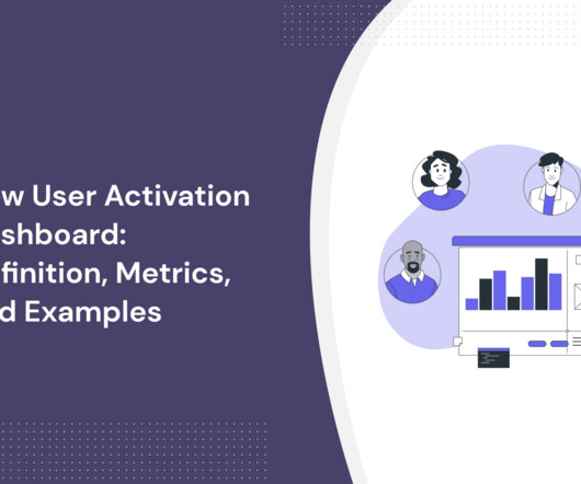
In SaaS, a new user activation dashboard can become a massive product analytics tool to understand and optimize the user journey. But how can a dashboard for user activation can help you engage more users? moment ," impacting user retention and satisfaction. What is user activation?
Guest Post by: Vivek Karna (Mentee, Session 11, The Product Mentor) [Paired with Mentor, John Masterson]. Hence it is critical that one is aware of the best practises of the role and develops his own philosophy which results into maximum positive leverage for the organization. the Product Manager role is a rather recent phenomenon.
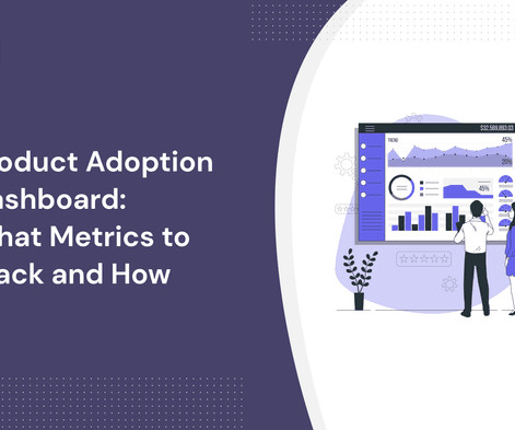
A product adoption dashboard helps you visualize key adoption metrics so you can make data-driven decisions and boost user engagement. In this article, we cover the following: Why you need a product adoption dashboard. Steps to measure adoption using a comprehensive dashboard. Define your main objectives.
Most product teams get mobile app analytics wrong. They track 47 different key performance indicators (KPIs) in their mobile analytics platform , spend hours debating dashboard numbers, yet can’t predict which users will churn next week The problem here isn’t a lack of data.
Thats why one in four users drops off after just one session, often before they even get to experience the core product. This guide breaks down 7 mobile onboarding strategies that work, complete with real mobile app onboarding examples and tips on how to build a solid app onboarding process using Userpilot.
With this shift in mindset, the key question becomes: “how can we measure the value of support and set metrics that drive meaningful change?” We talked with support leaders at several forward-thinking companies – including Zapier , Wistia , and InVision – to get insight into how their support metrics have evolved, and why. retention).
A product analytics dashboard helps you visualize user behavior, so you can make informed decisions on how to improve product engagement. In this article, we cover the following: Why you need an analytics dashboard. The types of metrics to track in your dashboard. What is an analytics dashboard?
If youve ever tried evaluating product tour tools, you know the surface-level comparisons dont tell you much. Every tool claims to be a no-code tool and easy to use, but few support the workflows product teams care about, like multi-step onboarding , flow targeting, mobile support, or analytics that go beyond step views.
It’s no secret that learning how to evaluate product performance is essential for product management. But how can you effectively measure productmetrics that can help you reach your goals and increase revenue growth? Why not book a Userpilot demo to see how you can analyze and improve product performance continuously?
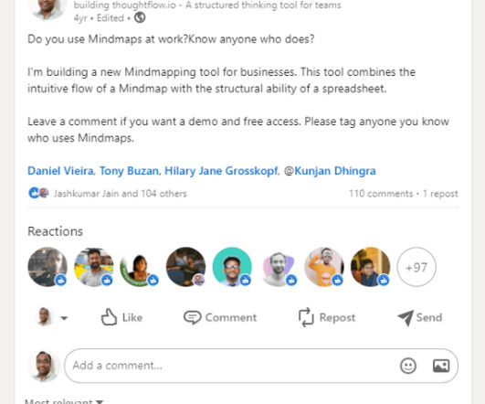
For today’s Product in Practice , we caught up with Kranthi Kiran , the Founder of ThoughtFlow. Do you have a Product in Practice success story you’d like to share? He says, “My earlier approach to building products was to start with an idea, build a product, and then market it.” It’s a vicious cycle.
Let me jump right in: With product analytics, customer retention isn’t just something you measure after the fact; it should be something you can learn to predict (and then improve). How could a product manager possibly dig into the data and pull up something that’s genuinely useful for activation and retention?
Incorporating these tools into your customer experience tech stack will drive more engagement, deliver high-quality customer feedback, and help inform your product roadmap. This in-app analytics tool helps companies make data-driven iterations to their apps and gain a better understanding of how product changes impact customer satisfaction.
” And that’s also why AARRR metrics are called pirate metrics. Short for acquisition, activation, retention, referral, and revenue, these metrics help you measure and drive product growth. In this article, we’ll dig deeper into the AARRR framework and the relevant metrics associated with each stage.
These days, customers expect instant access to support, especially for products that are critical to their business operations. Global support teams can positively influence customer retention, especially if they provide service in their customers’ native language. Improved global customer retention. Consistent customer experience.
Through case studies, statistical evidence, and methodological frameworks, I aimed to establish how systematic user research can positively impact key business metrics, from acquisition to referral. Additional statistics reinforce this argument: 74% of SaaS companies consider their product the primary driver of growth OpenView, 2022.
Incorporating these tools into your customer experience tech stack will drive more engagement, gather high-quality customer feedback, and help inform your product roadmap. Developers can remove the pains associated with constantly incorporating new SDKs into an app and focus on delivering products that transform the customer experience.
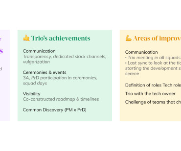
Working as a product trio can be a major transformation. Making the shift to product trios involves changing everything from the coworkers you collaborate with most closely and your communication style to the mindset you bring to work every day. – Tweet This The product team at Botify knows this all too well. What works well?
Most product analytics tools make tracking user activity on web applications look easy, and it is. Open up a webpage, drop in a script, and boom: clicks, scrolls, and form inputs start flowing into your dashboard without writing a single line of code. You want your tracking to be anchored around real product goals and success metrics.
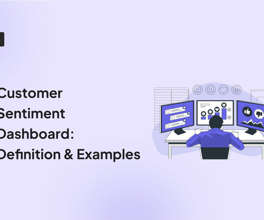
A customer sentiment dashboard is a great way to visualize customer feedback and see what users love (or hate) about your product. TL;DR A sentiment analysis dashboard typically integrates information from multiple data sources, such as social media posts, customer reviews, survey responses , and customer service chats.
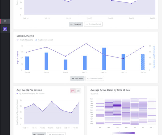
Are you tracking SaaS metrics without knowing how to make the analytics process easier? Analytics dashboards are visualization tools that give you an overview of key metrics. In this article, we’ll discuss 10 analytics dashboard examples. TL;DR Analytics dashboards are tools for visualizing key metrics in your business.
With the right strategy and proactive support tools – think Outbound Messages , Product Tours , Mobile Carousels , and Banners – you can alert customers to known issues, like delivery delays, bugs in your product, and website downtime. Download The Ultimate Guide to Conversational Support.
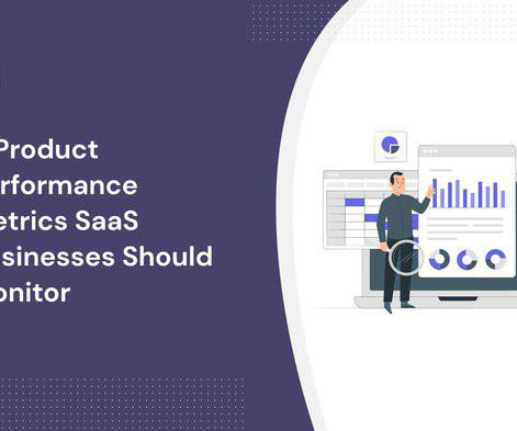
Tracking relevant product performance metrics allows you to assess how successful your product is at satisfying user needs and achieving business goals. What metrics should you track though? Our guide covers 11 key performance metrics to analyze at different stages of the customer journey. Let’s dive in!
On this week’s show, we catch up with email marketing strategist, Val Geisler, as she walks us through some practical emailing tips, her process for onboarding, and why she likens career progression to a spiral staircase. Think about onboarding like you’re hosting a dinner party. That’s what I went to school for.
Incorporating these tools into your customer experience tech stack will drive more engagement, gather high-quality customer feedback, and help inform your product roadmap. Developers can remove the pains associated with constantly incorporating new SDKs into an app and focus on delivering products that transform the customer experience.
Are you overwhelmed by too many customer metrics and don’t know which ones to track for your SaaS? We’ll cover the best KPIs that help measure true business impact, along with: What they are. You’ll also see how to use product analytics tools to track your customer metrics in one place and save time. No need to panic.
Adoption metrics are essential to measure to aid in making improvements to your product. But which product adoption metrics should you track? This article will cover the 14 metrics to track to help you increase your customer lifetime value. The user churn rate highlights how well your product adoption is working.
Not sure how to measure product adoption or what metrics to track? Product adoption is key to creating loyal users for your SaaS and it’s important to track it regularly. In this article, we’ll explore how to measure product adoption and twelve key metrics that can provide valuable insights into product adoption.
Wondering what customer journey KPIs align with your business goals? Customer journey KPIs, alongside product analytics , help product teams understand if they’re meeting their goals. SEO ranking to monitor and improve product visibility on search engine results.
Understanding your users and their journey stages will help you create flows tailored to the various SaaS onboarding phases. This is essential because your customers aren’t all the same; their needs change as they progress through your product. Benefits of the SaaS user onboarding process: Improved retention. Welcome new users.
Are its features worth the money, or are there better alternatives for your product management team? UserGuiding is a reliable platform that helps businesses optimize user onboarding processes with effective guidance solutions. You can use UserGuiding analytics to track and optimize your onboarding materials’ performance.
User onboarding is piling extra pressure on product leaders’ and managers’ shoulders. But there are onboarding traps that ambush product leaders as they work to perfect this critical stage of their user’s journey. Read on to learn about four common onboarding mistakes and the best ways to avoid them. Wondering how?
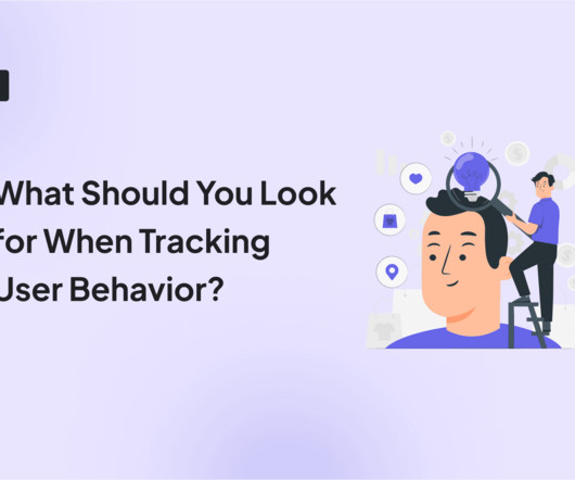
Many product people fall into a common trap when tracking user behavior by focusing too much on numbers or relying only on user feedback. But if you want to get to the heart of things, you need to understand the why behind those actions and how users interact with your product. Quantitative data shows you what users are doing.
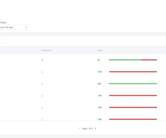
Wondering how an NPS dashboard can help you track customer loyalty? While Net Promoter Score (NPS) measures customer satisfaction and loyalty, NPS surveys give you valuable customer feedback that you can analyze to gauge user sentiment about your product. This is where the NPS dashboard comes in. What is the NPS dashboard?
Having an effective SaaS onboarding strategy is essential to user success and, by extension, customer retention. If you don’t make your onboarding flow as streamlined as possible, you could struggle to retain customers in the long run. The product, sales, marketing, and CS teams all play a role in the onboarding concerto.
But all too often the way the underlying data is collected makes NPS little more than a vanity metric, easily rigged to give the impression of positive customer sentiment, leading to shallow insights and false assurances. Phil Byrne helps you get onboarded, Bobby Stapleton sends you billing notifications, and so on.
But as we consider how we take our customer support fully remote, we are rethinking how we would use our workflows, automation tools, and day-to-day rituals to protect our team dynamics and productivity. Along with metrics, our values will help the team keep a positive “business as usual” mindset. Actively used team values.
In this blog post, we’re going to break down the pros and cons of using UserGuiding as an onboarding and engagement tool for SaaS and give you the best alternatives that may fit your specific needs and use cases. UserGuiding is a no-code tool for user onboarding. Userguiding features. User onboarding. Feature adoption.
On this episode of Intercom on Product myself and Paul (Adams, our SVP of Product) delve into how product teams can and should partner with their marketing team peers. To this end we’ll be broadening our scope in future episodes, to look at the various intersections that a product team meets in a typical SaaS organisation.
In fact, 52% of users have abandoned a mobile app due to poor localization , and over 60% of B2B buyers say theyll choose a localized product over a more expensive one in a foreign language. Youll also see how Userpilots all-in-one localization, onboarding, and analytics features make the process easier. How do you go about it?
We organize all of the trending information in your field so you don't have to. Join 96,000+ users and stay up to date on the latest articles your peers are reading.
You know about us, now we want to get to know you!
Let's personalize your content
Let's get even more personalized
We recognize your account from another site in our network, please click 'Send Email' below to continue with verifying your account and setting a password.


Let's personalize your content