This site uses cookies to improve your experience. To help us insure we adhere to various privacy regulations, please select your country/region of residence. If you do not select a country, we will assume you are from the United States. Select your Cookie Settings or view our Privacy Policy and Terms of Use.
Cookie Settings
Cookies and similar technologies are used on this website for proper function of the website, for tracking performance analytics and for marketing purposes. We and some of our third-party providers may use cookie data for various purposes. Please review the cookie settings below and choose your preference.
Used for the proper function of the website
Used for monitoring website traffic and interactions
Cookie Settings
Cookies and similar technologies are used on this website for proper function of the website, for tracking performance analytics and for marketing purposes. We and some of our third-party providers may use cookie data for various purposes. Please review the cookie settings below and choose your preference.
Strictly Necessary: Used for the proper function of the website
Performance/Analytics: Used for monitoring website traffic and interactions
How to plan a dashboard people will use: 10 Key Steps Dashboard user interface elements in light and dark modes Our team has built dashboards for a wide range of businesses, and we’ve picked up a few key insights along the way. If you want a solid dashboard, treat its design as seriously as you would an airplane’s cockpit.
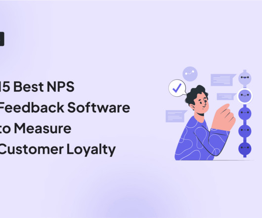
Get real-time insights into your survey responses, with visual breakdowns of data, NPS score, and trends. Plus, the ability to create custom NPS dashboards allow you to analyze the results easily without writing a line of code. Get real-time access to customer feedback via a centralized dashboard that updates as responses come in.
A dashboard showing metrics like feature adoption or user engagement amplifies your credibility. How to Get Started: Create Dashboards: Track key metrics like churn, engagement, or feature adoption that align with business goals. Analyze Trends: Use historical data to inform recommendations and showcase strategic thinking.
Creating an expansion revenue dashboard with Userpilot without coding. For this, these companies often invest in predictive analytics to anticipate trends, perform experiments, and ideate more features for the product roadmap. What does a product analytics strategy look like for SaaS companies in different stages?
Embedding dashboards, reports and analytics in your application presents unique opportunities and poses unique challenges. No matter where you are in your analytics journey, you will learn about emerging trends and gather best practices from product experts.
Data analysis: Reports : Gauge product performance and user behavior with reports for funnel and path analytics, trends, and retention tables. Dashboard : Customize the analytics dashboard or choose from pre-built ones to easily visualize and compare key metrics over time. UX analytics FAQs What is analytics in UX?
Build a foundation that drives action Use reporting tools to translate feedback into trends. Turn survey responses, review data, and post-purchase feedback into clear dashboards your teams can actually use. The following post references our new e-guide, The Retail Industrys Blueprint to Leveling Up CX .
From there, she mapped macro trends (using a PESTEL analysis) to understand what was happening in their market and customer base. They built customer understanding from the ground up Instead of jumping to AI, blockchain, or whatever buzzword was trending in the C-suite that week, Heather and Tommy focused on listening.
With the product usage dashboard, you can track user engagement metrics, popular pages and features, top interactions, trends, and even browser preferences. Know what you’re looking for before you start looking Dashboards have been a fad in the SaaS sphere for a while now. And the concept of diminishing returns sets in.
Speaker: Daniel O'Sullivan, Product Designer, nCino and Jeff Hudock, Senior Product Manager, nCino
We’ve all seen the increasing industry trend of artificial intelligence and big data analytics. In a world of information overload, it's more important than ever to have a dashboard that provides data that's not only interesting but actually relevant and timely. Dashboard design do’s and don’ts. Where to start the journey.
Custom dashboards to track key metrics at a glance. Pendo The dashboard on Pendo. Additional reports: You get a built-in Product Engagement Score dashboard. Lack of templates: There arent many ready-to-use dashboards or templates to get started quickly. UserGuiding dashboard. for collecting user sentiment data.
Real-World Example If product analytics shows a high abandonment rate during a workflow, you might embed a dashboard or visualization that makes the workflow clearer. Predictive Analytics: Go beyond simple trackingReveals tools allow you to use predictive analytics to forecast user behavior and future trends.
This grouping provides valuable insights into overall customer satisfaction and sentiment trends over time. For example, tracking CSAT over time can reveal trends in customer sentiment. Real-time analysis helps respond to trends as they arise, with dashboards visualizing results for quick, data-driven decisions.
Based on your current dashboard, it looks like most users churn before completing onboarding. Bad data leads to bad decisions, whether that means duplicated records, misfired onboarding flows, or false signals in your dashboards. Products can be prioritized based on support trends. Which features need attention?
Speaker: Dean Yao, Director of Marketing at Jinfonet
What's the next big trend in analytics software and applications? Dean Yao will talk you through powerful strategies and best practices in embedded reporting, dashboards and analytics that will add value to your products and applications while giving you an analytics partner you can rely on.
But as Jove explains, “NPS is just a trended line. If your CX platform includes AI: Highlight how it reduces time-to-insight Emphasize executive visibility (dashboards that your CFO will actually use) Address security and data governance concerns Jove notes, “The tools I never question are the ones that give me dashboards I open every day.
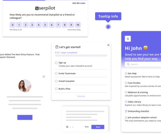
In just a few clicks, you combine properties and events to craft ultra-specific segments and deploy targeted campaigns directly from the Userpilot dashboard. How to do it in Userpilot: Track user behavior, feature adoption , and engagement trends across both web and mobile devices in real time.
You can then visualize the data as trends, funnels, paths, and heatmaps. Well, you can easily track the metrics from one of Userpilot’s analytics dashboards. There’s a ready-to-use Expansion Revenue & Upgrades dashboard, and you can create custom ones, too. Expansion Revenue & Upgrades dashboard in Userpilot.
Leveraging product analytics isnt just about making pretty dashboards; its about viewing your existing data as a learning opportunity to make informed decisions with your onboarding strategy. At Userpilot, we create quarterly dashboards organized by release. These dashboards dont just collect numbers; they tell a story.
But today, dashboards and visualizations have become table stakes. Think your customers will pay more for data visualizations in your application? Five years ago they may have. Discover which features will differentiate your application and maximize the ROI of your embedded analytics. Brought to you by Logi Analytics.
2 Context-Led Questions Similarly, knowing the external environment and industry trends is crucial for product development. Ive noticed that [industry trend or challenge] is becoming more common. Exploring industry trends helps identify their impact on workflows. Is this affecting your team?
Reports & analytics : Provide tailored analytics, dashboards, and reporting capabilities to track customer engagement, identify trends , and enable data-driven decision-making for improved customer success. Reporting and dashboards for outcome tracking. Reporting and dashboards. Custom dashboards.
A good form helps you: Ask the right mix of quantitative and qualitative questions Personalize questions based on behavior or past responses Seamlessly embed feedback opportunities in workflows Route responses directly into dashboards, alerts, or next steps The most effective forms are intuitive, quick to complete, and tailored to the moment.
Instead of sifting through endless data, teams can create bar charts to compare metrics or line charts to track trends over time and spot patterns quickly. Heres how they help: Spot patterns and trends Teams can track feature adoption, engagement, and retention over time. Track feature engagement with funnel reports on Userpilot.
Review data quarterly – Regularly analyze results to uncover trends, risks, and opportunities, and adjust strategy as needed. Real-time insights: Get full access to a powerful dashboard that gives you an always-on view of your brand performance—no waiting on reports.
Problem Brief Over a span of 4 weeks, we tested Civians platform and created design solutions to improve the overall user experience of the dashboard. We also encouraged them to think out loud while they were navigating the dashboard, to help us uncover their mental model and identify hidden insights.
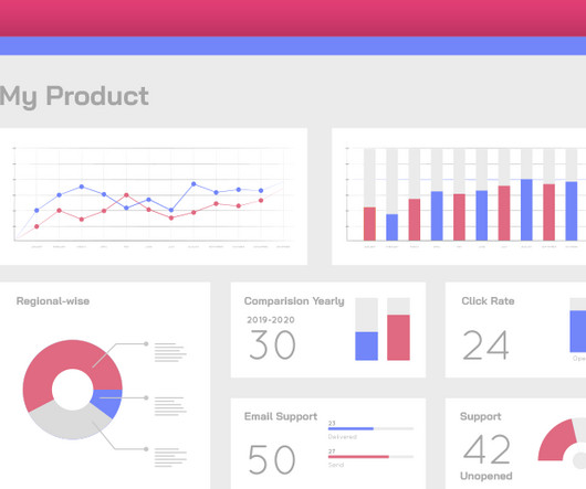
Factors I consider when evaluating customer analytics tools Important core features Analytics dashboards : Provide real-time visualizations of key performance indicators (like active users and page views) at a glance, so you can easily track changes. Example of a Userpilot dashboard showing free trial to paid user conversion rate.
Instead of turning insights into engagement and revenue, slow dashboards frustrate users and stall adoption. Slow dashboards or unresponsive queries quickly erode user trust. Designed for centralized dashboards and batch reports, they struggle to support the demands of modern applications. This isn’t a minor inconvenience.
These sessions can bring shared pain points or trends that one-on-one conversations might miss. PMs can quickly label and track specific user actions on customizable analytics dashboards without relying on engineers or data science teams. Focus groups: Gather 5-8 participants from your target users in a moderated discussion.
Lesson 4: Share feedback across the entire organization At Company Sage, feedback doesn’t stay hidden in dashboards. And they’re watching trends closely—like the sudden rise in mobile requests that no one mentioned two years ago. It’s shared company-wide. Teams are encouraged to face the tough stuff and take ownership.
Social listening tools : Software for monitoring online conversations, brand mentions, and trends. Finally, Userpilot’s analytics allow you to track every user action in the app automatically, without tagging them, and analyze the data in funnels, paths, trends, and heatmaps. Userpilot feedback widget. Userpilot heatmap.
Autocapture events dashboard in Userpilot. Custom dashboards: Custom dashboards help you gather crucial metricslike average session duration, recurring revenue, or funnel conversions all in one place. Build and view custom dashboards in Userpilot. Example of DebugBears dashboard. Example of Datadogs dashboard.
Use dashboards to track actuals against forecasts in real time, highlighting variances early. Supporting data and systems : Use your support ticketing system to categorise and quantify issues, highlighting trends and repeat pain points. Set up regular reports or dashboards that tie support volumes to product areas or features.
Embedded analytics solves these pain points by providing insights directly within your application, allowing sales teams to track performance metrics in their CRM and operations teams to monitor workflows through embedded dashboards. Visualization: Presenting data through intuitive charts, dashboards, or reports.
For instance, a basic tool might sample 10% of user sessions and extrapolate trends, missing critical friction points. Or, you can discover that simplifying your project dashboard (based on low engagement metrics) retains more customers. However, many platforms sacrifice depth for scalability, relying on partial data or assumptions.
Dry note: “Added smart filters to dashboard.” Narrative: “Teams waste hours stitching CSVs; usage trends hide in noise. Story prompt (SCQA style) “Rewrite this update using Situation, Complication, Question, Answer. Inject stakes and resolution.” What if one filter exposed churn risk instantly?
For example, say a user opens your app, skips the onboarding tutorial , and heads straight to the dashboard. For example: Suppose users are dropping off before finishing their dashboard setup. Create cohorts, build retention tables, and visualize retention trends with Userpilot. What does that tell you? G2 rating: 4.5/5
Identify navigation issues in your analytics dashboard based on real-time user interactions. It helps quantify customer behaviors on a larger scale to uncover user trends and correlations. Create custom analytics dashboards in Userpilot to track relevant metrics and visualize research findings.
Tooltip added to a Userpilot ’s analytics dashboard. Hotspot added to a Userpilot ’s analytics dashboard. You can monitor statistics such as the number of signups or time to activation, find trends and patterns, or observe user behavior connected with your flows. Userpilot ’s analytics dashboard.
This means real-time analytics and user engagement trends, without having to juggle between multiple tools and fragmented data. Mobile analytics: Build custom analytics dashboards to keep track of app engagement metrics, such as top screens, drop-offs, and active users. Tracking core app KPIs via Mixpanel. But then take action.
Help center software is an umbrella term for tools that help you quickly spot trends in user issues, keep documentation updated, and guide users in real-time. Instead of juggling countless email threads or Slack messages, you manage everything from a central dashboard. What are the different types of help center software?
Case Study:MINDBODY MINDBODY, a leading platform for health and wellness businesses, used funnel analysis on its Activity Dashboard to better understand user engagement patterns. Revenue: Monetizing Delivered Value The revenue phase of the AARRR funnel focuses on the ability to monetize the value delivered to users.
Continuously throughout the product lifecycle: I regularly monitor analytics dashboards for red flags, such as high drop-off rates, low conversions, or unusual navigation loops. Monitor product usage trends in Userpilot. Whenever I spot these issues, I run usability sessions again to dig deeper into the numbers.
Userpilot analytics dashboards can help you add relevant metrics and keep an eye on any changes that may occur. Userpilots Analytics dashboards. The brand posts TikToks and funny memes frequently, a cadence that lands regular press hits and keeps the mascot trending.
We organize all of the trending information in your field so you don't have to. Join 96,000+ users and stay up to date on the latest articles your peers are reading.
You know about us, now we want to get to know you!
Let's personalize your content
Let's get even more personalized
We recognize your account from another site in our network, please click 'Send Email' below to continue with verifying your account and setting a password.


Let's personalize your content