This site uses cookies to improve your experience. To help us insure we adhere to various privacy regulations, please select your country/region of residence. If you do not select a country, we will assume you are from the United States. Select your Cookie Settings or view our Privacy Policy and Terms of Use.
Cookie Settings
Cookies and similar technologies are used on this website for proper function of the website, for tracking performance analytics and for marketing purposes. We and some of our third-party providers may use cookie data for various purposes. Please review the cookie settings below and choose your preference.
Used for the proper function of the website
Used for monitoring website traffic and interactions
Cookie Settings
Cookies and similar technologies are used on this website for proper function of the website, for tracking performance analytics and for marketing purposes. We and some of our third-party providers may use cookie data for various purposes. Please review the cookie settings below and choose your preference.
Strictly Necessary: Used for the proper function of the website
Performance/Analytics: Used for monitoring website traffic and interactions
Most product teams get mobile appanalytics wrong. They track 47 different key performance indicators (KPIs) in their mobile analyticsplatform , spend hours debating dashboard numbers, yet can’t predict which users will churn next week The problem here isn’t a lack of data.
The smartphone app has become the front line of financial competition. Any banking app that feels generic, uninspired or offers little real value is already lagging behind. Because todays users wont waittheres always a smarter, faster and more useful app waiting to take itsplace. Uber challenged traditional taxis.
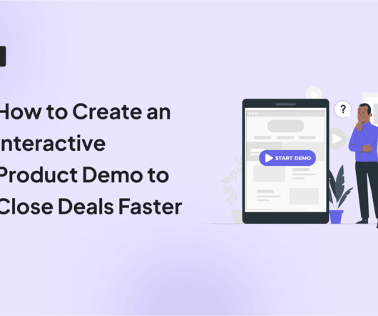
An interactive demo is a self-guided walkthrough that uses tooltips, modals, hotspots, and other interactive elements to help users quickly explore your SaaS product. Why build interactive demos for your SaaS product? This both shortens the sales process and enhances the customer experience. This results in faster Aha!
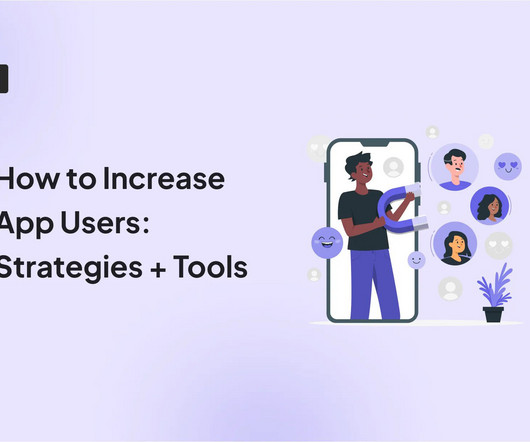
If youve recently launched a mobile app and want to increase appusers, its going to be an uphill battle. Because most mobile apps lose 77% of their users within 3 days! Sure, you could blame onboarding or a clunky user interface. User acquisition isnt a one-time campaign.
How to plan a dashboard people will use: 10 Key Steps Dashboard user interface elements in light and dark modes Our team has built dashboards for a wide range of businesses, and we’ve picked up a few key insights along the way. In the wrong hands, they can turn a helpful tool into a harmful one.
Customer Retention Rate (CRR) is a key business performance metric that measures the percentage of customers a company retains over a givenperiod. CRR formula, reference values andexample Customer Retention Rateformula Number of customers at the end of the period : Total number of customers at the end of the measuredperiod.
Data visualization tools help turn your messy spreadsheets into clear, interactive insights. Because product analytics should be easy and accessible for everyone, not just data experts. So where do you find the right tools? What are data visualization tools? How do data visualization tools help product teams?
Stripe: Product Manager, Local Payment Methods Cost Optimization Stripe is a financial infrastructure platform for businesses. You’ll help define the most relevant local payment methods to build (breadth) and aspects of payment methods to invest in (depth) to deliver the best outcomes for Stripe users.
This is the effect of Dopamine Banking, where finance meets emotions and entertainment, and every tap of your smartphone is engineered to delight and reward. Buckle up, because the future of finance just got exhilarating. Traditional banking often struggles to capture and maintain customer engagement.
Mobile apps are evolving fast, but whats changing even faster is what users expect from them. They want apps that understand them, personalize their journey, and grow with their needs. At Userpilot, we help teams meet those expectations with better onboarding, in-app guidance, and personalized engagement.
When you think of Whatfix, your mind probably goes to a digital adoption or an employee onboarding platform. But for mobile, youd want to invest in a solution that truly gets the job done, aka one that improves user engagement and retention. The question is: Can Whatfix mobile give you what youre looking for? moment faster.
Finding the right product experience platform isnt just about features, its about getting real value for your money. If youre investing in a tool to drive feature adoption, onboard users faster, and collect feedback, you want to be sure its worth the cost. Onboard new users effectively. Analyze user behavior.
AI is revolutionizing product development in ways no technology has before. Instead, they come from a rigorous review of five years of client work, 2024 sales inquiries, analyst insights, and industry offerings. Reinforcement learning will enable agentic AI systems to adapt and improve continuously.
A deep dive into how artificial intelligence is shaping the next generation of financial user experiences — through metrics, strategy, and real success stories Until recently, most banks and financial organizations treated artificial intelligence (AI) as tomorrow’s experiment. In the UK, NatWest’s AI assistant, “Cora,” handled 11.2
The Before-and-After Story: Heavy Stack ➜ Self-Service Product Analytics Before: At Tanya’s previous unicorn, data lived in a “very massive and cumbersome” stack: ETL pipelines, Snowflake, Tableau and Amplitude. Annual tool cost: ~$150 K. 31–60 days Layer on a self-service BI tool. The predictable result?
Epic Systems dominates the electronic health record (EHR) market, powering over 250 million patient records across the United States. Epic implementation represents far more than a simple software installation. The business impact of successful Epic implementation extends beyond technology adoption.
I’m going to take a wild guess and assume that you already understand the importance of mobile in-appfeedbacktools. You might already have a Voice of the Customer (VoC) program in place that you’re looking to improve, or perhaps you’re just trying to get started. Now, more than ever, your customers want to be heard.
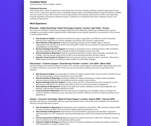
🧠 Check out our complete data analytics interview prep course. Customizing your resume for each job application is essential. Recent certifications in finance and data science show continuous learning and business acumen. ✅ Passes the ATS (Applicant Tracking System) filters. GCP , AWS , SQL ).
In this “inherently cross-functional” role, the potential hire would “work closely with engineering, design, operations, finance and executive teams to bring a consumer product to the market and develop and grow a new business opportunity for Amazon.”. Amazon highlights the “cross-functional” nature of the product management role.
Good help center designs promote self-service, allowing users to find answers independently without waiting for support. Which is exactly how users prefer it. In fact, research shows that 81% of customers try resolving issues on their own before contacting a support agent. No unnecessary jargon.
I’m going to take a wild guess and assume that you already understand the importance of mobile in-appfeedback. You might already have a Voice of the Customer (VoC) program in place that you’re looking to improve, or perhaps you’re just trying to get started. Now, more than ever, your customers want to be heard.
Creating quality customer experiences has always been important for retaining customers. Now, during this time of economic uncertainty and against a competitive landscape, effective customer engagement is business critical. Discover the top trends transforming customer engagement. But they’re facing big barriers.
This approach focuses on understanding customer needs, generating quality ideas, and turning those ideas into real value. It’s what helps create products that customers love and keeps companies successful in the long run. Staying Close to Customers A big part of successful innovation is keeping a close connection with customers.
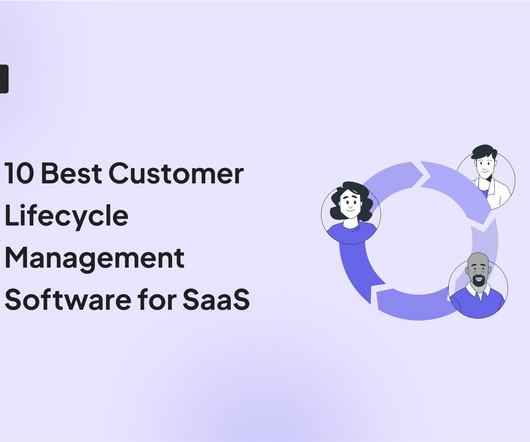
Knowing what your customer does at different stages of their relationship with you can help increase engagement, loyalty, and customer retention. You can access this information through the right customer lifecycle management software. However, it’s not easy to pick a tool among the many suitable options in the market.
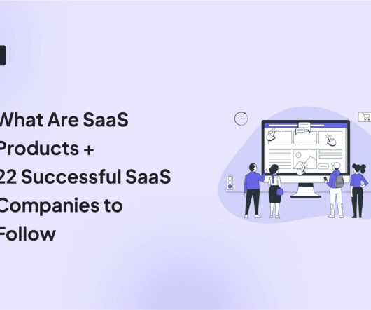
There are many SaaS products , but knowing that, how do you choose the best? This article will look at the most successful SaaS companies, so you can decide if you want to invest in them for your business. TL;DR A SaaS product delivers software remotely, reducing the need for local installation, maintenance, and updates.
The SaaS industry is full of advice on the perfect product metrics to gauge your users’ activation, engagement, and interactions. Product metrics are data measurements that businesses use to evaluate the success of a product and determine how customers are engaging with it. Not all products are the same.
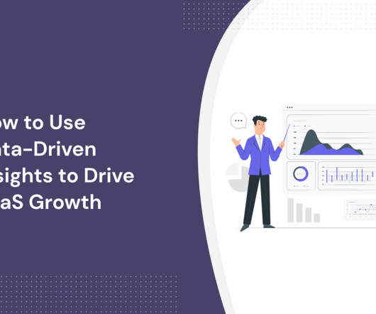
Thus, properly harnessing data-driven insights is key to achieving product growth and business success. This article explores what data-driven insights are and why they are important. It will also guide you through uncovering and harnessing these insights in your SaaS business. What are data-driven insights?
Zoezi is an all-in-one platform for the wellness industry. It allows gyms, yoga studios, spas, outdoor centers, and personal trainers to streamline day-to-day operations: admin, finance, and customer care. They use Userpilot to monitor product usage, design onboarding flows, deliver release notes , and provide in-app support.
Since volumes of textual data increase, natural language processing becomes an effective tool for financial analysis. Photo by Morgan Housel on Unsplash The language is the substance absorbing information from the epochs, reflecting social trends and giving a profound insight into things happening to us, humans, today.
Here’s how you can apply the ‘User Outcome Connection’ and get results. In some instances, these innovations feel like game-changers, set to transform the experience for users across the board. In others, though, it’s clear they’re more of a response to market demand than a well-thought-out solution.
Brian joined Pendo from Namely, and formerly from Intuit, where he started his career in finance before finding his passion for product. He worked on new businesses for TurboTax and later led global expansion for QuickBooks, Intuit’s suite of accounting and payroll SaaSsolutions for small businesses with 1.5M
Reveal Embedded Analytics. Easy to use and understand analytics is a crucial part of every modern SaaS application. In today’s digitalized and technology-oriented world, customers require much more than static data visualization or simple reporting. Table of contents: What is a legacy system?
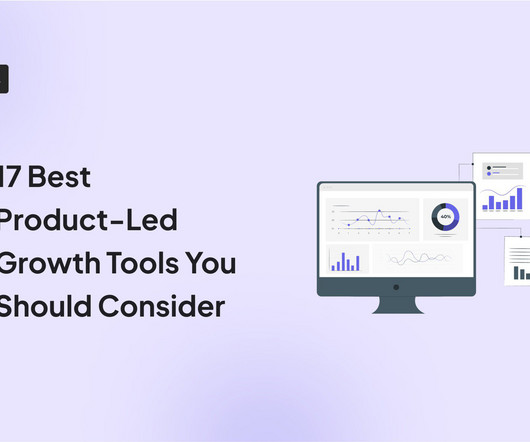
Product-led growth tools allow you to improve your product experience by analyzing customer data and adding in-app interventions. However, having a different tool for each functionality can make product-led growth sound too much of a hassle. Luckily, we’ve listed the 17 best product-led growth software in the market.
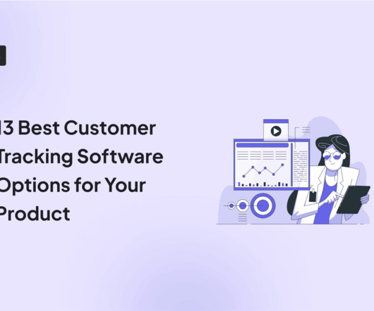
You’re looking to track your customer data and build your sales and marketing efforts around it. Do that by choosing the right customer tracking software for your business. However, it’s not easy to pick a tool among a myriad of tools available on the market. Let’s dig in! Get a demo.
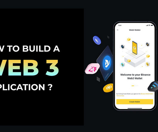
Explore the future of decentralized innovation with our guide on building Web3 apps. Master the process, tech stacks, and tools for a transformative development experience. In the dynamic landscape of digital innovation, the advent of Web3 technology has ushered in a new era of decentralized applications. Step by Step Process!
How many financial apps do you have on your phone, and how often do you use them? Chances are the ones you frequently use have a simple, intuitive app onboarding process. If you’re a financial services product manager, you’ll know that crafting an effective fintech app onboarding process is no small feat.
At some inflection point of growth, it becomes impossible to intuitively know your customers, let alone decide which ones to focus on. We could no longer assume all our customers had uniform needs and could be reached the same way. What is customer segmentation? This final assumption in particular was no longer true or useful.
As a team supporting diversity and women in tech – we decided to use the International Women’s Day as an opportunity to showcase some of the best talent in the industry – and interviewed the top female Product Managers, Product Owners and SaaS founders and CEOs. Women in SaaS. Women in Product.
As a founder, you may know exactly what tech stack you need to build your product – but what about when it comes to the tools you need to run your business? But these days, there are so many innovative and impactful tools that can massively streamline your workflows and help to set you up for success as you scale.
I believe that predictive analytics is poised to enable businesses in ways we didn’t think were possible several years ago. And we’re starting to see applications being deployed in Healthcare, Manufacturing, Finance, and Retail. This will help make your predictive analytics project more successful. What will be most helpful?
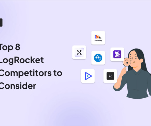
However, the best product analyticstools for you depend on factors other than having a wider range of features. So let’s go over the best LogRocket alternatives, their ideal use cases, and how each tool compares to it so you can choose the right product. Marker.io : Use Marker.io G2 rating : 4.6/5
If software is leading the world, then product managers are the modern-day businessmen and women,” says Brian Crofts, Chief Product Officer (CPO) at Pendo. With Pendo, product teams can understand user behavior and sentiment and then act on those insights by engaging with users through in-app messaging or surveys.
Know Your Customer (KYC) in mobile app banking is designed to protect financial businesses against crimes like fraud and money laundering. On the user’s side, it’s a process where they need to verify their identity, address, and purpose of using the app. Short attention span. Make support easily accessible.
According to the report, “abstract roles — typically in management, technology or finance — tend to require more formal education and skills such as creativity, persuasion, intuition and problem solving.”. The report predicts what automation does not replace, it will complement — as will be the case with many technology workers.
We organize all of the trending information in your field so you don't have to. Join 96,000+ users and stay up to date on the latest articles your peers are reading.
You know about us, now we want to get to know you!
Let's personalize your content
Let's get even more personalized
We recognize your account from another site in our network, please click 'Send Email' below to continue with verifying your account and setting a password.


Let's personalize your content