This site uses cookies to improve your experience. To help us insure we adhere to various privacy regulations, please select your country/region of residence. If you do not select a country, we will assume you are from the United States. Select your Cookie Settings or view our Privacy Policy and Terms of Use.
Cookie Settings
Cookies and similar technologies are used on this website for proper function of the website, for tracking performance analytics and for marketing purposes. We and some of our third-party providers may use cookie data for various purposes. Please review the cookie settings below and choose your preference.
Used for the proper function of the website
Used for monitoring website traffic and interactions
Cookie Settings
Cookies and similar technologies are used on this website for proper function of the website, for tracking performance analytics and for marketing purposes. We and some of our third-party providers may use cookie data for various purposes. Please review the cookie settings below and choose your preference.
Strictly Necessary: Used for the proper function of the website
Performance/Analytics: Used for monitoring website traffic and interactions
How to plan a dashboard people will use: 10 Key Steps Dashboard user interface elements in light and dark modes Our team has built dashboards for a wide range of businesses, and we’ve picked up a few key insights along the way. If you want a solid dashboard, treat its design as seriously as you would an airplane’s cockpit.
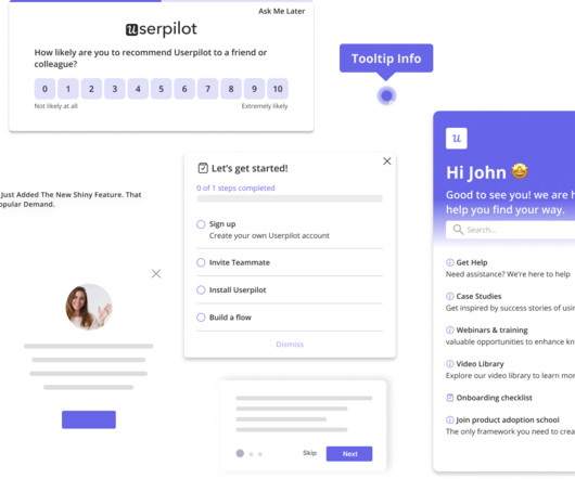
A dashboard showing metrics like feature adoption or user engagement amplifies your credibility. How to Get Started: Create Dashboards: Track key metrics like churn, engagement, or feature adoption that align with business goals. Communicate Progress Early: Regular updates on winsno matter how smallbuild trust and momentum.
For example, telling users that the dashboard loading time has been reduced by 50% shows commitment to continuous improvement to keep them happy. Blog posts Distributing release notes via blog posts is an effective way to communicate with your existing users. Chameleon announces release changes with a blog post.
If your CX platform includes AI: Highlight how it reduces time-to-insight Emphasize executive visibility (dashboards that your CFO will actually use) Address security and data governance concerns Jove notes, “The tools I never question are the ones that give me dashboards I open every day. This blog just scratches the surface.
In this blog, we explore 5 key principles that exist to ensure you create a relevant dashboard that guides and simplifies the user experience, makes it as easy as possible to interpret what is presented no matter its complexity, and increases the adoption of BI.
One insight: HR managers didn’t just need dashboards. They created proto-personas across their three key customer groups (HR managers, employees, and healthcare providers), then ran empathy interviews and used Jobs to Be Done to uncover true pain points. They needed clear, customizable ways to show WellNest program ROI to their leadership.
Whether its customer feedback, analytics dashboards, or training in decision frameworks, make sure they have what they need to succeed. Use this insight to refine your approach. Empower with Data and Tools Equip your teams with the resources they need to make informed decisions.
Leveraging product analytics isnt just about making pretty dashboards; its about viewing your existing data as a learning opportunity to make informed decisions with your onboarding strategy. At Userpilot, we create quarterly dashboards organized by release. These dashboards dont just collect numbers; they tell a story.
Turning Strategy Into Outcomes: Influencing Stakeholders To Achieve Alignment By Erica Wass At a Glance This blog outlines how successful product strategy depends on aligning cross-functional stakeholders, not just building a strong plan. Use dashboards to track actuals against forecasts in real time, highlighting variances early.
Start by creating a project and selecting a sharable link as the collection type, or simply use the Add Feedback option in the project dashboard for structured input. The post 30 Essential Product Discovery Questions to Uncover User Needs appeared first on Usersnap Blog.
In this blog, you’ll learn: What brand health tracking is and why it’s essential for modern brands The key metrics that reveal brand awareness, loyalty, and competitive positioning Best practices for consistent, high-quality tracking and reporting A phased approach to launching and optimizing your tracking program Let’s break it down.
Mention is a media monitoring tool that enables collecting user feedback from online conversations across various platforms, like social media, blogs, forums, and news sites. Product teams can use Mixpanel to create tailored reports and dashboards to facilitate data-driven decision-making. Product feedback software: Mixpanel.
Dry note: “Added smart filters to dashboard.” AI turns raw data into a story arc in seconds. Story prompt (SCQA style) “Rewrite this update using Situation, Complication, Question, Answer. Inject stakes and resolution.” Narrative: “Teams waste hours stitching CSVs; usage trends hide in noise. What if one filter exposed churn risk instantly?
And every new dashboard sat “a month” away in an analyst backlog. After: At Metabase, the same insights come from a lean team (“one data engineer and one analyst”) because PMs and success managers build the dashboards themselves “in 5, 10, 15 minutes”. Follow the timeline and you don’t just build better dashboards.
Clarity and social proof on every external touchpoint (like social media, community forums, and blogs) matter. Userpilot analytics dashboards can help you add relevant metrics and keep an eye on any changes that may occur. Userpilots Analytics dashboards. So, you can see interactions with your mobile app in real-time.
In this blog, were diving into actionable tips, examples, and templates to help you craft release notes that educate, inspire, and drive adoption. People consume updates differently, so you need to meet them where they arewhether thats inside your app, in their inbox, through your blog, or even on social media.
Users clearly preferred in-app content, where they could immediately try new features instead of digging through blog posts or newsletters. In this blog, I’ll share some of the best paid and free changelog tools to help your team overcome similar challenges. Pricing Paid plans start at $39/month 2.
E.g., Identify navigation issues in your analytics dashboard based on real-time user interactions. Userpilot is one answer, offering data collection and analytics features for quantitative and qualitative data, along with a custom analytics dashboard for visualizing your unique data and responses. Dashboard example in Hotjar.
Learn about delta testing Resources By Type ïª Blog ï Ebooks & Guides ï¬ Events & Webinars ï Case Studies ï Podcast ï Community Featured Content The Definitive Guide to Delta Testing What is delta testing and how are tech leaders using it to deliver customer insights throughout agile development?
Its not enough to browse dashboards or let sales be your proxy. Power 1: Customer Intimacy (No, AI Cant Do This for You) Toms first point was blunt: Theres one thing at least right now that Im not going to trust AI forand thats customer intimacy. PMs need to be talking to customers directlyfrequently, intentionally, and with real curiosity.
In this blog post, well break down Pendos pricing structure, expose its hidden costs, and compare it to a better alternative: Userpilot. Leverage cross-app executive dashboards and journey orchestration to refine engagement strategies. Heres what that looks like in action: Pendo dashboard showing in-app message pop-up.
Things seem great initially, but soon enough, you see your analytics dashboard showing a constant decline. 57% of users want to receive push notifications from social media platforms, followed by news apps (45.94%), e-commerce apps (25.29%), mobile games (19.05%), travel apps (10.08%) and blogging apps (9.24%).
Explore the Benefits of Customizable Dashboards for Greater Alignment and Transparency Roadmaps drive alignment, transparency, and strategic decision-making across product teams. As a central hub for planning and execution, they enable product managers to visualize goals, track progress, and communicate updates effectively.
How Userpilot can help: Build, schedule, and send each email to the right user segment from one dashboard so every message feels personal and arrives exactly when it matters. They also provide links to their blog and knowledge base for users who prefer to read instead. Riverside onboarding email template.
You end up with: Multiple roadmaps but no shared priorities PMs stepping on each others toes Dashboards galore, but zero signal Before long, youve built what we call a meeting maze. Insights : Turning data into direction Most PMs are drowning in dashboards but starving for clarity. Growth reveals cracks in your product organization.
Extra support links: The bottom section offered more help (tutorials, blog, knowledge base ) without distracting me from the main CTA. resume setup, log in, revisit dashboard). To do this, we use Userpilot’s email analytics dashboard to track engagement metrics such as: Delivery and open rates per email. What can be improved?
AWS Security Hub can aggregate security data from multiple sources and provide you with a centralized dashboard for identifying and mitigating threats. Learn more Modus Create > Insights > Blog Posted in Operations Share this Matthew Smith Matthew Smith is the Director of Digital Operations at Modus Create.
This blog provides an in-depth exploration of Allscripts EMR, highlighting its features, benefits, and applications. Customizable Dashboards : Offers customizable tools for physicians to adapt to their specific needs. Practices using automated billing tools like those in Allscripts have reported up to a 30% boost in revenue.
In this blog, well take you behind the scenes of how co-founders Ori Entis and Lior Harel built Staircase AI and the few core principles they had in mind: Zero User Input: AI That Works for You From day one, Staircase AI was built on a non-negotiable principle: zero user input. No new dashboards to check. OMG, I need this.
Includes : Real take-home case studies, technical and dashboarding skills, and strategies from interviewers at top tech companies. Strategic Projects & Certifications AI-powered data assistant and dashboard projects demonstrate hands-on experience beyond daily tasks. Presentations: Show your ability to communicate complex topics.
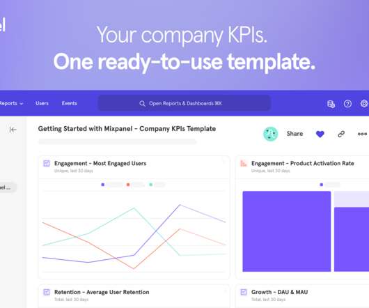
To take the guesswork out of measuring the right metrics, today we released the Company KPIs Dashboard template—nine out-of-the-box, fully customizable reports that make it easy for anyone to measure engagement, retention, and growth metrics. You need product analytics fast, and that’s where the Company KPIs Dashboard template can help.
Reveal Embedded Analytics If you’ve ever struggled to create new dashboards with similar KPIs, integrations, and layouts but different data sources, this article is for you. What Are Dashboard Templates? Dashboard templates are pre-designed layouts that provide a framework for organizing and presenting data in a visual format.
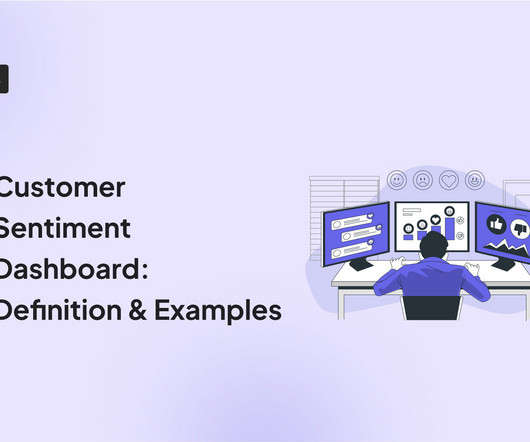
A customer sentiment dashboard is a great way to visualize customer feedback and see what users love (or hate) about your product. TL;DR A sentiment analysis dashboard typically integrates information from multiple data sources, such as social media posts, customer reviews, survey responses , and customer service chats.
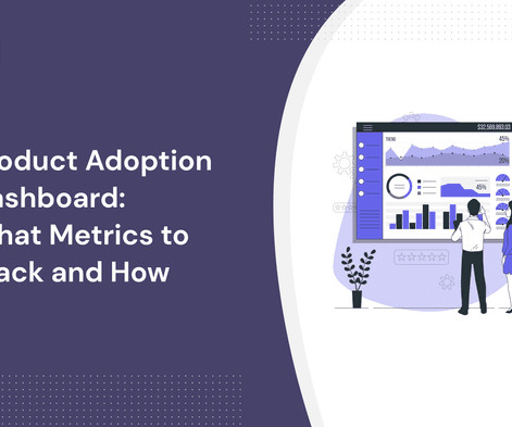
A product adoption dashboard helps you visualize key adoption metrics so you can make data-driven decisions and boost user engagement. In this article, we cover the following: Why you need a product adoption dashboard. Steps to measure adoption using a comprehensive dashboard. Build your dashboard or use a template.
Now we have dashboards measuring metrics like conversion, user growth, and stickiness,” said May Co-Founder Antoine Creuzet. Company KPIs Dashboard Template. Today, all Mixpanel customers have access to the free new Company KPIs Dashboard Template. Mixpanel for Startups. Even in the best conditions, very few startups make it.
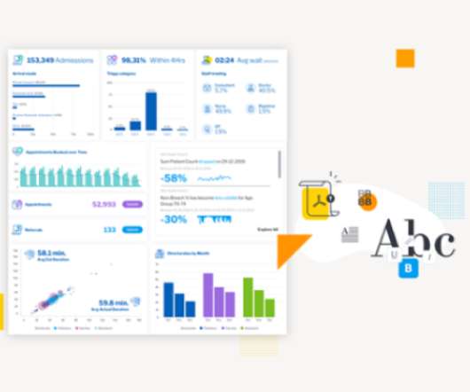
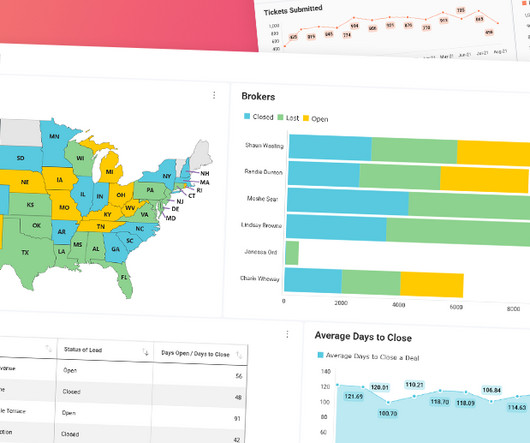
Analytics dashboards are visualization tools that give you an overview of key metrics. In this article, we’ll discuss 10 analytics dashboard examples. It will give you a better understanding of the type of metrics to monitor in your dashboard and help you draw product growth insights from them. Book a demo to learn more.
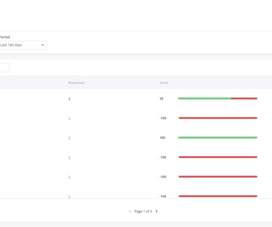
Wondering how an NPS dashboard can help you track customer loyalty? This is where the NPS dashboard comes in. Let’s see how the dashboard can help you extract insights from NPS responses and improve customer loyalty. What is the NPS dashboard? Why do you need an NPS dashboard?
Way back, when I started the Product Bistro, I had a lot of spare time (between gigs), and I was using the blog to drum up some consulting, and piece work to fill in the gaps and time. However, during that time period, the Boston Product Management Association discovered my blog, and asked if I was interested in them sharing my content.
Some examples are: Dashboards are cluttered Or the insights are too superficial No option to drill down into data Insights aren’t adjusted to the user’s role For deep analysis, data export to Excel is the only (time-consuming) option 3. With view-only, static dashboards, customers have no control over the insights they can extract.
Check out the 10-minute video version of this blog post. This blog post maps mental models (now there’s meta for you). Dashboards of user behavior summarizing trends. Usage dashboards are maps that influence what we measure but also how we iterate. We’ve all seen the over-excited PM with his vanity metrics dashboard.
Between the message boards, subreddits, and blogs, chances are you can find your existing online communities directly in your niche. DESIGN A DASHBOARD FOR RECORDING AND ANALYZING YOUR METRICS AND KPIS. CONTINUE TO ADD TO YOUR PERFORMANCE DASHBOARD. LEVERAGE EXISTING COMMUNITIES POPULAR WITH YOUR TARGET AUDIENCE.
We were so inspired by Tali’s enthusiasm that we just had to share her story here on the Product Talk blog. To prepare for the workshop, Tali created a fictional case study, and with the help of ChatGPT, she generated six interview snapshots and some analytics dashboards. Do you have your own Product in Practice you’d like to share?
From your dashboard, you’ll be able to see your own tasks and organize them however you’d prefer. Aericon has a post on its blog about how they use Asana for product management – we here at UserVoice are also a fan of keeping tabs on marketing projects via Asana. Costs Vs Benefits.
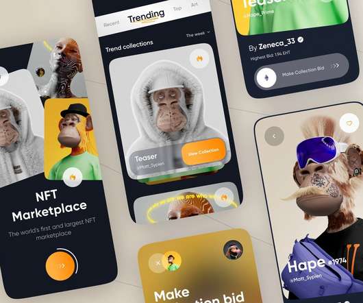
This blog will be sharing some of the most informative and interesting development of web3’s favorite NFT marketplace. NFT dashboard/Storefront The NFT dashboard is a display for all the digital assets in the marketplace, open for the users to trade them. The blog discussed is just the tip of the iceberg.
We organize all of the trending information in your field so you don't have to. Join 96,000+ users and stay up to date on the latest articles your peers are reading.
You know about us, now we want to get to know you!
Let's personalize your content
Let's get even more personalized
We recognize your account from another site in our network, please click 'Send Email' below to continue with verifying your account and setting a password.


Let's personalize your content