This site uses cookies to improve your experience. To help us insure we adhere to various privacy regulations, please select your country/region of residence. If you do not select a country, we will assume you are from the United States. Select your Cookie Settings or view our Privacy Policy and Terms of Use.
Cookie Settings
Cookies and similar technologies are used on this website for proper function of the website, for tracking performance analytics and for marketing purposes. We and some of our third-party providers may use cookie data for various purposes. Please review the cookie settings below and choose your preference.
Used for the proper function of the website
Used for monitoring website traffic and interactions
Cookie Settings
Cookies and similar technologies are used on this website for proper function of the website, for tracking performance analytics and for marketing purposes. We and some of our third-party providers may use cookie data for various purposes. Please review the cookie settings below and choose your preference.
Strictly Necessary: Used for the proper function of the website
Performance/Analytics: Used for monitoring website traffic and interactions
Without effective UX analytics that goes beyond collecting data, you’re losing valuable customers. Unfortunately, the research backs this up, with a staggering 90% of users reporting that they stopped using an app due to poor performance. Basically, anything that ruins the userexperience.
When your company adopts multiple SaaS solutions to drive productivity, you unknowingly create a perfect storm for data fragmentation. Your customer information lives in Salesforce, while your support tickets are in Zendesk, your product usage data in Mixpanel, and your marketing campaigns in HubSpot. Sound familiar?
How Rumi Cosmetiques Boosted UserExperience and Conversion Rates in eCommerce: A Case Study for Marketers andManagers Discover how Rumi Cosmetiques achieved a 75% increase in cart adds and doubled conversion rates by enhancing userexperience and conversion rate in eCommerce.
Case Study: Improving Data-Driven Decision Making for CSR Leadership Civian is a data-driven platform designed to help businesses measure, optimize, and showcase the social and economic impact of their investments in communities. Feature Engagement Users most frequently gravitated toward the map to explore and compare data.
Think your customers will pay more for data visualizations in your application? But today, dashboards and visualizations have become table stakes. Five years ago they may have. Discover which features will differentiate your application and maximize the ROI of your embedded analytics. Brought to you by Logi Analytics.
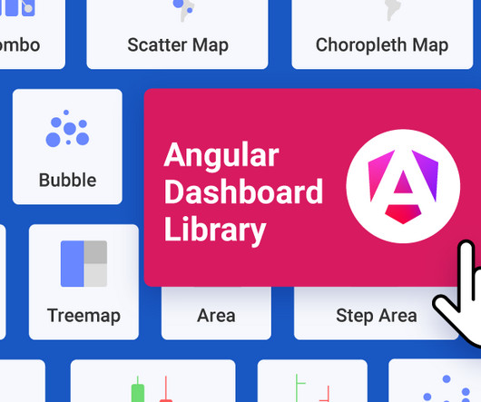
Reveal Embedded Analytics We know how difficult it is to create dashboards, especially for web applications. Thats what dashboards are for. They track everything from user behavior to system performance. In fact, Angular dashboards can provide key insights that will eventually allow data-driven decision-making at your company.
You can gather all the user feedback or behavioral data you want or even generate tons of Google Analytics reports. Kevin has almost a decade of experience working at some of the world’s most innovative software companies. This causes siloed data and integration issues.
Instead of trying to eliminate these biases, a neuroscientific approach harnesses them for goodgently guiding users toward better decisions through well-timed nudges and simplified choices. It is also counterintuitive to think that less information might actually benefit users. In practice, it actually does the opposite.
Website feedback and online surveys : These collect opinions about digital experiences, focusing on usability and content quality. Businesses can use this feedback to improve website navigation, enhance userexperience, and drive conversions. This format efficiently gathers quantitative data and identifies common themes.
Dashboard design can mean the difference between users excitedly embracing your product or ignoring it altogether. Great dashboards lead to richer userexperiences and significant return on investment (ROI), while poorly designed dashboards distract users, suppress adoption, and can even tarnish your project or brand.
A/B and multivariate testing for optimizing userexperiences. Custom dashboards to track key metrics at a glance. Analytics reports like paths, funnels, and cohort tables for visualizing user behavior data. Session replays to see how users navigate your product. for collecting user sentiment data.
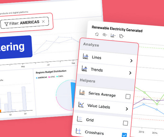
Fixed Lines for Charts: Set static reference points to highlight key data trends. Flexible Chart Legend Positioning: Move and align legends for better dashboard design. Grid Paging with Sorting: Instantly organize data with new column sorting capabilities. Custom Alignment: Left, right, or centercontrol it in the Settings tab.
While “use data to drive decision-making” sounds obvious, there’s a HUGE gap between saying it and doing it well. Product analytics refers to the process of gathering and analyzing data on how users interact with a product. This process may reveal gaps such as: Insufficient raw data. Outdated technology.
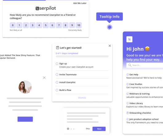
1 Userpilot for product teams to collect and act on NPS data Creating NPS surveys with Userpilot. Personalize surveys by setting conditions based on user behaviors , translating and localizing your NPS surveys using AI, and customizing the appearance of your surveys to match your app’s design.
A customer sentiment dashboard is a great way to visualize customer feedback and see what users love (or hate) about your product. But how do you collect the right data for your analysis? Customer sentiment dashboards help you generate the following: Sentiment trends over time. However, a single data source (e.g.,
When it comes to product management, you need to look at different SaaS dashboard examples to see what kind of product analytics you can measure, and how. So what are the most important types of dashboards and which ones are the best for you? Ready to transform your data into actionable insights?
As today’s user increasingly desires swift solutions when using digital products, userexperience optimization can spell the difference between the success and failure of a product. To retain users, continuous improvement of your UX optimization efforts is critical. Analyze the collected data and prioritize changes.
You know your product collects tons of data. Data visualization tools help turn your messy spreadsheets into clear, interactive insights. The best ones dont even need SQL or data science skills. Because product analytics should be easy and accessible for everyone, not just data experts. What are data visualization tools?
These tools can provide you with the qualitative and quantitative data you need to understand how your customer behaves in your product, so you can make the necessary changes to improve their experience. TL;DR UX research tools help collect and analyze data on user interactions to improve product usability and satisfaction.
Would you like to learn how to design a SaaS metrics dashboard for your team without any coding? In the article, you will find examples of various SaaS dashboards and learn how to create them with Userpilot analytics. If so, you're in the right place! Let's dive in, shall we? To name just a few.
Get to Know Your User (30 minutes) First things first – who are you solving for? This step is all about understanding who your user is. Example: Imagine you’re designing a new dashboard for a fintech app. ” Perhaps users are spending a lot of time on manual tasks. Big difference, right?
They track 47 different key performance indicators (KPIs) in their mobile analytics platform , spend hours debating dashboard numbers, yet can’t predict which users will churn next week The problem here isn’t a lack of data. 86% of leaders agree that this data overwhelm leads to less confidence in decisions.
You have the analytics data, but it doesn’t tell the whole story. You know what users are doing, but not why. This powerful tool allows you to see your website or web app through your users’ eyes. It reveals the “why” behind their actions and unlocks valuable insights to improve the userexperience.
Alongside usability testing, userexperience interface guidelines allow you to build more intuitive and user-friendly solutions. In this blog, we explain eleven userexperience and interaction design guidelines supported by real-life examples to improve product engagement. System status visibility.
NPS survey dashboard in UsrGuiding tool. In reality, UX is multidimensional, and it requires multiple qualitative and quantitative metrics like task success rate, user satisfaction score, and summary of user reviews. Also, when you rely on one metric, the risk of data manipulation increases. Google HEART framework.
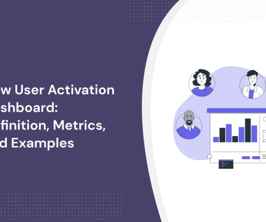
In SaaS, a new user activation dashboard can become a massive product analytics tool to understand and optimize the user journey. But how can a dashboard for user activation can help you engage more users? moment ," impacting user retention and satisfaction.
. – Isa Olsson, UX Researcher and Designer at Zoezi Finally, Zoezi users had no easy way to report issues from within the product. They had to leave the app and use email, which was inconvenient and led to poor userexperience. Zoezi uses Userpilot mainly to: Monitor product usage from the analytics dashboards.
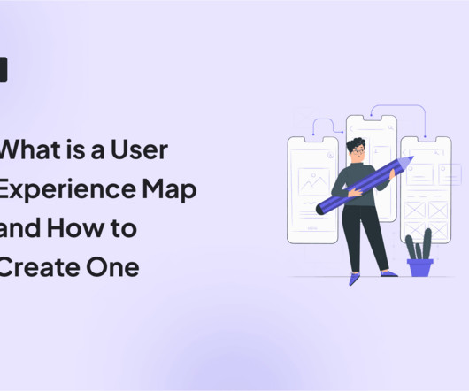
The solution might lie in your ability to create a comprehensive userexperience map. A well-crafted userexperience map can be your secret weapon for understanding customers, identifying pain points, and boosting product engagement. We also identify some best practices to follow when creating the userexperience map.
Functionality is a must when it comes to attracting customers, but it’s userexperience that helps you retain them. Wondering how to create an outstanding userexperience ? TL;DR UX design identifies user needs, wants, and pain points and creates engaging products that enable them to achieve their goals.
It’s what you do with the behavior data your app collects. And by behavior data, I dont mean installs (thats the easy part). I mean what happens after the download: how users navigate, what features they engage with, and where they drop off. Why track in-app user behavior? What separates a good app from a great one?
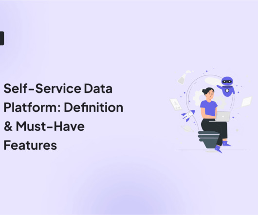
A self-service data platform is the backbone of informed decision-making and a growing SaaS business. But how do you choose the right data platform for product analytics ? Let’s go over what a data platform is, its importance, and the must-have features you should consider to choose the right platform for you.
Data analysis is integral to a product manager’s job – it’s what helps them build impactful products. This article dives deep into data analysis for product managers. Userdata analysis helps: Provide direction for product development , allowing for effective resource allocation.
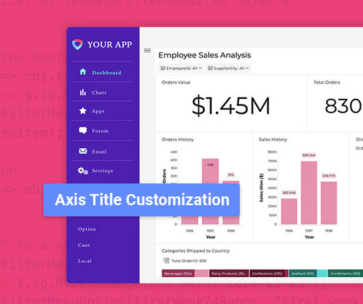
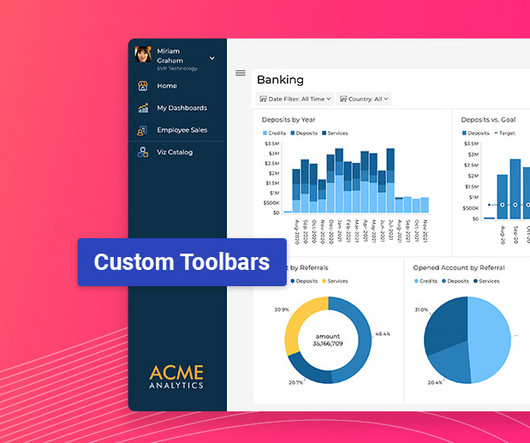
Latest Update Features: Custom Toolbars: Full control over dashboard menus. Interactive Filtering: Compare data instantly. Axis Title Control: Sharpen data clarity. Enhanced Visuals & Data Sources: Smarter charts, faster data. Dynamically adjust menu behavior based on user conditions (e.g.,
This updated toolbar enhances userexperience by offering advanced data analysis and interactive features. Chart % Based Filtering [Beta] Chart % Based Filtering in Reveal enhances your dashboard’s interactivity by allowing percentage-based interactions across various visualizations.
Reveal Embedded Analytics For product owners, leveraging data is not just an advantageits a necessity. Product analytics empowers you to understand gaps in your offering and how users engage with your product. Whether its a mobile app, a web platform, or a SaaS tool, understanding user behavior is critical for improving performance.
These tools help with improving retention, enhancing the userexperience , and making data-driven decisions. You can use them when monitoring in-app experiences, launching new features, and tracking campaign performances. You’ll know exactly what makes your users stick.
One look at your mobile app analytics dashboard, and you just want to shut your eyes and scream in frustration. You aim to extract meaningful insights to improve app performance and user engagement. Or you simply want to find out more about your users and where they are coming from. What decision will this data influence?
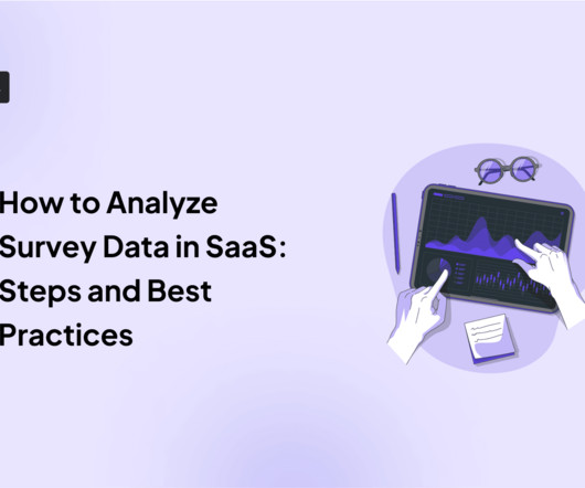
Understanding how to analyze survey data doesn’t have to be complicated. Effectively analyzing data from your user feedback will also help you eliminate assumptions and create marketing strategies that positively impact your audience. The two main types of survey data are quantitative data and qualitative data.
However, without a solid foundation in user research, this framework may be limited to a set of quantitative metrics that fail to adequately reveal the why behind observed behaviors. The Emergence of Research-Driven Growth Authentic growth lies not only in analyzing quantitative data but in deeply understanding user behavior and motivations.
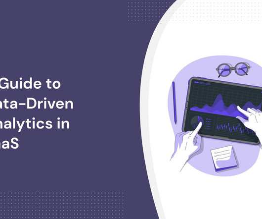
What is data-driven analytics in SaaS? How to conduct userdata analysis? TL;DR Data-driven analytics describes the process of collecting, analyzing , and interpreting customer data to help organizations make better-informed product and strategic business decisions. Data collection comes next.
Users share sensitive data and entrust performing operations with their finances, so even minor defects in fintech products destroy confidence, make users question the company’s expertise, and what’s worse, abandon an app. To increase working efficiency, users can tweak dashboards and choose the most topical tabs.
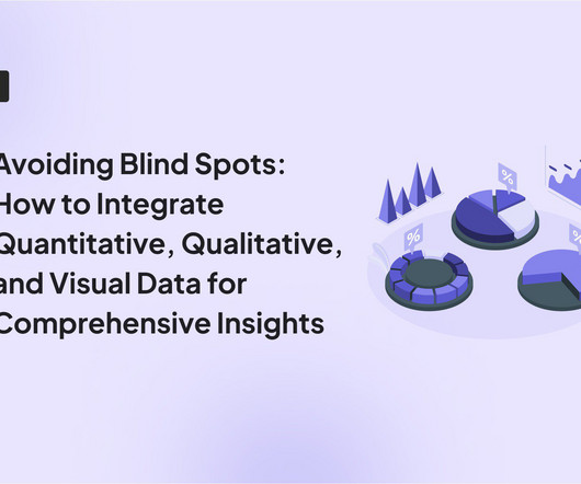
User feedback is valuable , but without data, its just opinions. Session replays and heatmaps show user friction , but they dont explain why it happens. To eliminate these blind spots, you need to combine quantitative, qualitative, and visual data. Key differences between data types. How to collect each data type.
Much of the literature that defines the role as the intersection of business, technology, and userexperience isn't particularly helpful for practitioners who are left wondering what skills they need to learn versus the fine people they work closely with in actual business, technology, and userexperience roles.
For SaaS companies, this “listening” can take many forms to learn how users interact with their product and uncover areas for improvement. It could include conducting user interviews and surveys, analyzing product usage data, and tracking customer feedback , to name a few.
We organize all of the trending information in your field so you don't have to. Join 96,000+ users and stay up to date on the latest articles your peers are reading.
You know about us, now we want to get to know you!
Let's personalize your content
Let's get even more personalized
We recognize your account from another site in our network, please click 'Send Email' below to continue with verifying your account and setting a password.


Let's personalize your content