This site uses cookies to improve your experience. To help us insure we adhere to various privacy regulations, please select your country/region of residence. If you do not select a country, we will assume you are from the United States. Select your Cookie Settings or view our Privacy Policy and Terms of Use.
Cookie Settings
Cookies and similar technologies are used on this website for proper function of the website, for tracking performance analytics and for marketing purposes. We and some of our third-party providers may use cookie data for various purposes. Please review the cookie settings below and choose your preference.
Used for the proper function of the website
Used for monitoring website traffic and interactions
Cookie Settings
Cookies and similar technologies are used on this website for proper function of the website, for tracking performance analytics and for marketing purposes. We and some of our third-party providers may use cookie data for various purposes. Please review the cookie settings below and choose your preference.
Strictly Necessary: Used for the proper function of the website
Performance/Analytics: Used for monitoring website traffic and interactions
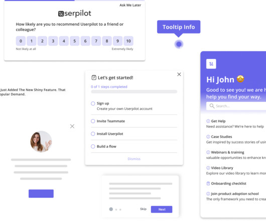
Variety of UI patterns to engage users, including modals , tooltips , and slideouts. A/B and multivariate testing for optimizing userexperiences. Autocapture for recording in-app events without manual tags. Custom dashboards to track key metrics at a glance. Session replays to see how users navigate your product.
Unfortunately, the research backs this up, with a staggering 90% of users reporting that they stopped using an app due to poor performance. Basically, anything that ruins the userexperience. UX analytics involves gathering, analyzing, and interpreting data about how users interact with your product or service.
When data collection is messy, product managers lose visibility, teams waste hours chasing answers, and userexperience suffers. Based on your current dashboard, it looks like most users churn before completing onboarding. But that view only reflects web users. You check event data, but somethings missing.
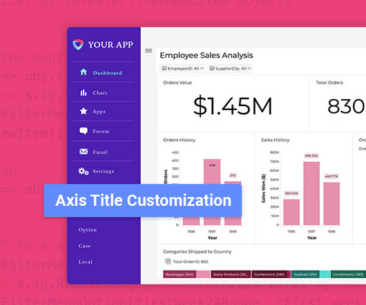
Flexible Chart Legend Positioning: Move and align legends for better dashboard design. Date Filter API Update: More Power for Developers Enhanced API Usability: The onDateFilterMenuOpening event now utilizes IRVDateFilterMenuItem objects for more structured handling. Request a Demo Originally from Reveal 1.7.3
Website feedback and online surveys : These collect opinions about digital experiences, focusing on usability and content quality. Businesses can use this feedback to improve website navigation, enhance userexperience, and drive conversions. Event feedback surveys gather insights on attendee satisfaction.
A product analytics strategy is essential for any business looking to make informed decisions about product development and userexperience. Plus, there are many reasons why you need a product analytics strategy: Aligns product development with user needs and business goals. Tracking in-app events with Userpilot.
Userpilot’s Visual Labeler enables you to track in-app user behavior, such as clicks, text input, and form submissions, code-free and with no interference from your dev team. With the product usage dashboard, you can track user engagement metrics, popular pages and features, top interactions, trends, and even browser preferences.
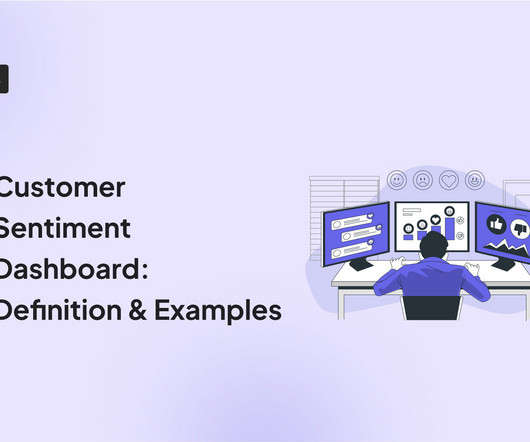
A customer sentiment dashboard is a great way to visualize customer feedback and see what users love (or hate) about your product. TL;DR A sentiment analysis dashboard typically integrates information from multiple data sources, such as social media posts, customer reviews, survey responses , and customer service chats.
Mobile app tracking captures data on how users interact with your app, including actions such as screen views, button taps, session length, and feature usage. For example, say a user opens your app, skips the onboarding tutorial , and heads straight to the dashboard. Build custom events you want to track in Userpilot.
Userpilot’s in-depth survey customization and targeting make it ideal for product teams focused on improving specific user touchpoints and optimizing in-app feedback collection. Plus, the ability to create custom NPS dashboards allow you to analyze the results easily without writing a line of code. A 14-day free trial is available. #8
Userexperience analytics is one of the secret ingredients for boosting SaaS growth. This ensures your product remains enjoyable for users, boosting retention and loyalty. This data type identifies the “what” of a userexperience problem. What is userexperience analytics? across the customer journey.
Would you like to learn how to design a SaaS metrics dashboard for your team without any coding? In the article, you will find examples of various SaaS dashboards and learn how to create them with Userpilot analytics. If so, you're in the right place! Let's dive in, shall we? Let's dive in, shall we? To name just a few.
One of these features you should look for is dashboard linking. The following article will delve into dashboard linking, its advantages, and potential benefits across various industries. What Is Dashboard Linking? In embedded analytics , dashboard linking refers to the ability to connect and navigate between multiple dashboards.
One of these features you should look for is dashboard linking. The following article will delve into dashboard linking, its advantages, and potential benefits across various industries. What Is Dashboard Linking? In embedded analytics , dashboard linking refers to the ability to connect and navigate between multiple dashboards.
. – Isa Olsson, UX Researcher and Designer at Zoezi Finally, Zoezi users had no easy way to report issues from within the product. They had to leave the app and use email, which was inconvenient and led to poor userexperience. Zoezi uses Userpilot mainly to: Monitor product usage from the analytics dashboards.
As part of the broader Userpilot platform, it helps you guide, engage, and learn from mobile users at every stage of their journey. With the SDK, you can trigger onboarding flows, tooltips , checklists, and surveys based on userevents and properties. Everything lives in one SDK, with a single interface and one user profile.
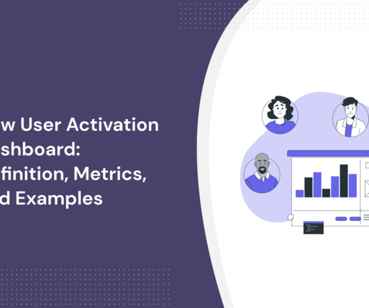
In SaaS, a new user activation dashboard can become a massive product analytics tool to understand and optimize the user journey. But how can a dashboard for user activation can help you engage more users? moment ," impacting user retention and satisfaction.
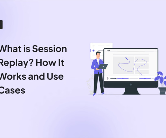
This powerful tool allows you to see your website or web app through your users’ eyes. It reveals the “why” behind their actions and unlocks valuable insights to improve the userexperience. Conversely, session replays don’t actually record a user’s screen in the traditional sense.
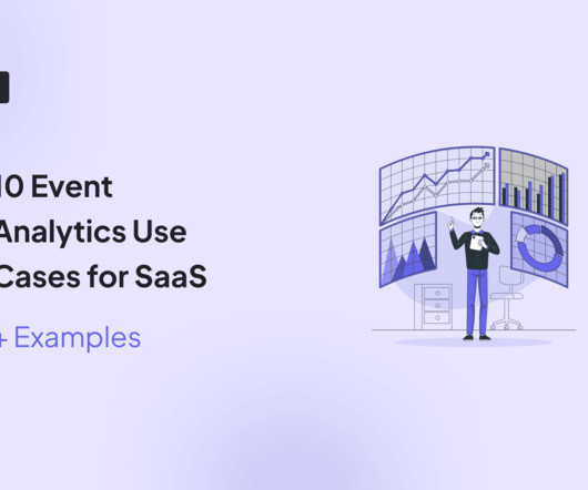
Event analytics is a great way for SaaS companies to study user interactions to gain actionable insights into the customer journey. Knowing what steps users take to perform an event can help uncover friction points that are ruining the customer experience.
One look at your mobile app analytics dashboard, and you just want to shut your eyes and scream in frustration. You aim to extract meaningful insights to improve app performance and user engagement. Validating one with the other gives you the whole picture and confidence to make decisions that improve usersexperience.
Do you want to leverage event data to make data-driven decisions to enhance userexperience? Event data allows you to understand your users’ behaviors and needs on a deeper level. It encompasses a wealth of data like user actions, feature usage, and beyond. What is event data?
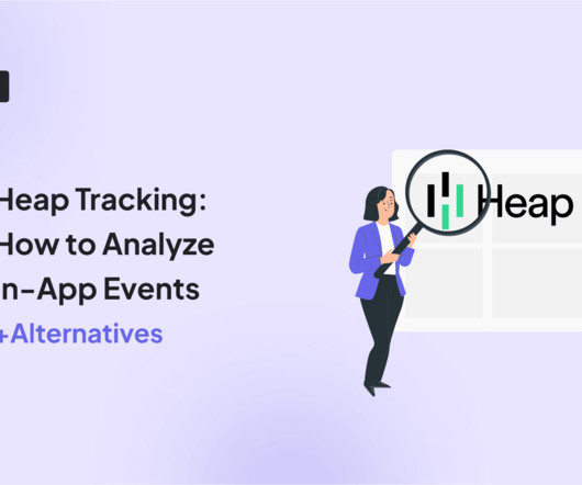
If you want to get the data you need without having to collect it first, Heap tracking features can capture in-app events automatically and make retroactive analysis a breeze. Let’s explore: The types of events Heap can track and how to set them up. Change events : Changes in the values of inputs, text, and element selection.
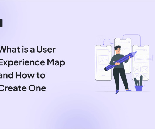
The solution might lie in your ability to create a comprehensive userexperience map. A well-crafted userexperience map can be your secret weapon for understanding customers, identifying pain points, and boosting product engagement. We also identify some best practices to follow when creating the userexperience map.
Without a strong and consistent digital brand, financial institutions risk being overshadowed by nimble Fintech startups or tech giants like Apple and Google that excel in userexperience. A strong digital brandensures: Customer Loyalty: A seamless and intuitive digital experience keeps customers engaged. million to 91.7
Mobile marketers and product managers can immediately take action on events in Apptentive by simply flipping a switch. Apptentive also offers “codeless integration” through mParticle, without requiring customers to create a new series of events within their apps. This saves companies valuable time and resources. Apptentive.
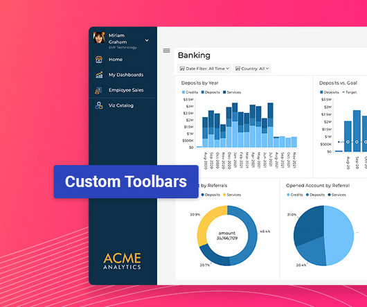
Latest Update Features: Custom Toolbars: Full control over dashboard menus. Custom Toolbar Options: Full Control Over Menus Developers can now fully customize dashboard and visualization toolbars using the revealView.onMenuOpening event handler. Dynamically adjust menu behavior based on user conditions (e.g.,
Userexperience can make or break a web app. If your software is slow or buggy, users wont stick around for long. If youre only finding out about these issues after users complain, youre already too late. Conversion funnel tracking : Analyzes where users abandon processes like the onboarding flow. The worst part?
Companies already using Whatfix for web For teams already leveraging Whatfix on desktop, extending that functionality to mobile ensures a consistent userexperience across platforms. With a shared dashboard and content strategy, you can manage flows, tooltips, and updates without duplicating effort.
All too often it’s the latter, because they weren’t built to provide a delightful experience. Expectations around userexperience are higher than ever – therefore we need fast and impactful tools. We believe that in the future, the experience of the tools we use at work will be indistinguishable from our personal life.
Factors I consider when evaluating customer analytics tools Important core features Analytics dashboards : Provide real-time visualizations of key performance indicators (like active users and page views) at a glance, so you can easily track changes. Automatically capture all events with Userpilot.
UX deals with a user's interactions with specific aspects of your product, while CX is broader and covers all customer engagements with your brand. TL;DR The userexperience (UX) is the sum of a user's thoughts, impressions, and feelings as they interact with specific aspects of your product.
Amplitude Amplitude’s onboarding process focuses on defining what success looks like for your product and encourages you to start implementing event tracking as soon as possible (with or without demo data). Amplitude skips unnecessary onboarding surveys and gets users into action immediately. What can you learn from Amplitude?
Mobile marketers and product managers can immediately take action on events in Apptentive by simply flipping a switch. Apptentive also offers “codeless integration” through mParticle, without requiring customers to create a new series of events within their apps. This saves companies valuable time and resources. Apptentive.
Robust real user monitoring solutions, like Userpilot , capture 100% of interactions, ensuring you see the full picture: every hesitation, every bottleneck, and every Aha moment. How is real user monitoring different from synthetic monitoring? How to set up real user monitoring in 5 steps Setting up RUM doesnt have to be complicated.
For example, the travel and events management software, Groupize, created an interactive assistant – G.G. This assistant pops up when needed to guide new users through the app in a fun manner. The value of their contract with your business, as well as the number of users they have onboard justifies immediate attention.
Free to paid conversion rate This user metric measures the percentage of users who upgrade from a free trial to a paid plan. The free to paid conversion rate is a metric for assessing your onboarding and initial userexperience. Monitor these events throughout the customer journey. Assign a score (e.g.,
They combine quantitative and qualitative data to help businesses understand the big picture of their userexperience. As the name implies, FullStory auto logs all aspects of users’ interactions such as scroll, swipe, click, and pageview. The dashboard’s widget wizard contains a library of pre-configured dashboards.
Plus, it connects with the web version so you can track the userexperiences across mobile and web platforms. To start using Pendo mobile, you need to install the Pendo Mobile SDK in your app so it can track all the users data and connect it with the web app. Dashboards. ” ( G2 ) Difficult event tracking.
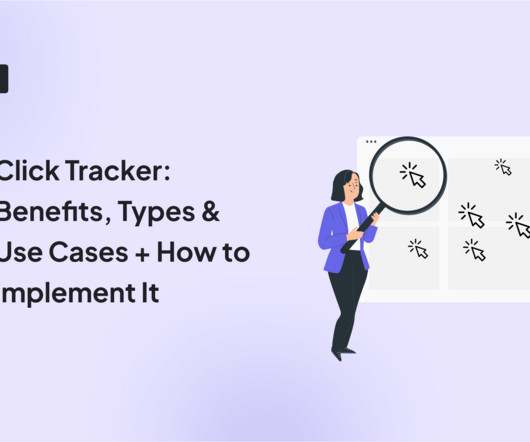
TL;DR A click tracker records where users click, providing insights to optimize layout and enhance userexperience. Tracking user click data helps understand user behavior, optimize conversion rates , and improve product development. Product usage dashboard in Userpilot. Userpilot Data and Events.
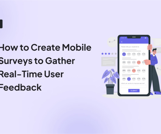
Cost-effective: Compared to other user research methods like usability testing, mail surveys, or in-person interviews, mobile surveys are much more cost-effective. Focused: Mobile surveys are specific and targeted feedback; you can use segmentation and event-triggered targeting to reach a precise audience.
And finally, Tali was so convinced of the power of opportunity solution trees that she started leading workshops at product events to teach others how to use this tool. Tali was so excited to share her experience with opportunity solution trees, she led a workshop at UXDX in Dublin.
To calculate: How to track free trial conversion rates in UXCam Example of parameters to use to measure free trial conversion rates Add a report to your dashboards in UXCam to easily keep track of the number of users converting from a free trial to a subscription by using custom events.
We’re fresh from our first virtual global event, New at Intercom. That’s just scratching the surface – watch the full recording or read through the event transcript to experience New at Intercom , and catch up on all the major announcements, industry insights, and customer stories that were shared at our first virtual event.
Highlight any improvements that enhance existing functionality Clearly explain how the improvement will enhance the user's experience and quantify the improvement if possible. For example, telling users that the dashboard loading time has been reduced by 50% shows commitment to continuous improvement to keep them happy.
We organize all of the trending information in your field so you don't have to. Join 96,000+ users and stay up to date on the latest articles your peers are reading.
You know about us, now we want to get to know you!
Let's personalize your content
Let's get even more personalized
We recognize your account from another site in our network, please click 'Send Email' below to continue with verifying your account and setting a password.


Let's personalize your content