This site uses cookies to improve your experience. To help us insure we adhere to various privacy regulations, please select your country/region of residence. If you do not select a country, we will assume you are from the United States. Select your Cookie Settings or view our Privacy Policy and Terms of Use.
Cookie Settings
Cookies and similar technologies are used on this website for proper function of the website, for tracking performance analytics and for marketing purposes. We and some of our third-party providers may use cookie data for various purposes. Please review the cookie settings below and choose your preference.
Used for the proper function of the website
Used for monitoring website traffic and interactions
Cookie Settings
Cookies and similar technologies are used on this website for proper function of the website, for tracking performance analytics and for marketing purposes. We and some of our third-party providers may use cookie data for various purposes. Please review the cookie settings below and choose your preference.
Strictly Necessary: Used for the proper function of the website
Performance/Analytics: Used for monitoring website traffic and interactions
Learn about the importance of mobile app KPI dashboards and copy dashboards from real mobile app product managers, engineers and designers. A key performance indicator (KPI) dashboard is a visual representation of data that quantifies how well a team is performing towards its goals. How do I create a mobile app KPI dashboard?
Two hours is not a big time commitment, and it helps you get a group of stakeholders all together to solve a problem. Example: Imagine you’re designing a new dashboard for a fintech app. Example: For our dashboard, we might ask, “How might we create a dashboard that helps analysts quickly spot trends and take action?”
With an abundance of product analytics to track, having a robust SaaS KPI dashboard is essential to monitor the metrics that matter most. This guide will walk you through what it is, why you need one, and how to build your very own dashboard. TL;DR A SaaS dashboard can be used to track important metrics and key performance indicators.
When it comes to product management, you need to look at different SaaS dashboard examples to see what kind of product analytics you can measure, and how. So what are the most important types of dashboards and which ones are the best for you? A SaaS (software-as-a-service) dashboard is a centralized interface within your app.
This grouping provides valuable insights into overall customer satisfaction and sentiment trends over time. Pilot your survey: Before launching the survey widely, test it with a small group. Real-time analysis helps respond to trends as they arise, with dashboards visualizing results for quick, data-driven decisions.
Custom dashboards to track key metrics at a glance. Pendo The dashboard on Pendo. Additional reports: You get a built-in Product Engagement Score dashboard. Lack of templates: There arent many ready-to-use dashboards or templates to get started quickly. UserGuiding dashboard. for collecting user sentiment data.
For example, say a user opens your app, skips the onboarding tutorial , and heads straight to the dashboard. For example: Suppose users are dropping off before finishing their dashboard setup. How it helps: Cohort analysis shows how specific groups engage with your app. Track mobile app engagement metrics with Userpilot.
A product adoption dashboard helps you visualize key adoption metrics so you can make data-driven decisions and boost user engagement. In this article, we cover the following: Why you need a product adoption dashboard. Steps to measure adoption using a comprehensive dashboard. Build your dashboard or use a template.
Are you wondering how the new Userpilot custom analytics dashboards can help you drive product growth? In this article, you will learn about the main benefits of custom product analytics dashboards and how to create them in Userpilot. TL;DR Userpilot custom analytics dashboards allow you to display multiple reports in one place.
Problem Brief Over a span of 4 weeks, we tested Civians platform and created design solutions to improve the overall user experience of the dashboard. We also encouraged them to think out loud while they were navigating the dashboard, to help us uncover their mental model and identify hidden insights.
Plus, the ability to create custom NPS dashboards allow you to analyze the results easily without writing a line of code. Get real-time access to customer feedback via a centralized dashboard that updates as responses come in. Visualize detailed reports with advanced data segmentation and dashboards.
Wondering how to build a customer success dashboard for your team? From the article, you will learn what a customer success dashboard is, why you need it, and what metrics it should include. And how to build a dashboard for your customer success team using Userpilot analytics ! Populate your dashboard with up to 30 reports.
Keep a Human Feedback LoopAlive Have a group of design partners , people from different age groups, tech comfort levels, and accessibility needs. Theyll surface friction points no dashboard can show you. When youre dealing with millions of users, you need to hear from everyone, not just the vocal early adopters.
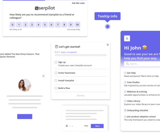
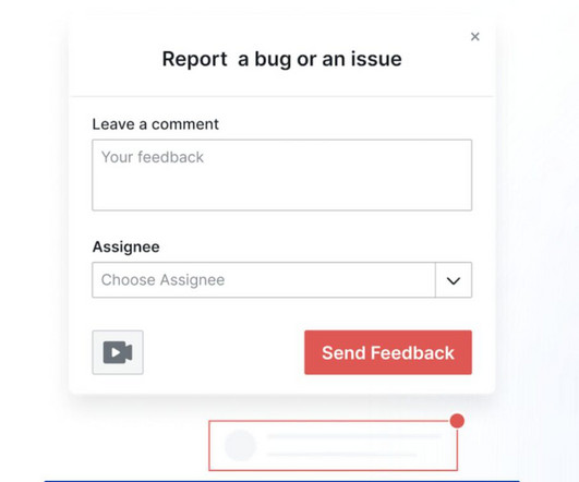
Uncover why the needs exist : Even when using methods like user feedback widgets and focus groups, the aim is to learn how users use your product. So group users into five states (New, Activated, Active, At-Risk, and Dormant) to see if utility and usability issues occur for any of the users in these states.
This would then allow other groups at eBay to start using this information to create new buyer and seller experiences. Even if you are used to dashboards, not every outcome is measurable, and you must not confuse the outcome with your progress monitoring. With that focus in mind, we started rolling. We were super strict on delivery.
These kinds of questions help uncover actionable insights, like trying a group activity for social motivation or breaking your routine into shorter, more manageable sessions. This insight could lead to implementing shared dashboards or concise weekly recaps, fostering clearer communication and smoother collaboration.
For this story, we spoke with a product team leading the Digital Hotels vertical at Seera Group , a travel and tourism company based in the Kingdom of Saudi Arabia (KSA). Our thinking was it was too soon to start grouping as no immediate patterns or trends have emerged.”. Hi there, Product Talk readers! Tweet This. Tweet This.
By measuring CRR for specific groups (e.g., high-value customers or frequent purchasers), you can reveal actionable insights about this group of customers. Chargebee dashboard for tracking customer behavior (and measuring retention). Segment customers. Create segments based on demographics, purchase behavior, or lifecycle stage.
According to the Nielsen Norman Group, quantitative data can identify where users encounter problems, but it often fails to explain why those problems occur Nielsen Norman Group,2023. Retention: Implementing improvements based on user feedback can boost retention by up to 25% Nielsen Norman Group,2022.
So, instead of listing tools for mobile app analytics randomly, Ive grouped them into three categories here: cross-platform analytics, marketing attribution, and performance monitoring. Cohorts: Group users based on behavior (like opened app 3x this week) and analyze them over time. Mobile app analytics tools: Mixpanel. #3
Participating in these groups is a great way to conduct market research (What is your target market talking about? Just be sure to read the group’s terms and conditions and avoid any blatant advertising that will only do a disservice to you and your app. DESIGN A DASHBOARD FOR RECORDING AND ANALYZING YOUR METRICS AND KPIS.
Execution: Metrics Dashboards. The best product managers look at a consistent set of metric dashboards on a daily and weekly basis to keep an active pulse on the product, but also to build their intuition for the natural ebbs and flows of their product metrics.
It turns out it was over 35 forms that were riddled with conditional logic, a redundant backend ticketing system, several dashboard views and needed to cater to a myriad of job functions. Sign up to be a Mentor today & join an elite group of product management leaders! Check out the Mentors & Enjoy!
At that time, she was looking for people who had used radios or walkie talkies in their work to participate in focus groups. Because Ellen was looking to hold the focus groups in person, she posted an ad on classified ad website Craigslist. Ellen’s takeaway: Do not give away all of the focus group information in your initial ad.
By the time you see revenue (or a lack of it)—whether it’s in a dashboard, cash in the bank, or a cancellation notice from a churned customer—it’s too late to take corrective action. They group and align these unmet needs as opportunities under their desired product outcome. What is a lagging indicator?
Examples of qualitative research methods include: Focus groups: Recruit a group of participants to discuss their opinions and feelings about a new product, service, or feature. E.g., Identify navigation issues in your analytics dashboard based on real-time user interactions. Survey results dashboard in SurveyMonkey.
With a shared dashboard and content strategy, you can manage flows, tooltips, and updates without duplicating effort. Analytics dashboards: Youll see high-level engagement trends and user-level insights, but unlocking deeper metrics demands extra setup or third-party integrations. Create mobile slideouts and carousels with Userpilot.
Using Apptentive Notes, you can follow up with a group of variant participants to let them know that the functionality they tested in beta is now generally available in your product. The integration between mParticle and Apptentive allows mobile app providers to build a bond with their customers through the data that defines them.
Groups have the flexibility to prepare and take a look at cases around specific options and eventualities. Groups will review however a modification in needs impacts associated tests and problems. Choose from a group of pre-defined roles or produce custom roles as per the necessity of the projects.
And it’s great that more open-minded companies understand how important it is to think about all social groups when it comes to using the software. To increase working efficiency, users can tweak dashboards and choose the most topical tabs. The revenue aspect also matters. And here’s when UX testing steps in.
A typical workflow involved looking at a dashboard full of charts with metrics sliced and diced by various attribute combinations. A typical operational dashboard we used before doubling down on traces. We assembled a group of champions who were already skilled at observability. Why traces? Finding allies was key to success.
Factors I consider when evaluating customer analytics tools Important core features Analytics dashboards : Provide real-time visualizations of key performance indicators (like active users and page views) at a glance, so you can easily track changes. Example of a Userpilot dashboard showing free trial to paid user conversion rate.
Segment your audience for hyper-relevant messages What it is: Segmenting your audience involves dividing users into groups based on specific criteria like behavior, preferences, or demographics. Why it matters: Segmentation ensures messages are tailored to each group’s interests, leading to higher engagement and reduced opt-outs.
Once the themes (aka feature groups) are defined, it becomes easier to think through the features that falls under various themes. Sign up to be a Mentor today & join an elite group of product management leaders! There are various tools that can be used for roadmapping such as Aha!, Airtable and most simply on excel.
Leveraging product analytics isnt just about making pretty dashboards; its about viewing your existing data as a learning opportunity to make informed decisions with your onboarding strategy. At Userpilot, we create quarterly dashboards organized by release. These dashboards dont just collect numbers; they tell a story.
Analytics Which platform gives teams the clearest insights without drowning them in dashboards? Its the self-serve analytics platform that transforms raw numbers into intuitive dashboards. The platforms real-time performance dashboards highlight not just whats happening, but why its happeningso you can course-correct on the fly.
A lot of it has to do with pulling together a bunch of other groups. There needs to be coordination and alignment that spans across the different groups. Only when they have a small product is it the right time to hire somebody to lead this group. There’s only so much that you can do in product yourself.
TL;DR Mixpanel’s A/B tests work by letting you select an experiment (or create a new one), define your control/variant groups, and set a date range. You can analyze Mixpanel A/B testing results using analytics dashboards , funnel analysis , and customer segmentation. Make sure the groups don’t overlap. Source: Mixpanel.
Our SDK is instrumented into mParticle, and when a mParticle customer decides to leverage Apptentive, a switch is flipped on in their dashboard which gives them immediate access to Apptentive. Apptentive also offers “codeless integration” through mParticle, without requiring customers to create a new series of events within their apps.
Analytics Which platform gives teams the clearest insights without drowning them in dashboards? Its the self-serve analytics platform that transforms raw numbers into intuitive dashboards. The platforms real-time performance dashboards highlight not just whats happening, but why its happeningso you can course-correct on the fly.
Address any new questions raised in the output and share the strawman proposal with the key stakeholder group. Depending on the output, the trailer can appear in different formats – from a one-page project overview to highlight reels, a dashboard, or designs. Ads/trailer: Build the anticipation.
With Userpilot , you can auto-capture in-app user interactions and build analytics dashboards. Quantitative data analysis also looks into identifying patterns , drivers, and metrics for different groups. This is the entire group of individuals or entities that are relevant to the research. Identifying patterns. Get a demo.
Use the data to set conditions to make segments: I use Userpilots segmentation feature to group users based on several factors, including demographic and psychographic ones. Userpilot analytics dashboards can help you add relevant metrics and keep an eye on any changes that may occur. Userpilots Analytics dashboards.
For example, let’s say a $100k ARR company (enterprise subscriber) reports their custom SSO integration is failing, a $10k ARR company reports dashboard loading slowly, and a $1k ARR company reports an issue with a new feature. Effort required to resolve the issue. This is exactly what I needed!”
We organize all of the trending information in your field so you don't have to. Join 96,000+ users and stay up to date on the latest articles your peers are reading.
You know about us, now we want to get to know you!
Let's personalize your content
Let's get even more personalized
We recognize your account from another site in our network, please click 'Send Email' below to continue with verifying your account and setting a password.
Let's personalize your content