This site uses cookies to improve your experience. To help us insure we adhere to various privacy regulations, please select your country/region of residence. If you do not select a country, we will assume you are from the United States. Select your Cookie Settings or view our Privacy Policy and Terms of Use.
Cookie Settings
Cookies and similar technologies are used on this website for proper function of the website, for tracking performance analytics and for marketing purposes. We and some of our third-party providers may use cookie data for various purposes. Please review the cookie settings below and choose your preference.
Used for the proper function of the website
Used for monitoring website traffic and interactions
Cookie Settings
Cookies and similar technologies are used on this website for proper function of the website, for tracking performance analytics and for marketing purposes. We and some of our third-party providers may use cookie data for various purposes. Please review the cookie settings below and choose your preference.
Strictly Necessary: Used for the proper function of the website
Performance/Analytics: Used for monitoring website traffic and interactions
A dashboard showing metrics like feature adoption or user engagement amplifies your credibility. How to Get Started: Create Dashboards: Track key metrics like churn, engagement, or feature adoption that align with business goals. Pro Tip: Refer to Jeff Pattons principles for crafting impactful product visions that rally your team.
Product analytics refers to the process of gathering and analyzing data on how users interact with a product. Maturity refers to how well your company collects, processes, and utilizes data in its decision-making process. Creating an expansion revenue dashboard with Userpilot without coding. What is product analytics?
Dashboard : Customize the analytics dashboard or choose from pre-built ones to easily visualize and compare key metrics over time. Userpilot’s customizable analytics dashboards make metric tracking easier, enabling teams to track changes in performance, user behavior, and engagement at a glance.
The following post references our new e-guide, The Retail Industrys Blueprint to Leveling Up CX . Turn survey responses, review data, and post-purchase feedback into clear dashboards your teams can actually use. Heres how to take insights from customer feedback and turn them into results. You can download the free e-guide, here !
For example, telling users that the dashboard loading time has been reduced by 50% shows commitment to continuous improvement to keep them happy. The platform often references relatable events to help users connect with the product on a personal level and make complex information more accessible to a wider audience.
Establish benchmarks – Use this initial wave as your reference point for all future tracking. Real-time insights: Get full access to a powerful dashboard that gives you an always-on view of your brand performance—no waiting on reports. Phase 3: Optimize (Ongoing) Turn insights into action and evolve your program as your needs grow.
Headspace is one of my favorite examples to refer to because they ace their ASO game. For instance, if youve built a mobile CRM app, you could use in-app tutorials to guide users through setting up their first dashboard and a new feature that automates follow-ups. Cohort analysis and revenue dashboards for paywall tracking.
CRR formula, reference values andexample Customer Retention Rateformula Number of customers at the end of the period : Total number of customers at the end of the measuredperiod. Reference values CRR varies widely across industries due to differences in customer expectations about business. SaaS: 85%95%.
Case Study:MINDBODY MINDBODY, a leading platform for health and wellness businesses, used funnel analysis on its Activity Dashboard to better understand user engagement patterns. References: AMPLITUDE. 88 doubled seventh-day retention by identifying and optimizing an underutilized extension Amplitude, 2022. Available at: [link].
You can target specific segments, configure when the survey appears, and analyze results from the dashboard. Analytics dashboard: Track screen engagement, flow completion rates , and drop-offs. Segment-specific dashboards make it easy to measure whats working for each audience. Collect user feedback effectively with Userpilo t.
If you’re short on time, refer to the summary table below: Tool name Best for… Free plan? Product teams can use Mixpanel to create tailored reports and dashboards to facilitate data-driven decision-making. Free trial? Product feedback software: Mixpanel. Amplitude Type : Product analytics tool.
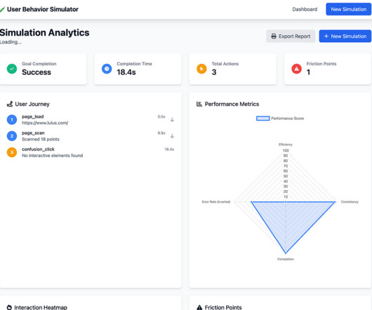
Home Dashboard (left) and Post Simulation Analytics (right) Taking a closer look at the end result, here’s what stood out to me about the process. To begin, it generated a wizard like step by step UI and entirely looked over a project management dashboard type entry point, even after prompting. The visual output felt underwhelming.
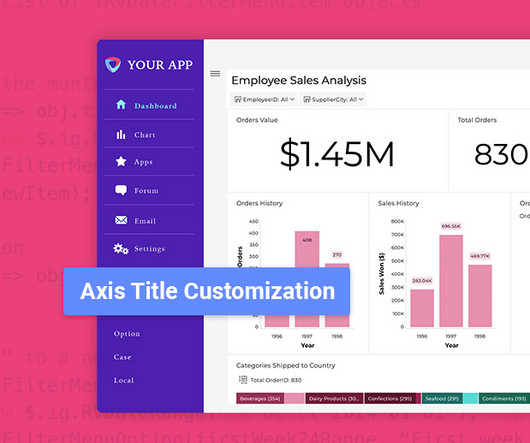
Fixed Lines for Charts: Set static reference points to highlight key data trends. Flexible Chart Legend Positioning: Move and align legends for better dashboard design. Fixed Lines: Set Key Benchmarks in Charts Static Reference Points: Easily highlight important thresholds for better comparisons.
What we refer to here as a short-term solution is actually an emphasis on isolated parts of the user experience and its implementation, whereas the long-term perspective considers how the solution integrates with the rest of the user flows, accommodates potential future changes and expansions, and accounts for technical complexities.
Real-World Use Cases Immersive UX is transforming sectors beyond gaming: Credit — Source Healthcare: AR-guided surgeries and training Education: Virtual classrooms and labs Retail: AR try-on experiences Manufacturing: Work instructions via smart glasses Field Service: Hands-free manuals Smart Factories: 3D dashboards for monitoring 8.
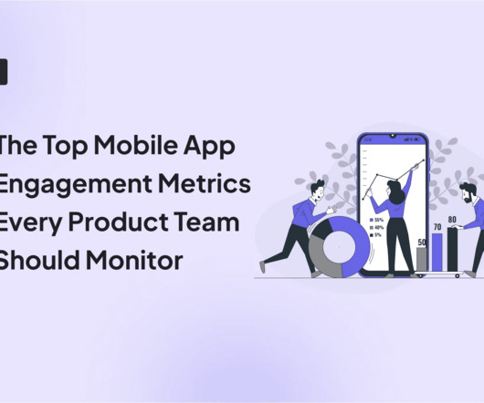
App engagement refers to how users interact with your mobile app, beyond just downloading it. Mobile analytics: Build custom analytics dashboards to keep track of app engagement metrics, such as top screens, drop-offs, and active users. What is app engagement?
At this stage, delighted users can refer other people and give reviews about your app. Userpilot analytics dashboards can help you add relevant metrics and keep an eye on any changes that may occur. Userpilots Analytics dashboards. So, you can see interactions with your mobile app in real-time.
Understanding Embedded Analytics Embedded analytics refers to the integration of data visualization and business intelligence (BI) tools directly into software applications. Lazy Loading: Load dashboards and components only when needed to improve app speed. HTTPS: Always use secure connections for data transmission.
The following post references our new e-guide, The Retail Industry’s Guide to Collecting Customer Feedback. How easy is it to customize surveys, dashboards, and workflows? Customer expectations are rising, brand loyalty is shrinking, and margins are tighter than ever. You can read the full, free e-guide here.
It lacks other analytics reports such as cohort retention reports, path analysis, and custom dashboards. The platform offers several analytics reports, and you can even set up custom dashboards to track relevant reports. out of 5 stars Pricing: Available on request Supported devices: Web and mobile Dashboard of Pendo.
Definition and Core Components Outsourced software product development refers to the practice of delegating all or part of the software development lifecycle to an external partner. Watch for red flags such as vague contracts, lack of client references, or opaque pricing models. What Is Outsourced Software Product Development?
If its a new dashboard, show them how to find it, tweak settings, or view data more intuitively. Avoid technical jargon and focus on user-facing issues, such as: Fixed login error on the mobile app Resolved loading issue on the dashboard. How It Works: Give users a simple, clear rundown of how to use the feature.
Instead of a static dashboard, users see a tailored path that feels relevant every time they open the app. User retention refers to the percentage of users who return to your app after the first session. Example: Headspace Headspace personalizes the home screen based on your last session, time of day, or meditation history.
A platform like Userpilot allows you to create custom dashboards and measure only the metrics that relate to your goals. Plus, retained and happy users are more likely to refer others to your business. 1 Engagement DAU/MAU Understand daily and monthly active user engagement and overall app popularity.
Quantitative data Quantitative data refers to insights that can be quantified and expressed using numbers. Product metrics: Track product health and user adoption with analytics dashboards using product analytics tools (like Userpilot) to monitor system performance, error rates, and key activation metrics.
How toApply: In Branding/Marketing: Reference cultural touchstones, popular nostalgia or personalized messages for specific audience segments. The dopamine in Dopamine Banking references one of the brains primary neurotransmitters associated with motivation, learning and reward.
use the recipients name, reference their recent activity, or tie the message to their specific journey inside your product. But something like New feature unlocked: Try Smart Filters in your dashboard now gives both context and direction. But personalized messages make users react as if youre speaking directly to them. Why it matters.
But it could do better by guiding users directly into their personalized workspace after setup instead of using a general dashboard. ‹ › Airtable onboarding. Customer onboarding in software refers to the structured process where new users are introduced to a product’s features and functionalities. What can you learn from Airtable?
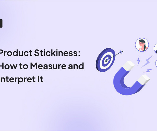
You log into your dashboard, check your DAU/MAU ratio, and see an upward trend. Product stickiness refers to how frequently users engage with a product and how essential it becomes in their daily workflows. Product Usage Dashboard in Userpilot. Great news, right? More product engagement means a stickier product. Not necessarily.
Hey Julia, saw you started setting up your dashboard but didn’t finish. A good rule of thumb is to reference the user’s specific action. Cross-reference that with a funnel report to see how many of those users actually went on to activate the feature. Goal: Nudge them to finish onboarding while interest is still fresh.
Other analytics features, like funnels , custom dashboards, page flow analytics, segmentation, or trends, are available as add-ons. Custom dashboards. One-click highlights to save important clips for team collaboration and quick reference. Fullstory pricing. What do real users say about Fullstory’s session replay feature?
The goal is to drive customer acquisition and, additionally, delight the referring champion with rewards. The referral email A referral email leverages the user’s credibility to generate some word-of-mouth marketing. Let’s look at this Dropbox email: Referral email from Dropbox. Book a Userpilot demo to start creating your first campaigns.
Session recordings dashboard on Hotjar. Session playlists: Organize sessions with your favorite filters into playlists so you can refer back to them when needed without much hassle. Userpilot allows you to save similar sessions in a playlist so you can refer back easily.
Setting up dashboards is confusing. Its not flexible enough for technical teams because creating specific dashboards or adding granular filters requires extra steps (or not possible at all). Session replay code refers to the snippet of JavaScript that integrates a session replay tool into your website or app.
Centralized dashboards and a wealth of pre-built reports enable organizations to maintain oversight and accountability, a key requirement in NIS2. NIS2 extended those sectors covered be NIS as “essential” as well as added additional sectors to be covered by the directive and categorized as “Important entities”.
There are usage requirements and limits on the number of user-defined tags that can be added to an AWS resource (see: Tag naming limits and requirements in the AWS General Reference guide). AWS generated tags do not count against the user-defined tag limits.
Data Visualization & Dashboarding Data storytelling is a core part of communicating your insights. Candidates must know how to build and explain dashboards using tools like Tableau, Power BI, or Looker. How would you redesign a cluttered dashboard to make it stakeholder-friendly? Who was it for, and what did it help them do?”
This service has a dashboard that displays real-time metrics. Create an AWS ECS dashboard by adding your desired widgets for different metrics. Add dashboards to the default or custom Dashboards menu for one-click access. Dashboards will give you a unified view of multiple metrics.
The survey method refers to the systematic approach of designing and distributing surveys to collect data. Survey software works by guiding users through the process of building a survey, distributing it to a selected audience, collecting responses in real time, and analyzing results through built-in dashboards and reports.
That’s where investing time and energy into building an operations dashboard will pay dividend for years to come. What is a product operations dashboard? What is a product operations dashboard? A product operations dashboard is not a report. What KPIs should I track on my dashboard? making a purchase)?
What you'll learn: How to use Cursor to explore different design aesthetics—from brutalist to Y2K to cyberpunk A simple workflow for creating interactive sound elements in prototypes that would be difficult with traditional design tools A step-by-step process for transforming an ugly dashboard into a polished design using strategic prompting (..)
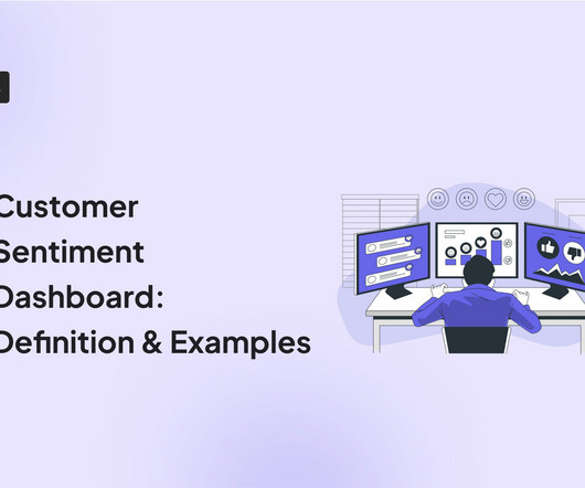
A customer sentiment dashboard is a great way to visualize customer feedback and see what users love (or hate) about your product. TL;DR A sentiment analysis dashboard typically integrates information from multiple data sources, such as social media posts, customer reviews, survey responses , and customer service chats.
Background Story : Readers familiar with the history of Scrum—sometimes lovingly referred to as Scrumtorians—will undoubtedly know that it has contained sprint goals at least since 2002 and a (product) vision since 2004 , even though the latter is not mentioned in the Scrum Guide.
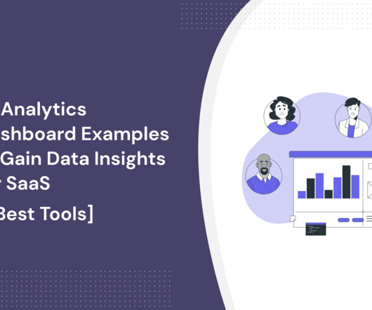
Analytics dashboards are visualization tools that give you an overview of key metrics. In this article, we’ll discuss 10 analytics dashboard examples. It will give you a better understanding of the type of metrics to monitor in your dashboard and help you draw product growth insights from them. Book a demo to learn more.
We organize all of the trending information in your field so you don't have to. Join 96,000+ users and stay up to date on the latest articles your peers are reading.
You know about us, now we want to get to know you!
Let's personalize your content
Let's get even more personalized
We recognize your account from another site in our network, please click 'Send Email' below to continue with verifying your account and setting a password.


Let's personalize your content