This site uses cookies to improve your experience. To help us insure we adhere to various privacy regulations, please select your country/region of residence. If you do not select a country, we will assume you are from the United States. Select your Cookie Settings or view our Privacy Policy and Terms of Use.
Cookie Settings
Cookies and similar technologies are used on this website for proper function of the website, for tracking performance analytics and for marketing purposes. We and some of our third-party providers may use cookie data for various purposes. Please review the cookie settings below and choose your preference.
Used for the proper function of the website
Used for monitoring website traffic and interactions
Cookie Settings
Cookies and similar technologies are used on this website for proper function of the website, for tracking performance analytics and for marketing purposes. We and some of our third-party providers may use cookie data for various purposes. Please review the cookie settings below and choose your preference.
Strictly Necessary: Used for the proper function of the website
Performance/Analytics: Used for monitoring website traffic and interactions
72% of shoppers would stay loyal to brands they loved even if it meant paying more. But if you’re not measuring how your brand is performing, how can you build—or protect—that loyalty? That’s where brand health tracking comes in. What is brand health tracking? Think of it as your brand’s pulse check.
Plus, the ability to create custom NPS dashboards allow you to analyze the results easily without writing a line of code. Qualaroo is a powerful in-context survey tool designed to help you gather feedback directly from users as they interact with your brand on any channel. Send surveys across different devices.
Build a foundation that drives action Use reporting tools to translate feedback into trends. Turn survey responses, review data, and post-purchase feedback into clear dashboards your teams can actually use. Dont wait for quarterly NPS reports. You can download the free e-guide, here ! Establish a continuous feedback loop.
The rapid shift to digital-first lifestyles has disrupted traditional financial services, forcing companies to rethink their approach to branding. Todays customers expect financial brands to deliver deeply personalized, seamless digital experiences at every touchpoint, consistently reinforcing what they stand for.
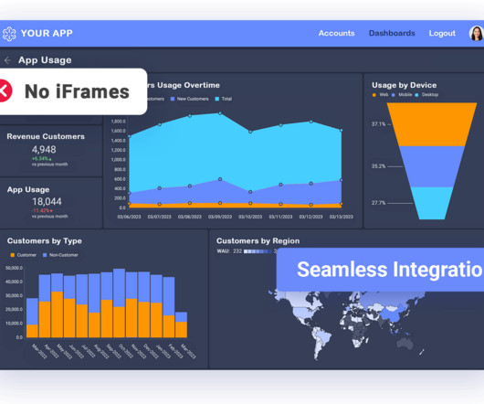
But today, dashboards and visualizations have become table stakes. Think your customers will pay more for data visualizations in your application? Five years ago they may have. Discover which features will differentiate your application and maximize the ROI of your embedded analytics. Brought to you by Logi Analytics.
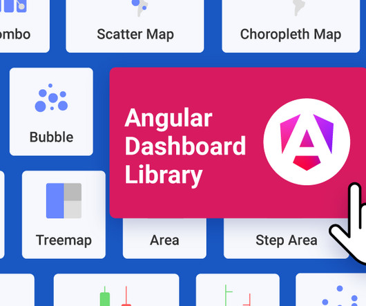
Reveal Embedded Analytics We know how difficult it is to create dashboards, especially for web applications. Thats what dashboards are for. In fact, Angular dashboards can provide key insights that will eventually allow data-driven decision-making at your company. It offers several options when it comes to dashboard libraries.
Unfortunately, the research backs this up, with a staggering 90% of users reporting that they stopped using an app due to poor performance. This helps youdig deeper until you uncover the final insight that’s worth reporting and acting on. So eventually everyone on the product team has a great grasp of their data reporting.
Notably, 80% of customers say it’s quick and easy to implement, and 92% report that their ROI met or exceeded expectations. Survey & Engagement Insights : Access detailed reports on how customers responded to surveys and interacted with prompts to measure engagement and sentiment.
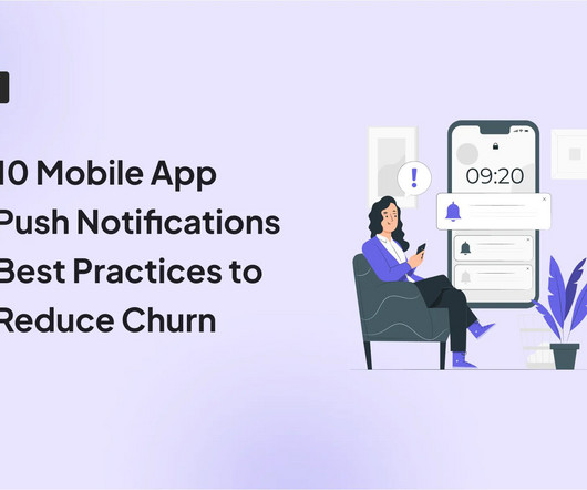
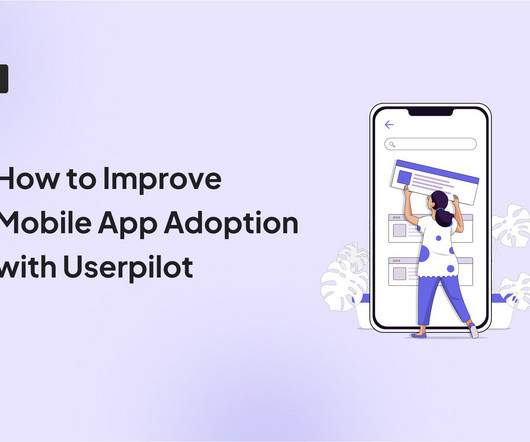
78% of users churn in the first week after installation when brands dont have a clear engagement strategy based on regular push notifications. In just a few clicks, you combine properties and events to craft ultra-specific segments and deploy targeted campaigns directly from the Userpilot dashboard. Source: TheRodinHoods.
This means using the welcome survey discussed above to learn what users expect from your brand. Gamification involves integrating game mechanics like challenges, rewards, and feedback to boost enthusiasm for your brand. A deep sense of loyalty to your brand ! Frequency of reported issue. The result?
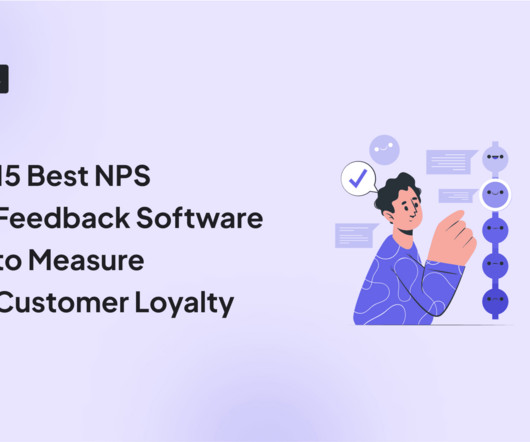
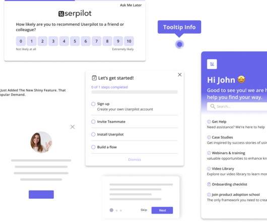
NPS survey dashboard in UsrGuiding tool. Self-reported data is alwaysreliable Many organizations believe that the best way to learn about users is to ask them directly. Meet our brand new design. NPS is notoriously known as a metric that businesses rely on to evaluate the current state of things. How NPS is calculated.
Theyve consistently outperformed their counterparts, reporting significantly higher metrics across operational efficiency (81% vs. 58%) , revenue growth (77% vs. 61%), and employee satisfaction (68% vs. 39%). Visualization: Presenting data through intuitive charts, dashboards, or reports. How is this possible?
The Challenge: Keeping Experiments Healthy at Scale For leading brands running over 100 campaigns a year, experimentation is at the heart of digital optimization. But with so many campaigns running simultaneously, manually checking reports every day to spot issues is time-consuming and inefficient. What’s Next?
Social listening tools : Software for monitoring online conversations, brand mentions, and trends. Online review tools : Tools that help you collect, manage, and showcase customer reviews to build credibility and enhance your online reputation.
According to a Forrester Research report, integrating UX Research into the product development process can result in up to a 400% increase in conversion rates Forrester Research, 2016. Amplitude reports that companies systematically analyzing these patterns see an average 32% improvement in activation metrics Amplitude, 2022.
Instead of juggling countless email threads or Slack messages, you manage everything from a central dashboard. When agents and product managers can quickly navigate the dashboard, they spend less time on training and more time resolving issues. 5 No-code editor, various module groups, segmentation, localization, analytics dashboard.
Userpilot analytics dashboards can help you add relevant metrics and keep an eye on any changes that may occur. Userpilots Analytics dashboards. The brand posts TikToks and funny memes frequently, a cadence that lands regular press hits and keeps the mascot trending. Example of Streaks showing a progress report.
For example, say a user opens your app, skips the onboarding tutorial , and heads straight to the dashboard. For example: Suppose users are dropping off before finishing their dashboard setup. Mobile analytics : Track metrics like active users, activation rate, drop-offs, and top screens with customizable dashboards.
They measure customer loyalty along with user opinions and feelings about interactions with your brand and app. After analyzing user reviews, you see many users are frustrated because of the reporting feature. That’s where NPS and user sentiment come in. ” Respondents score on a rating scale from 0 to 10.
For example, we can spot when a cohort’s engagement dips, diagnose the root causes, and launch targeted campaigns, like re-engagement emails , to boost customer satisfaction and brand loyalty. For example, suppose we identify a group of trial users who repeatedly build custom reports.
Connect the Tools Set up alerting or dashboards in shared tools like Jira, Slack, Zendesk, or Centercode. But beta testing can also help you decrease support costs, which can [â¦] The best brands in the world partner with Centercode to perfect their products Delta Testing New to Delta?
In action, customer research in SaaS could look something like examining support tickets to uncover recurring issues or feature requests , like consistent asks for better reporting features. E.g., to capture audience reactions to a new reporting feature and see whether users are clear on its functionality. The short answer: yes.
Unified analytics across all touchpoints: I recommend platforms that show the complete user journey in one dashboard. With Userpilot's funnel and path reports, I can trigger contextual messages that guide them forward. Funnel reports in Userpilot. I use funnel reports to analyze behavior and spot friction.
Continuously throughout the product lifecycle: I regularly monitor analytics dashboards for red flags, such as high drop-off rates, low conversions, or unusual navigation loops. This method quickly reveals whether key elements, like calls to action or branding, are immediately clear. number of taps) and qualitative feedback (e.g.,
Limited reporting for the Resource Center: The absence of reporting for the “life ring widget” can limit your understanding of how users engage with your resources and content. Analytics dashboard: Track your key performance and user behavior metrics at a glance. The NPS dashboard tracks NPS scores and feedback in real time.
Customers who actively connect with your brand are more likely to stay loyal, spend more, and become advocates. How I chose the best customer engagement software My evaluation process combined thorough feature analysis , a careful review of user feedback, and insights from industry reports. Analytics dashboard in Userpilot.
Reveal Embedded Analytics Today’s business users expect more than static dashboards or delayed reports. By embedding analytics directly into your application, you empower users to filter, drill down, and act on data without turning your developers into report builders. This is where embedded self-service BI comes in.
A platform like Userpilot allows you to create custom dashboards and measure only the metrics that relate to your goals. Benchmark: Mixpanels 2024 benchmark report found the average stickiness across industries to be 37%. Benchmark: Statista reports that the average one-month retention rate for mobile apps varies between 1.2%
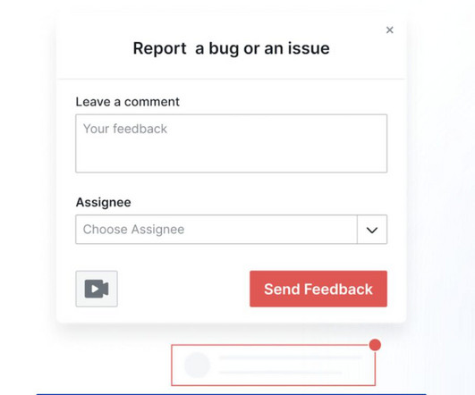
If its a new dashboard, show them how to find it, tweak settings, or view data more intuitively. Include a link for easy access, encouraging users to share their thoughts or report any issues. By acting on customer feedback , you can ensure that reported issues are addressed quickly and transparently.
Leverage cross-app executive dashboards and journey orchestration to refine engagement strategies. Heres what that looks like in action: Pendo dashboard showing in-app message pop-up. Those who dont may see annual price increases ranging from 5-10%, with some cases reported as high as 20%, depending on their agreement.
You can then track performance using our built-in flow analytics: step completions, drop-off rates, and time to finish, all visible inside the dashboard. Adoption reports, funnels, and trend dashboards, no need for separate advanced analytics tools. Deploy A/B testing for your flows with Userpilot.
” message, you notify a user about progress in a project they started but haven’t completed: “Your tax report is 80% complete. Userpilot’s mobile analytics dashboard offers real-time data on key performance indicators : Daily and monthly active users ( DAU/MAU ). Trend reports to track feature usage over time.
Reduce churn by delivering relevant, personalized experiences: 71% of customers expect a personalized experience , and Twilios 2023 State of Personalization Report shows 56% will become repeat buyers if they receive personalized interactions. It shortens time-to-value , boosts app engagement, and drives long-term retention.
Customizability: The design team could customize all the in-app elements to make the flows match the branding. Leveraging product analytics: Use behavioral data to create customizable dashboards with your key metrics. You can also build reports to analyze funnels, user paths, trends, and retention cohorts.
In fact, Validity’s 2024 state of email report says behavioral emails generate up to 10X more revenue than other email marketing types. Hey Julia, saw you started setting up your dashboard but didn’t finish. Add a custom signature to personalize the message and reinforce your brand. Sample copy: Subject: Almost there, Julia!
Userpilot ‘s mobile app performance dashboard. For example, a project management tool can give “productivity points” for completing tasks on time, which can then unlock premium reporting features. Just ensure you maintain consistency across channels to reinforce key messages and brand values.
The New Era of Professional Branding: A Journey BeyondResumes Image Source 1 | Image Source2 Today, however, the professional landscape demands more. As we navigate a fiercely competitive job market shaped by rapid technological advancements and shifting employer expectations, a new era of professional branding is taking root.
It blends into your app, scales with your architecture, and reflects your brand without adding overhead. Self-service analytics empowers users and relieves dev teams —freeing product and engineering to focus on core features instead of managing reports. Enterprise BI was historically designed for high-scale, centralized reporting.
Key capabilities include segmentation, which allows you to group users based on behavior, demographics, or custom properties; custom analytics dashboards, which visualize the metrics that matter most to your team; and screen-level analytics, which show exactly how users interact with each part of your app.
They’re especially useful in product development, brand positioning, or when entering a new market. Survey software works by guiding users through the process of building a survey, distributing it to a selected audience, collecting responses in real time, and analyzing results through built-in dashboards and reports.
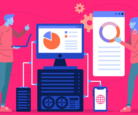
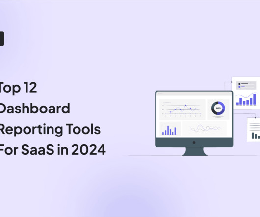
As you’re researching dashboardreporting tools, you’ve probably noticed how hard it is to find reliable information on the available solutions. To make your life a little bit easier and help you choose the best dashboard analytics tool for your SaaS, we’ve produced a guide of 12 excellent platforms available on the market in 2024.
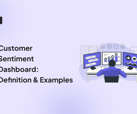
A customer sentiment dashboard is a great way to visualize customer feedback and see what users love (or hate) about your product. TL;DR A sentiment analysis dashboard typically integrates information from multiple data sources, such as social media posts, customer reviews, survey responses , and customer service chats.
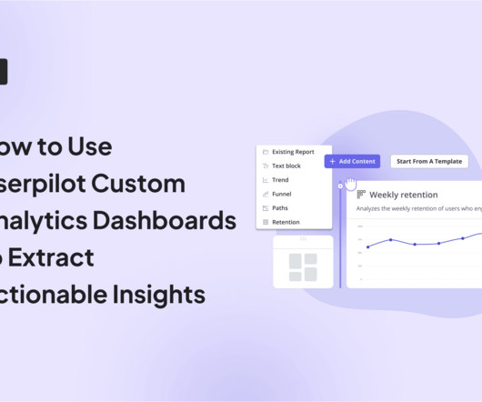
Are you wondering how the new Userpilot custom analytics dashboards can help you drive product growth? In this article, you will learn about the main benefits of custom product analytics dashboards and how to create them in Userpilot. TL;DR Userpilot custom analytics dashboards allow you to display multiple reports in one place.
That painful choice ends today as we unveil an array of new features that range from advanced ticketing workflows to new Inbox views, from beefed-up Reportingdashboards to sophisticated asynchronous support. Sophisticated reporting for valuable insights. More knowledge brings more power with advanced reporting.
We organize all of the trending information in your field so you don't have to. Join 96,000+ users and stay up to date on the latest articles your peers are reading.
You know about us, now we want to get to know you!
Let's personalize your content
Let's get even more personalized
We recognize your account from another site in our network, please click 'Send Email' below to continue with verifying your account and setting a password.


Let's personalize your content