This site uses cookies to improve your experience. To help us insure we adhere to various privacy regulations, please select your country/region of residence. If you do not select a country, we will assume you are from the United States. Select your Cookie Settings or view our Privacy Policy and Terms of Use.
Cookie Settings
Cookies and similar technologies are used on this website for proper function of the website, for tracking performance analytics and for marketing purposes. We and some of our third-party providers may use cookie data for various purposes. Please review the cookie settings below and choose your preference.
Used for the proper function of the website
Used for monitoring website traffic and interactions
Cookie Settings
Cookies and similar technologies are used on this website for proper function of the website, for tracking performance analytics and for marketing purposes. We and some of our third-party providers may use cookie data for various purposes. Please review the cookie settings below and choose your preference.
Strictly Necessary: Used for the proper function of the website
Performance/Analytics: Used for monitoring website traffic and interactions
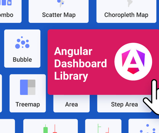
Reveal Embedded Analytics We know how difficult it is to create dashboards, especially for web applications. Thats what dashboards are for. They track everything from user behavior to system performance. In fact, Angular dashboards can provide key insights that will eventually allow data-driven decision-making at your company.
For example, instead of merely presenting numbers, we can incorporate storytelling into the userexperience, transforming each financial action into a personal goalsuch as saving for a vacation or a childs educationmaking the experience more relatable and motivating. In fact, sometimes less really is more.
Unfortunately, the research backs this up, with a staggering 90% of users reporting that they stopped using an app due to poor performance. Basically, anything that ruins the userexperience. UX analytics involves gathering, analyzing, and interpreting data about how users interact with your product or service.
How Rumi Cosmetiques Boosted UserExperience and Conversion Rates in eCommerce: A Case Study for Marketers andManagers Discover how Rumi Cosmetiques achieved a 75% increase in cart adds and doubled conversion rates by enhancing userexperience and conversion rate in eCommerce.
But today, dashboards and visualizations have become table stakes. Think your customers will pay more for data visualizations in your application? Five years ago they may have. Discover which features will differentiate your application and maximize the ROI of your embedded analytics. Brought to you by Logi Analytics.
A product analytics strategy is essential for any business looking to make informed decisions about product development and userexperience. Plus, there are many reasons why you need a product analytics strategy: Aligns product development with user needs and business goals. Why should you have a product analytics strategy?
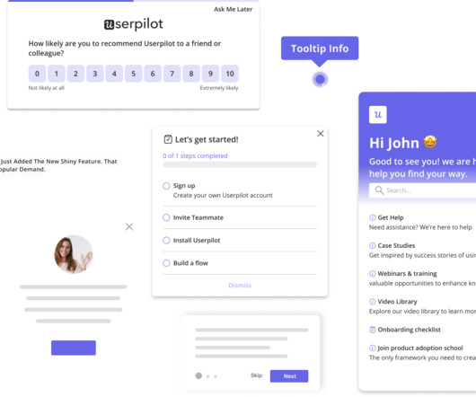
Userpilot’s in-depth survey customization and targeting make it ideal for product teams focused on improving specific user touchpoints and optimizing in-app feedback collection. Plus, the ability to create custom NPS dashboards allow you to analyze the results easily without writing a line of code. A 14-day free trial is available. #8
Variety of UI patterns to engage users, including modals , tooltips , and slideouts. A/B and multivariate testing for optimizing userexperiences. Custom dashboards to track key metrics at a glance. Analytics reports like paths, funnels, and cohort tables for visualizing user behavior data. UserGuiding dashboard.
Userpilot’s Visual Labeler enables you to track in-app user behavior, such as clicks, text input, and form submissions, code-free and with no interference from your dev team. With the product usage dashboard, you can track user engagement metrics, popular pages and features, top interactions, trends, and even browser preferences.
Dashboard design can mean the difference between users excitedly embracing your product or ignoring it altogether. Great dashboards lead to richer userexperiences and significant return on investment (ROI), while poorly designed dashboards distract users, suppress adoption, and can even tarnish your project or brand.
When data collection is messy, product managers lose visibility, teams waste hours chasing answers, and userexperience suffers. Based on your current dashboard, it looks like most users churn before completing onboarding. But that view only reflects web users. Which features need attention?
Instead of guessing what users need, youll have concrete data on which features work, and which dont. Increased User Retention: Understanding user behavior allows you to personalize the userexperience, keeping them engaged for longer. Improve product performance by fixing issues before they affect users.
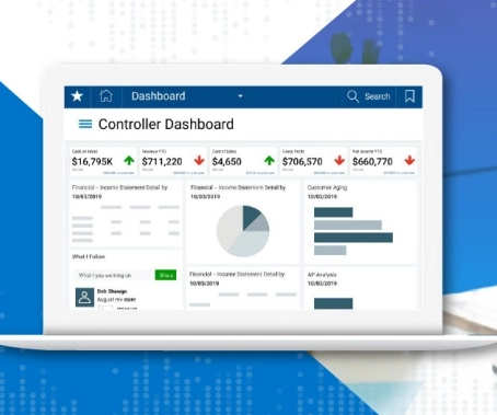
Flexible Chart Legend Positioning: Move and align legends for better dashboard design. is Here: Smarter Analytics, More Control, Better UserExperience and written by Casey McGuigan. Fixed Lines for Charts: Set static reference points to highlight key data trends. Request a Demo Originally from Reveal 1.7.3
Instead of turning insights into engagement and revenue, slow dashboards frustrate users and stall adoption. Thus, Scalable analytics hinges on four essential pillars: Performance : Systems must deliver real-time responses, even under heavy loads from big datasets or thousands of concurrent users.
In this blog, we explore 5 key principles that exist to ensure you create a relevant dashboard that guides and simplifies the userexperience, makes it as easy as possible to interpret what is presented no matter its complexity, and increases the adoption of BI.
NPS survey dashboard in UsrGuiding tool. In reality, UX is multidimensional, and it requires multiple qualitative and quantitative metrics like task success rate, user satisfaction score, and summary of user reviews. Such companies rely on user surveys and feedback to evaluate userexperience.
Highlight any improvements that enhance existing functionality Clearly explain how the improvement will enhance the user's experience and quantify the improvement if possible. For example, telling users that the dashboard loading time has been reduced by 50% shows commitment to continuous improvement to keep them happy.
Userexperience can make or break a web app. If your software is slow or buggy, users wont stick around for long. If youre only finding out about these issues after users complain, youre already too late. Autocapture events dashboard in Userpilot. Build and view custom dashboards in Userpilot.
Embedded analytics solves these pain points by providing insights directly within your application, allowing sales teams to track performance metrics in their CRM and operations teams to monitor workflows through embedded dashboards. Visualization: Presenting data through intuitive charts, dashboards, or reports.
This allows teams to create solutions that fill those gaps, improve efficiency, and provide a better userexperience. Focusing on these areas ensures your product directly addresses user concerns, enhancing satisfaction and productivity. Understanding the user journey is also essential in the product discovery process.
Problem Brief Over a span of 4 weeks, we tested Civians platform and created design solutions to improve the overall userexperience of the dashboard. We also encouraged them to think out loud while they were navigating the dashboard, to help us uncover their mental model and identify hidden insights.
Without a strong and consistent digital brand, financial institutions risk being overshadowed by nimble Fintech startups or tech giants like Apple and Google that excel in userexperience. A strong digital brandensures: Customer Loyalty: A seamless and intuitive digital experience keeps customers engaged. million to 91.7
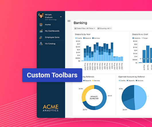
Latest Update Features: Custom Toolbars: Full control over dashboard menus. Custom Toolbar Options: Full Control Over Menus Developers can now fully customize dashboard and visualization toolbars using the revealView.onMenuOpening event handler. Dynamically adjust menu behavior based on user conditions (e.g.,
Product analytics tools : Platforms that allow you to track and analyze user interactions within a product to help you optimize the userexperience and improve product performance. Try Userpilot’s Product Feedback Software to Optimize Your UserExperience Get a Demo 14 Day Trial No Credit Card Required 2.
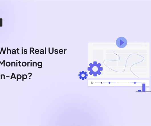
Robust real user monitoring solutions, like Userpilot , capture 100% of interactions, ensuring you see the full picture: every hesitation, every bottleneck, and every Aha moment. How is real user monitoring different from synthetic monitoring? How to set up real user monitoring in 5 steps Setting up RUM doesnt have to be complicated.
Website feedback and online surveys : These collect opinions about digital experiences, focusing on usability and content quality. Businesses can use this feedback to improve website navigation, enhance userexperience, and drive conversions.
Factors I consider when evaluating customer analytics tools Important core features Analytics dashboards : Provide real-time visualizations of key performance indicators (like active users and page views) at a glance, so you can easily track changes. Example of a Userpilot dashboard showing free trial to paid user conversion rate.
This resource allocation reflects a fundamental truth: understanding and optimizing the current userexperience often yields more substantial results than the constant introduction of new, unvalidated features. Tools like click tracking and funnel analysis help pinpoint where users encounter difficulties during onboarding.
For example, you could: Equip ICU teams with step-by-step walkthroughs so nurses can confidently use life-support dashboards in under ten minutes. Create tailored user journeys based on specific conditions. In-app survey created with Userpilot. Don’t take our word for it.
For example, let’s say a $100k ARR company (enterprise subscriber) reports their custom SSO integration is failing, a $10k ARR company reports dashboard loading slowly, and a $1k ARR company reports an issue with a new feature. userpilot.com How can Userpilot help you implement user onboarding strategies?
.: If you want to ace mobile onboarding, I suggest you watch our webinar: How to Get Mobile Users to Stick: Onboarding & Retention Strategies That Work 2. Personalize userexperience No one wants to feel like just another user. Use those insights to build targeted in-app experiences. Custom design templates.
Everything lives in one SDK, with a single interface and one user profile. This cohesion matters when aiming for rapid iterations and consistent userexperiences across the journey, from first-time use to feature reactivation. Collect user feedback effectively with Userpilo t. Build custom user segments with Userpilot.
The only way to have a fighting chance is by focusing on the userexperience within your mobile app. Try to understand what the in-app user journey is like. Why aren’t app users engaging with it more? And how can you turn them into active users?
Free to paid conversion rate This user metric measures the percentage of users who upgrade from a free trial to a paid plan. The free to paid conversion rate is a metric for assessing your onboarding and initial userexperience. Use Userpilot s analytics dashboard to see your user metrics in one place.
For example, when launching a new feature, the right data visualization tool will let you track user interactions through a funnel report. The goal is simple: make data easy to understand and improve userexperience quickly. Pricing starts at $30/user/month, with a free trial available.
Conversely, if the userexperience heavily relies on a graphic user interface, the larger the gap for the product designer toaddress. While it would be foolish for a product designer to complain about this approach, it can inadvertently exclude important userexperience considerations.
Throughout my career as a product manager, I’ve seen too many promising mobile apps fail; oftentimes not because they lacked great features, but because the userexperience fell short. With 88% of users considering leaving after a single bad experience , every usability flaw costs you lost revenue.
Todays users demand seamless experiences across various communication channels , whether on mobile or web, and expect instant, personalized interactions that feel intuitive and relevant. As product managers, the challenge goes beyond delivering consistent cross-platform customer experiences.
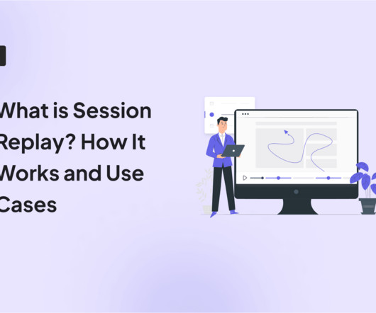
This powerful tool allows you to see your website or web app through your users’ eyes. It reveals the “why” behind their actions and unlocks valuable insights to improve the userexperience. Conversely, session replays don’t actually record a user’s screen in the traditional sense.
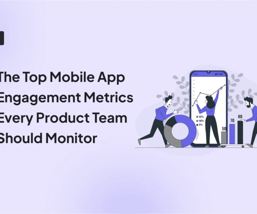
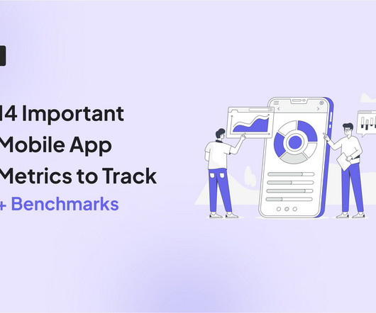
1 Engagement DAU/MAU Understand daily and monthly active user engagement and overall app popularity. 2 Engagement Feature adoption Gauge user interest in new features and optimize feature development. 3 Engagement Average user session length Measure user interactions and identify areas for improved content or flow.
Usability testing: Observe users as they interact with your product to identify usability issues and collect feedback on userexperience. E.g., Identify navigation issues in your analytics dashboard based on real-time user interactions. Survey results dashboard in SurveyMonkey. Dashboard example in Hotjar.
Mobile app tracking captures data on how users interact with your app, including actions such as screen views, button taps, session length, and feature usage. For example, say a user opens your app, skips the onboarding tutorial , and heads straight to the dashboard. Analytics dashboard via Google Analytics.
It lacks other analytics reports such as cohort retention reports, path analysis, and custom dashboards. out of 5 stars Pricing: Growth plan at $799/month Supported devices: Web for the time being and mobile coming in 2025 Userpilot is a product growth platform that helps companies increase adoption, user satisfaction, and retention.
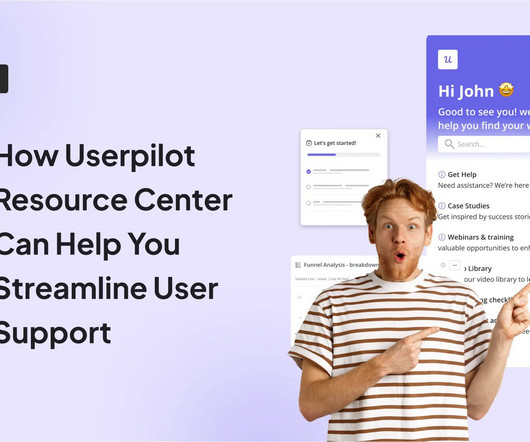
That, in turn, helps personalize the resource center content and provides a seamless experience tailored to individual users needs. Its particularly helpful when you cater to a global user base. It ensures that users can find relevant knowledge base content without leaving your application, resulting in a better userexperience.
We organize all of the trending information in your field so you don't have to. Join 96,000+ users and stay up to date on the latest articles your peers are reading.
You know about us, now we want to get to know you!
Let's personalize your content
Let's get even more personalized
We recognize your account from another site in our network, please click 'Send Email' below to continue with verifying your account and setting a password.


Let's personalize your content