This site uses cookies to improve your experience. To help us insure we adhere to various privacy regulations, please select your country/region of residence. If you do not select a country, we will assume you are from the United States. Select your Cookie Settings or view our Privacy Policy and Terms of Use.
Cookie Settings
Cookies and similar technologies are used on this website for proper function of the website, for tracking performance analytics and for marketing purposes. We and some of our third-party providers may use cookie data for various purposes. Please review the cookie settings below and choose your preference.
Used for the proper function of the website
Used for monitoring website traffic and interactions
Cookie Settings
Cookies and similar technologies are used on this website for proper function of the website, for tracking performance analytics and for marketing purposes. We and some of our third-party providers may use cookie data for various purposes. Please review the cookie settings below and choose your preference.
Strictly Necessary: Used for the proper function of the website
Performance/Analytics: Used for monitoring website traffic and interactions
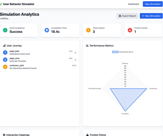
Without effective UX analytics that goes beyond collecting data, you’re losing valuable customers. This article will help reduce such churn by refining your product management and UX analysis approach. It covers key topics, such as: Defining UX analytics. Why UX analytics should go beyond quantitative data.
You can struggle with one of the following five misconceptions about measuring UX: 1. UX can be measured with a singlemetric How are we doing? NPS survey dashboard in UsrGuiding tool. By using a holistic set of metrics, you can achieve a much better understanding of your current state of UX. How NPS is calculated.
Learn about the importance of mobile app KPI dashboards and copy dashboards from real mobile app product managers, engineers and designers. A key performance indicator (KPI) dashboard is a visual representation of data that quantifies how well a team is performing towards its goals. How do I create a mobile app KPI dashboard?
They are ignoring brand-driven consistent UX and often associate digital banking with just adding standard features. The user journey-from the first login screen to the advanced investment dashboard-must reflect the institutions identity. In finance, UX is increasingly the brand differentiator.
Speaker: Laura Klein, Principal at Users Know and Author of UX for Lean Startups
That's why Laura Klein, product manager and UX designer, has a set of tips to help application teams improve their embedded dashboards and reports. No one makes poorly designed products on purpose. And yet we have so many of them in our lives.
UX does matter. So, let’s have a closer look at the most important UI/UX issues to bear in mind when assuring the quality of financial products. Businesses can focus on UX/UI testing for accessibility. During testing UX, the team should make sure the path to entering biometrics is simple and quick.
A little investigative research on G2 uncovered the top 5 analytics UX mistakes made by SaaS vendors. Users describe this overall poor UX experience in multiple ways: A time-consuming process Too difficult to learn Clunky and confusing interface Insights are spread out across multiple sections 2.
SaaS UX/UI design aims to capture and retain users, teach them how to use the product, simplify complex processes, and create competitive advantages. UX design should aim to maximize ease of perception and reduce cognitive load, simplifying and minimizing the number of usersteps. User experience becomes the key driver.
A customer sentiment dashboard is a great way to visualize customer feedback and see what users love (or hate) about your product. TL;DR A sentiment analysis dashboard typically integrates information from multiple data sources, such as social media posts, customer reviews, survey responses , and customer service chats.
Speaker: Miles Robinson, Agile and Management Consultant, Motivational Speaker
Dashboards and analytics can really set your application apart, but that doesn't mean you can implement them and forget about them. Join Miles Robinson, former UX and Design Manager, as he explains the different ways to refresh your dashboards - and how to determine what's the best path to product dashboard success.
Custom dashboards to track key metrics at a glance. Pendo The dashboard on Pendo. Additional reports: You get a built-in Product Engagement Score dashboard. Lack of templates: There arent many ready-to-use dashboards or templates to get started quickly. UserGuiding dashboard. for collecting user sentiment data.
When it comes to product management, you need to look at different SaaS dashboard examples to see what kind of product analytics you can measure, and how. So what are the most important types of dashboards and which ones are the best for you? A SaaS (software-as-a-service) dashboard is a centralized interface within your app.
Example: Imagine you’re designing a new dashboard for a fintech app. Example: For our dashboard, we might ask, “How might we create a dashboard that helps analysts quickly spot trends and take action?” Example: Imagine you’re designing a new dashboard for a fintech app. Big difference, right?
Problem Brief Over a span of 4 weeks, we tested Civians platform and created design solutions to improve the overall user experience of the dashboard. We also encouraged them to think out loud while they were navigating the dashboard, to help us uncover their mental model and identify hidden insights.
Embedding dashboards, reports and analytics in your application presents unique opportunities and poses unique challenges. We interviewed 16 experts across business intelligence, UI/UX, security and more to find out what it takes to build an application with analytics at its core.
I just can’t make sense of this dashboard.”. Along the way, we’ll explore how conversational UX – cooperative exchanges of inputs and outputs – closes gaps between products and users. Keeping those rules in mind, we can solve four common UX design problems: Turn-taking problems. In UX, don’t present users with a wall of text.
As you’re researching dashboard reporting tools, you’ve probably noticed how hard it is to find reliable information on the available solutions. To make your life a little bit easier and help you choose the best dashboard analytics tool for your SaaS, we’ve produced a guide of 12 excellent platforms available on the market in 2024.
Are you wondering how the new Userpilot custom analytics dashboards can help you drive product growth? In this article, you will learn about the main benefits of custom product analytics dashboards and how to create them in Userpilot. TL;DR Userpilot custom analytics dashboards allow you to display multiple reports in one place.
Analytics dashboards are visualization tools that give you an overview of key metrics. In this article, we’ll discuss 10 analytics dashboard examples. It will give you a better understanding of the type of metrics to monitor in your dashboard and help you draw product growth insights from them. Book a demo to learn more.
Reports & analytics : Provide tailored analytics, dashboards, and reporting capabilities to track customer engagement, identify trends , and enable data-driven decision-making for improved customer success. Reporting and dashboards for outcome tracking. Reporting and dashboards for keeping a real-time pulse on customer sentiment.
Read this article to discover 17 UX design principles to drive customer satisfaction and loyalty. TL;DR UX design identifies user needs, wants, and pain points and creates engaging products that enable them to achieve their goals. UX design principles are guidelines that aid the process. Let’s dive right in!
How do you write a UX microcopy that helps users accomplish their objectives and drives conversions? That’s what our guide to microcopy in UX design covers, so if you’re after the answer, you’re in the right place! What is microcopy UX? Why is it important to write a great UX microcopy?
Chargebee dashboard for tracking customer behavior (and measuring retention). link] Customer Retention Rate: Essentials was originally published in UX Planet on Medium, where people are continuing the conversation by highlighting and responding to this story. Help me shape it by filling out this quick survey!
A good SaaS UX design is critical to a successful SaaS product in today’s constantly evolving and competitive market. In this article, we will examine what an effective SaaS UX design is, why it’s important, and the best practices to produce a well-crafted design that works. What is SaaS UX design? Creating S.M.A.R.T
This case study reveals how Rumi Cosmetiques doubled its conversion rates and saw a 75% increase in adds to cart within a week, thanks to strategic changes in their user experience (UX) design and conversion rate optimization (CRO). An expertly crafted UX design ensures that customers glide through your site like butter on a hot skillet.
Open up a webpage, drop in a script, and boom: clicks, scrolls, and form inputs start flowing into your dashboard without writing a single line of code. Otherwise, you might end up chasing UX issues that are actually app performance problems. So if most users never even start onboarding, that’s not necessarily a UX failure.
Are you ready to elevate your UX measurement game with a unique, all-in-one metric? Photo by NordWood Themes on Unsplash Measuring user experience (UX) has always been a complex challenge, requiring a blend of creativity and data-driven precision. TSR norm : 70 / 100 =0.70 ToT norm : 1 (10 / 15) = 1 0.67 =0.33
Using UXDAs strategic UX framework , we turn brain science into simple design choices that build trust and make digital financial services feel clearer, friendlier and more human. At UXDA, we use strategic UX to simplify things by replacing complexity with intuitive visuals, clear language and easy step-by-step flows.
Appsee is a mobile app analytics platform that focuses on qualitative data and is designed to help inform UX decisions. Our SDK is instrumented into mParticle, and when a mParticle customer decides to leverage Apptentive, a switch is flipped on in their dashboard which gives them immediate access to Apptentive.
What is the UX research process? It also outlines a 9-step guide on how to conduct UX research for product managers and UX designers. TL;DR The UX research process is a sequence of steps to collect and analyze data on user interactions with the product to better understand their needs and preferences. Book the demo!
Usability testing is an invaluable resource for UX researchers…but only if you’re able to recruit participants in the first place. This is a problem that our own UX researcher at Userpilot, Lisa, faced when she tried recruiting participants the traditional way. Here are a few features that will streamline your UX research efforts.
As a product manager, you probably already understand the importance of a great onboarding UX design and its importance for customer journey optimization and user retention. TL;DR Onboarding UX refers to the design framework that shapes how users interact with your product during onboarding. Some of the most common ones include: 1.
Looking for ways to uncover behavior patterns (UX) and optimize your product experience? Step-by-step process to perform behavioral pattern analysis and improve your UX. Essentially, habituation is where UX development and behavioral design intersect. Product usage dashboard in Userpilot. Book a demo now to begin.
Understanding and addressing user problems is a fundamental aspect of effective UX design. Digging deeper into user problems helps UX designers identify user pain points and create experiences that fulfill their needs. Plus, it allows UX designers to create frictionless experiences that meet user expectations.
In early-stage startups, product managers are often responsible for executing all of their own customer research, while in larger organizations product managers often work closely with designers, UX researchers, or product marketers to accomplish this. Execution: Metrics Dashboards.
Now, you can track how users interact with your app across platforms, understand their behavior in context, and respond with in-app experiences, all from the same dashboard. Boards: Build custom dashboards on Mixpanel to keep your most important mobile metrics front and center. Mobile app analytics tools: Mixpanel. #3
UX mistakes will disrupt the user experience and undervalue your product. This article shows you 14 common UX mistakes designers make, plus how to avoid them and build fantastic product experiences. Optimizing for search engines and not humans While SEO is important, it shouldn’t come at the expense of good UX.
Creating an expansion revenue dashboard with Userpilot without coding. It offers features like auto capture, dashboards, and reporting tools (cohort, path, and funnel analysis) that allow you to perform granular user analysis—helping you quickly identify trends and areas for improvement without coding.
Understanding data visualization UX best practices is key to creating compelling visuals that produce digestible insights, empowering users to make informed product management decisions. Try Userpilot and Take Your UX to the Next Level Get a Demo 14 Day Trial No Credit Card Required What is data visualization?
Its a leap of faith in their engineering counterpartsdelegating ownership of a UX decision. If the UXs long-term and holistic considerations are included in the final solution, then its cooperation. If the UXs long-term and holistic considerations are included in the final solution, then its cooperation.
Wheres the authenticity, the cutting-edge aesthetics or the refined UX that we know customers crave from a premium digitalservice? How toApply: In UX/UI: Surprise users with playful iconography, Easter eggs or custom animations. To design Dopamine Banking, we at UXDA are using the following strategic UX principles: 1.
DESIGN WORKBOOKS How to put design theory into practice in an efficient way My favorite UX design workbooks: develop your skills by solving exercises Learning design theory is a good step towards becoming a better designer, but it is also important to put the things you’ve learned into practice.
To optimize UX, teams must bridge these data silos. UX researchers can share real user behavior evidence: Heatmaps and A/B test results only go so far. For example, when metrics show teams actively using dashboards but having low report exports, replays reveal them taking screenshots instead.
Autocapture events dashboard in Userpilot. Custom dashboards: Custom dashboards help you gather crucial metricslike average session duration, recurring revenue, or funnel conversions all in one place. Build and view custom dashboards in Userpilot. Example of DebugBears dashboard. Example of Datadogs dashboard.
We organize all of the trending information in your field so you don't have to. Join 96,000+ users and stay up to date on the latest articles your peers are reading.
You know about us, now we want to get to know you!
Let's personalize your content
Let's get even more personalized
We recognize your account from another site in our network, please click 'Send Email' below to continue with verifying your account and setting a password.
Let's personalize your content