This site uses cookies to improve your experience. To help us insure we adhere to various privacy regulations, please select your country/region of residence. If you do not select a country, we will assume you are from the United States. Select your Cookie Settings or view our Privacy Policy and Terms of Use.
Cookie Settings
Cookies and similar technologies are used on this website for proper function of the website, for tracking performance analytics and for marketing purposes. We and some of our third-party providers may use cookie data for various purposes. Please review the cookie settings below and choose your preference.
Used for the proper function of the website
Used for monitoring website traffic and interactions
Cookie Settings
Cookies and similar technologies are used on this website for proper function of the website, for tracking performance analytics and for marketing purposes. We and some of our third-party providers may use cookie data for various purposes. Please review the cookie settings below and choose your preference.
Strictly Necessary: Used for the proper function of the website
Performance/Analytics: Used for monitoring website traffic and interactions
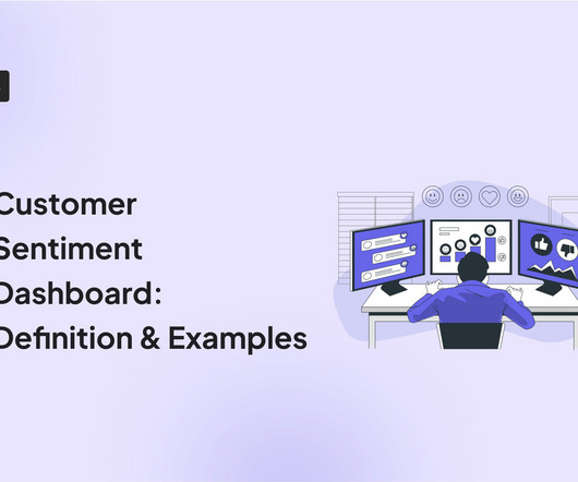
A customer sentiment dashboard is a great way to visualize customer feedback and see what users love (or hate) about your product. TL;DR A sentiment analysis dashboard typically integrates information from multiple data sources, such as social media posts, customer reviews, survey responses , and customer service chats.
One of these features you should look for is dashboard linking. The following article will delve into dashboard linking, its advantages, and potential benefits across various industries. What Is Dashboard Linking? In embedded analytics , dashboard linking refers to the ability to connect and navigate between multiple dashboards.
One of these features you should look for is dashboard linking. The following article will delve into dashboard linking, its advantages, and potential benefits across various industries. What Is Dashboard Linking? In embedded analytics , dashboard linking refers to the ability to connect and navigate between multiple dashboards.
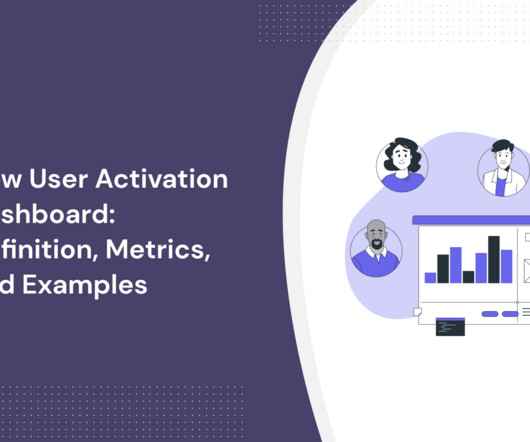
In SaaS, a new user activation dashboard can become a massive product analytics tool to understand and optimize the user journey. But how can a dashboard for user activation can help you engage more users? moment ," impacting user retention and satisfaction.
Dashboard design can mean the difference between users excitedly embracing your product or ignoring it altogether. Great dashboards lead to richer userexperiences and significant return on investment (ROI), while poorly designed dashboards distract users, suppress adoption, and can even tarnish your project or brand.
When data collection is messy, product managers lose visibility, teams waste hours chasing answers, and userexperience suffers. Based on your current dashboard, it looks like most users churn before completing onboarding. But that view only reflects web users. Create shared definitions and stick to them.
Unfortunately, the research backs this up, with a staggering 90% of users reporting that they stopped using an app due to poor performance. Basically, anything that ruins the userexperience. It helps get a better understanding of user pain points and uncover improvement areas for enhancing the overall userexperience.
Problem Brief Over a span of 4 weeks, we tested Civians platform and created design solutions to improve the overall userexperience of the dashboard. We also encouraged them to think out loud while they were navigating the dashboard, to help us uncover their mental model and identify hidden insights.
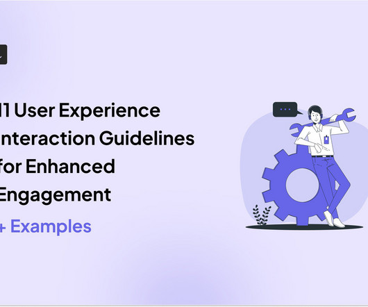
Alongside usability testing, userexperience interface guidelines allow you to build more intuitive and user-friendly solutions. In this blog, we explain eleven userexperience and interaction design guidelines supported by real-life examples to improve product engagement. System status visibility.
Much of the literature that defines the role as the intersection of business, technology, and userexperience isn't particularly helpful for practitioners who are left wondering what skills they need to learn versus the fine people they work closely with in actual business, technology, and userexperience roles.
No-code and low-code data collection : Allows non-technical users to gather and manipulate data easily, democratizing data access and improving productivity. Reports and dashboards : Presents data in a digestible format, providing real-time insights and key performance indicators to help teams monitor progress and make informed decisions.
An active user is an individual who regularly engages with and utilizes your platform and has a high user engagement score. The active user metric is commonly used to measure app performance, but the definition of an active user can vary depending on the product.
UX deals with a user's interactions with specific aspects of your product, while CX is broader and covers all customer engagements with your brand. TL;DR The userexperience (UX) is the sum of a user's thoughts, impressions, and feelings as they interact with specific aspects of your product.
Incorporating gamification in the onboarding process can make it more engaging and motivating for users. Userpilot allows you to create onboarding flows without coding and enables tracking activation rate and related metrics from a single dashboard. For example, when the user logs in, they're asked what they want to create first.
They track 47 different key performance indicators (KPIs) in their mobile analytics platform , spend hours debating dashboard numbers, yet can’t predict which users will churn next week The problem here isn’t a lack of data. Ask targeted questions about specific experiences right when they happen.
Highlight any improvements that enhance existing functionality Clearly explain how the improvement will enhance the user's experience and quantify the improvement if possible. For example, telling users that the dashboard loading time has been reduced by 50% shows commitment to continuous improvement to keep them happy.
This resource allocation reflects a fundamental truth: understanding and optimizing the current userexperience often yields more substantial results than the constant introduction of new, unvalidated features. Tools like click tracking and funnel analysis help pinpoint where users encounter difficulties during onboarding.
Analyze user interactions with your product to identify the most valuable features. And find ways to optimize the userexperience. Monitor social media, forums, and review pages for user comments. Create a public roadmap where users can submit feature requests , vote them down or up, and follow their development progress.
When marketing aligns with product development , customer service, and sales, the result is a more cohesive userexperience that can increase customer satisfaction, loyalty, and product advocacy. Tools like Userpilot allow you to create custom dashboards , so you can track all the key metrics from one place.
Conversely, if the userexperience heavily relies on a graphic user interface, the larger the gap for the product designer toaddress. While it would be foolish for a product designer to complain about this approach, it can inadvertently exclude important userexperience considerations.
Define the definition of success at that particular stage (from your user’s point of view). A truly personalized product experience delivers value according to your customer’s use case, job to be done (JTBD) , and the journey stage—helping users achieve their goals more easily and faster. Pendo’s dashboard.
They combine quantitative and qualitative data to help businesses understand the big picture of their userexperience. As the name implies, FullStory auto logs all aspects of users’ interactions such as scroll, swipe, click, and pageview. The dashboard’s widget wizard contains a library of pre-configured dashboards.
Define the definition of success at that particular stage (from your user’s point of view). A truly personalized product experience delivers value according to your customer’s use case, job to be done (JTBD) , and the journey stage—helping users achieve their goals more easily and faster. Pendo’s dashboard.
Where to do user journey map in UX process Discovery and Research Phase: Objective: Understand user needs, pain points, and behaviors. User Journey Map Role: Initial user journey maps can be created to outline existing userexperiences and identify areas that need improvement. Example: Empathy Map 4.
TL;DR Product analytics tools analyze user interaction, preferences, and engagement with a product. They provide insights to improve userexperience and meet customer needs. They offer data visualization, analyze user behavior data, and identify friction points to improve customer experience.
For example, when launching a new feature, the right data visualization tool will let you track user interactions through a funnel report. The goal is simple: make data easy to understand and improve userexperience quickly. Pricing starts at $30/user/month, with a free trial available.
They used the NPS dashboard to monitor customer sentiment, prioritize feedback, and act on negative feedback quickly. – Subhash Yadav, Product Marketer at Unolo The feature that Unolo found particularly useful was the NPS dashboard. Unolo’s NPS dashboard powered by Userpilot. And engage them accordingly.
Stay focused on the metrics that are closely related to your goals to avoid unnecessary implementation effort and dashboard clutter.” Kerry Rodden, a UserExperience Researcher at Google says in a blog post on Google Ventures’ blog. Do you really need to track them over time, or is a current snapshot sufficient?
One example: the script currently runs in CLI mode with arguments, but it’s not implemented in the latest-best-Python way, and I’d definitely want to correct that. The non-profit’s primary user-facing (farmer-facing!) To make the project public, though, I wanted to do more significant remodeling.
We then made the decision to eliminate the ones that users weren’t using and keep ones that users were using. Here’s my dashboard that I used to track everything: my dashboard that I used to track everything. There are two that I want to dive into: The number of times users change their default sort.
You might also be interested in Mobile app KPI dashboard examples and how to use them What is customer retention and why is it so important? do they still count as a user even if they haven’t used it ever since? While the formula for customer retention is simple, the definition of the customer should focus on active users.
This guide covers everything you need to know about outsourced software product development services , from core definitions and benefits to a stepbystep process, pros and cons, realworld case studies, and future trends. This can include: Product strategy: Roadmap definition, market research, feature prioritization.
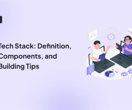
In this guide, we’ll explore the definition, components, and essential building tips for constructing a robust tech stack! Frontend UI and frameworks The frontend tech stack, encompassing user interface (UI) designs, frameworks, and design tools, is crucial for the initial user interaction with an application.
Let’s explore how to turn cognitive science into your secret weapon for user engagement and retention, starting with general definitions. How Memory Affects User Interaction Memory plays a pivotal role in userexperience design. Userexperience: You can create interfaces that minimize cognitive load.
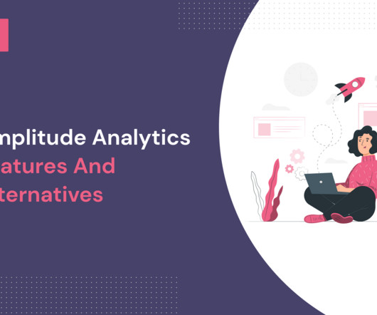
It offers valuable insights into user behavior to drive growth and enhance your userexperience. Amplitude’s Event Segmentation function shows you what your users are doing within your product. Using Amplitude’s dashboards, you can get a bird’s eye view of all your relevant charts. Amplitude Analytics dashboards.
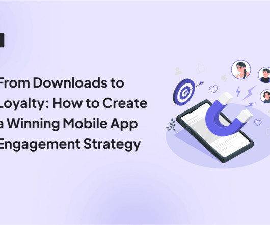
4 Key steps to building a successful mobile app engagement strategy Building a successful user engagement strategy requires an in-depth understanding of your users and their goals with your product. As a result, defining user engagement requires a holistic view encompassing user actions, retention, and business outcomes.
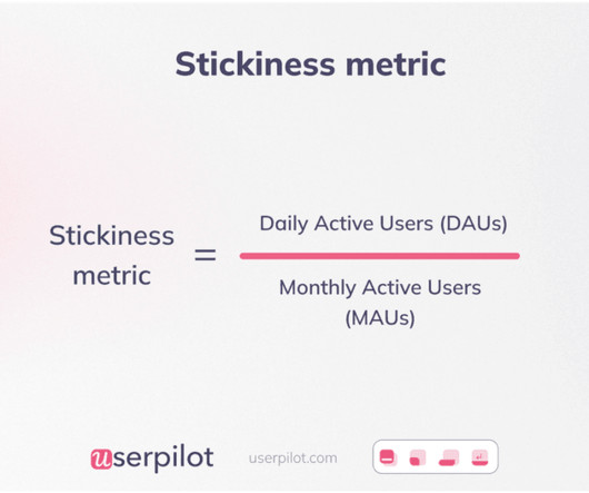
There are a number of methods that can help you improve your DAU/MAU ratio as follows: You can personalize the userexperience from the start as it helps improve the stickiness in the long run. Creating a standard definition for active users will help SaaS companies calculate metrics like DAU/MAU ratio.
Pendo and WalkMe do some similar things, but they are definitely not equivalent. Pendo specializes most in terms of user segmentation and analytics during onboarding, though it certainly has powerful tools for creating the onboarding flow itself. WalkMe onboarding segmentation dashboard. Pendo vs WalkMe: Features Overview.
Though our marketing team at the time was reporting healthy acquisition in Google Analytics leading to high numbers of new signups, our product team’s Mixpanel dashboard showed conversion from those signups to paying customers was low. We hope all the new use cases we’re unlocking in Mixpanel help you build better holistic userexperiences!
PMMs use product analytics to gain actionable insights into their customers' experiences, understand what's driving success and what's causing friction in the user journey to help the customer achieve repeated value by using the product. KPI and other custom-built dashboards. User property attachments.
In any case, you definitely cannot plan for all of the surprises on the way. If any of the stages did not work, the user got zero value out of his day work. Barely made it: The second part was to enable a user to create a reasonable model around the data he had to record, so he can easily access it later.
I also really liked the resource center, definitely a big push for us over some of the other tools. Analyze user behavior to identify gaps in the product experience To evaluate the effectiveness of the 3-step wizard for new users, Impala utilized Userpilot’s analytics features. Analyze onboarding funnels with Userpilot.
High engagement but no conversions: When new users are active but dont convert, its a clear indicator that something in your onboarding flow or product experience is not what users expect. You can track all the key metrics using dashboards like this in Userpilot, so you know when something unusual happens.
Create basic user segments with branching walkthrough experiences. Communicate with users via in-app messages and notifications. View analytics on user interactions and engagement with your software. WalkMe dashboard – Source: WalkMe. Set up basic contextual onboarding to differentiate userexperience.
We organize all of the trending information in your field so you don't have to. Join 96,000+ users and stay up to date on the latest articles your peers are reading.
You know about us, now we want to get to know you!
Let's personalize your content
Let's get even more personalized
We recognize your account from another site in our network, please click 'Send Email' below to continue with verifying your account and setting a password.


Let's personalize your content