This site uses cookies to improve your experience. To help us insure we adhere to various privacy regulations, please select your country/region of residence. If you do not select a country, we will assume you are from the United States. Select your Cookie Settings or view our Privacy Policy and Terms of Use.
Cookie Settings
Cookies and similar technologies are used on this website for proper function of the website, for tracking performance analytics and for marketing purposes. We and some of our third-party providers may use cookie data for various purposes. Please review the cookie settings below and choose your preference.
Used for the proper function of the website
Used for monitoring website traffic and interactions
Cookie Settings
Cookies and similar technologies are used on this website for proper function of the website, for tracking performance analytics and for marketing purposes. We and some of our third-party providers may use cookie data for various purposes. Please review the cookie settings below and choose your preference.
Strictly Necessary: Used for the proper function of the website
Performance/Analytics: Used for monitoring website traffic and interactions
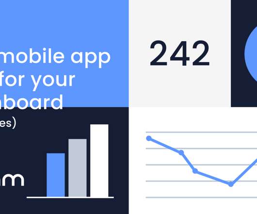
Learn about the importance of mobile app KPIdashboards and copy dashboards from real mobile app product managers, engineers and designers. A key performance indicator (KPI) dashboard is a visual representation of data that quantifies how well a team is performing towards its goals.
In this article, you will learn: What is a KPI in SaaS? KPIs vs. Metrics. Why is it so important to track KPI, metric, or measure? A key performance indicator (KPI) is a measurable value that shows how effectively a company is meeting key business objectives. When you add context to a metric, you get a KPI.
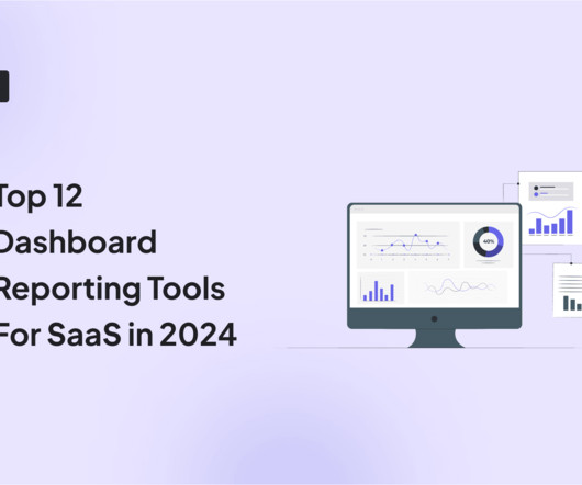
As you’re researching dashboard reporting tools, you’ve probably noticed how hard it is to find reliable information on the available solutions. To make your life a little bit easier and help you choose the best dashboard analytics tool for your SaaS, we’ve produced a guide of 12 excellent platforms available on the market in 2024.
So, what is the compass that guides a product manager when making product decisions (new functionality, UX, UI)? It’s not a roadmap or a KPI. When the product team designed the new dashboard we had many product/UX dilemmas – which functionality to expose and how to present it. We disrupt banking.
To calculate: How to track free trial conversion rates in UXCam Example of parameters to use to measure free trial conversion rates Add a report to your dashboards in UXCam to easily keep track of the number of users converting from a free trial to a subscription by using custom events. Clear messaging.
As companies usually have many different KPIs, maintaining or growing customer retention is a key KPI that each business commonly shares. You might also be interested in Mobile app KPIdashboard examples and how to use them What is customer retention and why is it so important? a leading Buy Now, Pay Later solution.
One look at your mobile app analytics dashboard, and you just want to shut your eyes and scream in frustration. Update dashboards and alerts: I edit my custom dashboards to reflect the new metrics, so I can monitor them at a glance. Tracking mobile app performance metrics can feel daunting. I archive ones that dont.
We have a centralised product group (product management, product marketing, engineering, UX, PMO) that is in part geographically dispersed which covers 10 product lines, and we’re in the process of dramatically diversifying our portfolio and driving our business to a new phase of growth.
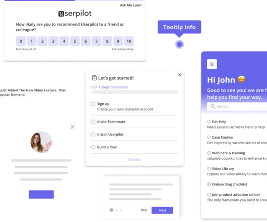
Begin with the most basic or essential KPI reports that align with the goals you defined earlier. Customization options : Go for a tool that allows you to easily create custom dashboards , reports, and visualizations. Creating a dashboard in Userpilot. Self-service analytics with Tableau.
Product analytics software varies but most have similar features, such as data capturing, customized segmentation, and KPIdashboards. KPI and other custom-built dashboards. Heap’s dashboard. Amplitude’s dashboard. Mixpanel’s dashboard. Userpilot goals dashboard. Tracking custom events.
SaaS User Persona Example-Userpilot: UX Designer 5. Like – my user persons is: “a SaaS product marketer who works for a large company and is in charge of increasing first-month retention” or “a UX product designer in a UX team, who is in charge of prototyping, building, and optimizing the onboarding user flow”.
The tool should provide relevant insights for this on the dashboard. Understanding user behavior will enable you to improve the UX of your product. Industry-standard capabilities of a product analytics tool are the abilities to capture events and user journeys. The third layer drills down into individual user journeys.
User Experience is a key factor regarding the success of a digital product, and the main ingredient to an excellent UX lies in a thorough user-centered approach. In that sense, Imaginary Cloud is introducing a new UX Audit service focused on providing high-quality professional UX Audits. What is a UX Audit? Conclusion.
There’s no single KPI to measure customer satisfaction. What is the KPI for customer satisfaction? Although customer satisfaction is a simple concept, there isn’t just one KPI that will provide the full picture of user sentiments. Product usage analytics dashboard on Userpilot. NPS dashboard on Userpilot.
Why you need dashboards for cohort analysis , funnel analysis and feature adoption. So follow these rules: Product Analytics KPIs 101a: Articulate Your Business Goals. If it generates revenue, then revenue should definitely be a KPI! Product Analytics KPIs 101b: Make the Goals Quantitative.
You need your data to be as up-to-date as possible, and your analytics to be as accessible as possible, so you can pull open your dashboard at any time of day and know your app’s status. If your dashboards show the most up-to-date data, they’ll give you the power to make good decisions fast. You need to make good decisions fast.
Picking the wrong KPI is part of the process. Or they’ll argue that one group needs to “decide and agree on the KPIs and what they need to see on dashboards” and THEN, some other group goes off and does the work. Just get them out there and tune it.
Instead, you can create, run, and monitor tests from your dashboard with a few simple clicks. The full-suite digital experience platform lets you validate new feature ideas and personalize your website’s UX. Automatic rollback : You can set a specific KPI to revert the release of a new feature when the metric crosses a threshold.
Basically, you need to break down your users’ journeys into smaller steps – as many as you can identify and measure – and generate a detailed funnel or growth KPIdashboard. Here’s an example of what a simple dashboard might look like: Source: mattyford.com. Mixpanel allows you to track real-time data.
Depending on the company’s maturity, those might be separate roles, or a skill the product manager owns; or maybe they’re the responsibility of the UX department. This makes analytics data tangible, enabling you to combine input from various data sources and analytics tools into a super-flexible dashboard. Third are heatmaps.
As product usage analytics deliver a growing stream of data and insights into product team dashboards, user retention metrics have become an increasingly reliable KPI to measure customer, product, and company health. While this has long been the case for SaaS it is becoming increasingly important for B2B on-premise software, too.
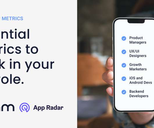
In this article, we will cover the essential app metrics for: Product managers UX/UI designers Growth marketers iOS and Android developers Backend developer Found yourself on this list? Weekly active users (WAU) and Daily active users (DAU) on the UXCam Dashboard. Cart activity shown in dashboard from UXCam.
RACE is KPI-powered and based on a performance improvement process. To succeed, digital marketers must define and track KPIs and goals for each stage. Use these KPIs to measure the success of each step and refine your tactics. NPS response dashboard. Userpilot goals dashboard. Jira product feedback survey.
An empty state is what users see when they sign-up, and all they see is a blank dashboard, which puts barriers to value realization and hurts time to value. Return on investment (ROI) is the most famous KPI. With UX gamification and emotional design , you can add badges, points, and levels for a more fun product experience.
Show your new users one of the following alternatives at random: No welcome screen at all – confront them with a dashboard and leave them to get on with it. Many SaaS products display all of their available features on new users’ dashboards, but then restrict access to some of them to premium users. Source: userpilot.com.
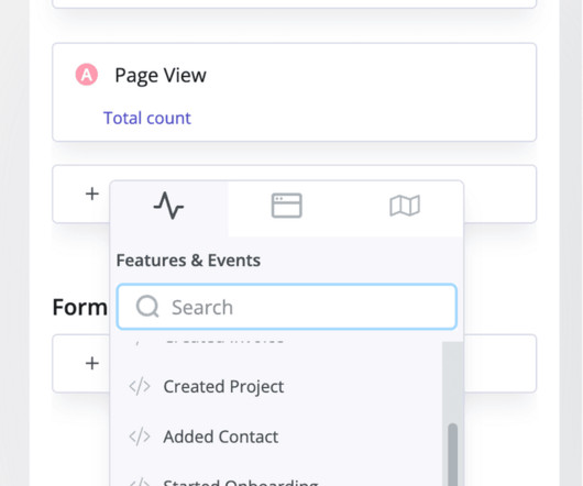
By examining trends reports, you can see the rise and fall of each KPI, allowing you to spot abnormalities easily. Features and events dashboard in Userpilot. If you’re unsure, here’s a brief overview of what each analysis type does: Trend analysis Userpilot’s trend analysis helps you track day-to-day changes in key metrics.
Expansion MRR is the main KPI to track revenue growth you gain from current customers through upsells, add-ons, and cross-sells. You go on the analytics dashboard, and you see the image below. Good Upselling Examples we cover: Slack uses well-timed in-app messaging to turn free users into paying customers. What would be your reaction?
Product and user behavior analytics tools help you track user journeys, UX issues, and more. It also offers dashboards that you can use for visualizing KPIs like conversion rates after tracking and calculation. 9 KPIs to track through your SaaS analytics. KPI #1: Average Revenue Per User (ARPU).
That said, you don’t have to limit this KPI to new features since even older features in your product may be underperforming in the time-to-adopt department. Feature and event audit via Userpilot dashboard. Tracking active users with Userpilot ’s engagement dashboard. Stage 4: Used again.
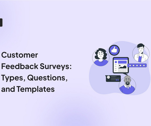
This KPI determines product ease according to users. Customizable dashboards; d. Interactive dashboards. Also, compare your NPS with benchmarks of customer satisfaction in the industry. Example of an NPS survey for Campfire. Customer effort score (CES) surveys The third type of customer satisfaction survey measures the CES.
Using the app everyday helps me organically spot UX pain points that aren’t immediately apparent until you use a feature time and time again,” he says. Using the app everyday helps me organically spot UX pain points that aren’t immediately apparent until you use a feature time and time again. What metrics/KPIs are you measured on?
Average Resolution Time – CX KPI. Average 1st response time – customer experience KPI. Customer Lifetime Value – CX KPI. Customer Health Score – CX KPI. Customer churn rate – CX KPI. How to improve CX KPIs and optimize the customer experience in SaaS? Mixpanel dashboard.
A huge KPI for the success of your interactive walkthrough is going to be the percentage of users who activate. In the Userpilot dashboard, Postfity can see how many users have completed each of these two goals. But all users need to know how to create boards and tasks. Make a list of key activation events in your product.
Not only is the purchase funnel a key KPI, but we also monitor how customers pick up their order (e.g. As a user experience (UX) researcher, I use analytics and user testing research to determine how users interact with our mobile app and better understand how their customer experience leads to conversion. Click To Tweet.
Engineers include a KPI section with an Amplitude link where the rest of the company can see how the feature is being adopted by our users. You can encourage your coworkers to share data in a variety of ways: Post dashboards on TV monitors in the office. then it’s as if it was never found.
It’s been just over a year since Moritz joined NBC, and we spoke to him about his process of redesigning the storied news organization’s digital properties from the outside in, why audience loyalty is his number one KPI and how he’s improving the monetization efforts of sites like msnbc.com and today.com. Here’s our interview with Moritz.
I’ve been following you for a long time on LinkedIn and I’ve really enjoyed your reposts, posts, comments, and it was always encouraging, especially for the new designers in the company, in the UX studio and they always, share things within the Slack group. These days are more around product design and UX design.
There are many ways to approach this, but my favorite is how Duolingo created a Markov model around their main business KPI (DAUs) to grow it. In the same way, you can start from your business KPI and then break it down into sensitive metrics you can act on. Communication is key here. Tracking engagement metrics with Userpilot.
Analytics dashboard: Get a clear, centralized snapshot of vital metrics like retention, feature adoption, and revenue growth, plus behavioral trends and conversion patterns, all in one place. Mobile dashboards: Visualize daily active users alongside key metrics to monitor engagement trends. Mobile analytics software: Amplitude.
As a UX researcher, understanding the why behind user behavior is at the core of my work. In this post, Ill share how I use session replays efficiently so you can extract valuable UX insights without drowning in recordings. Why I love session replays as a UX researcher Simply put, I love session replays because of their practicality.
There are many ways to approach this, but my favorite is how Duolingo created a Markov model around their main business KPI (DAUs) to grow it. In the same way, you can start from your business KPI and then break it down into sensitive metrics and touchpoints you can map. Plus, you dont have to create a Markov model to find bottlenecks.
It lets you embed dashboards, reports, and visualizations using Azure infrastructure and familiar tools like Power BI Desktop. There is a KPI visualization, graphs, charts, maps, R script visuals, and more. This helps teams stay current without manually patching or rebuilding embedded dashboards.
Improve UX: Metrics like crash rates, app load times, and screen flow analysis help you spot and address friction points in the user journey, leading to better engagement and retention. Centralized user data: Userpilot provides a unified dashboard for viewing customer information across web and mobile apps.
We organize all of the trending information in your field so you don't have to. Join 96,000+ users and stay up to date on the latest articles your peers are reading.
You know about us, now we want to get to know you!
Let's personalize your content
Let's get even more personalized
We recognize your account from another site in our network, please click 'Send Email' below to continue with verifying your account and setting a password.


Let's personalize your content