This site uses cookies to improve your experience. To help us insure we adhere to various privacy regulations, please select your country/region of residence. If you do not select a country, we will assume you are from the United States. Select your Cookie Settings or view our Privacy Policy and Terms of Use.
Cookie Settings
Cookies and similar technologies are used on this website for proper function of the website, for tracking performance analytics and for marketing purposes. We and some of our third-party providers may use cookie data for various purposes. Please review the cookie settings below and choose your preference.
Used for the proper function of the website
Used for monitoring website traffic and interactions
Cookie Settings
Cookies and similar technologies are used on this website for proper function of the website, for tracking performance analytics and for marketing purposes. We and some of our third-party providers may use cookie data for various purposes. Please review the cookie settings below and choose your preference.
Strictly Necessary: Used for the proper function of the website
Performance/Analytics: Used for monitoring website traffic and interactions
Without effective UX analytics that goes beyond collecting data, you’re losing valuable customers. This article will help reduce such churn by refining your product management and UX analysis approach. It covers key topics, such as: Defining UX analytics. Why UX analytics should go beyond quantitative data.
The results reveal that companies integrating UX Research into their growth strategies see significant improvements in conversions, engagement, and retention, with well-documented returns on investment. This fundamental gap in understanding is where UX Research becomes not only valuable but essential for driving authentic and lastinggrowth.
CRR formula, reference values andexample Customer Retention Rateformula Number of customers at the end of the period : Total number of customers at the end of the measuredperiod. Reference values CRR varies widely across industries due to differences in customer expectations about business. SaaS: 85%95%.
This article is a practical guide for UX designers who want to e xplore immersive design — from key terms to real-world use cases. Common Terminology & Pillars in Immersive UX Creating a truly immersive AR or VR experience depends on several important elements. Table of Contents What Is an Immersive World?
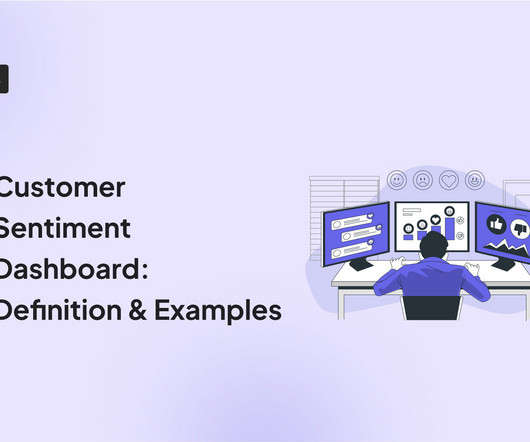
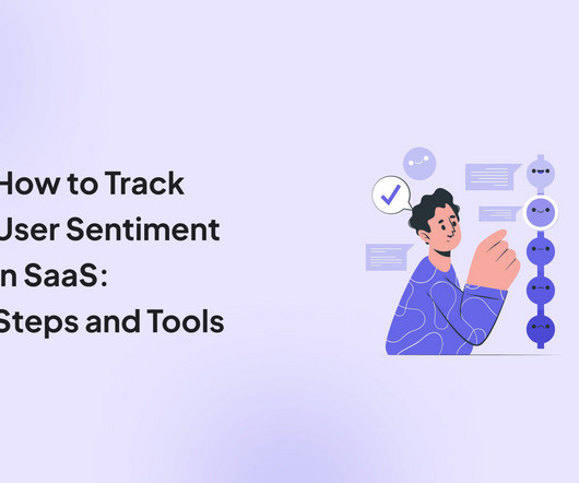
A customer sentiment dashboard is a great way to visualize customer feedback and see what users love (or hate) about your product. TL;DR A sentiment analysis dashboard typically integrates information from multiple data sources, such as social media posts, customer reviews, survey responses , and customer service chats.
Product analytics refers to the process of gathering and analyzing data on how users interact with a product. Maturity refers to how well your company collects, processes, and utilizes data in its decision-making process. Creating an expansion revenue dashboard with Userpilot without coding. What is product analytics?
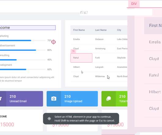
Analytics dashboards are visualization tools that give you an overview of key metrics. In this article, we’ll discuss 10 analytics dashboard examples. It will give you a better understanding of the type of metrics to monitor in your dashboard and help you draw product growth insights from them. Book a demo to learn more.
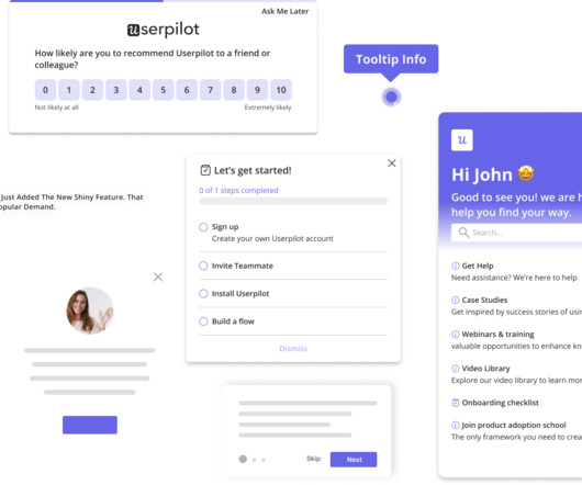
You can target specific segments, configure when the survey appears, and analyze results from the dashboard. Analytics dashboard: Track screen engagement, flow completion rates , and drop-offs. Segment-specific dashboards make it easy to measure whats working for each audience. Collect user feedback effectively with Userpilo t.
What we refer to here as a short-term solution is actually an emphasis on isolated parts of the user experience and its implementation, whereas the long-term perspective considers how the solution integrates with the rest of the user flows, accommodates potential future changes and expansions, and accounts for technical complexities.
Are you ready to elevate your UX measurement game with a unique, all-in-one metric? Photo by NordWood Themes on Unsplash Measuring user experience (UX) has always been a complex challenge, requiring a blend of creativity and data-driven precision. TSR norm : 70 / 100 =0.70 ToT norm : 1 (10 / 15) = 1 0.67 =0.33
Christophe—along with help from motivated team members such as Product Managers Matthieu de Vivie and Sarah Loichot as well as Staff UX Designer Maureen Rodaro —transformed the product organization by emphasizing the importance of meeting users and creating teams (or squads) for each outcome with one product manager per scope.
What is it that everybody does in the UX industry, but does it differently? Probably one of correct answers is the UX design process. In our field, it is not a surprising thing if there are differences in the ways we build up our UX processes – everyone can have their own methods. Here’s how we do it at UX studio.
As a product manager, you probably already understand the importance of a great onboarding UX design and its importance for customer journey optimization and user retention. TL;DR Onboarding UXrefers to the design framework that shapes how users interact with your product during onboarding.
Wheres the authenticity, the cutting-edge aesthetics or the refined UX that we know customers crave from a premium digitalservice? How toApply: In Branding/Marketing: Reference cultural touchstones, popular nostalgia or personalized messages for specific audience segments. Wheres the brand identity?
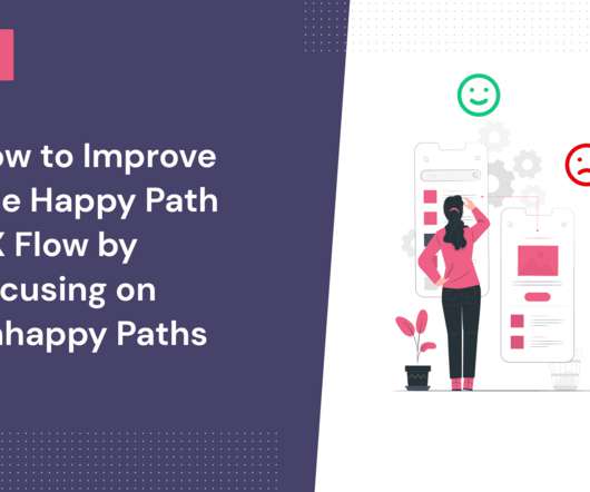
The more your users stick to the happy path UX, the more they’ll see the value in your product and want to stay around. You can make this happen by optimizing the UX for unhappy paths within your product. What is a happy path in UX? What is the unhappy path in UX? Tinder’s critical flow UX example.
But how to make a successful self-tracking app with good UX? UX best practices in self-tracking apps. 5 UX best practices in self-tracking apps. We at UX studio use these methods to design a smooth user journey. Bring users right to their dashboard where they can see their current status and the data they want most.
It’s just as important to ensure the UX of the feedback process as it is to ensure the quality of your testing product. But in return, your product can harvest memorable UX and customer loyalty. They are looking for UX defects and identifying missing elements to close the expectation gap. “We
Their tightly packed visual dashboards organize the data in a way that makes it easy to map out sales funnels, track common paths, uncover behavior patterns, and identify friction points. As a mobile-friendly solution, UXCam’s offers push notifications, so your support and UX teams can connect with specific user segments more easily.
Instead of a static dashboard, users see a tailored path that feels relevant every time they open the app. This simple UX touch helps increase the mobile app's retention rate and motivates users to return. #6 Google Maps improves customer retention with subtle UX like recent search recall.
Drag and drop analytics are interactive and user-friendly analytics platforms that allow users to analyze complex data sets and build custom dashboards and reports by themselves when they need them. . Let’s you build custom dashboards and reports in minutes. The drag and drop dashboard creator experience is just the start.
UX/UI consistency and standards. Jakob Nielsen introduced these in the early 90s to standardize what a good UI/UX meant. This guideline invites you to replicate the user mental models in UX to make your software more intuitive and predictable. Internal consistency refers to the logic within the platform.
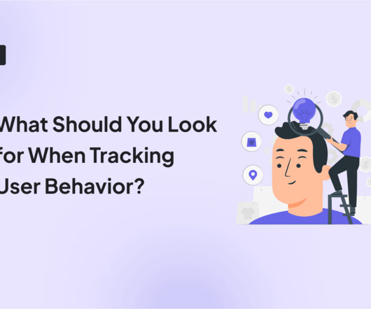
Click tracking is an essential method for uncovering weak spots in the product UX and the user flow by analyzing how users engage with your UI. This can be a broken link, poor onboarding , confusing UX, etc. The most valuable types of data to track are email click tracking, link click tracking, and UX click tracking.
As a UX designer , you aim to create app designs that facilitate the best experience. Usability refers to how easy it is for users to interact with your product’s UI and complete a specific action. ” 5 UX design principles to follow for providing the best experience : Usability first. The four elements of UX.
TL;DR User behavior patterns refer to the common behaviors people demonstrate while using an app. A/B tests help you test two or more variations of UX to find the one that’s better aligned with your users’ preferences. User behavior refers to the way users interact with your app and its features. Userpilot path analysis.
Quantitative data Quantitative data refers to insights that can be quantified and expressed using numbers. Product metrics: Track product health and user adoption with analytics dashboards using product analytics tools (like Userpilot) to monitor system performance, error rates, and key activation metrics.
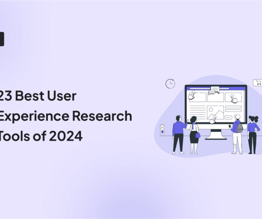
Unfortunately, that technology isn’t here yet, so UX research tools are the next best thing. This article will highlight 23 of the best UX research tools available in 2024. TL;DR UX research tools help collect and analyze data on user interactions to improve product usability and satisfaction.
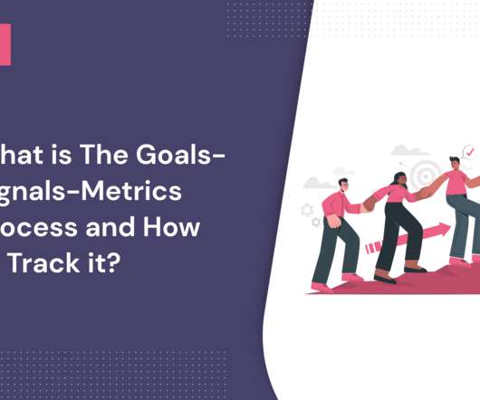
The goals-signals-metrics process consists of outlining the goals of a product or feature, identifying signals of success, and then building metrics to track on a dashboard. Google’s HEART framework is a method that focuses on improving the UX of your product. Why is the goals-signals-metrics process important for UX?
But it could do better by guiding users directly into their personalized workspace after setup instead of using a general dashboard. ‹ › Airtable onboarding. Customer onboarding in software refers to the structured process where new users are introduced to a product’s features and functionalities. What can you learn from Airtable?
It lacks other analytics reports such as cohort retention reports, path analysis, and custom dashboards. The platform offers several analytics reports, and you can even set up custom dashboards to track relevant reports. out of 5 stars Pricing: Available on request Supported devices: Web and mobile Dashboard of Pendo.
Data visualization, for example in a dashboard, aids in its interpretation and trend tracking. Improve data-driven decision-making Data-driven analytics enable product managers, marketers, UI/UX designers, and customer success managers to make informed product and business decisions. This is priceless for optimizing product funnels.
Using Amplitude’s dashboards, you can get a bird’s eye view of all your relevant charts. Amplitude Analytics dashboards. Using Amplitude’s dashboards, you can get a bird’s eye view of all your relevant charts. Moreover, you can also save cross-project charts in the same dashboard and draw a side-by-side comparison.
Sometimes, cross-platform development may not even be the best option for software projects including streaming, graphs, and dashboards. App development It refers to the development of applications for usage on mobile devices. Knowledge of back-end computing and APIs. Programming languages: HTML, CSS, JavaScript.
TL;DR Customer success software refers to tools that help manage customer experiences and drive customers toward their desired outcomes. Additionally, good tools allow you to visualize data through different dashboards, charts, or graphs. Either use pre-built dashboards or create custom dashboards with metrics of your choice.
Marketing Resource Management (MRM) refers to a set of marketing technologies and processes focused on streamlining and centralizing marketing assets, operations, workflows, and information into a single system. CRM refers to the strategies, technologies, and processes used to develop and maintain customer relationships. Conclusion.
Free tools cost nothing and offer basic tools like event tracking , user segmentation, reporting features, dashboards , and visualizations, but are limited in data processing, lack customizations and technical support, and have no integrations with other apps. Analytics dashboards. A dashboard from Mixpanel. Source: UXtweak.
UXPressia – Best for UX research into the customer’s journey. The map will lose its impact as a quick reference tool if it’s too cluttered or complex. Analytics dashboards : View all key data points from a single location with the analytics dashboard. You can also build custom dashboards.
If you’re short on time, refer to the summary table below: Tool name Best for… Free plan? Product teams can use Mixpanel to create tailored reports and dashboards to facilitate data-driven decision-making. Design teams collect user feedback on their product interactions to optimize the UI/UX design and improve product usability.
UI/UX Communication Tools. You can also reference your history in it. #4 The intuitive dashboard manages all your apps. Usersnap’s dashboard with labels and a personalized list view helps you in easy issue status tracking. Let’s check out some of the popular screen capture tools. Table of Contents. 1 Nimbus Capture.
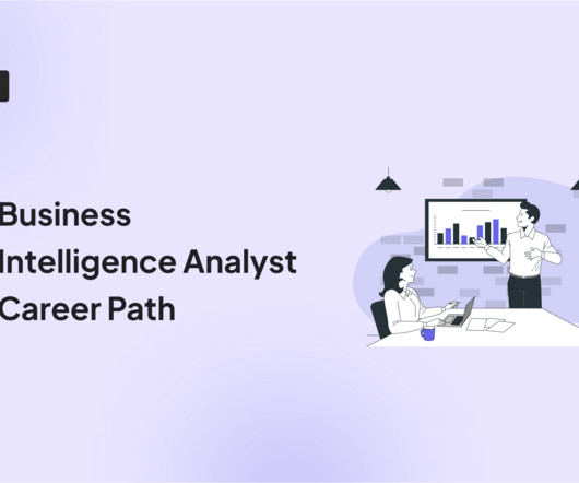
UX/UI Design and Research Teams Can Use Userpilot to: Recruit Users for Usability Tests with Usage Analytics and Segmentation Collect User Feedback with In-App Surveys Understand Product Usage with Product Analytics Get a Demo 14 Day Trial No Credit Card Required What is a business intelligence analyst? Book a demo to see it in action!
User sentiment, also known as customer sentiment, refers to how users feel about a product, service, brand, or even an industry. What is customer sentiment analysis and how does it work Customer sentiment analysis refers to the process of examination of a user’s thoughts and feelings about their interactions with your brand.
Definition and Core Components Outsourced software product development refers to the practice of delegating all or part of the software development lifecycle to an external partner. Slack: Outsourced initial UI/UX design to a Canadian agency, enabling a rapid launch in 2013. What Is Outsourced Software Product Development?
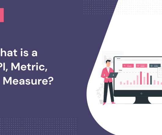
What does metric refer to in SaaS? A metric refers to any quantitative measure that can be used to track business performance. Trial-to-paid conversion rate refers to the number of users who switched to the paid version of your product after their trial period. Geckoboard Dashboard. Databox Dashboard. Geckoboard.
Userpilot can help you track and optimize quantitative and qualitative metrics by improving the onboarding experience with interactive walkthroughs, tracking in-app behavior to trigger contextual flows, sending microsurveys to collect user feedback, and accessing powerful insights in an analytics dashboard. What are quantitative metrics?
Measuring customer satisfaction with NPS surveys is crucial because satisfied customers are more likely to refer others to your business and stay loyal to your service. Are user experience surveys interrupting the user experience so much that they are the source of your negative UX reviews? What should we improve?
We organize all of the trending information in your field so you don't have to. Join 96,000+ users and stay up to date on the latest articles your peers are reading.
You know about us, now we want to get to know you!
Let's personalize your content
Let's get even more personalized
We recognize your account from another site in our network, please click 'Send Email' below to continue with verifying your account and setting a password.


Let's personalize your content