This site uses cookies to improve your experience. To help us insure we adhere to various privacy regulations, please select your country/region of residence. If you do not select a country, we will assume you are from the United States. Select your Cookie Settings or view our Privacy Policy and Terms of Use.
Cookie Settings
Cookies and similar technologies are used on this website for proper function of the website, for tracking performance analytics and for marketing purposes. We and some of our third-party providers may use cookie data for various purposes. Please review the cookie settings below and choose your preference.
Used for the proper function of the website
Used for monitoring website traffic and interactions
Cookie Settings
Cookies and similar technologies are used on this website for proper function of the website, for tracking performance analytics and for marketing purposes. We and some of our third-party providers may use cookie data for various purposes. Please review the cookie settings below and choose your preference.
Strictly Necessary: Used for the proper function of the website
Performance/Analytics: Used for monitoring website traffic and interactions
They are ignoring brand-driven consistent UX and often associate digital banking with just adding standard features. Differentiation: In a crowded market, your brands unique personality and approach set youapart. The user journey-from the first login screen to the advanced investment dashboard-must reflect the institutions identity.
What’s product differentiation? What differentiation strategies can a product manager use to make the product stand out in a saturated market? Product differentiation is about highlighting the features of your product that make it stand out on the market. Mixed differentiation uses both objective and subjective criteria.
This case study reveals how Rumi Cosmetiques doubled its conversion rates and saw a 75% increase in adds to cart within a week, thanks to strategic changes in their user experience (UX) design and conversion rate optimization (CRO). An expertly crafted UX design ensures that customers glide through your site like butter on a hot skillet.
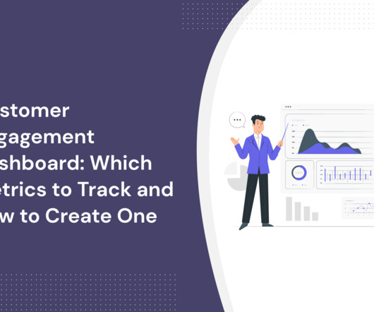
A customer engagement dashboard is invaluable for interpreting customer data and making the right business decisions. Read on to learn how to choose the right engagement metrics for your dashboard and how to build one code-free. User engagement dashboard tools to consider: Userpilot, Amplitude, and Mixpanel.
Wheres the authenticity, the cutting-edge aesthetics or the refined UX that we know customers crave from a premium digitalservice? How toApply: In UX/UI: Surprise users with playful iconography, Easter eggs or custom animations. Wheres the brand identity?
Understanding data visualization UX best practices is key to creating compelling visuals that produce digestible insights, empowering users to make informed product management decisions. Use colors to differentiate data points and keep your color selection inclusive. This will make your data more actionable.
I find that every business requires at least these 8 product/market fit hypotheses that make up their product strategy, but your specific business may have more: Target audience Problem you're solving Value propositions Strategic differentiation Competition Acquisition strategy Monetization strategy Key performance indicators (KPIs).
What UX trends are shaping the SaaS industry in 2022? There’s no denying that UX design plays a significant role in the design of SaaS products. A UX design trend occurs as a result of a change in user behavior or the adoption of new technologies. Decluttered UI’s are another UX trend.
Five years ago, including embedded analytics in an application was a powerful way for product teams to differentiate their applications, reduce customer churn, and charge more for their products. Reduce Security Friction Points: If you want your customers to make use of embedded analytics, start by making the dashboards easy to access.
Google Trends helps businesses differentiate products in crowded markets by identifying evolving consumer interests and regional search behaviors. Google Analytics 4 offers advanced tools for understanding cross-platform customer behavior, aiding product differentiation and tailored offerings in a competitive market.
Click tracking is an essential method for uncovering weak spots in the product UX and the user flow by analyzing how users engage with your UI. This can be a broken link, poor onboarding , confusing UX, etc. The most valuable types of data to track are email click tracking, link click tracking, and UX click tracking.
Explore here to differentiate between web vs mobile development for projects. Sometimes, cross-platform development may not even be the best option for software projects including streaming, graphs, and dashboards. When developing a software application, the important thing is to consider cost efficiency.
You might also be interested in Mobile app KPI dashboard examples and how to use them What is customer retention and why is it so important? Steve used to preach how UX is about balance in design and function and both are just as important. That motto was inscribed into Apple’s simplistic design philosophy.
Mixpanel provides robust event analytics with features like funnel analysis , cohort analysis, A/B testing, and customizable analysis reports and dashboards. Amplitude excels in mobile and web analytics, offering deep behavioral insights, user journey mapping , A/B testing , and customizable dashboards. LogRocket’s main dashboard.
Whiteboard template includes mission, pricing, features, strengths, weaknesses, and differentiators , helping teams visually map and compare competitors. Monday targets various industries, offering customizable dashboards and visual project boards with tiered pricing. Refining UI/UX for ClickUp. Whiteboard template in Aha.io
User Experience is a key factor regarding the success of a digital product, and the main ingredient to an excellent UX lies in a thorough user-centered approach. In that sense, Imaginary Cloud is introducing a new UX Audit service focused on providing high-quality professional UX Audits. What is a UX Audit? Conclusion.
Next, you can find out more about their in-app behavior and the features they use from the Features & Events dashboard. Your value metrics will be your main price differentiator. Apart from limiting usage, you could also differentiate your plans based on additional features. User differentiation in Userpilot.
Product analysis benefits teams from across the organization, including your product , marketing , customer success , and UX design colleagues. You can use it to refine your marketing , differentiation , and pricing strategies. It can also help them adjust their differentiation and pricing strategy. NPS dashboard in Userpilot.
And the one area that you should never skimp on in your development recipe is user experience (UX). Creating a positive user experience is essential for innovative companies to retain customers, grow their user base, and differentiate from their competitors. Still not convinced UX should be a priority?
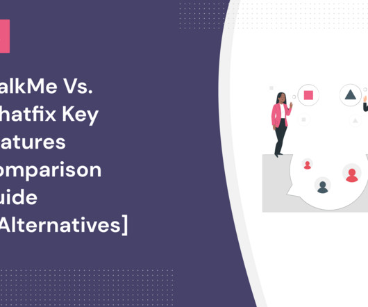
WalkMe dashboard – Source: WalkMe. Set up basic contextual onboarding to differentiate user experience. Whatfix Dashboard – Source: Whatfix. Here’s a rundown of some of the most important differentiating factors: Implementation. Whatfix analytics dashboard. Userpilot onboarding checklist.
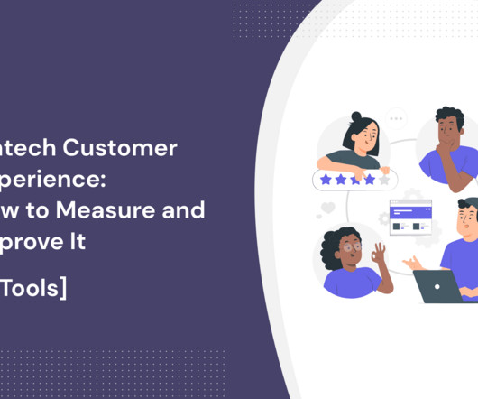
TL;DR The fintech customer experience helps neobanks, cryptocurrencies, and blockchain wallets differentiate themselves from traditional financial institutions. However, this guide will show you how to measure customer experience in the fintech industry, make improvements, and pick the best tools for the job!
Our platform automatically calculates the results—a glance at the dashboard will show you the percentage of promoters, passives, and detractors. Userpilot’s NPS dashboard. The pricing differentiation happens mostly on the service level (e.g. Mixpanel dashboard. Team collaboration dashboard to help your team work together.
Teams will use augmented reality for user onboarding , UI & UX design , testing , and research. Feature engagement dashboard in Userpilot. Greater emphasis on creating an exceptional user experience To remain competitive in 2024, focusing on product functionality as the main differentiators won’t cut it.
As a UX designer , you aim to create app designs that facilitate the best experience. In comparison, user experience ( UX ) is a broader concept, looking at the entire process even before the user interacts with the product. ” 5 UX design principles to follow for providing the best experience : Usability first.
That said, let’s explore some secondary navigation examples, the role of secondary navigation in UX, the key differences between primary and secondary navigation, and share some strategies to aid your navigation. In terms of design, it must be differentiated from the primary menus, including colors, fonts, and placements.
Using Amplitude’s dashboards, you can get a bird’s eye view of all your relevant charts. Amplitude Analytics dashboards. Using Amplitude’s dashboards, you can get a bird’s eye view of all your relevant charts. Moreover, you can also save cross-project charts in the same dashboard and draw a side-by-side comparison.
To be able to complete on price, they compromise on QA which leads to buggy and badly implemented functionality and poor UX. It’s relatively easy to put together a fancy product dashboard to track all the imaginable metrics we believe to be important. Product parity trap and no product differentiation.
The pricing differentiation is based on the number of Monthly Active Users (MAUs) your company has. Zendesk dashboard. Freshdesk dashboard. Includes service-level agreements (SLAs) and real-time dashboards. Tidio chatbot dashboard and features. Document360 dashboard. AI-based automation. AI-powered chatbot.
We built Userpilot to give product and growth teams everything they need to launch interactive product tours and support the sales process by highlighting differentiators in self-serve demos. Adoption reports, funnels, and trend dashboards, no need for separate advanced analytics tools. Deploy A/B testing for your flows with Userpilot.
Product analytics are used not only by the product team but also by the customer success and the marketing team, as well as UX designers and devs. UX designers use product usage analytics to understand how users engage with the product UI, identify friction and make the user experience more intuitive. Userpilot dashboard.
Solution : use in-app surveys to collect qualitative customer feedback, focusing on customer satisfaction and UX improvement. Overcoming this dysfunction with Userpilot Userpilot allows product managers to track all metrics from its dashboards so that you have a clear view of your product performance. Userpilot analytics dashboards.
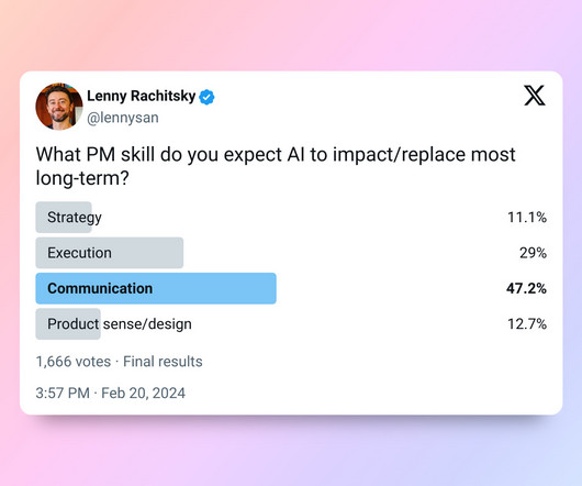
Furthermore, soft skills like product sense, communication, creativity, and being the glue that enables a team to operate at their very best will become even more important (and a differentiator among companies). That being said, I can definitely imagine AI tools will get good at pointing out UX challenges and suggesting best practices.
Userpilot dashboard. Chameleon is a dedicated onboarding tool, with two key differentiators. Drift lets you build and deploy custom chatbots, and with a dashboard that shows live users engaging with the bot, it also lets your agents take over conversations in-person (including over video or email as well as chat) when it suits.
To differentiate between KPIs and metrics, remember this: all metrics are KPIs, but not all KPIs are metrics. Geckoboard is a real-time KPI dashboarding tool that allows users to streamline data from many sources. Geckoboard Dashboard. Databox Dashboard. What’s the difference between a metric and KPI? Geckoboard.
These are most likely to be the key differentiators. Track in-app behavior, analyze data and see the direct impact of the experiences inside the dashboard. Works with: Manages a team of developers, UX designers, and QA engineers. Product persona: UX Designer. Userpilot product persona example: UX Designer.
Because still – there are some differentiators that may affect your choice. Appcues comes second-next, with really nice UX and UI. Userguiding and Product Fruits offer more features, but have very clonky and buggy UX and UI, which makes them feel ‘half-baked’ and offers a poor user experience. User-friend UX and UI. ?
Marketing teams need them to develop positioning and differentiation strategies and to orchestrate marketing campaigns that resonate. An NPS dashboard in Userpilot. Custom dashboards. So that they don’t want to switch to competing products. It’s not only the product team that needs customer insights.
Userpilot can help you to: collect feedback for customer sentiment analytics, analyze customer profiles , access the NPS dashboard , and create customized in-app flows to improve customer sentiment. Great for measuring customer loyalty and differentiate between promoters, passives, and detractors. NPS dashboard on Userpilot.
Blank states are the empty areas in your product dashboard that usually appear when someone uses your product for the first time and hasn’t completed any actions yet. That being said, overdoing it is a common UX design mistake. Reduce visual noise by balancing tooltips with hotspots, which are less invasive on the screen.
The pricing differentiation is based on the number of Monthly Active Users (MAUs) your company has. Pros & Cons Pros: It has one of the best UX in the market, with interactive interfaces and clean design. Alchemer dashboard. The dashboard needs more filters and sorting options. Survicate dashboard.
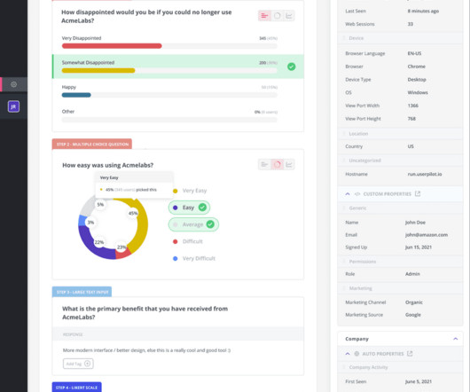
If it turns out, however, that your product is all bee’s knees, the voice of the customer that you capture can be extremely valuable for tailoring your marketing copy for different user segments and tweaking your differentiation strategy. NPS dashboard in Userpilot. How would you feel if you could no longer use our product?
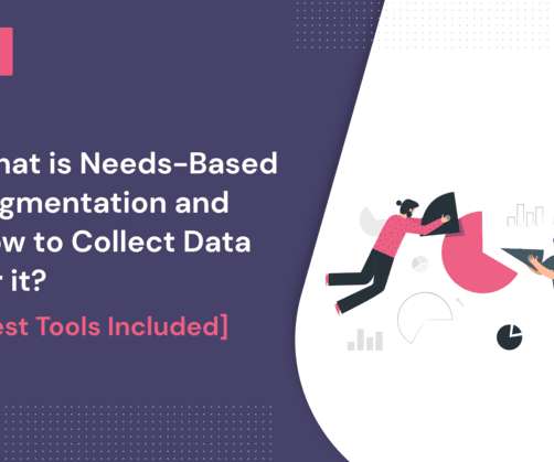
In SaaS, there are 4 most common needs-based segments that you need to differentiate. Needs-based segmentation allows you to deliver a personalized UX for new users. Segment dashboard example. Best Tools Included] appeared first on Thoughts about Product Adoption, User Onboarding and Good UX | Userpilot Blog. Onboarding.
For instance, Userpilot’s detailed analytics dashboards make it easy for any SaaS product team to get granular with user behavior data and extract actionable insights. Niche features can be a powerful differentiator and build loyalty within that particular audience. Too many metrics to track?
The time tracking feature doesn’t differentiate between billable and non-billable time. If you sign up for most SaaS products, one of the first things you’ll see is an empty dashboard. The effort for them to create the first item on the dashboard seems so much greater when there’s nothing else there. The post What is PARO?
We organize all of the trending information in your field so you don't have to. Join 96,000+ users and stay up to date on the latest articles your peers are reading.
You know about us, now we want to get to know you!
Let's personalize your content
Let's get even more personalized
We recognize your account from another site in our network, please click 'Send Email' below to continue with verifying your account and setting a password.


Let's personalize your content