This site uses cookies to improve your experience. To help us insure we adhere to various privacy regulations, please select your country/region of residence. If you do not select a country, we will assume you are from the United States. Select your Cookie Settings or view our Privacy Policy and Terms of Use.
Cookie Settings
Cookies and similar technologies are used on this website for proper function of the website, for tracking performance analytics and for marketing purposes. We and some of our third-party providers may use cookie data for various purposes. Please review the cookie settings below and choose your preference.
Used for the proper function of the website
Used for monitoring website traffic and interactions
Cookie Settings
Cookies and similar technologies are used on this website for proper function of the website, for tracking performance analytics and for marketing purposes. We and some of our third-party providers may use cookie data for various purposes. Please review the cookie settings below and choose your preference.
Strictly Necessary: Used for the proper function of the website
Performance/Analytics: Used for monitoring website traffic and interactions
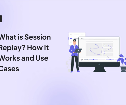
Without effective UX analytics that goes beyond collecting data, you’re losing valuable customers. This article will help reduce such churn by refining your product management and UX analysis approach. It covers key topics, such as: Defining UX analytics. Why UX analytics should go beyond quantitative data.
Video onboarding can be the solution you need when text-only tutorials are driving your users away. But videos provide a more human way to guide and demonstrate how your app works, and drive customer retention. However, a video thumbnail of a GIF breaks that pattern, because it piques curiosity and motivates users to click.
They are ignoring brand-driven consistent UX and often associate digital banking with just adding standard features. Digital artifacts, such as explainer videos, interactive calculators and gamified content provide an additional layer of engagement that informs as well as entertains.
UX does matter. So, let’s have a closer look at the most important UI/UX issues to bear in mind when assuring the quality of financial products. Businesses can focus on UX/UI testing for accessibility. During testing UX, the team should make sure the path to entering biometrics is simple and quick.
The results reveal that companies integrating UX Research into their growth strategies see significant improvements in conversions, engagement, and retention, with well-documented returns on investment. This fundamental gap in understanding is where UX Research becomes not only valuable but essential for driving authentic and lastinggrowth.
Custom dashboards to track key metrics at a glance. Pendo The dashboard on Pendo. Additional reports: You get a built-in Product Engagement Score dashboard. Lack of templates: There arent many ready-to-use dashboards or templates to get started quickly. A/B and multivariate testing for optimizing user experiences.
This article is a practical guide for UX designers who want to e xplore immersive design — from key terms to real-world use cases. Common Terminology & Pillars in Immersive UX Creating a truly immersive AR or VR experience depends on several important elements. Table of Contents What Is an Immersive World?
Poor mobile UX design leads to high bounce rates, abandoned carts , and negative app reviews. We covered: What mobile UX design is (and how it differs from desktop UX). Actionable mobile UX best practices to give your app a competitive edge. What is mobile UX design? Why is mobile UX design important?
Reports & analytics : Provide tailored analytics, dashboards, and reporting capabilities to track customer engagement, identify trends , and enable data-driven decision-making for improved customer success. Reporting and dashboards for outcome tracking. Reporting and dashboards for keeping a real-time pulse on customer sentiment.
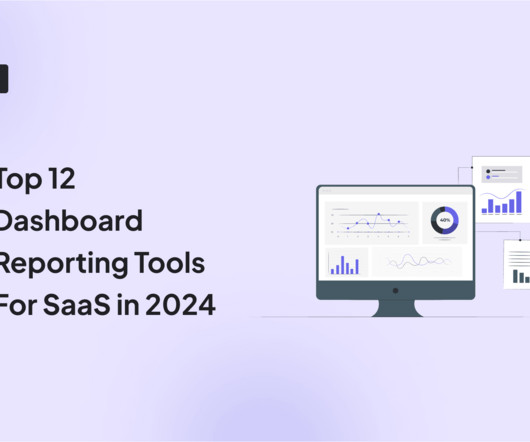
As you’re researching dashboard reporting tools, you’ve probably noticed how hard it is to find reliable information on the available solutions. To make your life a little bit easier and help you choose the best dashboard analytics tool for your SaaS, we’ve produced a guide of 12 excellent platforms available on the market in 2024.
A good SaaS UX design is critical to a successful SaaS product in today’s constantly evolving and competitive market. In this article, we will examine what an effective SaaS UX design is, why it’s important, and the best practices to produce a well-crafted design that works. What is SaaS UX design? Creating S.M.A.R.T
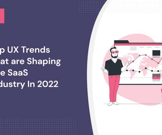
What UX trends are shaping the SaaS industry in 2022? There’s no denying that UX design plays a significant role in the design of SaaS products. A UX design trend occurs as a result of a change in user behavior or the adoption of new technologies. Decluttered UI’s are another UX trend.
She turns to a saved dashboard in their business intelligence tool. Download the UX of Data worksheet. Creating videos. Download the UX of Data worksheet. The less ambiguity, the better. Our Product Manager friend, Sophia, knows this feeling well. She’s been trying to understand the impact of her team’s work on MRR.
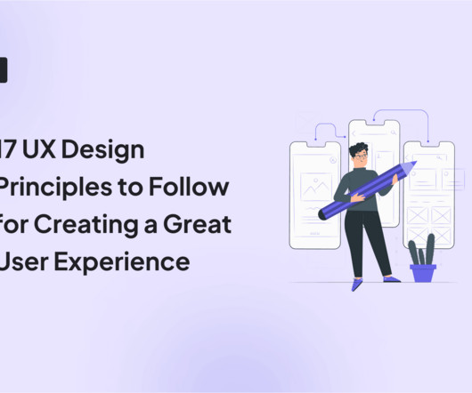
Read this article to discover 17 UX design principles to drive customer satisfaction and loyalty. TL;DR UX design identifies user needs, wants, and pain points and creates engaging products that enable them to achieve their goals. UX design principles are guidelines that aid the process. Let’s dive right in!
Session recordings capture everything that happens on a user’s screen—similar to a video recording of their browser window or app. For example, you can now utilize our platform to generate analytics reports, track specific customer profiles, auto-track user events, and create custom dashboards to visualize your key metrics.
Written by Mary Moore, copywriter at Shakuro As a UI/UX designer or a startup founder, youre likely acutely aware of the countless challenges that come with this task. Virtual Classrooms: These platforms facilitate live teaching sessions through video conferencing and real-time interactions between instructors and students.
For example, here is a video from 2016 that showcases the vision for SpaceX's Interplanetary Transport System which aims to bring the first manned crew to Mars. Execution: Metrics Dashboards. Too many metrics as well as too few metrics are both challenges that can make dashboards ineffectual.
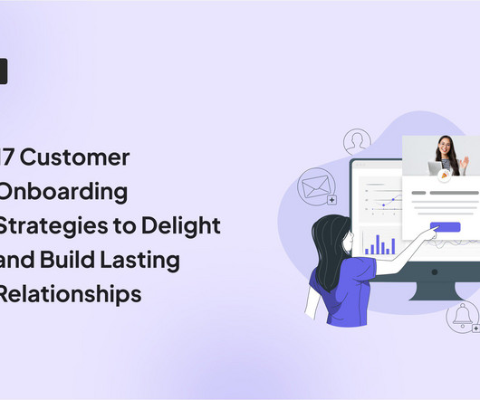
As a product manager, you probably already understand the importance of a great onboarding UX design and its importance for customer journey optimization and user retention. TL;DR Onboarding UX refers to the design framework that shapes how users interact with your product during onboarding. Some of the most common ones include: 1.
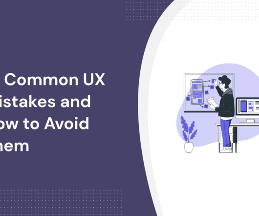
UX mistakes will disrupt the user experience and undervalue your product. This article shows you 14 common UX mistakes designers make, plus how to avoid them and build fantastic product experiences. Optimizing for search engines and not humans While SEO is important, it shouldn’t come at the expense of good UX.
30-Second AI Solutions From idea-to-script-to-publish with an AI video creation copilot It’s the weekend, and I’m feeling lazy. It integrates with InVideo to fully script and generate AI videos with voiceover narration. The video was longer than making it! You can generate 10 mins of AI video a week, so roughly 4 short vids.
You don’t want to send project managers on the ideal path for UX designers, after all. A good resource center can host onboarding flows , how-to guides, video tutorials, FAQs, and knowledge-base documents. You can think of this as a 3-step process: Start by segmenting your power users by personas. Effort required to resolve the issue.
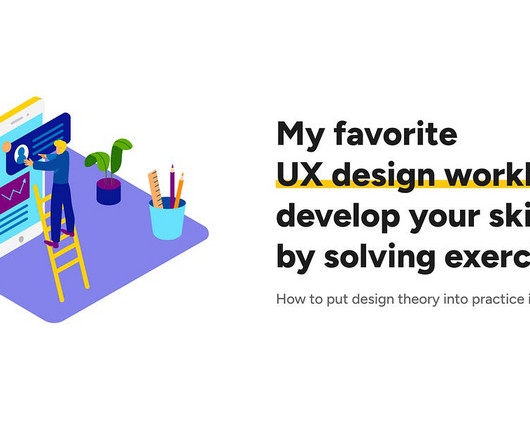
DESIGN WORKBOOKS How to put design theory into practice in an efficient way My favorite UX design workbooks: develop your skills by solving exercises Learning design theory is a good step towards becoming a better designer, but it is also important to put the things you’ve learned into practice.
What's the difference between UX vs CX? UX deals with a user's interactions with specific aspects of your product, while CX is broader and covers all customer engagements with your brand. Read on to find four key differences between UX and CX and how to improve both. That's not entirely true.
But it could do better by guiding users directly into their personalized workspace after setup instead of using a general dashboard. ‹ › Airtable onboarding. The main purpose of Loom’s onboarding is to help users start recording as soon as possible, which is perfect for a tool designed for instant video communication.
When you first log in to Platformly, you’re greeted with an empty dashboard. This empty state is designed to drive you towards creating your first dashboard. Here you can see a button that says “Dashboard Walkthrough”. Clicking the walkthrough CTA on this dashboard page triggers this modal to appear.
We’re not going to pretend here you can prevent UX debt. Let’s face it: UX debt, just like technical debt, is unavoidable. Talking about UX debt, under such circumstances, may feel a lot like this: “When your city is getting bombed and someone comes over and tells you you have an ugly bathroom”. Why does UX debt happen?
AI-driven user testing, video insights, plus seamless app distribution and expert resourcesâ discover Centercode 10x. Connect the Tools Set up alerting or dashboards in shared tools like Jira, Slack, Zendesk, or Centercode. Start for free , scale as your program grows. Platform Overview Managed Services Compare Plans What's New?
It typically includes features like interactive walkthroughs that help UX designers and marketing teams improve customer satisfaction, drive feature adoption, and reduce time spent on routine customer requests. Instead of juggling countless email threads or Slack messages, you manage everything from a central dashboard.
Factors I consider when evaluating customer analytics tools Important core features Analytics dashboards : Provide real-time visualizations of key performance indicators (like active users and page views) at a glance, so you can easily track changes. Example of a Userpilot dashboard showing free trial to paid user conversion rate.
Unfortunately, that technology isn’t here yet, so UX research tools are the next best thing. This article will highlight 23 of the best UX research tools available in 2024. TL;DR UX research tools help collect and analyze data on user interactions to improve product usability and satisfaction.
His roles over the last 15 years have started with engineering and architecture, and moved on from there to product management, and now he oversees product, but also data science, engineering, and UI/UX teams. You need to start investing in things like systems, automation, feedback loops, and metrics dashboards.
Additionally, good tools allow you to visualize data through different dashboards, charts, or graphs. Analytics dashboards : Track key metrics such as active users , number of sessions , average session duration, or feature adoption within a singular, accessible hub. Userpilot’s analytics dashboard. Customer segmentation.
You might also be interested in Mobile app KPI dashboard examples and how to use them What is customer retention and why is it so important? Steve used to preach how UX is about balance in design and function and both are just as important. Ask yourself, what is something users can only get on your platform? So what now?
This transformation includes features like embedded project videos, infographics that illustrate key achievements, and responsive designs that ensure compatibility across alldevices. Similarly, marketing professionals use multimedia-rich profiles to present campaign success stories with embedded analytics and videos.
Team communication tools: Slack and Zoom offer digital messaging and video conferencing platforms to keep everyone on your team in touch and up-to-date. Team communication tools: Keep everyone on your team in touch and up-to-date with digital chat and video conferencing tools. Userpilot’s growth insights dashboard.
Its core features include: Event tracking : Go beyond pageviews and analyze user clicks, downloads, form submissions, video plays, etc. Dashboards : These are customizable visual displays that provide a quick overview of your website’s performance. Product usage dashboard in Userpilot. Event tracking in Google Analytics.
Loom: showcases its video recording features by providing video tutorials for customer education. Linkgraph: drives customer education using video tutorials. Unlike YouTube, Loom focuses more on private video sharing among colleagues and friends. Loom’s onboarding screen showcases video tutorials to guide new users.
User experience (UX) refers to how easy it is for users to accomplish their goals inside the product. User experience (UX) is based on specific user interactions inside the product. It’s made up of the UX and the emotional and perceptual responses that it produces. Goals dashboard in Userpilot. Let’s dive in!
” However, a qualitative analysis relies on text, graphics, or videos and explores “why” and “how” events occur. With Userpilot , you can auto-capture in-app user interactions and build analytics dashboards. For instance, evaluating graphics, videos, text-based answers, or impressions. Get a demo.
However, face-to-face testing isn’t always practical, so UX teams turn to remote usability testing as an alternative. TL;DR Remote usability testing is a UX research method that doesn’t require meeting the participants face-to-face. During the test, create a relaxing atmosphere. Don’t interfere unless testers get stuck.
Send onboarding emails with important resources Use your welcome email to present resources (such as videos and links to external resources) to the user that you can’t put in the onboarding flow. Immediately after signup, your Loom dashboard is populated by videos from Loom. Loom empty state videos.
Create video tutorials catering to different learning styles that show how to use features. Use heatmaps to discover areas of user friction and identify UX issues. Create analytics dashboards tracking key onboarding metrics like activation and adoption rates. Creating such videos isn’t challenging either.
Card layout The card layout trend is relatively new in UX design (popularized by Facebook and Twitter) but has already won many supporters. Storyboarding is a useful document for mobile product managers and UX/ UI designers to reflect user experience in screenshots of mobile devices. Example of mobile app storyboarding.
This is especially true when they’re used during signup to show dashboard screenshots, positioning messages, etc. But it can seem like something you can’t find a way around—particularly when your platform requires users to populate their dashboards themselves. It makes sense, as Loom is a video tool.
We organize all of the trending information in your field so you don't have to. Join 96,000+ users and stay up to date on the latest articles your peers are reading.
You know about us, now we want to get to know you!
Let's personalize your content
Let's get even more personalized
We recognize your account from another site in our network, please click 'Send Email' below to continue with verifying your account and setting a password.


Let's personalize your content