This site uses cookies to improve your experience. To help us insure we adhere to various privacy regulations, please select your country/region of residence. If you do not select a country, we will assume you are from the United States. Select your Cookie Settings or view our Privacy Policy and Terms of Use.
Cookie Settings
Cookies and similar technologies are used on this website for proper function of the website, for tracking performance analytics and for marketing purposes. We and some of our third-party providers may use cookie data for various purposes. Please review the cookie settings below and choose your preference.
Used for the proper function of the website
Used for monitoring website traffic and interactions
Cookie Settings
Cookies and similar technologies are used on this website for proper function of the website, for tracking performance analytics and for marketing purposes. We and some of our third-party providers may use cookie data for various purposes. Please review the cookie settings below and choose your preference.
Strictly Necessary: Used for the proper function of the website
Performance/Analytics: Used for monitoring website traffic and interactions
When your company adopts multiple SaaS solutions to drive productivity, you unknowingly create a perfect storm for data fragmentation. Your customer information lives in Salesforce, while your support tickets are in Zendesk, your product usage data in Mixpanel, and your marketing campaigns in HubSpot. Sound familiar?
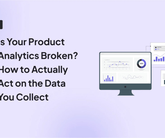
Without effective UX analytics that goes beyond collecting data, you’re losing valuable customers. Unfortunately, the research backs this up, with a staggering 90% of users reporting that they stopped using an app due to poor performance. Basically, anything that ruins the userexperience.
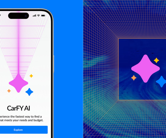
Transforming userexperience in cars-as-a-service industry through Strategic AI/ML Integrationa UX casestudy. Overview This case study focuses on integrating AI/ML to improve userexperience in the car-as-a-service automobile marketplace. Image Credit: Karena E.I Image Credit: Karena E.I Image credit: Karena E.I
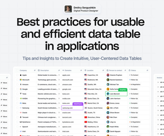
Tips and Insights to Create Intuitive, User-Centered DataTables Data tables provide a structured way to organize and manage information, making it easier to analyze and visualize data effectively. Well-designed tables enable users to access, analyze, and act on critical information quickly and accurately.
Think your customers will pay more for data visualizations in your application? Five years ago they may have. But today, dashboards and visualizations have become table stakes. Discover which features will differentiate your application and maximize the ROI of your embedded analytics. Brought to you by Logi Analytics.
How Rumi Cosmetiques Boosted UserExperience and Conversion Rates in eCommerce: A Case Study for Marketers andManagers Discover how Rumi Cosmetiques achieved a 75% increase in cart adds and doubled conversion rates by enhancing userexperience and conversion rate in eCommerce.
Mike explains that traditional market analysis might take weeks of research, but with AI assistance, teams can gather initial market insights, including total addressable market (TAM) and serviceable market data, in minutes rather than weeks. This allows for immediate testing and validation of the userexperience.
Read more » The post How Duolingo uses AI to enhance its userexperience appeared first on Mind the Product. We caught up with Edwin Bodge, Principal Product Manager at Duolingo, to learn more about its product strategy, how AI has helped, and where the product is heading next.
Instead of trying to eliminate these biases, a neuroscientific approach harnesses them for goodgently guiding users toward better decisions through well-timed nudges and simplified choices. It is also counterintuitive to think that less information might actually benefit users. In practice, it actually does the opposite.
Dashboard design can mean the difference between users excitedly embracing your product or ignoring it altogether. Great dashboards lead to richer userexperiences and significant return on investment (ROI), while poorly designed dashboards distract users, suppress adoption, and can even tarnish your project or brand.
I’ve seen first-hand how tiny data-driven tweaks can lead to massive business results, and I’m going to share how to accomplish those with a little case study. A SaaS company I recently worked with had over 50 million active users enjoying a host of great free features. Yeah… these aren’t accidents. The Result?
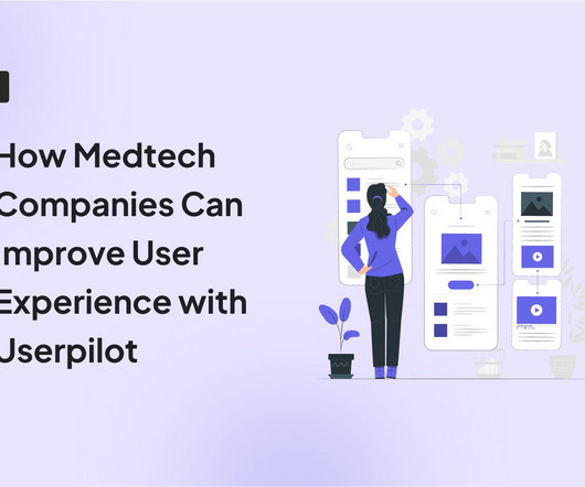
Personalize care and experiences Most patients only use medtech tools a few times a year, so there’s always that anxiety with navigating products after a long while. Instead of leaving users to themselves, Userpilot lets you collect behavioral data and use that to continue shaping their product experiences, ensuring they never get lost.
Case Study: Improving Data-Driven Decision Making for CSR Leadership Civian is a data-driven platform designed to help businesses measure, optimize, and showcase the social and economic impact of their investments in communities. Feature Engagement Users most frequently gravitated toward the map to explore and compare data.
You can gather all the user feedback or behavioral data you want or even generate tons of Google Analytics reports. Kevin has almost a decade of experience working at some of the world’s most innovative software companies. This causes siloed data and integration issues.
We’ll explore essential criteria like scalability, integration ease, and customization tools that can help your business thrive in an increasingly data-driven world. You’ll discover how successful companies align BI capabilities with their growth strategies and learn what to look for when it comes to user adoption and implementation.
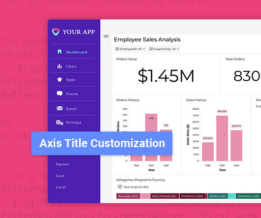
Fixed Lines for Charts: Set static reference points to highlight key data trends. Grid Paging with Sorting: Instantly organize data with new column sorting capabilities. Optimized Data Label Placement: Improved visibility for column and bar charts. Improved Readability: More descriptive labels mean faster data interpretation.
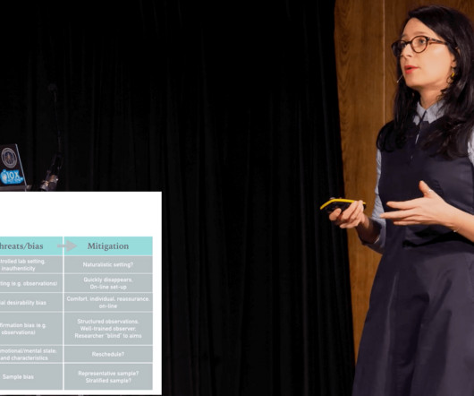
In this #ProductTank London talk from 2019, researcher Martina Kuvalja looks at the application of userexperience(UX), types of research methods, and bias and sampling. Read more » The post Sunday Rewind: How accurate is your UX research data? By Martina Kuvalja appeared first on Mind the Product.
Website feedback and online surveys : These collect opinions about digital experiences, focusing on usability and content quality. Businesses can use this feedback to improve website navigation, enhance userexperience, and drive conversions. This format efficiently gathers quantitative data and identifies common themes.
Often, these requests are made without supporting data or customer feedback, which can create tension between PMs and top-level executives. Use data to support your position and explain the trade-offs. Suggested Solution : The key is to respectfully push back when necessary.
Speaker: Amy Bucher, Ph.D., Vice President of Behavior Change Design, Mad*Pow
Why motivation is the key to user empowerment. How to determine the data needed to effectively personalize a product. Best practices for personalization that fit timeline and budget while empowering users. In this webinar, you will learn: The basics of motivation and the types of motivation that last.
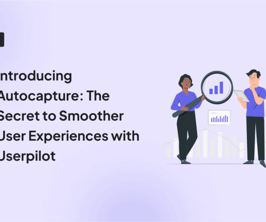
The feature eliminates the need for manual event tracking and provides access to historical event data. To use the feature, enable autocapture in Settings (scroll down to Raw data settings). To use the feature, enable autocapture in Settings (scroll down to Raw data settings). And the data is actionable. This takes time.
Figure 1 depicts a simple software architecture that consists of three layers: user interface, business logic, and data. A feature team might then develop the capability that allows users to see their eating trend, for instance. It would implement the feature as a vertical slice, from the user interface down to the data layer.
Wouldn’t it be great to see all user interactions with your product as they happen? Think about all the insights you could gather to improve the userexperience. Identify points of user frustration and friction Session replays allow you to see where usersexperience friction and diagnose the causes of their frustration.
It assumes, though, that enough good-quality data is available to make reasonably reliable predictions. This is unlikely to be the case for disruptive innovations, as I discuss below, as well as specialised products with a comparatively small user base, like tailored IT solutions. Take the original iPhone as an example.
Qualitative data from UXers should not compete against the quantitative data product owners need for their business model. Storyboarding is a simple way to start integrating both perspectives into a complete picture of how the userexperience impacts the business model. Qualitative vs. Quantitative is a silly argument.
While “use data to drive decision-making” sounds obvious, there’s a HUGE gap between saying it and doing it well. Product analytics refers to the process of gathering and analyzing data on how users interact with a product. This process may reveal gaps such as: Insufficient raw data. Outdated technology.
If there is one thing thats altering the way we create userexperience (UX) designs and conduct research in 2024, it is definitely artificial intelligence (AI). Well start with an overview and explore how AI can take on tasks such as analyzing userdata and automated prototyping to help professionals connect with users on a humanlevel.
This level is evident since we all want to design user-centered products that align with businessgoals. Userexperience: Measure how UX research impacts the userexperience. Task success rate measures how effectively an individual user completes tasks. Frequency of referencing research data.
You have the analytics data, but it doesn’t tell the whole story. You know what users are doing, but not why. This powerful tool allows you to see your website or web app through your users’ eyes. It reveals the “why” behind their actions and unlocks valuable insights to improve the userexperience.
Storyboarding is a simple way to integrate Qualitative and Quantitative perspectives into a complete picture of how the userexperience impacts the business model. In this session, you'll learn: How to integrate qualitative insights on userexperience with a business model based on numbers.
You know your product collects tons of data. Data visualization tools help turn your messy spreadsheets into clear, interactive insights. The best ones dont even need SQL or data science skills. Because product analytics should be easy and accessible for everyone, not just data experts. What are data visualization tools?
From Raw Data to Clarity — Cleaning, Sorting, and Synthesising Insights Part 4 (of 5) of the UX Research Playbook series Synthesising qualitative data is similar to reaping the harvest after the diligent effort poured into research — it’s the step where hard work blossoms into meaningful insights. Mural , Miro , etc.) is recommended.
Unveiling the User’s Essence: The Data That Drives UX To “sell the pen” effectively, you first need to know who needs it and why. The quality work of a UX designer in e-commerce relies on a deep understanding of the user, supported by a combination of data. User interviews, focus groups, usability tests, surveys.
Collecting data at every touchpoint and simplifying the userexperience would be a huge effort for old insurance companies. 12:41] How are you using data? We collect behavior data and customer feedback to improve the userexperience. 21:09] How do you discover how to make a better userexperience?
Speaker: Jay Allardyce, Deepak Vittal, Terrence Sheflin, and Mahyar Ghasemali
As we look ahead to 2025, business intelligence and data analytics are set to play pivotal roles in shaping success. Understanding these trends is not only essential to staying ahead of the curve, but critical for those striving to remain competitive and innovative in an increasingly data-driven world.
I almost choked on my tea because the value of UX is a good userexperience that solves user problems. Just look at Googles mantra: Focus on the user, and all else will follow. This mantra underscores the shift toward placing user needs at the heart of the design process. ROI should not lead UX decisions.
In reality, UX is multidimensional, and it requires multiple qualitative and quantitative metrics like task success rate, user satisfaction score, and summary of user reviews. Also, when you rely on one metric, the risk of data manipulation increases. More data always leads to betterinsights Data is the new gold.
Thats why Ive curated a list of three top product manager openings at data-driven companies, along with standout candidates who are ready to make an impact. Recommended product manager job openings in data-driven companies Looking for a job in data-driven product management ? Meta Manager, Product Data Operations Meta office.
As we are building products, we often try collecting a lot of data rather than just concentrating on intuition and founder bias to build products. A lot of products either use data to support their founder bias or tell their story. Quantitative data helps define the what of your product and qualitative defines the why of the product.
Ruben Ugarte will be focusing on how to improve all aspects of onboarding experiences by understanding how your current onboarding process is stacking up, and giving you the tools to prioritize what to try changing. With improved onboarding, you'll see less drop-off and a happier userexperience.
In this final part, well explore the broader landscape of common bias traps that can compromise your survey data and discuss strategies to minimise theirimpact. Erika Hall, Just EnoughResearch Confirmation bias occurs when researchers interpret data to support their pre-existing assumptions or hypotheses.
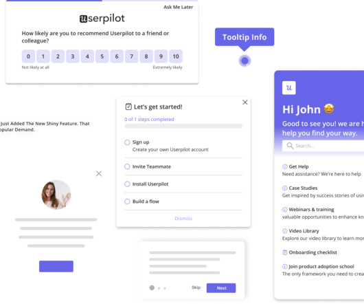
A/B and multivariate testing for optimizing userexperiences. Analytics reports like paths, funnels, and cohort tables for visualizing user behavior data. Session replays to see how users navigate your product. 15+ survey templates (NPS, CES, user satisfaction surveys, etc.) Userpilot Chrome extension.
To put it differently, if the business goal is wrong, you are likely to determine the wrong opportunities and discover the wrong features and userexperience. Apply the method and collect the relevant data. Evaluate the data and adapt the strategy. It’s garbage in, garbage out. It applies to product discovery in general.
User feedback is valuable , but without data, its just opinions. Session replays and heatmaps show user friction , but they dont explain why it happens. To eliminate these blind spots, you need to combine quantitative, qualitative, and visual data. Key differences between data types. How to collect each data type.
Speaker: Edie Kirkman - VP, Digital at Focus Brands
To overcome this challenge, it is crucial to build core product and technology competencies that provide actionable insights through qualitative and quantitative data analysis. By leveraging data-driven insights, companies can accelerate time-to-market, enhance product quality, and align offerings with customer needs.
We organize all of the trending information in your field so you don't have to. Join 96,000+ users and stay up to date on the latest articles your peers are reading.
You know about us, now we want to get to know you!
Let's personalize your content
Let's get even more personalized
We recognize your account from another site in our network, please click 'Send Email' below to continue with verifying your account and setting a password.


Let's personalize your content