This site uses cookies to improve your experience. To help us insure we adhere to various privacy regulations, please select your country/region of residence. If you do not select a country, we will assume you are from the United States. Select your Cookie Settings or view our Privacy Policy and Terms of Use.
Cookie Settings
Cookies and similar technologies are used on this website for proper function of the website, for tracking performance analytics and for marketing purposes. We and some of our third-party providers may use cookie data for various purposes. Please review the cookie settings below and choose your preference.
Used for the proper function of the website
Used for monitoring website traffic and interactions
Cookie Settings
Cookies and similar technologies are used on this website for proper function of the website, for tracking performance analytics and for marketing purposes. We and some of our third-party providers may use cookie data for various purposes. Please review the cookie settings below and choose your preference.
Strictly Necessary: Used for the proper function of the website
Performance/Analytics: Used for monitoring website traffic and interactions
One-click dashboard templates are among a number of tools available within eG Enterprise to allow organizations to rapidly set up targeted and bespoke views for a wide range of audiences across their organizations, whilst avoid the costs and inconsistencies of building and maintaining many individual dashboards.
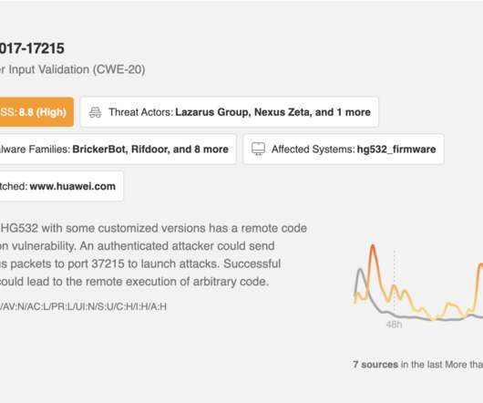
The Leo CVE Dashboard gives you at-a-glance visibility into relevant trending vulnerabilities, and you can use Leo to focus any of your feeds for faster insight into risks impacting your business’s software, hardware, and application stack. All of this information is available at a glance via the Leo CVE Dashboard and throughout your Feeds.
In this blog, you’ll learn: What brand health tracking is and why it’s essential for modern brands The key metrics that reveal brand awareness, loyalty, and competitive positioning Best practices for consistent, high-quality tracking and reporting A phased approach to launching and optimizing your tracking program Let’s break it down.
Their tightly packed visual dashboards organize the data in a way that makes it easy to map out sales funnels, track common paths, uncover behavior patterns, and identify friction points. FullStory is used by enterprises and large organizations but the platform has a few shortcomings: Mobile integrations. Product Analytics.
John Worthington (Director – Customer Success, eG Innovations) and Richard Faulkner (Enterprise Solutions Architect, Conversant Group) presented on the topic: “ End-to-End monitoring for your Citrix infrastructures with a single pane of glass “. Could you please explain the licensing cost for this product [eG Enterprise]?
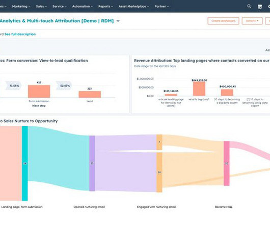
Unify your data to deliver better customer experiences : You can combine data using the flexible and customizable HubSpot marketing dashboards to see the initiatives that yield the best results for your business. For instance, the dropdown menu will show the names of specific blogs or landing pages where the CTA is.
To help you make a decision, in this blog, we will go over the specifics of A/B tests in Mixpanel, uncover its pros and cons, and introduce you to a better alternative. You can analyze Mixpanel A/B testing results using analytics dashboards , funnel analysis , and customer segmentation. Run the test and analyze the results.
This blog will be sharing some of the most informative and interesting development of web3’s favorite NFT marketplace. NFT dashboard/Storefront The NFT dashboard is a display for all the digital assets in the marketplace, open for the users to trade them. The blog discussed is just the tip of the iceberg.
Retention rate and churn rate should again be based on the typical term length and billing period, so if you are dealing in enterprise SaaS, retention rate is number of customers who extended their contract in the period / number of customers whose contracts where up for extension. Churn rate is 1 – retention rate.”
By focusing on real customer feedback and adapting continuously, companies can develop sustainable businesses more effectively, whether they’re new ventures or established enterprises. Top blog posts of Eric Ries to read Eric Ries shares his insights on his blog, Startup Lessons Learned. The Startup Way The Startup Way.
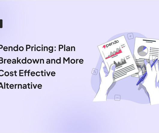
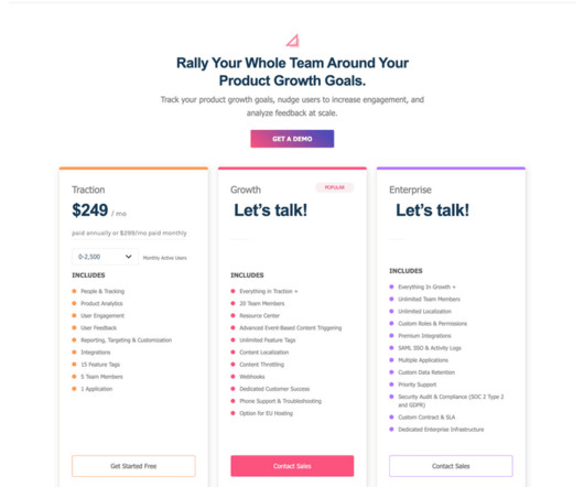
With plans starting at $7,000 per year and enterprise costs exceeding $100,000, many teams are left questioning: Are we overpaying for features we dont even need? In this blog post, well break down Pendos pricing structure, expose its hidden costs, and compare it to a better alternative: Userpilot. Support product growth initiatives.
The Enterprise plans start at $1,667/month and can serve 1B+ events. It has no free plan but its Growth and Enterprise plans are more competitive than Amplitude or Mixpanel plans. Mixpanel dashboard. The Growth plan pricing starts at $20 a month and covers up to 300M events a month. What is Mixpanel? Yes and no.
One of the most impactful steps that your company can take is to create a shared dashboard that connects employees across your organization to a single source of truth. Indicative dashboards allow you to host a collection of KPIs and metrics that update in near real-time so you can keep track of regular business performance.
It has multiple analytics functionalities, including event tracking, A/B testing, customer segmentation, goal tracking, and reporting dashboards. HubSpot reports track all assets, including your website, blog, emails, and social media. There are two main types of events that you can track through HubSpot: traffic and clicks.
Here are the key features to look for in an analytics tool: segmentation, tracking capabilities, A/B testing , and data visualization with analytics dashboards. Mixpanel is a marketing analytics tool that imports data and transforms it into visual and interactive dashboards. Enterprise. Marketing data can be messy and confusing.
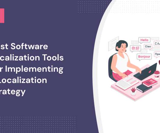
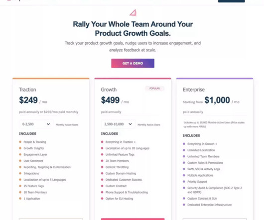
Phrase is an enterprise-level TMS that uses AI and machine learning to automate the translation process. Translation management system for enterprise: Phrase. Enterprise from $1000/month. memoQ software localization tool dashboard. Translation management system for enterprise: Phrase. Growth from $499/month.
UserGuiding’s dashboard. The package is ideal for larger enterprises that have multiple products. Userpilot Userpilot’s dashboard. Userpilot pricing vs UserGuiding pricing Userpilot offers a 14-day free trial along with three subscription packages: Traction, Growth, and Enterprise. Appcues Appcues’ dashboard.
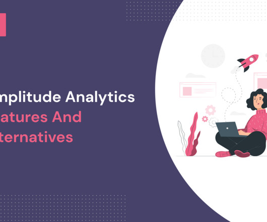
With cross-platform tracking, real-time analytics, powerful behavioral analytics , enterprise-level security measures, and solid customer support, Amplitude Analytics is a powerful analytics solution designed to meet the requirements of modern-day product and growth teams. Amplitude Analytics dashboards. Next, click ‘Add to Dashboard’.
You should consider the following: SMB or Enterprise? Larger enterprises tend to have in-house customer service teams, and if each team member needs an account, the costs can rack up quickly. Delighted Dashboard. Feedier Dashboard. Promoter Dashboard. New NPS Dashboard Userpilot. What we like. What we like.
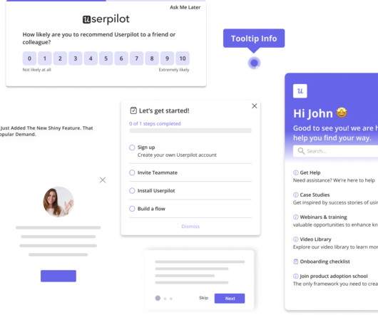
In this blog, we’ll explore her background and the journey that shaped her insights. Teresa has coached hundreds of teams across various industries, from early-stage startups to large global enterprises. Userpilot’s dashboards visualize multiple reports in a single place, so you’re always on top of performance.
Thanks to the Hootsuite integration, you can monitor and manage social media accounts and Zendesk tickets from one dashboard. With Agent Dashboard , you can integrate Looker, Power BI, and Tableau dashboards into Zendesk. Chatdesk Trends automatically tags and identifies patterns in customer feedback from different channels.
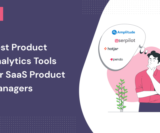
In the blog, we look at 4 well-known product analytics tools, their pros, cons, and most suitable applications. It is a great option for enterprises because it’s SOC 2 Type II-certified and offers robust features for enterprise needs. 1-hour delay for the analytics to appear on the dashboard. Pendo review on G2.
Released GA in March 2021, there is an excellent deep-dive blog from Jeff Barr at AWS now available. eG Enterprise Logon Simulation for Amazon WorkSpaces. From the eG Enterprisedashboard, you can see a breakdown of logon time into different steps. but that’s one for another blog! This makes it simple to implement.
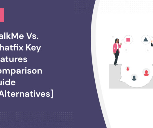
At its core, WalkMe is an enterprise solution for employee onboarding. WalkMe dashboard – Source: WalkMe. Its typical customers are also large, enterprise-level companies with user onboarding needs. Whatfix Dashboard – Source: Whatfix. Whatfix analytics dashboard. What is WalkMe?
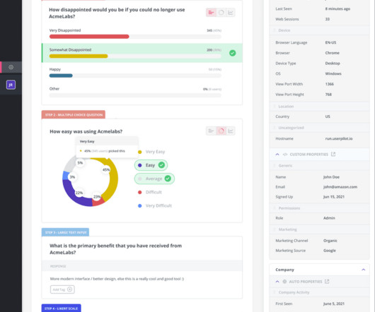
Like Appcues, Userpilot allows you to track goals from the Goals dashboard after you set them from the Chrome extension. The NPS dashboard in Userpilot is more detailed. The NPS dashboard provides you with the total NPS score as well as the breakdown into promoters, passives, and detractors. Appcues analytics: NPS dashboard.
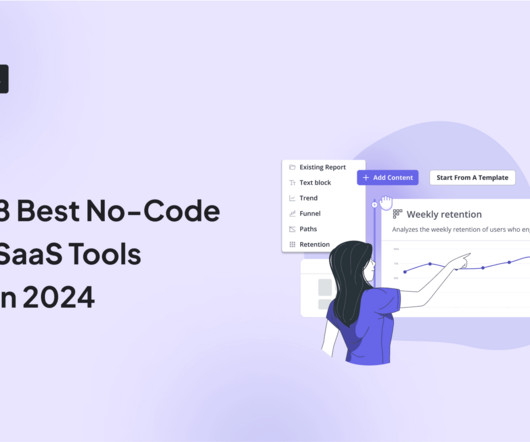
No-code SaaS tools are software products that allow users to create applications, in-app experiences , analytics dashboards or automate marketing processes without writing any traditional programming code. It’s ideal for blogs, portfolios, or any site with dynamic content. Enterprise — Custom pricing. Pricing Free plan.
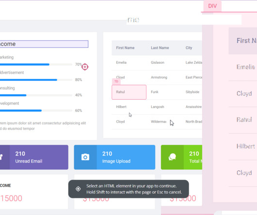
At $1000, it’s as expensive as the Userpilot Enterprise plan but it doesn’t offer similar functionality. Chameleon Dashboard. The Chameleon pricing strategy is built around 3 main plans: Startup, Growth, and Enterprise. The pricing of the Enterprise plan depends on the needs of your business. Userpilot Dashboard.
While their features for in-app guides and user analytics are similar in many ways, WalkMe focuses on employee onboarding for enterprise-level businesses, while Pendo helps create walkthroughs for customer onboarding as well. Strong scalability for large enterprises. WalkMe onboarding segmentation dashboard. UI elements.
Mention is a media monitoring tool that enables collecting user feedback from online conversations across various platforms, like social media, blogs, forums, and news sites. Best for : Enterprise-level customer experience management Pricing : Custom pricing. Pricing : From $49/month, free trial is available.
For businesses, agencies, and brands who need to quickly and simply write business texts (engaging emails, high-converting blogs, etto create. Users can link their data sources to Sparrow Charts, which then has access to all relevant indicators and compiles the data into a single, configurable dashboard.
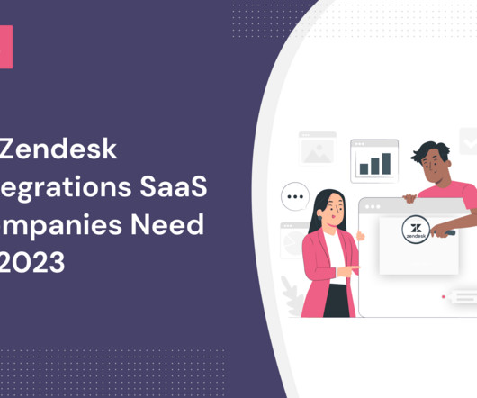
Zendesk stands out as a top customer service platform for enterprise companies, providing omnichannel communication and customizable automation features. Zendesk – best customer service platform for enterprise companies Zendesk is a well-known customer service platform for large companies.
It offers three pricing plans : Growth, Traction, and Enterprise, with a free demo on booking. UserGuiding dashboard. After publishing your content, you can see all user interactions related to it on the analytics dashboard. Userpilot dashboard. What is UserGuiding? Let’s see. UserGuiding guide analytics.
Product analytics software varies but most have similar features, such as data capturing, customized segmentation, and KPI dashboards. KPI and other custom-built dashboards. Heap’s dashboard. Amplitude’s dashboard. They offer personalized payment plans for enterprises but their business plans start from $995 per month.
LiveAgent for enterprises who need a customized help desk platform that fits their needs. Enterprise. As well as unlimited team members, multiple apps, dedicated enterprise infrastructure, and so on. Zendesk dashboard. Freshdesk dashboard. Enterprise plan. Custom pricing and usage limits. Userpilot pricing.
There are plenty of all these blogs “15 alternatives to {Brand Name} that are equally good” that are…plain wrong. Walkme is an enterprise onboarding tool that nowadays caters more to the employee onboarding use case. Best for large enterprises. You may be wondering: “Why is Userpilot writing about Userpilot Alternatives?!”
Userpilot is a powerful tool that’s more directed to mid-market and enterprise-level companies. Enterprise: Custom pricing and usage limits. As well as unlimited team members, multiple apps, dedicated enterprise infrastructure, and so on. The enterprise plan starts at $3,600/mo as you get to 10,000 contacts.
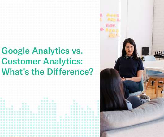
When you install Google Analytics on your website, you gain access to a basic data-dashboard in exchange for sharing insights with Google. For instance, Google BigQuery provides a serverless and low-cost enterprise data warehouse solution with limitless elastic scalability. Website Usage Analytics. See website traffic.
SurveySparrow focuses on improving overall customer experience with an executive dashboard and conversational forms. Analyze with the Analytics Dashboard in Userpilot. Enterprise: It offers custom pricing and usage limits, with unlimited members, localization, and more. Userpilot Plans. Rating Userpilot has a high rating of 4.6
The majority of Heap's clients are large enterprises, like Uber or Salesforce. Dashboard in Heap. Pendo for product analytics Pendo is a product adoption platform catering to enterprise clients. Pendo Dashboard. The ability to customize a dashboard and create very specific page rules is helpful. Pendo review.
In my last blog, I wrote about how to set up Azure Monitor for WVD leveraging a Log Analytics Workspace. Since my last blog Microsoft have changed the name of WVD (Windows Virtual Desktop) to AVD (Azure Virtual Desktop). Using Azure Monitor for Monitoring Azure Virtual Desktop (AVD) and Estimating Your Costs.
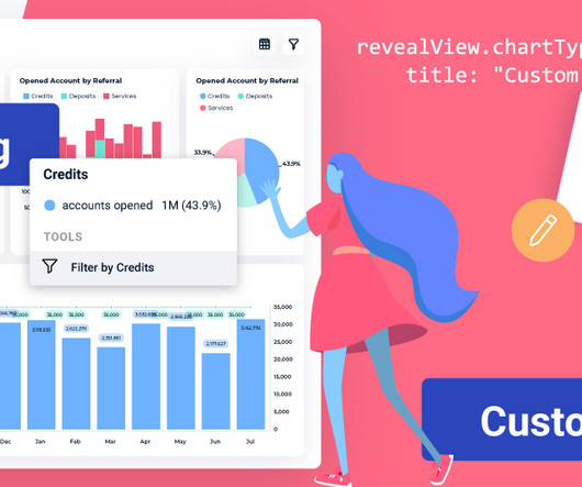
In this blog post, we’ll dive into the key highlights, with a particular focus on two standout features: custom visualizations and interactive chart filtering. DIY Custom Visualizations with Reveal With this innovative addition to our platform, you can now control the chart types available within your dashboards.
Pendo Dashboard. The data visualization and analysis options in Data Explorer, Dashboards and Reports can feel limited and a bit “canned.” Dashboard in Amplitude. She also likes how easy it’s to create dashboards and data visualizations and share them with team members. What do you dislike about Pendo?
Next, you can find out more about their in-app behavior and the features they use from the Features & Events dashboard. Features & Events Dashboard in Userpilot. Feature Tags: there are 15 included in the Traction plan but there’s no such limit in the Growth or Enterprise plan.
We organize all of the trending information in your field so you don't have to. Join 96,000+ users and stay up to date on the latest articles your peers are reading.
You know about us, now we want to get to know you!
Let's personalize your content
Let's get even more personalized
We recognize your account from another site in our network, please click 'Send Email' below to continue with verifying your account and setting a password.


Let's personalize your content