This site uses cookies to improve your experience. To help us insure we adhere to various privacy regulations, please select your country/region of residence. If you do not select a country, we will assume you are from the United States. Select your Cookie Settings or view our Privacy Policy and Terms of Use.
Cookie Settings
Cookies and similar technologies are used on this website for proper function of the website, for tracking performance analytics and for marketing purposes. We and some of our third-party providers may use cookie data for various purposes. Please review the cookie settings below and choose your preference.
Used for the proper function of the website
Used for monitoring website traffic and interactions
Cookie Settings
Cookies and similar technologies are used on this website for proper function of the website, for tracking performance analytics and for marketing purposes. We and some of our third-party providers may use cookie data for various purposes. Please review the cookie settings below and choose your preference.
Strictly Necessary: Used for the proper function of the website
Performance/Analytics: Used for monitoring website traffic and interactions
When your company adopts multiple SaaS solutions to drive productivity, you unknowingly create a perfect storm for data fragmentation. Your customer information lives in Salesforce, while your support tickets are in Zendesk, your product usage data in Mixpanel, and your marketing campaigns in HubSpot. Sound familiar?
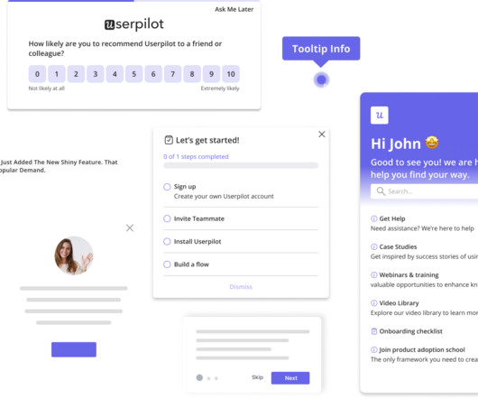
Without effective UX analytics that goes beyond collecting data, you’re losing valuable customers. Why UX analytics should go beyond quantitative data. Methods for collecting and analyzing UX data. UX analytics involves gathering, analyzing, and interpreting data about how users interact with your product or service.
You can gather all the user feedback or behavioral data you want or even generate tons of Google Analytics reports. This causes siloed data and integration issues. However, this increases the likelihood of errors, leading to missing data and misinterpretations. Kevin has a few tips covering everything important.
Case Study: Improving Data-Driven Decision Making for CSR Leadership Civian is a data-driven platform designed to help businesses measure, optimize, and showcase the social and economic impact of their investments in communities. Feature Engagement Users most frequently gravitated toward the map to explore and compare data.
The world of data analytics is changing fast as organizations look to gain competitive advantages through the application of timely data. Choosing the best solution for your dashboards and reports starts with understanding the types of analytics solutions on the market. How do you differentiate one solution from the next?
Reveal Embedded Analytics We know how difficult it is to create dashboards, especially for web applications. Thats what dashboards are for. In fact, Angular dashboards can provide key insights that will eventually allow data-driven decision-making at your company. What is an Angular Dashboard Library? Dont worry.
This format efficiently gathers quantitative data and identifies common themes. For more survey question types see here: [link] Balancing qualitative and quantitative data: The role of customer insights Achieving a balance between qualitative and quantitative data is essential for a well-rounded understanding of customer experiences.
Would you like to learn how to design a SaaS metrics dashboard for your team without any coding? In the article, you will find examples of various SaaS dashboards and learn how to create them with Userpilot analytics. If so, you're in the right place! Let's dive in, shall we? To name just a few.
Custom dashboards to track key metrics at a glance. Analytics reports like paths, funnels, and cohort tables for visualizing user behavior data. for collecting user sentiment data. Pendo The dashboard on Pendo. Additional reports: You get a built-in Product Engagement Score dashboard. UserGuiding dashboard.
Think your customers will pay more for data visualizations in your application? But today, dashboards and visualizations have become table stakes. Five years ago they may have. Discover which features will differentiate your application and maximize the ROI of your embedded analytics. Brought to you by Logi Analytics.
SaaS users expect a self-service analytics experience to make data-driven decisions. The post Introducing Qrvey 9: MultiCloud Embedded Analytics and Unified Dashboards appeared first on Qrvey. There is a huge opportunity to add value with your analytics experience it improves customer happiness, and drives engagement and stickiness.
You know your product collects tons of data. Data visualization tools help turn your messy spreadsheets into clear, interactive insights. The best ones dont even need SQL or data science skills. Because product analytics should be easy and accessible for everyone, not just data experts. What are data visualization tools?
When it comes to product management, you need to look at different SaaS dashboard examples to see what kind of product analytics you can measure, and how. So what are the most important types of dashboards and which ones are the best for you? Ready to transform your data into actionable insights?
Last month we turned our attention to data – unleashing new features that help you improve how you collect, access, and use first-party data to influence your product and scale your business. New data localization with Australian Data Hosting. Learn more about our data hosting program here.
Every data-driven project calls for a review of your data architecture—and that includes embedded analytics. Before you add new dashboards and reports to your application, you need to evaluate your data architecture with analytics in mind. Expert guidelines for a high-performance, analytics-ready modern data architecture.
Turn survey responses, review data, and post-purchase feedback into clear dashboards your teams can actually use. If you can show how a better pickup experience increased return visits or how fixing inventory visibility boosted conversion, youll have the data to back every CX investment. You can download the free e-guide, here
1 Userpilot for product teams to collect and act on NPS data Creating NPS surveys with Userpilot. Get real-time insights into your survey responses, with visual breakdowns of data, NPS score, and trends. Plus, the ability to create custom NPS dashboards allow you to analyze the results easily without writing a line of code.
Pro Tip: Pair your quick wins with data. A dashboard showing metrics like feature adoption or user engagement amplifies your credibility. Deliver Data-Driven Insights In a new role, data is your best tool for establishing credibility. It shows youre thoughtful, analytical, and focused on results.
Are you wondering how the new Userpilot custom analytics dashboards can help you drive product growth? In this article, you will learn about the main benefits of custom product analytics dashboards and how to create them in Userpilot. TL;DR Userpilot custom analytics dashboards allow you to display multiple reports in one place.
Speaker: Laura Klein, Principal at Users Know and Author of UX for Lean Startups
That's why Laura Klein, product manager and UX designer, has a set of tips to help application teams improve their embedded dashboards and reports. How to avoid common mistakes people make when presenting data. No one makes poorly designed products on purpose. And yet we have so many of them in our lives.
Collect customer data to calculate complex formulas for tracking metrics, monitor customer health scores, and resolve support tickets while continuously trying to improve retention and expansion. Evaluate data hygiene & availability : Assess the quality of customer data you’ll be feeding into the platform.
Wondering how to build a customer success dashboard for your team? From the article, you will learn what a customer success dashboard is, why you need it, and what metrics it should include. And how to build a dashboard for your customer success team using Userpilot analytics ! Populate your dashboard with up to 30 reports.
While “use data to drive decision-making” sounds obvious, there’s a HUGE gap between saying it and doing it well. Product analytics refers to the process of gathering and analyzing data on how users interact with a product. This process may reveal gaps such as: Insufficient raw data. What is product analytics?
In the first part of this series I covered the why behind data products. In the previous article I gave examples of some of the data products you interact with everyday. The key thing to remember is that a data product is “ …facilitating an end goal using data ” (DJ Patil).
Think your customers will pay more for data visualizations in your application? But today, dashboards and visualizations have become commonplace. Download the whitepaper to learn about Monetizing Analytics Features, and Why Data Visualizations Will Never Be Enough. Five years ago they may have.
Well, it’s not quite that simple – despite the influx of customer conversations, it can be hard to derive meaningful insights from all that data. With custom data attributes you’ll be able to refine broad topics and get more granular insights on things like feature requests or product feedback. And that’s just the beginning.
Example: Imagine you’re designing a new dashboard for a fintech app. Example: For our dashboard, we might ask, “How might we create a dashboard that helps analysts quickly spot trends and take action?” Example: Imagine you’re designing a new dashboard for a fintech app. Big difference, right?
Does the thought of quantitative data analysis bring back the horrors of math classes? But conducting quantitative data analysis doesn’t have to be hard with the right tools. TL;DR Quantitative data analysis is the process of using statistical methods to define, summarize, and contextualize numerical data.
Chatbots (ChatGPT, Claude) Best for: Prototypes that are just one page and don’t have complex design requirements, like calculators, flip cards, or data visualizations Chatbots are capable of writing code in response to a question or prompt. file conversion, job applicant tracking) and data-driven applications (e.g.
You'll learn: How to turn basic dashboard metrics into a financial model. Early stage startups in particular may not need a four year business plan, but they need to start building out a model which will show how they can someday be profitable. Learn how margin of error impacts financial projections.
A self-service data platform is the backbone of informed decision-making and a growing SaaS business. But how do you choose the right data platform for product analytics ? Let’s go over what a data platform is, its importance, and the must-have features you should consider to choose the right platform for you.
When one tool gathers feedback via email and another through your website, consolidating all that data and customer feedback can be nearly impossible. Most organizations struggle with disconnected tools that create data silos and incomplete customer insights.
Dealfront is a platform designed to enhance sales and marketing efforts by providing teams with reliable and compliant B2B data. The company adopted Userpilot as a feedback platform to enable stakeholders to report issues with data accuracy. The data team then verifies and corrects the feedback, ensuring data reliability.
You can then visualize the data as trends, funnels, paths, and heatmaps. Leverage welcome surveys to gather the data. Teach them to use data to identify customers who are ready for expansion. Well, you can easily track the metrics from one of Userpilot’s analytics dashboards.
Think your customers will pay more for data visualizations in your application? But today, dashboards and visualizations have become table stakes. Five years ago, they may have. Turning analytics into a source of revenue means integrating advanced features in unique, hard-to-steal ways.
Perform a report and/or data feasibility analysis. Identify the metrics i.e. the quantitative measurements of data. Ensure you know how to produce that metric from your data. If a data point is difficult to produce, negotiate to remove from scope, and plan ahead for future implementation. Identify the complex entities.
Tired of spending big on third-party data providers and not getting the results you want? Say hello to direct data capture! By collecting data directly from your customers, you can cut down on costs, gain accurate insights, and maintain full control over your data. Gather direct data with user interviews.
This updated toolbar enhances user experience by offering advanced data analysis and interactive features. Chart % Based Filtering [Beta] Chart % Based Filtering in Reveal enhances your dashboard’s interactivity by allowing percentage-based interactions across various visualizations. For details, please refer to our release notes.
A typical workflow involved looking at a dashboard full of charts with metrics sliced and diced by various attribute combinations. A typical operational dashboard we used before doubling down on traces. We wanted full control over the way data would be sampled and retained”. Why traces? Enabling teammates to adopt traces.
Organizations look to embedded analytics to provide greater self-service for users, introduce AI capabilities, offer better insight into data, and provide customizable dashboards that present data in a visually pleasing, easy-to-access format.
Understanding how to analyze survey data doesn’t have to be complicated. Effectively analyzing data from your user feedback will also help you eliminate assumptions and create marketing strategies that positively impact your audience. The two main types of survey data are quantitative data and qualitative data.
Latest Update Features: Custom Toolbars: Full control over dashboard menus. Interactive Filtering: Compare data instantly. Axis Title Control: Sharpen data clarity. Enhanced Visuals & Data Sources: Smarter charts, faster data. Key Enhancements: Filters are now read-only once applied to protect data integrity.
User feedback is valuable , but without data, its just opinions. To eliminate these blind spots, you need to combine quantitative, qualitative, and visual data. This article will cover: Why combine quantitative, qualitative, and visual data? Key differences between data types. How to collect each data type.
And the behavioral data you do collect depends on what you choose to track and how you track it. Open up a webpage, drop in a script, and boom: clicks, scrolls, and form inputs start flowing into your dashboard without writing a single line of code. And if they reinstall the app, you lose whatever local data you had.
Unlike smaller organizations, where basic BI features and simple dashboards might suffice, enterprises must manage vast amounts of data from diverse sources. Large enterprises face unique challenges in optimizing their Business Intelligence (BI) output due to the sheer scale and complexity of their operations.
We organize all of the trending information in your field so you don't have to. Join 96,000+ users and stay up to date on the latest articles your peers are reading.
You know about us, now we want to get to know you!
Let's personalize your content
Let's get even more personalized
We recognize your account from another site in our network, please click 'Send Email' below to continue with verifying your account and setting a password.
Let's personalize your content