This site uses cookies to improve your experience. To help us insure we adhere to various privacy regulations, please select your country/region of residence. If you do not select a country, we will assume you are from the United States. Select your Cookie Settings or view our Privacy Policy and Terms of Use.
Cookie Settings
Cookies and similar technologies are used on this website for proper function of the website, for tracking performance analytics and for marketing purposes. We and some of our third-party providers may use cookie data for various purposes. Please review the cookie settings below and choose your preference.
Used for the proper function of the website
Used for monitoring website traffic and interactions
Cookie Settings
Cookies and similar technologies are used on this website for proper function of the website, for tracking performance analytics and for marketing purposes. We and some of our third-party providers may use cookie data for various purposes. Please review the cookie settings below and choose your preference.
Strictly Necessary: Used for the proper function of the website
Performance/Analytics: Used for monitoring website traffic and interactions
Without effective UX analytics that goes beyond collecting data, you’re losing valuable customers. Unfortunately, the research backs this up, with a staggering 90% of users reporting that they stopped using an app due to poor performance. It covers key topics, such as: Defining UX analytics. What is UX analytics?
When your company adopts multiple SaaS solutions to drive productivity, you unknowingly create a perfect storm for data fragmentation. Your customer information lives in Salesforce, while your support tickets are in Zendesk, your product usage data in Mixpanel, and your marketing campaigns in HubSpot. Sound familiar?
Most product teams get mobile app analytics wrong. They track 47 different key performance indicators (KPIs) in their mobile analytics platform , spend hours debating dashboard numbers, yet can’t predict which users will churn next week The problem here isn’t a lack of data.
You know your product collects tons of data. Datavisualizationtools help turn your messy spreadsheets into clear, interactive insights. The best ones dont even need SQL or data science skills. Because product analytics should be easy and accessible for everyone, not just data experts.
Dashboard design can mean the difference between users excitedly embracing your product or ignoring it altogether. Great dashboards lead to richer user experiences and significant return on investment (ROI), while poorly designed dashboards distract users, suppress adoption, and can even tarnish your project or brand.
Case Study: Improving Data-Driven Decision Making for CSR Leadership Civian is a data-driven platform designed to help businesses measure, optimize, and showcase the social and economic impact of their investments in communities. Feature Engagement Users most frequently gravitated toward the map to explore and compare data.
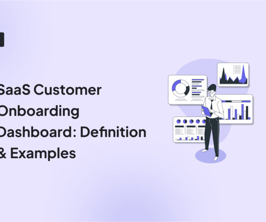
In SaaS, a customer onboarding dashboard can become a massive product analyticstool to understand and optimize the user journey. But what type of dashboards can you use to analyze your onboarding process? Let’s explore how a customer onboarding dashboard works and see different examples.
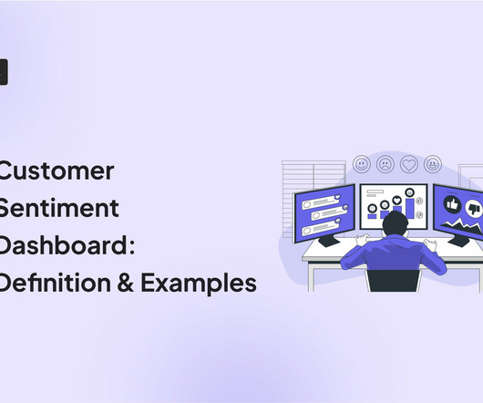
A customer sentiment dashboard is a great way to visualize customer feedback and see what users love (or hate) about your product. But how do you collect the right data for your analysis? This article shows you a step-by-step process and some of the best tools to use. Track customer behavior for experience insights.
Reveal Embedded Analytics Embedded analytics platforms have gained popularity as businesses seek to leverage data for decision-making and gain a competitive edge. One of these features you should look for is dashboard linking. What Is Dashboard Linking? However, not all solutions are the same.
Reveal Embedded Analytics Embedded analytics platforms have gained popularity as businesses seek to leverage data for decision-making and gain a competitive edge. One of these features you should look for is dashboard linking. What Is Dashboard Linking? However, not all solutions are the same.
If you’re shopping around for a mobile app analytics platform before biting the bullet with Fullstory, you’ve landed in the right place. FullStory is a robust web and analyticstool but there are platforms out there that may specialize in one of the features you want. Best for AI-powered future outcomes predictions.
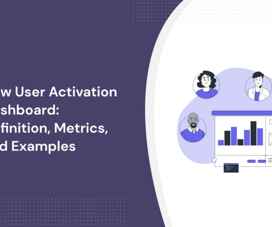
In SaaS, a new user activation dashboard can become a massive product analyticstool to understand and optimize the user journey. But how can a dashboard for user activation can help you engage more users? moment ," where the core value proposition of your service becomes clear and tangible.
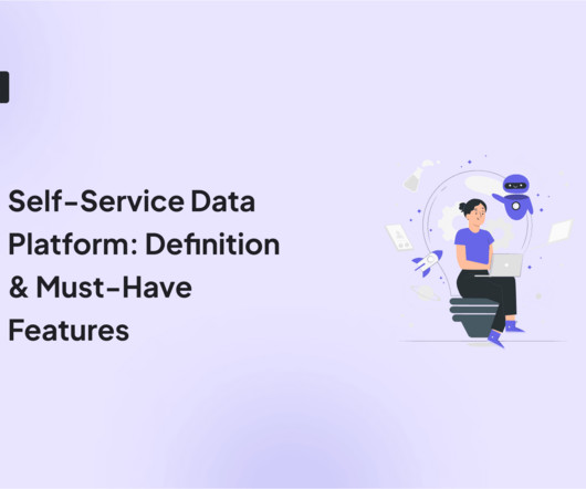
A self-servicedata platform is the backbone of informed decision-making and a growing SaaS business. But how do you choose the right data platform for product analytics ? Let’s go over what a data platform is, its importance, and the must-have features you should consider to choose the right platform for you.
Questions about production: We wanted our definition to be wide, generic, and representative of the broad scope of workflows we cater for. No tool will give you answers, only offer leads you can follow to find the real answers. Until recently, our observability tooling has been primarily based on metrics. Why traces?
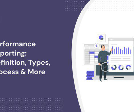
Performance reporting is essential for product and project managers to make data-driven decisions. In this article, we explore: What performance reporting is Why it is important What to include in a performance report How to create performance reports The best analyticstools for performance reporting Let’s get right to it!
As a product manager at Userpilot, I’ve had the chance (and let’s be honest, responsibility) to try out major onboarding automation tools in this space. In this post, I’ll walk you through how these tools compare based on actual, hands-on use, not just pricing tables and feature checklists. Starts at $300/month for 1,000 MAUs.
Marketing leader, Justin Norris shares recommendations for how to produce valuable reporting for stakeholders. Let’s say in this case, the digital product is a report. When a stakeholder requests a report, whether they tell you this or not, they made the request so they can get something done. Understand the business problem.
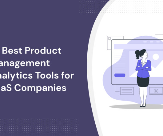
You can get the answers you need simply from product management analyticstools. To help you know which tool to use, this article will cover the ten best product analyticstools. TL;DR Product analyticstools analyze user interaction, preferences, and engagement with a product.
Instead, we must go back to the age-old mantra that a picture is worth a thousand words and provide a visual representation of what the future could look like if we are successful. Design: Customer Discovery Insights. Whenever you are surprised it means you've collected a valuable insight. Design: Product Roadmap.
We live and work today in a world that is increasingly data-driven, but we cannot successfully adopt a data-driven approach to decision making without first identifying the metrics that matter most. Plus, there’s no shortage of tools to help us quantify seemingly everything. The real issue is lack of focus. In This Article.
Generating data is easy. Data is often not accessible unless you can write code. People in non-technical roles rely on data every day to make decisions, develop ideas or measure success. When tools and systems are not created with them in mind, they lose trust and understanding. It doesn’t have to be this way.
Which product analyticstools should you be using? How many analyticstools do you need? And what type of analytics really matters for a product marketing manager? By the end, you'll know the only type of analyticstools you really need as a PMM. What is product analytics?
Primarily there are 3 major aspects to understanding and performing well as a Product Manager, which are as listed below: Understanding the Role Definition Hard Skills required for the Role Soft Skills required for the Role. Understanding the Role Definition. Definition of PM role. Data vs Intuition. Product Strategy.
Reveal Embedded Analytics. Embedded analytics is everywhere around us – in our cars, in our homes, in our security systems, in the digital advertising that we see while surfing the web, and even in the healthcare services we are being treated with. And that is because data nowadays is everything. Especially in business.
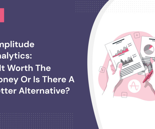
Amplitude Analytics is one of the most popular digital analyticstools for SaaS businesses. It offers valuable insights into user behavior to drive growth and enhance your user experience. But is Amplitude the right tool for your company? What is Amplitude Analytics? Source: Amplitude.
Reveal Embedded Analytics. While businesses continue making analytics and BI their top investment priority, new techniques, and trends emerge, making dataanalytics faster, easier, and even more powerful. . From this article, you’ll learn: What is augmented analytics ? Who is augmented analytics for?
According to the Nielsen Norman Group, quantitative data can identify where users encounter problems, but it often fails to explain why those problems occur Nielsen Norman Group,2023. The Emergence of Research-Driven Growth Authentic growth lies not only in analyzing quantitative data but in deeply understanding user behavior and motivations.
Data is the engine for SaaS, but without dataanalyticstools , your SaaS team will not be able to make sense of the data. The right set of SaaS analyticstools can help you generate actionable insights that fuel strategic decisions. But how do you ensure you’re picking the right tools?
Most SaaS companies understand the value of user feedback , but few actually have a system in place to collect feedback and customer data. Other businesses spend a small fortune on focus groups only to end up with zero actionable feedback and insufficient analytics to make data-driven decisions. Data-driven product development.
This guide will walk you through what research operations are, what role research operations managers play, which product analytics to track, and how you can get started with the process! The best tools for research operations are Userpilot for gathering insights, Optimal Workshop for conducting research, and Figma for testing prototypes.
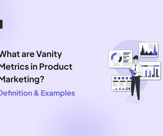
TL;DR Vanity metrics appear impressive but don’t provide actionable insights or inform future strategies. Gather data from various sources (e.g., web analytics, in-app surveys , product analytics). For example, if your web traffic data doesn’t help you improve your content strategy, it’s a vanity metric.
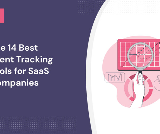
Choosing the best event-tracking tool for your business is not easy. To make the choice a bit easier for you, we’ve created a list of the best tools for tracking events available for SaaS teams in 2023. When choosing an event-tracking tool, first decide if you need to track user behavior inside a digital product or on a website.
Do you want to get product growth insights but are unsure whether to use Amplitude analytics or not? Amplitude is one of the best data analysis solutions to help you make data-driven decisions and grow your business. In this article, we’ll discuss the features and limitations of Amplitude analytics.
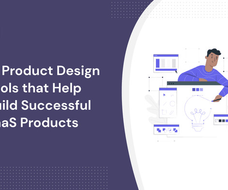
In the market for product design tools to support your workflows and help your team work better? A quick Google search will show you heaps of tools, and you may even experience decision fatigue trying to choose the best. In this article, we distilled it to just 15 tools, showing each product’s strengths and weaknesses.
There are so many multivariate testing tools available that it can be difficult to choose the right one. Whether you’re a seasoned marketer or a budding entrepreneur, this comprehensive guide will equip you with the knowledge and resources to elevate your product analytics and optimization efforts. Let’s dive in!
What is data product management? Data product management is the discipline of collecting and analyzing data to develop and improve products. Data products are built around advanced data processing, AI, and machine learning. Data products are built around advanced data processing, AI, and machine learning.
Customer journey analytics is your greatest resource in making sense of your user data. But can you take action on those insights? If all the data we collect to create better products and customer experiences were trees, each company could plant its own forest. What Is Customer Journey Analytics? But then what?
Is it possible that new sources of data will help product managers in hard times? Perhaps getting more data might be just exactly what you need to make it through this pandemic? The Power Of More Data. Just having access to the data is not enough. Image Credit: Wonderlane. Let’s face it: pandemics suck.
Learn more about industry benchmarks in our latest SaaS Product Metrics Report. Strategies to boost activation rates in your SaaS product: Optimizing the sign-up flow by minimizing required data and enabling easy registration methods can improve activation rates. That's when they experience the product or service value first-hand.
Reveal Embedded Analytics. Easy to use and understand analytics is a crucial part of every modern SaaS application. In today’s digitalized and technology-oriented world, customers require much more than static datavisualization or simple reporting. What is a modern analytics application?
Have you noticed recently an increase in the usage of the terms ‘data-driven’, ‘data-informed’, and ‘data-inspired’ around your office? What does data-inspired actually mean and how is it different from being data-informed? Data-driven, data-informed, and data-inspired describe how data should be used.
Using CRO analytics is one of the best ways to drive growth. In this article, we're going to: Set out how quantitative data analysis can lead to conversion optimization. How to leverage CRO analyticsdata to enhance conversion processes. Explore the best conversion rate optimization tools on the market.
What is application analytics? How can they help product teams extract actionable insights and build product experiences that deliver more value and delight to customers? TL;DR Application analytics is the process of collecting and analyzing product usage data to inform product development. What is application analytics?
They include fixes, enhancements, and new features , related to the product's hardware, software, and services. Sunsetted features : Focused on features or services being retired, these notes inform users about timelines and provide alternatives. If you must use a technical term, provide a brief definition or explanation.
We organize all of the trending information in your field so you don't have to. Join 96,000+ users and stay up to date on the latest articles your peers are reading.
You know about us, now we want to get to know you!
Let's personalize your content
Let's get even more personalized
We recognize your account from another site in our network, please click 'Send Email' below to continue with verifying your account and setting a password.


Let's personalize your content